
How To Tackle Data Visualization UX: Tips & Tricks

Summarize with AI:
Data visualization is so interesting because it sits at the intersection of several very different worlds. Let’s learn how to design powerful charts and graphs, using examples from the KendoReact library.
Data visualization (also referred to as data viz or simply as “charts”) is such an interesting topic because it sits at the intersection of several very different worlds. Obviously, there’s the data part of it: the raw numbers, the statistics, the math. Then, there’s a technical part, especially in the context of creating React apps, and the question of how we approach building these graphics particularly since they are often interactive or animated. Those two aspects are probably the ones developers are most familiar with, and for a lot of folks, that’s the place where they stop. Import the data, pass that data into a chart (probably from an external library, like KendoReact or D3), and ta-da: you’ve got data visualization sorted out.
However, this approach leaves out two other very important aspects of creating effective data visualizations: the story and the design. All data tells a story—the question for us is what we are trying to communicate with the data and what we want the users to take away. Even if our intention is to simply set the data before our users and let them draw their own conclusions, the choices that we make in data presentation will greatly influence how a viewer interprets the information—for better, or for worse.
Which means, by nature, that design is also a huge part of data viz—it’s the way that we tell the story. And that’s the part we’ll be primarily focusing on, today: how to design powerful data visualizations. But it’s important to acknowledge that this kind of design can’t happen in a vacuum, and all those other factors—the information, the technology and the story—all have an influence on the design choices that we make.
One of the most important goals of data viz design is matching your users’ expectations. 90% of the time, when users are confused by a data visualization, it’s because they’re not sure how the graphic is intended to be read: it’s not labeled clearly, it’s not accessible, it doesn’t follow an expected pattern, or the presentation method doesn’t match the data it’s displaying.
Sometimes in marketing, you’ll hear the term “surprise and delight”—the idea that you should include something a little bit different, a little bit unexpected to shake up your approach and give your users something new, exciting and memorable. This does not apply to data viz. The graphic itself should always be secondary to and supporting the data—if you’re surprising your users, you’re also distracting them. That’s not to say that you can’t do beautiful and interesting things in data viz—just that there are a few guardrails you’ll want to stay within in order to create effective data visualizations. And at the end of the day, effectiveness is the part that’s important.
When it comes to the UX of your data visualizations, the most important elements to consider are:
- Choosing the right chart: Are you presenting the data in the way that most effectively answers your users’ questions?
- Interactivity: Does this offer enough added value to your users to counterbalance the increased technical lift?
- Responsiveness: Do your data visualizations still look good and function well on small screens?
- Accessibility: Can all your users access your data visualizations?
Let’s dive into each of these key elements and learn how to design powerful charts and graphs every time. As we go through this information, we’ll be providing examples using the charts in KendoReact, since it offers a rich data viz library.
Types of Charts & How To Choose
When it comes to data visualizations, half the battle is won when you select the right format for your information. You’ll want to select a graphic style that most accurately answers the question your users are trying to answer with your data. With that goal in mind, let’s talk through some common questions that people ask about data, as well as the best suited visualizations to answer those questions and challenges to be aware of:
Showing Data Changes Over Time
One of the most common questions to ask about a set of data is how it’s shifted over a period of time. Have profits gone up since Q1? Is our app getting more downloads than we were 6 months ago? What did my heart rate look like over the last 15 minutes of exercise?
Most of the time in these situations, we want to make use of horizontal visualizations, where time is represented along the X axis and the metric of measurement along the Y. This is the pattern most of your users will be looking for in this kind of visualization, so again—it’s important to meet them where they expect you to be.
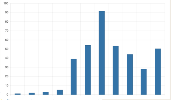
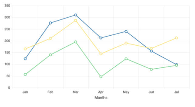
Bar charts and line graphs are by far the most popular options for this approach, since both offer an easy way to visualize the passage of time as compared to your measurement. Other good options might be a Gantt chart or waterfall chart.
You should always opt for the simplest data visualization that effectively answers the users’ question. If you can accurately and easily tell the story of the data with a line graph, don’t bother with a waterfall chart—that added complexity will only make it more difficult for your users to interpret. If there’s value that you can add by using a more complex visualization, then definitely go for it. But if there’s not, that added time and effort on the user’s end will only feel frustrating.
Showing Percentages and Proportions of Data
Another very common question has to do with how the data breaks down into subsets. How many people chose answer A as opposed to answer B? How much of our income are we spending on rent each month? Which of our products is generating the most profit for our company?
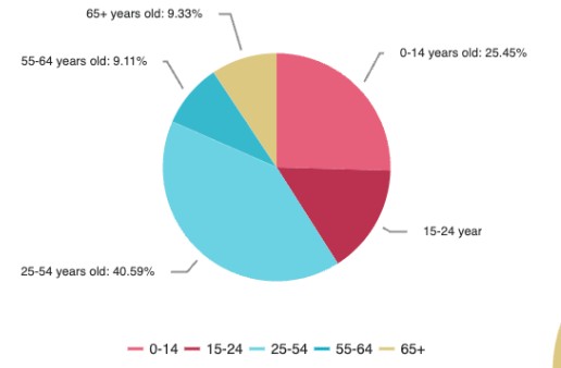
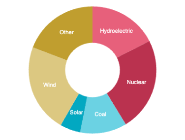
In these situations, we need something that can isolate parts within a greater whole. The most obvious answer is a pie chart or a donut chart. I recommend choosing a pie chart when every subsection is important—it’s faster for your users to interpret, since the larger blocks of color are easier to compare and contrast. The donut chart, on the other hand, is a great option when you just need to highlight the majority—it also offers you the opportunity to put additional information in the center, to reinforce the story. This can help you highlight primary takeaways, or just add a little bit of white space to your design.
Comparing Data
Sometimes, we just want to see how one thing stacks up against another. Which local town has the most ice cream shops? Which feature did our users rank as their most wanted? What’s the highest-grossing movie of all time?
When the question is relatively simple, our data visualizations should be as well. It can be tempting to overcomplicate these kinds of things—sometimes, we feel like it’s our job to create an impressive design, and that can lead to the bad practice of adding more and more unnecessary elements in order to make something look fancier or more “interesting.” However, it’s important to remember that the primary goal of all design—and data visualization in particular—is to communicate an idea. It’s far more important for your graphics to be easily and quickly understandable than it is for them to feel artistic or impressive in some way.
Most of the time, this isn’t an either/or choice—we can absolutely create data visualizations that are both beautiful and effective—but next time you catch yourself thinking about adding another purely decorative element to your designs or using a more visually complex graphic, consider whether you really need it.
When we’re looking for simple comparisons like this, it’s best to stick to the classics. Ranked lists, bubble charts and bar charts are all excellent options here.
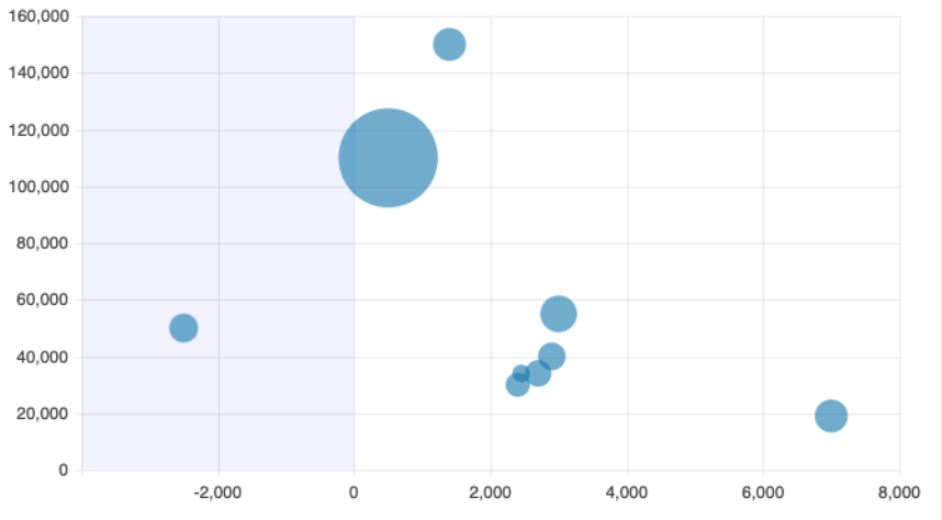
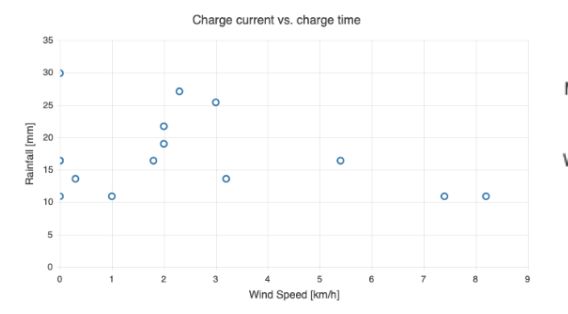
Showing Data Correlations or Differences
Occasionally, we’re in the unique position of having multiple sets of related data that we need to show together, in one visualization. Is there any correlation between income and life expectancy? Does the number of hours you study actually impact your grade on the final?
In this situation, you could be looking to juxtapose them to show differences or to highlight correlations and overlaps between them. No matter the reason, it can be a challenge to show two sets of data at once.
In these situations, interactivity can also be a really powerful tool. We’ll talk more about some guidelines for creating interactive designs in just a minute, but for now it’s enough to say that offering this kind of additional layer of information can help clarify complicated graphics.
Scatterplots are often the best match for this kind of data display—they do a great job of displaying a lot of data at a glance, and the cluster of dots is a strong and easily understood visualization for understanding groups and trends.
Beyond scatterplots, some other visualizations we can reach for include heatmaps and bubble charts.
Interactivity
Now that we’ve got a feel for some of the different options we have for common charts, graphs and visualizations, let’s talk interactivity. One of the coolest parts of working with data viz on the web or in applications is that we get to include the user’s input in our work. When you’re working in print, you just kind of have to guess at what the viewer is most likely to be interested in, or (alternatively) provide several different versions of the same graphic, each adjusted to focus on or highlight different parts of the data.
But, in our case, we can provide a default and then allow the user to filter, zoom, pan, click and more to really explore and get involved with the information we’re giving them. We don’t have to guess what they want in the same way—we can give them the tools to adjust our data and show them exactly what they want, every time.
That said, there are pros and cons to interactivity. On the pro side, it’s a great way to embed lots of information in not a lot of space. By giving users the ability to hover or click on things for more detailed information, you can keep the graphic itself more streamlined and simplified.
In general, I’m a big fan of giving your users this power whenever possible. When you could make something interactive and don’t, it can sometimes come with the implication that you don’t actually want the user to look closely at the data—it comes back to that idea of the story you’re telling. If you’re not allowing them to really dive deep and poke around, is there something you’re trying to hide? Why is it so important that they’re only allowed to see the data presented in one specific view? To return to that idea of meeting user expectations: users have come to expect digital data visualizations to be at least somewhat interactive—especially when they’re more complicated ones—and it can be a bit of a red flag when they’re not.
On the flip side, there are downsides to interactivity. Of course, it’s a larger technical lift. Anytime we’re talking interactivity in React, we’re talking state management—by nature, that’s added complexity. If your app is heavily data-driven, you’ll need to consider whether your users should be able to save the specific configurations they’ve created: If I spent 5 minutes filtering and sorting a complex Gantt chart to show me exactly what I need to see, I’ll be frustrated if I have to do that all over again just because I needed to check something on another page.
It’s also worth keeping in mind that you can’t assume your users will click or explore the visualization. They might just skim past it and not actually interact at all! If you have information in that graphic that is truly crucial and needs to be communicated, it should never be hidden within an interactive layer. You can’t depend on the user hovering on each one of the bar chart bars in order to see the exact number—if that number is important, it needs to be visible on first load.
The IBM Design Language has some great guidance on this: “Overview first, zoom and filter, then details on demand.” This means that, at first glance, your users should still be able to get the gist of the information without having to interact at all. Then, allow them to focus on the exact subset of data they want to explore, and show the nitty-gritty stuff only if asked. It’s a great rule of thumb.

GIF from IBM Design Language
Speaking of thumbs, you’ll also have to consider your users on mobile or tablet—how difficult is it to interact with your data visualizations if you’re not using a mouse? Can you easily target buttons, filters and other interactive items when you’re touch-tapping on a phone?
Responsiveness
Which brings us to our next item of consideration: responsiveness. Anything we’re building today needs to be fully responsive—especially now, when remote work has become so common, and more and more people are working from anywhere, using their phones and tablets for business purposes. The thought of someone sitting in an office, at a desk, loading your app on a desktop computer is rapidly becoming outdated.
That said, data visualizations on mobile are tricky. We’re working with seriously limited space, and data visualizations are often squeezing a lot of information into a small area to begin with—making them smaller runs the risk of rendering them unreadable. And, as mentioned, changing from a mouse and keyboard input to a touch/tap input can drastically reduce accuracy when it comes to clicking, scrolling, panning and more. So, what can we do about it?
Do All the Normal “Responsive” Stuff
The first step is to take the obvious steps to make your data visualizations as responsive as possible in their current state. Make sure any overflow is scrollable and that your images and text are resized correctly. It seems silly, but it’s often overlooked—simple visualizations like bar charts or pie charts often can look great on a phone, if a few small tweaks have been made to ensure that they resize correctly.
Simplify the Visualization
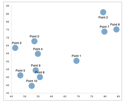
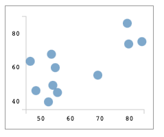
If that’s not enough, it’s time to see if you can simplify the data visualization while keeping the most useful parts of the data. For example, here’s a scatterplot at two different sizes. When the screen is large, we can add more detail, like names over each data point and more precise markings along the X and Y axes.
In the smaller version, we simplify. Note that the story this tells is slightly different and might not work depending on the purpose of the graph. If it’s more important for the user to be able to compare Data Point 10, specifically, to the rest of the options, this wouldn’t be a good solution. However, if you’re looking to communicate higher level trends—like that the majority of the options fall along the lower end of the X axis—then this could work perfectly.
Explore Other Methods To Present the Data
If we can’t get it to look good with those adjustments or are just unable to simplify the presentation of the data, then it’s time for the graceful degradation approach: What are the other ways of presenting the information that might not be as ideal or interactive but will be more small-screen friendly?
For example, if you’re showing population per city, a bar chart might be the best and most interesting solution, but a ranked list could be a good small-screen alternative. In this case, you could show the bar chart until it becomes too small to clearly read or interact with, and then use a media query to swap over to the ranked list.
If all else fails, a data grid is often a good enough solution here—it’s a place where you can display all the data, and it’s naturally scrollable so it often works well even on smaller screens. Plus, with filtering, sorting and grouping, your users can narrow down the wide variety of data into the specifics they need using mobile-friendly controls (like dropdowns or search bars) without needing to deal with a more complex data viz–specific interaction. It’s not ideal, but it’s infinitely better than a beautiful data visualization that your user can’t actually use.
Accessibility
Now, let’s talk about another aspect of data viz design that’s often overlooked: accessibility. There’s often an assumption that data visualizations can’t ever be fully accessible, and therefore it’s pointless to try—this is, obviously, incorrect. Depending on the situation, you might not be able to make every single aspect of a data visualization accessible in exactly the same way (especially complex, interactive ones). But there’s still a lot we can do in order to convey the relevant information and ensure that all our users can understand the story we’re telling with our data. Here’s a good checklist of basics you can use to immediately improve the accessibility of any data viz.
Use Specific Descriptions
First, make sure all your text is descriptive and useful. This includes titles, labels, subheaders—really, anything you’re using to annotate or describe your data visualization. Avoid general titles like “Cities,” “User Data” or “Top 10”—instead, make sure you include information about what is being compared or shown: “Heatmap of United States City Population Density,” “User Accounts Created in the Last 6 Months,” “Top 10 Flavors of Ice Cream as Ranked by Children Under 15.”
Create Graphics With SVGs
If you can, create the data visualization using SVGs, and not a flat image. Using SVGs allows screen readers to more accurately access the individual elements that make up your graphic. This does take more work but is well worth it for the myriad of benefits it offers. I wish we had the time to dive a little deeper into the topic of accessible SVGs today—but I can point you in the right direction, if you’re looking for some resources:
- https://css-tricks.com/accessible-svgs/#complex-images-an-accessible-graph
- https://www.youtube.com/watch?v=RydAA--QuD4
- https://www.deque.com/blog/creating-accessible-svgs/
Make Accessible Color Choices
Another important piece of the accessibility puzzle is color. Color tends to play a huge role in data visualizations—especially charts and graphs—because it’s often used as shorthand to differentiate various subsets of data. However, this can backfire if your color choices aren’t accessible, or if the colors are the only way that you’re labeling your data.
The first users you might think about in this situation might be your blind or colorblind users, but keep in mind that it’s not just them—the intent of your chosen colors can also be impacted for users who have nightshift enabled, who can’t see their device clearly while standing in bright sunlight, or who are looking at their phone with sunglasses on, for example. Making accessible color choices is a benefit to all your users and well worth your time.
When you’re picking colors for your various elements, it’s important to make sure you’re meeting an accessible standard for color contrast. The WCAG (Web Content Accessibility Guidelines) defines three levels of “passing” color contrast ratios—failing, AA and AAA. AA level means your colors have enough contrast to be readable but might still present problems for some users. AAA level means you have achieved extremely high contrast that should be readable for the majority of your users. You should always aim for AAA compliance, but making sure you’re not failing is a good starting point.
You can check your color contrast levels using any number of online tools—my personal favorite is the Adobe Color Contrast Checker (which includes an excellent Color Blind Safe tool as well). There, you can input your foreground and background colors and let them take the guesswork out of determining your color contrast ratio!
The other important aspect of accessibility and color is ensuring that you’re not communicating any information through color alone. This is a dangerously easy trap to fall into, unfortunately.
One of the easiest examples to think about is a bar graph—how many times have you seen a graph that uses a color-coded key below the graphic to identify the bars? It’s not such a bad thing to do ... as long as you also make sure to include some kind of icon, text, pattern or other element to indicate to the user which bar is which. If you’re relying on the color alone, there’s a large percentage of your users who will simply be unable to read the graph.
A good way to check is to convert your graphic to grayscale—if you can still easily tell the difference between the bars, you’re probably good. If it feels like even a little bit of a close call, you need to adjust.
Write Helpful Alt Text
Whether or not you’re able to make use of SVGs, you still need to think about your alt text. While this is always important, it’s especially important in the world of data viz, because you need to make sure you’re going that extra step beyond just describing the basics—you need to tell the story of the data. To start off, let’s do a quick review of guidelines for writing alt text, no matter the situation:
You don’t need to say, “Image of” or “Photo of.” That’s implied information. The only time you might need to call out the medium would be for illustrations, paintings or other works of art where that’s important context for your user.
You should only include blank alt text when the image is a decorative image. In most cases,
alt=""is a pattern to be avoided. The exception to that rule is when you have a purely artistic element on your page—things like borders, dividing lines and other things added to make the page look pretty, but communicate no information or value to the user.Be descriptive! They say a photo is worth a thousand words, so make sure you’re not using just one or two to try and describe a whole image.
alt="Cake"is significantly less helpful thanalt="A chocolate cake with candles, in front of a small girl wearing a birthday hat and a pink dress."One paints a much more accurate and descriptive picture of the image in question.Include any relevant text in the image. It’s generally a bad practice to use images of text, but sometimes you have an image that just happens to have relevant text included—maybe a photo of a sign or a book title. In those cases, make sure you include the text in your alt, so your users don’t miss out on the info.
For data viz, we need to push this just a little bit further. That means including not only a description of the chart, graph, etc., but also a summary of the information. So, while it might seem okay to write, “A line graph of ice cream flavor popularity,” it would be even better to say something like: “A line graph showing that vanilla ice cream has drastically increased in popularity in the last 10 years.” Obviously, you can’t include every single piece of relevant information in the alt text but try to summarize the biggest takeaway and include that in your description. Other, more secondary or supporting information can be included in the summary.
Include a Text Summary
And, on that note, you’ll always want to make sure you’re adding a text summary of the data below the visualization. Depending on the complexity of the data, this could be anything from a few lines to a few paragraphs—but it’s important to include.
Often, we make assumptions when we’re thinking about who our accessibility features will benefit, and that assumption tends to only include a very small subset of our users. But, in truth, creating accessible products benefits literally every single one of your users. A text summary beneath your data visualization obviously helps your visually impaired users …but it also helps your users who learn better through reading than through images, your users on mobile who might not have the “full” experience, and your users in a hurry who need to skim for quick takeaways—just to name a few.
Consider an Alternative Format
Similarly to the “graceful degradation” approach that we mentioned in the Responsiveness section, if you find that (for whatever reason) your data visualization just can’t be made fully accessible, then you need to provide the same data in an alternative format. This could be as simple as a link beneath the graphic that says, “View in table format” or “Export this data as a CSV.” Tables are, traditionally, very accessible—and, as mentioned briefly before, you can lean into more complex options like data grids or spreadsheets as accessible alternatives that offer your users the ability to filter, sort, group or otherwise manipulate the data to find what they need.
Something Is Always Better Than Nothing
People often see accessibility as a kind of on/off switch—either they’re committing to create something completely perfect and 100%, fully accessible … or it’s not worth even trying. In reality, accessibility is a spectrum, and something that’s 90%—or even 70%—accessible is a hell of an improvement over 0.
Even if we can’t get every data visualization all the way to 100%, we can still communicate a huge amount of information by ensuring that we’re providing context and descriptions via labels, color choices, screen-reader-friendly SVGs, alt text, etc. And anything we can’t manage to cover that way, we can share in a different way, using summaries or alternative forms of data presentation. The goal is always to ensure that we’re communicating the main takeaways in more than one format, so we’re creating an equitable and accessible experience for everyone who visits the page.
Summary
Okay, we covered a lot there, in not a lot of time! Here’s a quick recap of the most important takeaways:
- Always start by asking yourself what story you’re telling and what questions you’re answering with the data, then use that to guide your design decisions.
- Never try to subvert user expectations; rather, lean into them as a method for quick and effective communication.
- Don’t hide important information behind interactivity—make sure the big takeaway is visible at first look.
- Consider how your data visualization will look at multiple screen sizes and consider if there are ways you can simplify it for a better mobile experience.
- Present your data in multiple ways to ensure full accessibility—never rely on your visualization to communicate everything.
With all that, you’re ready to get out there and design some amazing visualizations! And if you’re looking to make it even easier than that by removing some of those considerations entirely, check out the KendoReact Charts library—it’s a beautiful, responsive and fully accessible library of data viz components that’s just one small part of an even larger component library. Try it free for 30 days and see how much easier your data viz tasks get! I can’t wait to see what you build.

Kathryn Grayson Nanz
Kathryn Grayson Nanz is a developer advocate at Progress with a passion for React, UI and design and sharing with the community. She started her career as a graphic designer and was told by her Creative Director to never let anyone find out she could code because she’d be stuck doing it forever. She ignored his warning and has never been happier. You can find her writing, blogging, streaming and tweeting about React, design, UI and more. You can find her at @kathryngrayson on Twitter.
Related Posts
Comments
All articles
Topics
Web MobileMobile
Desktop
Design
Productivity
People
