What Can Web Designers Do To Help Reduce Ecommerce Returns?

Summarize with AI:
In 2020, ecommerce companies made $565 billion, but customers returned $105 billion worth of inventory. This level of online returns isn’t sustainable monetarily or environmentally. How can web designers can help deter shoppers from making so many returns?
According to the National Retail Federation, the number of ecommerce returns doubled between 2019 and 2020. Of the $565 billion that ecommerce companies earned in 2020, $105 billion of it was returned by customers.
It’s not surprising that the volume of ecommerce returns increased as ecommerce shopping grew over the pandemic. But with ecommerce shopping trends remaining high today, how sustainable is this trend going to be for ecommerce brands over the long run, especially smaller ones trying to compete on the global stage?
What customers do after they buy something from a website or app might not seem like a problem for web designers. However, if your clients’ profits are being eaten up by returns processing, fraud and product loss, it’s not unreasonable to expect them to cut back on investing so much money externally (like on web design).
While I don’t believe there is one obvious solution to this returns problem, I do have some ideas on how you as a designer can help your clients suffer fewer losses. And, in return, offer a greater-value product for them to sell their inventory through.
Ways To Reduce Ecommerce Returns Through Web Design
As I spent the afternoon checking out what ecommerce sites are currently doing, I saw a lot of “Free & Easy Returns” promises and not much to deter shoppers from returning so much product back to them. Based on some of the data I’ve seen, here’s what I’m proposing designers do to help:
Tip 1: Add Visible Features That Improve the Decision-Making Process
This is an indirect way of helping ecommerce brands cut down on returns. Rather than outright address the issue of too much stuff getting returned to the store, the website or app provides customers with tools that reduce the likelihood of it happening in the first place. For instance:
- Easy-to-understand size charts
- Find-your-size quizzes
- Customer reviews that include how true to size, fit, etc. the product is
- Side-by-side product comparisons
- Interactive 3D views of the product
- Virtual or augmented reality try-ons
These features should be placed in highly visible areas, too. That way, the shopper doesn’t discover the tool after the fact or miss it entirely.
Let’s look at some examples. We’ll start with REI which includes a product comparison tool within the search results page:
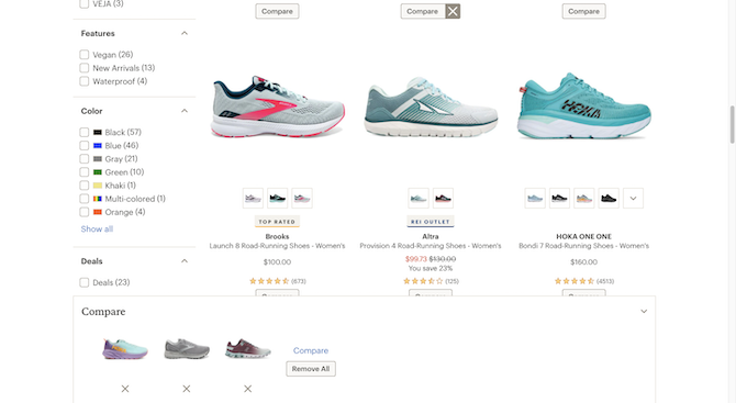
The shopper has the option of clicking on the product photo to go to the product page or the “Compare” button beneath it to add it to the comparison tool. When they click “Compare,” a bar appears at the bottom of the screen with the collected products.
When they’re ready to compare them side-by-side, they click the blue “Compare” text link and it takes them to a comparison table like this:
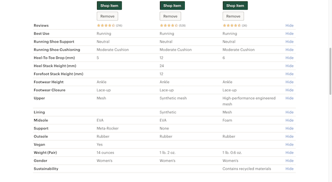
Shoppers will see how each product compares to one another based on a variety of specifications, which change based on the kind of product being compared.
What’s great about this table is that they don’t just get a comparison of physical characteristics, which they’d be able to glean on their own if they examined the shoes in person. They also get answers about things like the best use case that they would’ve had to consult with a store associate about.
Clothing companies, unsurprisingly, experience higher rates of returns than other ecommerce companies. One way to solve this issue would be with a virtual try-on tool. However, AR solutions can be expensive to build and maintain, and they’re not always the most user-friendly.
Another way to improve shoppers’ assurances about a product, and to help them pick the right specifications, is by including extra details under customer reviews as Athleta does:
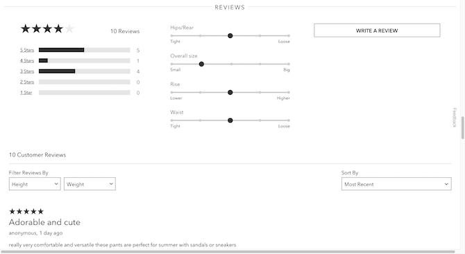
Shoppers don’t just see average ratings or customer reviews in this section. Beside the ratings bar is a set of sliders based on customer input. This provides shoppers with a summary of how the particular item of clothing fits. For instance, if they know that the overall size, on average, runs small, they can order up a size.
Now, if you’re working with a client with a big budget, they might want to invest in an augmented reality solution. That would actually be a smart idea considering companies with big budgets stand to lose more from customer returns.
Mind you, AR isn’t just a valuable tool for clothing companies. IKEA, for example, has a VR and AR solution that enables shoppers to see what their products look like within a three-dimensional space:
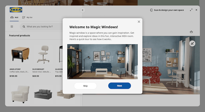
I say this is a virtual and augmented reality tool because it is. Magic Windows is the VR tool that’s accessible through the website and app. Shoppers look up products from the store and then drag them into the three-dimensional room on the right to see how they look and fit.
If you look at the top-right corner of my screenshot, you’ll see a text link that reads “Scan & design your own space.” When a shopper clicks that button, IKEA invites them to download the app so they can scan the actual space they live in and stage the furniture there.
Tip 2: Add the Returns Policy at Key Stages of the Buyers’ Journey
It’s quite common for ecommerce sites to tuck the returns policy into the footer and never mention it again. While they might be assuming that customers will reference it before hitting the “Purchase” button, that obviously has not been the right assumption seeing as how many returns take place online these days.
Having a returns policy isn’t enough to deter people from returning items. That said, I wonder how many shoppers are making assumptions of their own when they make a purchase. If there’s no returns policy readily available, they might assume that returns are free and easy as so many sites claim these days.
No one should make assumptions on either side of the transaction. The best way to encourage customers to shop and return responsibly is to be transparent about the policy. So, I think the returns policy needs to be addressed at every big step in the shoppers’ journey:
- The home page (or footer)
- Each product page
- The shopping cart and/or the checkout page
I don’t believe the UI has to be altered much to do this. There are many examples of ecommerce sites that have been able to bring up their returns policy and to do so in a minimal, yet attention-grabbing way.
Lush, for example, includes its returns policy just below the fold where the product specs are:
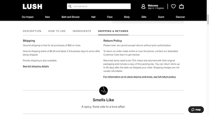
This is an important area for shoppers as it provides information on what the product is, what it’s for and what its ingredients are. To include the shipping and returns policies here is smart. For the shoppers that care enough to educate themselves on the returns policy before buying, there’s no need to hunt it down.
The information on H&M’s returns policy is somewhat hard to find on the website. The first time I encountered it, I didn’t even know what it was:
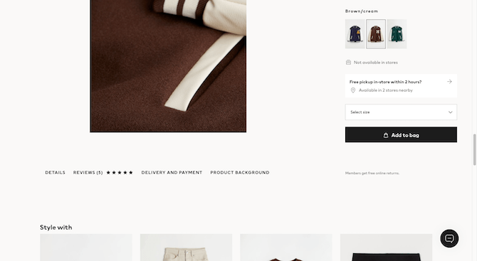
Beneath the gallery of product photos is a row of links that doesn’t really look like a row of links. When you click on “Delivery and Payment,” however, a pop-up briefly sums up the shipping, payment and returns policies. I doubt that’s sufficient enough in terms of visibility on the page or clear enough about what kind of information is there.
That’s OK though. The H&M shopping bag page does a good job of bringing it to shoppers’ attention:
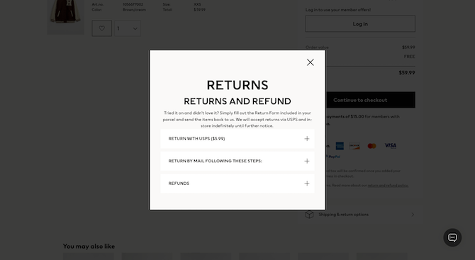
Just beneath the payment summary block on the right is a text link that says “return and refund policy.” Shoppers see a pop-up that allows them to expand each of the returns options. So, not only do they get to see the associated costs with each option, but also how easy or difficult each is.
There’s also a bigger button below that link that says “Shipping & return options.” It opens another pop-up that explains all of the relevant policies in complete detail:
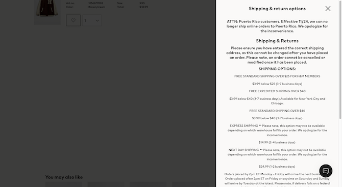
The returns policy is summed up again at the bottom of the pop-up. So, there are plenty of opportunities for this page to inform customers about the policy before they go through with the purchase.
One other recommendation I’d like to make is that the returns policy on these pages be dynamic. I’ve seen a number of sites that include a generic note about returns being free within a certain timeframe. But, then, upon closer examination of the policy, it appears that there are different policies.
One way I’ve seen this segmented is by who the shopper is. Companies that have loyalty programs will give members free returns or a longer returns window while other shoppers have to pay for returns.
Another way I’ve seen this addressed is by product type. For instance, large stores like Amazon or Macy’s sell lots of different products. Returning something like a T-shirt vs. a huge sectional couch deserve different return policies.
Yet another reason why this might come up is because items are sold by different vendors. We see this on Etsy.
Every product page has a section that breaks down the shipping and return policies. After the shipping timeline is shown, the vendor tells the customer whether or not returns or exchanges are accepted. In this example, they are:
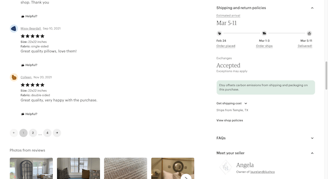
The big “Accepted” stands out more than most of the other copy in this section (with the exception of the projected arrival). This should help shoppers quickly zero in on the policy.
Here’s an example of what it looks like when returns aren’t accepted:
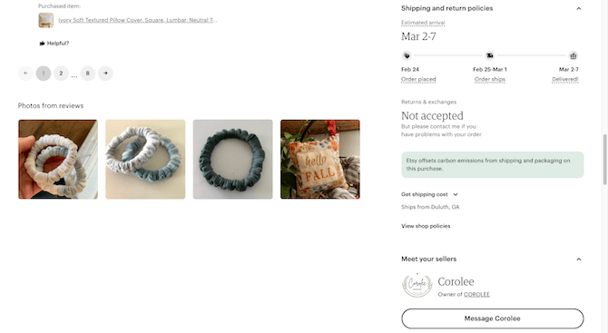
This vendor has stipulated that neither returns nor exchanges are accepted. That said, they’ve left a kind note below that invites customers to contact them if there are any problems.
Tip 3: Make the Returns Process a Challenge
According to the NRF’s 2020 report, $102 billion of merchandise got returned to e-retailers. What’s worrisome is that $7.7 billion of that was fraudulent. That refers to someone that:
- Bought the product knowing they’d only use it once and then return it.
- Lied about the state of the product and insisted on a return regardless.
- Claimed they had just bought the item but lost the receipt when in reality it wasn’t theirs to begin with or they’d had it longer than the returns window allowed for.
There’s another costly deceptive shopping practice ecommerce companies have to worry about. It’s what’s known as bracketing. Shoppers buy the same product in various sizes or variants. It’s kind of like picking up sizes 4, 6 and 8 to take into the changing room to see what fits best. The only problem is that shoppers can’t just put them back on the rack or give them to an associate. They have to ship them back to the ecommerce company.
These returns practices aren’t just costly for the retailer, it’s also bad for the environment. Shipping labels need to be printed. Delivery drivers have to drive two ways instead of one to deliver and then return purchases. And returned items either have to be repackaged or they end up in the landfill.
Shaming the shoppers who would do this won’t work. Instead, what you can do is make the returns process not so easy to get through. Mind you, other shoppers who have a justifiable reason for returning items will have to go through this process, so you don’t want it to be so full of friction that they never shop with the company again.
Here are some ways to make this work:
Do as Pela Case does and move anyone wanting to do a return to a dedicated Returns and Exchanges form:
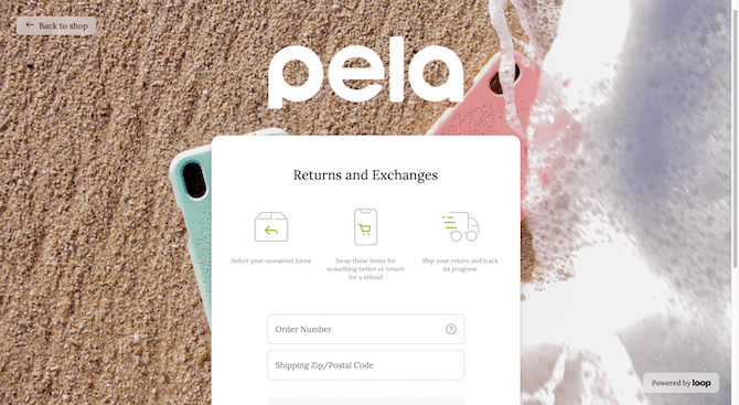
There are no returns unless the customer can provide their order number along with the ZIP code where it was shipped to. Even if someone tries to circumnavigate this process by clicking the “Returning or exchanging a gift?” button at the bottom of the page, they still have to confirm the purchase.
Qeep Up has an even more difficult return process. Considering how sustainability-focused the company is, I’m willing to bet this was done intentionally to reduce returns.
This is the Shipping & Returns page:
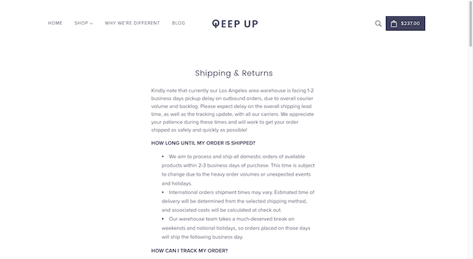
At first glance it looks pretty basic, answering questions about how long shipments take and how to track orders. However, when shoppers get to the Returns policy, they’ll see how strict the requirements and process are:
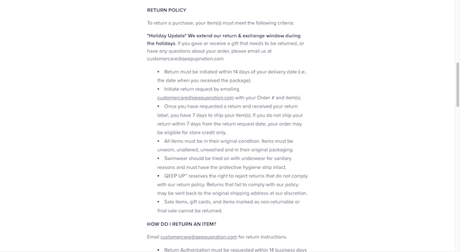
Qeep Up provides a list of criteria that must be met in order to request a return, including a relatively short return window of 14 days. The process also must be initiated by emailing the customer care team. Once the rep responds, the customer has seven days to get the product in the mail.
I’d make one additional suggestion if you are able to create a policy page like this one. Rather than just keep this information relegated to a page, add links to it on the product and shopping cart pages.
There’s one more technique that I’d like to recommend. However, I haven’t been able to find a site that uses it, so I’m not sure how easy it’ll be to implement.
Here’s the idea:
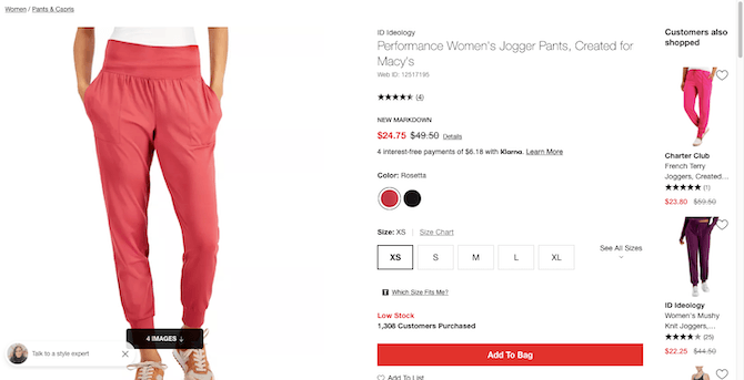
You’re able to program product pages to throw errors when someone has picked a variant that’s no longer available (like Blue in a size Small). You’re also able to send advisory messages about limited quantities, like the “Low Stock” notice on this Macy’s product page:
A similar message appears when the shopper places the item into the shopping bag:

Let’s say someone tries some bracketing as I’ve done here. I’ve added the same pants, in three consecutive sizes: XS, S and M. What if you programmed the shopping cart to alert shoppers when activity like this has been detected?
Here’s how that may look:
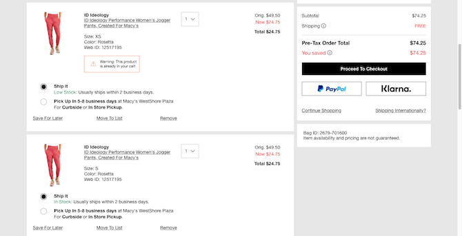
I’ve changed the message to read: “Warning: This product is already in your cart.”
If you design this note with enough space, you could put a link to the returns policy in the message, too. That might help deter some serial shoppers from moving forward if they know the abnormal activity has been detected or that there’s a penalty associated with it.
Even if the store doesn’t get a lot of fraudsters, it might still be nice to include this kind of messaging when duplicates are detected. I’m sure there are shoppers who’ve accidentally ordered a duplicate and didn’t realize they did until both items ended up in their package. So, you’d be helping clients reduce fraudulent as well as accidental duplicate returns.
Wrap-up
Ultimately, it’s up to your ecommerce clients to draft their returns policies. However, when it comes to adding those policies to their site or app, you can have the final say. And as you can see, not a whole lot needs to change in terms of the UI. So long as you make these returns-reducing features stand out, shoppers should take notice.
Next up, you may want to check out 2022 Holiday Prep for Ecommerce.

Suzanne Scacca
A former project manager and web design agency manager, Suzanne Scacca now writes about the changing landscape of design, development and software.
