Telerik UI for Blazor 2.7.0 - MultiSelect, New Grid Features, WebAssembly Support and More

Summarize with AI:
It's still January but our second release of Telerik UI for Blazor is here! Check out the new MultiSelect component, WASM support, Grid improvements and much more.
We are happy to announce the second release of Telerik UI for Blazor for 2020 and introduce you to the large number of January UI for Blazor goodies!
Earlier this month we released the Document Processing Library (DPL), Keyboard Navigation, Accessibility, AutoComplete Component, Report Viewer for Blazor (thanks to Telerik Reporting Team) and enhanced Scheduler. In the 2.7.0 release we expanded the UI for Blazor library with a brand new MultiSelect component, multiple enhancements to the Grid such as Column Aggregates, Group Footer and Header Templates, Column Header Template, new Progressive Web application built on top of Blazor WebAssembly and more!
Read ahead and find out all about the new additions in the 2.7.0 release.
Telerik UI for Blazor Supports Both Server and WebAssembly 3.2.0 Preview 1
Our goals is to continue to deliver native, production-ready UI components that support both Blazor hosting models: Server and WebAssembly (WASM). We ensured that the 2.7.0 release is compatible and supports the first preview version of Blazor WebAssembly 3.2.0.
To help you get started with Blazor WebAssembly, we created a detailed article describing the steps needed to set up and run your first solution. And for those of you who have existing projects, there are a few steps you need to take to upgrade them to v. 3.2.0 Preview 1 described in the official Microsoft article.
New Blazor MultiSelect Component
Overview
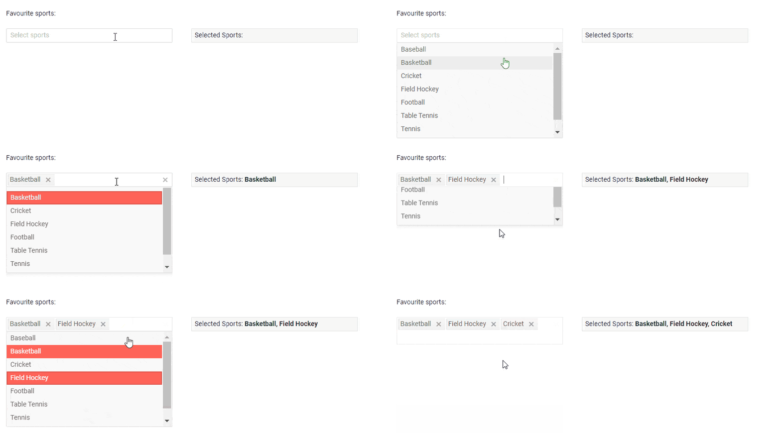
The new Blazor UI MultiSelect Component displays a list of options and allows multiple selections from this list. It provides suggestions as you type, supports customization of the behavior, look and feel through data-biding, events, and setting of dimensions and templates.
Telerik UI for Blazor MultiSelect Component
Data Binding
The MultiSelect component can be bound to a simple collection of string values
<TelerikMultiSelectData="@Options"@bind-Value="@TheValues"/>
Or data model with just a line of code:
<TelerikMultiSelect Data="@Options" @bind-Value="@TheValues" TextField="StringRepresentation" ValueField="MyValueField" />
Filtering
For cases with a large number of list values or a need for faster, simplified search of values, you can set the Filtering parameter of the component. This way the MultiSelect component will filter the available suggestions according to the current user input.
To enable filtering, set the Filterable parameter to true.
<TelerikMultiSelect Data="@Roles" @bind-Value="@TheValues" Filterable="true"
    Placeholder="Type 'de' to see the filtering" ClearButton="true/>
Additionally, you use the MinLength property to control when the filter list will appear.
<TelerikMultiSelect Data="@Roles" @bind-Value="@TheValues"  Filterable="true" MinLength="2"
Placeholder="Type 'de' to see the filtering" ClearButton="true" />
The filtering default filter operator is “starts with” and ignores casing. You can easily set a different operator through the FilterOperator parameter that takes a member of the Telerik.Blazor.StringFilterOperator enum as shown in the example below:
<TelerikMultiSelect Data="@Roles" @bind-Value="@TheValues"  Filterable="true"
     FilterOperator="@StringFilterOperator.Contains" />
Templates
You can customize the MultiSelect component and its items rendering using templates. The following options are available:
- Header Templates - manages the way the pop-up header of a MultiSelect is rendered
- Footer Templates - manages the way the pop-up footer of a MultiSelect is rendered
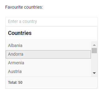
- Item Templates - manages the way the list items of a MultiSelect are rendered

Telerik UI for Blazor MultiSelect Templates
Events
You have several events available for capturing and handling changes to the values in the MultiSelect component:
- OnRead – fires upon component initialization and user filter
- ValueChanged - fires upon user selection change
- OnChange- fires only when the user presses Enter, or blurs the input (for example, clicks outside of the component)
Keyboard Support
Like all other Telerik UI for Blazor components, the MultiSelect supports out of the box Keyboard Navigation that will allow easy navigation and interaction with the list values of the component.
Blazor Grid New Features
Column Aggregates, Group Header and Footer Templates
“A Grid without grouping is no Grid,” said a wise customer once. Well, we decided to enhance grouping in this release and add column aggregates as well as group header and footer templates that will let you easily display totals of your grid data and highlight values worth attention.
The Telerik UI for Blazor Grid supports several built-in aggregating functions:
- Average
- Count
- Max
- Min
- Sum
Enabling aggregates is easy as 1, 2, 3:
- Set the Grid's Groupable property to true
- Under the <GridAggregates> tag, define the appropriate aggregate function to a filed in the <GridAggregate> tag
- Use the aggregated result in the supported templates
You can use aggregates in the following templates:
- GroupFooterTemplate of a GridColumn - a footer in the respective column that renders when the grid is grouped.
- GroupHeaderTemplate of a GridColumn - a header in the respective column that renders when the grid is grouped by that column. The Value field in the context carries the current group value.
Below is a sample code of how to implement Grid Column Aggregates and Group Templates:
<TelerikGrid Data=@GridData Groupable="true" Pageable="true" Height="650px">
    <GridAggregates>
        <GridAggregate Field=@nameof(Employee.Team) Aggregate="@GridAggregateType.Count" />
        <GridAggregate Field=@nameof(Employee.Salary) Aggregate="@GridAggregateType.Max" />
        <GridAggregate Field=@nameof(Employee.Salary) Aggregate="@GridAggregateType.Sum" />
    </GridAggregates>
    <GridColumns>
<GridColumn Field=@nameof(Employee.Name) Groupable="false" />
        <GridColumn Field=@nameof(Employee.Team) Title="Team">
            <GroupFooterTemplate>
                Team Members: <strong>@context.Count</strong>
            </GroupFooterTemplate>
            <GroupHeaderTemplate>
                @context.Value @* the default text you would get without the template *@
                 <span>Team size: @context.Count</span>
            </GroupHeaderTemplate>
        </GridColumn>
</GridColumns>
</TelerikGrid>
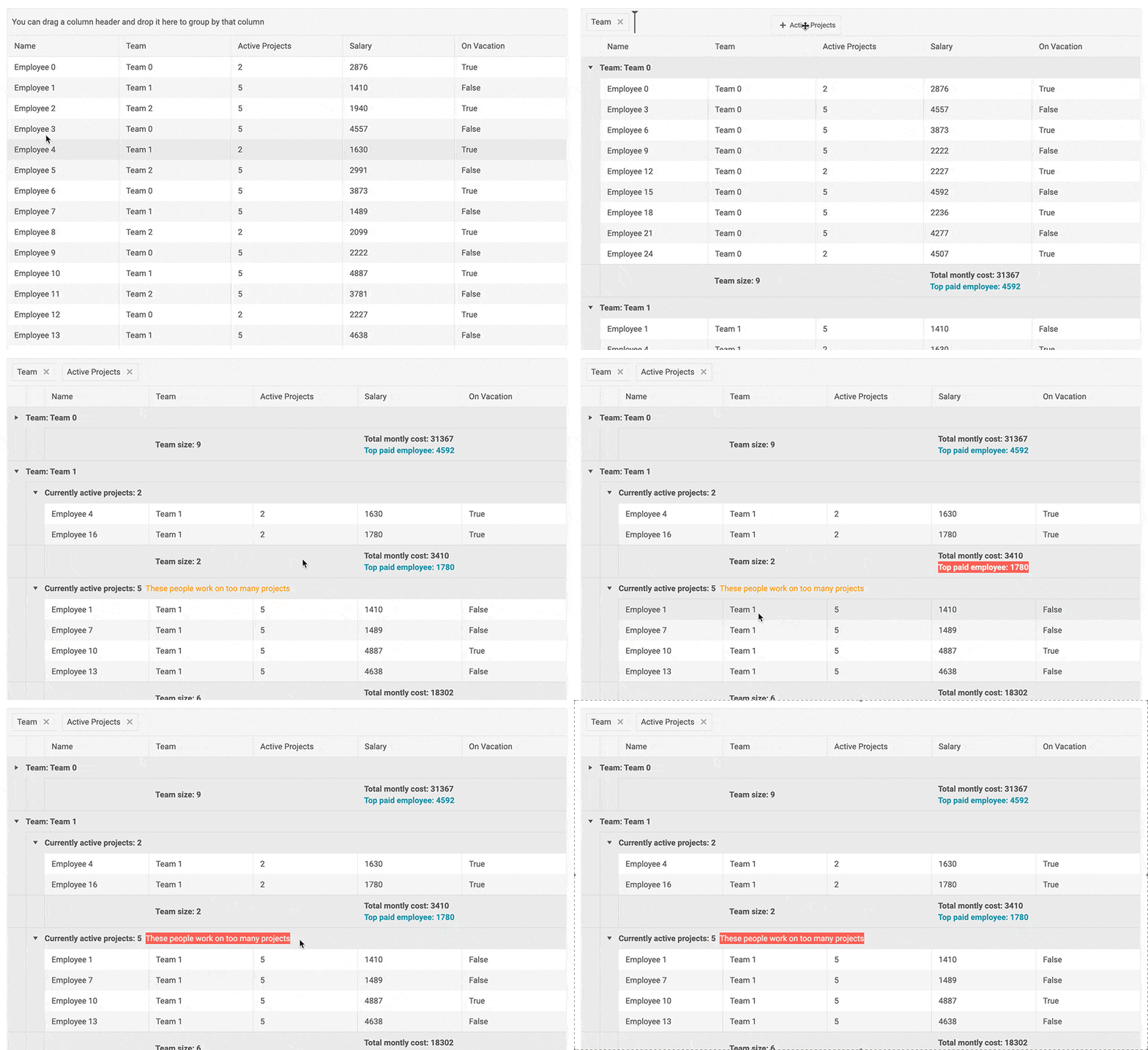
Telerik UI for Blazor Column Aggregates and Header/Footer Templates

Column Header Template
Using the <HeaderTemplate> tag, you can define custom content in the Blazor Grid column headers instead of just the title text. Using the column header templates, you can style headings, visualize images or even add different actions via buttons.
<TelerikGrid Data="@MyData" Height="300px" Pageable="true" Sortable="true" FilterMode="@GridFilterMode.FilterMenu">
    <GridColumns>
        <GridColumn Field="@(nameof(SampleData.Name))">
            <HeaderTemplate>
                Employee<br /><strong>Name</strong>
            </HeaderTemplate>
        </GridColumn>
        <GridColumn>
            <HeaderTemplate>
                <span class="k-display-flex k-align-items-center">
                    <TelerikIcon Icon="@IconName.Image" />
                    Employee Image
                </span>
            </HeaderTemplate>
        </GridColumn>
    </GridColumns>
</TelerikGrid>
New Blazor WebAssembly PWA Sample Application
Progressive Web Applications (PWAs) are on the rise in contemporary web world. Why? Well, PWAs are web apps that uses modern web capabilities to deliver an app-like experience to its users. It can be installed on desktop and mobile, they work offline, and have some nice features like push notifications and so much more.
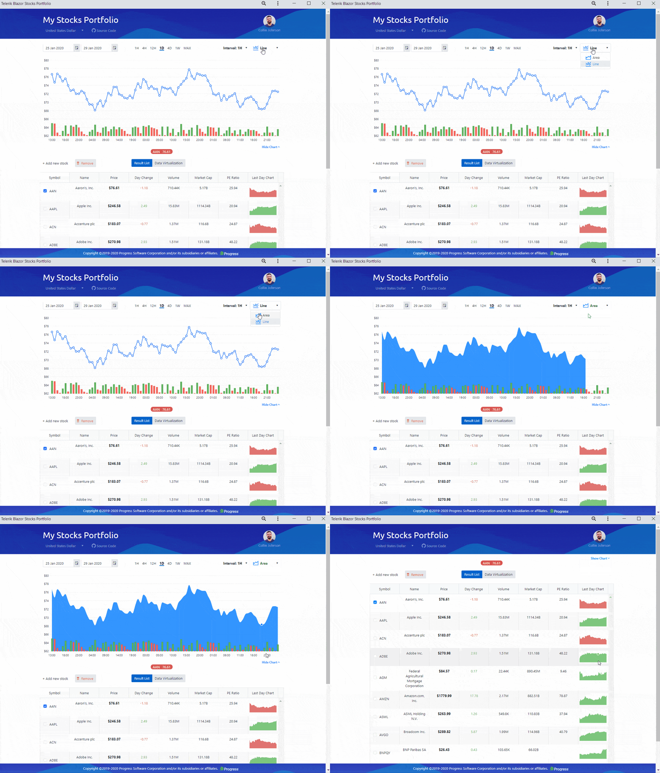
While dedicated a separate in-depth blog post on building Blazor PWA, we wanted to share with you the new financial demo app built as Blazor WebAssembly PWA.
 Telerik PWA built on top of Blazor WebAssembly
Download Telerik UI for Blazor 2.7.0
Head over to the the Telerik UI for Blazor page and download the 2.7.0 version of Telerik UI for Blazor Native Components. Let us know what next you would like to see in the suite in the comments section below or our dedicated Blazor feedback portal!
On behalf of the Telerik Blazor Team at Progress – thank you for your continuous active engagement and support!

Maria Ivanova
Maria Ivanova is a Manager of Product Management at Progress, for Telerik and Kendo UI components and developer tooling. She joined the company in 2019 as a Product Manager for Telerik UI web components and is passionate about developing impactful and innovative software products. Maria believes that to create great products, it's important to challenge the status quo, closely collaborate with customers, and embrace a spirit of experimentation.

