Telerik UI for Blazor 2.6.0 – Document Processing, Accessibility, AutoComplete and More!

Summarize with AI:
We're thrilled to announce that the latest release of Telerik UI for Blazor is loaded with new features - read on to catch up on everything that's new.
Happy new and blazing 2020, fellow developers! We hope it brings health, inspiration and success to all of you! As we kick off 2020, we're excited to announce that the Telerik UI for Blazor component suite - which counts 30+ native, production-ready components and a growing ecosystem of tooling and libraries - is getting even more goodness in the latest release. Telerik UI for Blazor 2.6 includes new and improved features such as Document Processing Library (DPL), Keyboard Navigation, Accessibility, new AutoComplete Component, Report Viewer for Blazor (thanks to Telerik Reporting Team), Enhanced Scheduler and more.
With the first release for 2020 we are adding some much desired libraries, tooling, components and features to Telerik UI for Blazor which will take your Blazor apps to the next level! Generate various documents like Excel, Word and PDF, convert files from one format to another, manage stream compression and archived files; Keyboard Navigation and Accessibility across the board, Report Viewer for Blazor (as part of Telerik Reporting R1 2020), brand new AutoComplete component, enhancements to the Scheduler with drag-and-drop, resources and more.
Telerik UI for Blazor Supports Both Server-Side and WebAssembly
2020 promises to be really progressive for the application development world with the official release of Blazor WebAssembly in May. Our goal with Telerik UI for Blazor is to continuously deliver Native, Production-Ready UI components and support both Blazor hosting models – Server-Side and WebAssembly.
We will ensure that your server-side apps work with .NET Core 3.1 LTS, and at the same time your client-side apps are continuously compatible with all latest preview versions of Blazor WebAssembly 3.2.
New in UI for Blazor – Document Processing Libraries
In the 2.6.0 release we added Telerik Document Processing as part of our Blazor offering. Telerik Document Processing is a set of UI-independent and cross-platform libraries that will boost your Blazor applications with the following:
- PDF Processing – the document processing library enables your application to create, import and export files to and from PDF formats with high performance. The document model allows you to generate sleek documents with differently formatted text, images, shapes and more.
- SpreadProcessing – enables you to manage spreadsheet documents: create new from scratch, modify existing or convert between the most common spreadsheet formats. You can save the generated workbook to a local file, stream, or stream it to the client browser.
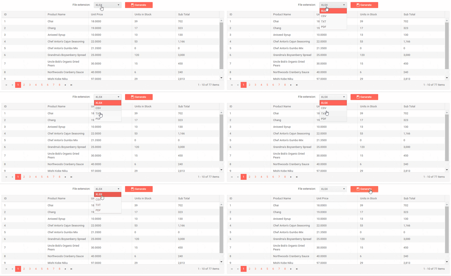
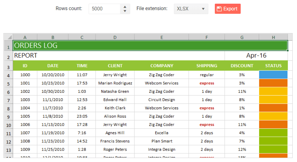
- SpreadStreamProcessing - create and export a large amount of data with excellent performance. You can also append data to an already existing document stream. The generated document can be exported directly to a file on the file system or to a stream (for example, to send it to the client).
- WordsProcessing – manage and export documents to DOCX, rich and plain text format without having to rely on third-party software (such as Microsoft Office). The rich text capabilities include tables, images, built-in styles and themes, various font types, sizes and colors.
- ZipLibrary – to load data from existing ZIP archives or create and edit ZIPs with data like images, DOCX or PDF files that can be used by other applications. You can also create ZIP archives in memory or use a stream to get data and add it to a ZIP archive.
734b5e7f94214feeaba82430a5a34c1f.gif?sfvrsn=9e04e954_0)
Telerik Reporting – Report Viewer for Blazor
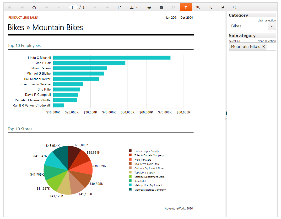
With the R1 2020 release, the Telerik Reporting Team introduced a new Report Viewer for Blazor, wrapping the flexible HTML5/JS web report viewer that will ensure the easy and fast preview of reports directly into your Blazor application.
Check out the official Telerik Reporting page for more details and demos.
New in Accessibility
Accessibility is a topic of growing importance and we at Progress are continuously working towards built-in accessibility for the components we create.
What does Accessibility mean for your Blazor apps and why you should consider it?
First of all, you show you care about people with disabilities and contribute to making their lives a bit easier. You can now provide full control over your Blazor app features by giving users with disabilities access to app content through assistive technologies or keyboard navigation.
Secondly, your apps will be compliant with current accessibility standards and policies, namely: The WCAG, Section 508 and WAI-ARIA standards.
A third factor is that by making your Blazor app accessible to people with disabilities, you are actually making it more accessible to everyone else too – from people in noisy offices that need captions, to people browsing your apps in a sunny park that need high-contrast themes.
And if the above reasons are not enough, consider the fact that there are more than 50 million people in the U.S. alone with some amount of disability - a pretty big market. So, with a little more care when you build your Blazor apps you can reach out many new potential customers.
New Keyboard Navigation
The Telerik UI for Blazor components have support for Keyboard Navigation! Your app users can directly use their keyboard to navigate through your app components and interact with them - invoke actions such as clicking links, buttons, paging the grid, navigating to form controls and more.
The following article shows the Telerik Blazor components that support specific keyboard combinations and links to live demos where you can see the behavior in action, together with the available keyboard shortcuts.
New AutoComplete Component
The AutoComplete component concept is well known and almost mandatory for modern app development. Based on a user’s input, the Blazor AutoComplete component provides a list of suggestions.
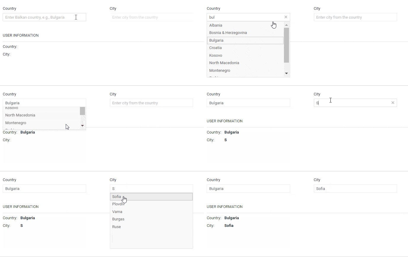
AutoComplete Data Binding
The AutoComplete component can be bound to a simple collection of string values or data model with just a line of code:
<TelerikAutoComplete Data="@Suggestions" @bind-Value="@TheValue" />AutoComplete Filtering
For cases with a large number of list values or where there's a need for a faster, simplified search of values, you can use the Filtering option of the component. This way the AutoComplete component will filter the available suggestions according to the current user input.
To enable filtering, set the Filterable parameter to true. The default filter operator is “starts with,” and it ignores casing.
<TelerikAutoComplete Data="@Suggestions" @bind-Value="@TheValue" Filterable="true" />Additionally, you can use the MinLength property to control when the filter list will appear.
<TelerikAutoComplete Data="@Suggestions" @bind-Value="@TheValue" Filterable="true" MinLength="2" />You can set different filter operators as shown in the example below:
<TelerikAutoComplete Data="@Suggestions" @bind-Value="@TheValue" Filterable="true" FilterOperator="@StringFilterOperator .Contains" />AutoComplete Customizations with Templates
You can completely customize the AutoComplete component and its items rendering by using templates. The component gives you options to set the following templates and customize:
- Item - individual items in the dropdown element of the component
- Header - the content that you can place above the list of items inside the dropdown element
- Footer - the content that you can place below the list of items inside the dropdown element.
AutoComplete Events
For capturing and handling changes to the values in the AutoComplete, you have two events which you can utilize:
- ValueChanged - fires upon user input keystrokes
- OnChange - fires when the user presses Enter, or blurs the input (for example, clicks outside of the component), and can be used with two-way binding of the Value
Scheduler Component Enhancements
Just released in December 2019, the Scheduler Component quickly became a favorite one and we are happy to extend its functionally based on your feedback. In the 2.6.0 release we are adding:
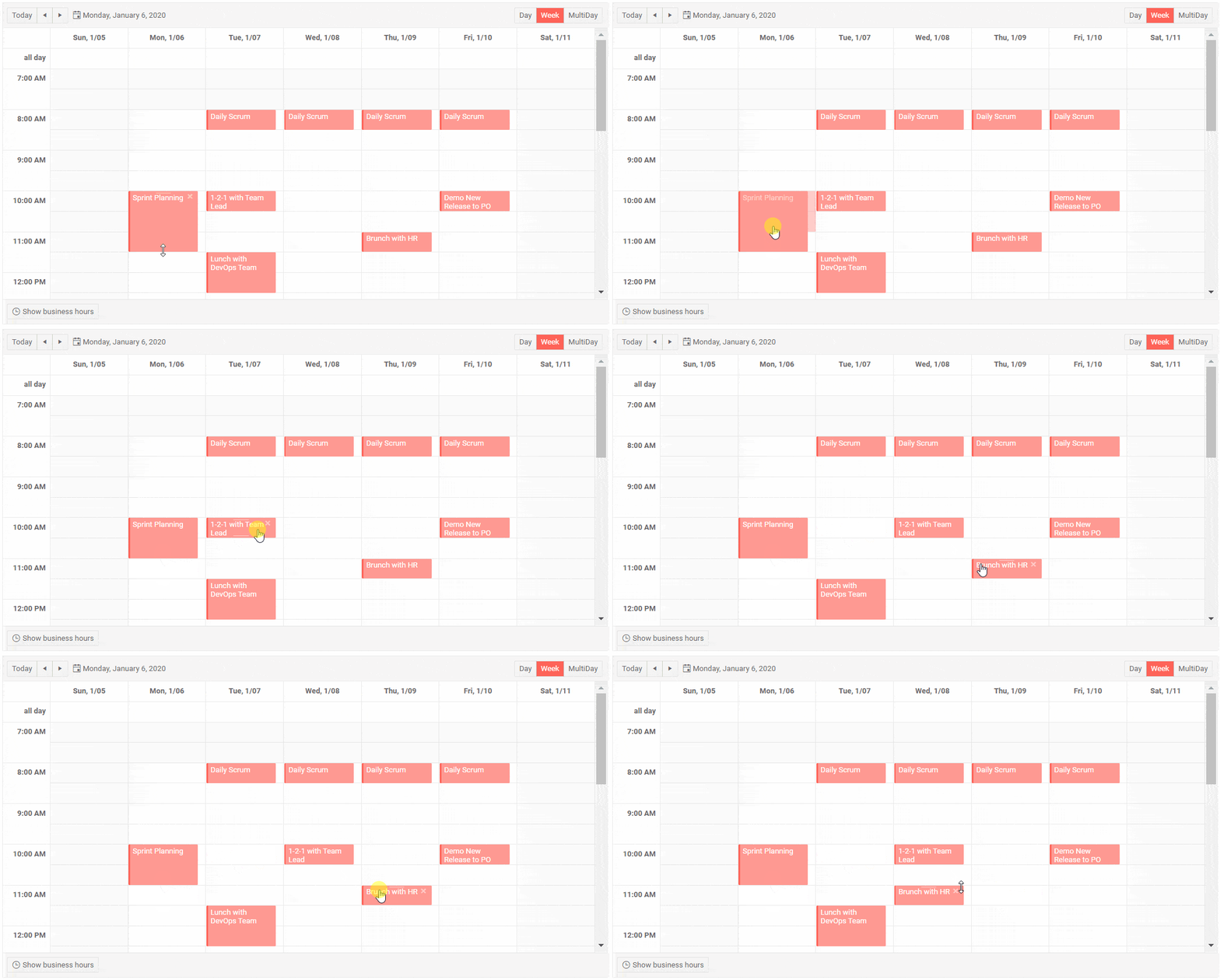
Scheduler Drag & Drop and Resize of Appointments
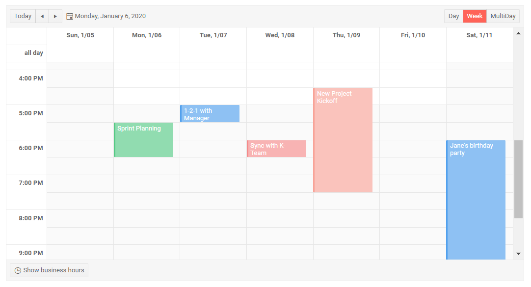
Change the timing of your appointments with a simple drag-and-drop between different slots, and resize the events to alter their duration.
Scheduler Resources
The Scheduler now allows you to assign shared resources to your appointments and mark that with a specific color. A common scenario is when you have meeting rooms, equipment or subject matter experts that you need to share between teams.
Resources are optional so you can have none, single or multiple resources. The color of an appointment will be determined by the first declared resource.
To add resources to a <TelerikScheduler>, add a <ScheduerResource> tag for each and specify its Field, Title and Data fields.
<TelerikScheduler Data="@Appointments" @bind-Date="@StartDate" @bind-View="@CurrView" Height="600px" Width="800px" AllowUpdate="true" AllowCreate="true">

    <SchedulerResources>

        <SchedulerResource Field="RoomId" Title="Meeting Room" Data="@Rooms" />

        <SchedulerResource Field="ManagerName" Title="Manager Name" Data="@Managers" />

    </SchedulerResources>

    <SchedulerViews>

        <SchedulerDayView StartTime="@DayStart" />

        <SchedulerWeekView StartTime="@DayStart" />

        <SchedulerMultiDayView StartTime="@DayStart" NumberOfDays="10" />

    </SchedulerViews>

</TelerikScheduler>
Example of Telerik UI for Blazor with Multiple Resources
Download Telerik UI for Blazor 2.6.0
We encourage you to download the 2.6.0 version of Telerik UI for Blazor native components from the Telerik UI for Blazor page. Be sure to let us know what you would like to see next in the suite in our dedicated Blazor feedback portal.
Telerik R1 2020 Release Webinar
As we have packed a lot of great new stuff from all Telerik UI Component suites, be sure to sign up for the Telerik R1 2020 release webinar on Tuesday, January 21st at 11:00 AM ET for a deeper look at all the new features in the release.
Thank you for contributing and being part of the amazing UI for Blazor Community! Looking Forward to an Amazing Blazing 2020!

Maria Ivanova
Maria Ivanova is a Manager of Product Management at Progress, for Telerik and Kendo UI components and developer tooling. She joined the company in 2019 as a Product Manager for Telerik UI web components and is passionate about developing impactful and innovative software products. Maria believes that to create great products, it's important to challenge the status quo, closely collaborate with customers, and embrace a spirit of experimentation.

