Telerik UI for Blazor 2.5.0 – Scheduler, Globalization and .NET Core 3.1 GA Compatibility!

Summarize with AI:
As we are approaching the end of an amazing 2019 (21 releases with more than 25 Blazor UI components), we are thrilled to announce the latest release 2.5.0 of Telerik UI for Blazor!
Something exciting that the team has been working over for the last few weeks is now available for download - the Scheduler! In November we announced the release of Localization in UI for Blazor. In 2.5.0 we expanded on Internationalization and included Globalization. Last but not least, in 2.5.0 we have also ensured that Telerik UI for Blazor is compatible with the official release of .NET Core 3.1. Read on to learn more.
New Blazor Scheduler Component
The Blazor UI Scheduler has been one of the most voted requests, so we put a lot of effort to make sure you can plug it in your apps soon - your events, appointments and tasks have a new home called <TelerikScheduler> !
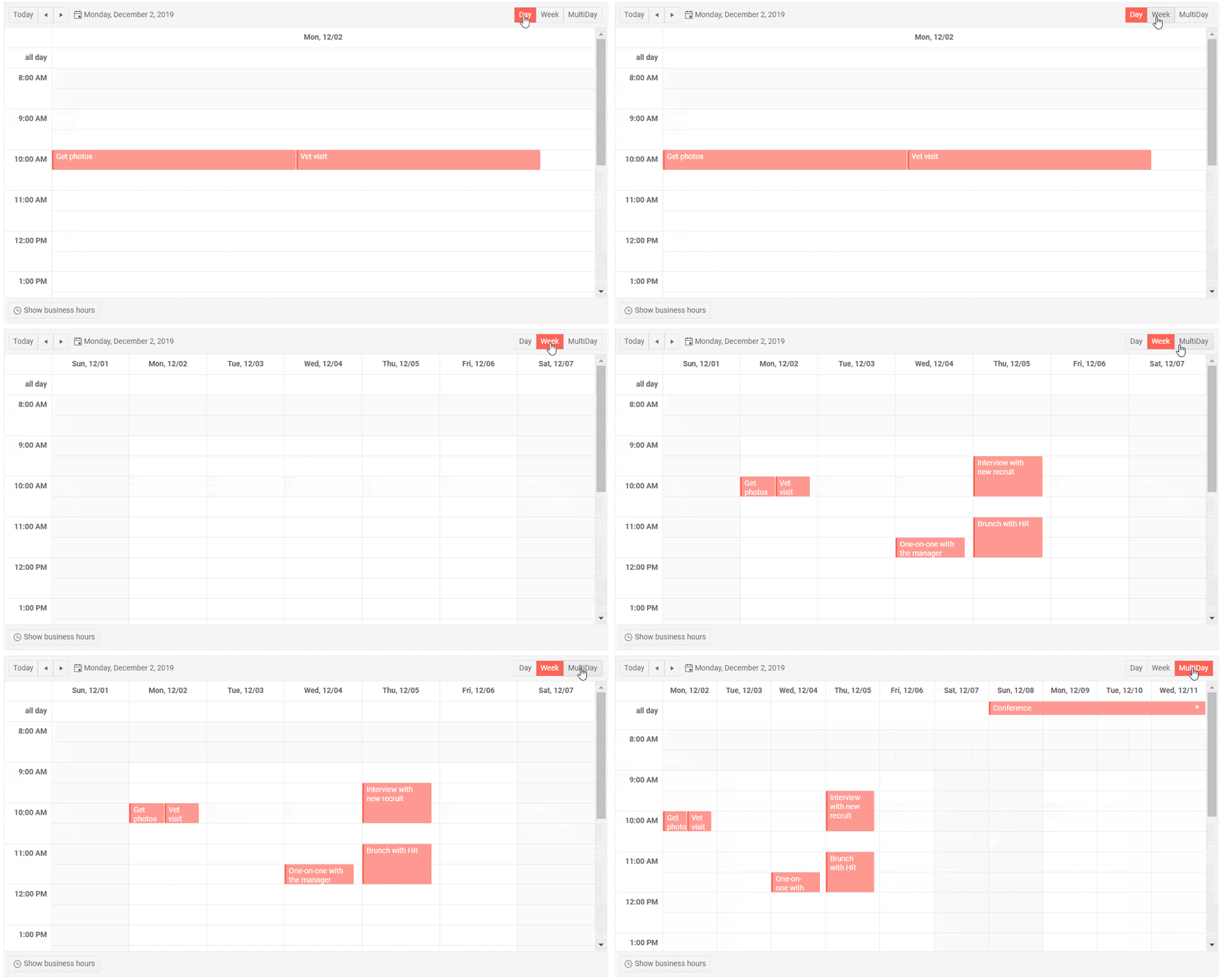
Blazor Scheduler Overview
The Scheduler is a feature-rich and powerful component that allows you to add, edit and visualize appointments, while also providing options to customize and look and feel by selecting different views.

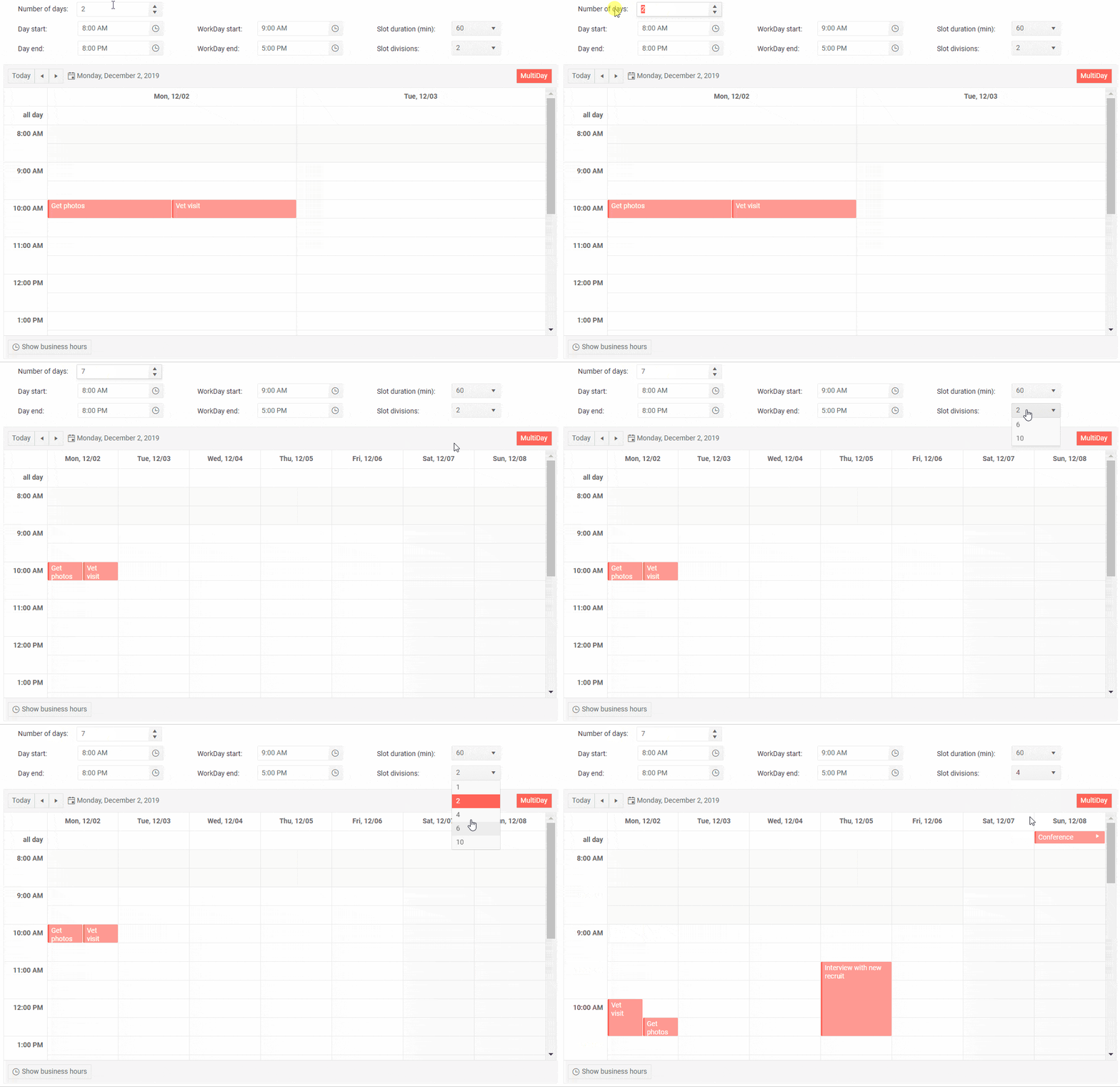
To add it in your application simply add the <TelerikScheduler> tag and populate its Data property. The cool thing is that if your model uses the default fields names, you only need to define the Scheduler appearance properties and views.
<TelerikScheduler Data="@Appointments" Height="600px" Width="800px"> <SchedulerViews> <SchedulerDayView /> </SchedulerViews></TelerikScheduler><TelerikScheduler Data="@Appointments" Height="600px" Width="800px"> <SchedulerViews> <SchedulerDayView StartTime="@DayStart" EndTime="@DayEnd" WorkDayStart="@WorkDayStart" WorkDayEnd="@WorkDayEnd" /> <SchedulerWeekView StartTime="@DayStart" EndTime="@DayEnd" WorkDayStart="@WorkDayStart" WorkDayEnd="@WorkDayEnd" /> <SchedulerMultiDayView StartTime="@DayStart" EndTime="@DayEnd" WorkDayStart="@WorkDayStart" WorkDayEnd="@WorkDayEnd" NumberOfDays="10" /> </SchedulerViews></TelerikScheduler>

Scheduler Appointments
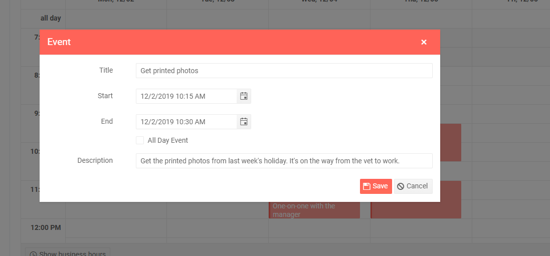
For each event/appointment in the Scheduler you can set the following fields:
- Title – short appointment title that would bring meaning to the user such as “Sprint Demo Meeting”
- Start - start date and time of the appointment
- End - start date and time of the appointment
- Description - detailed description of the appointment
- IsAllDay – specifies whether the appointment is with a whole day duration or specific time interval

Need appointment validation? No problem – to make it easier for you, the component has built-in validation for the Title, Start and Date fields.
Scheduler Navigation
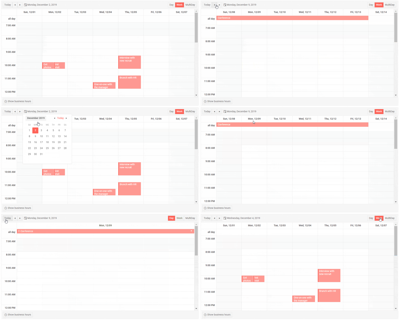
The Scheduler provides multiple ways to navigate it – both from an user perspective and as a developer. Users can change the currently shown time range, choose from several available views, and toggling between business and full day hours.
If you need to utilize navigation via code you can refer to the UI for Blazor Navigation article.
Scheduler Events
Telerik Scheduler for Blazor has the following events available as of 2.5.0 release:
- CUD Events – needed for managing appointment editing. The Scheduler exposes OnCreate, OnDelete and OnUpdate events to help you update data in the view model and the underlying database and OnEdit and OnCancel for implementing custom logic
- DateChanged – fires when the user navigates to another day
- ViewChanged – fires when the user changes the Scheduler view
And this is just the start. Stay tuned for more cool Scheduler features in our upcoming release.
New in UI for Blazor Globalization
If your Blazor app is going to conquer the world, it needs Internationalization – translation of UI components texts to multiple languages, adapting value formatting based on specific culture, and even right-to-left support. Since 2.4.0 release the Telerik UI for Blazor components have supported localized translations, and in 2.5.0 we implemented Globalization – the ability to read CurrentCulture and render the date formats, currencies and numbers accordingly.
Read more on Globalization in UI for Blazor in the dedicated blog post.
UI for Blazor is Compatible with .NET Core 3.1 Official Release!
.NET Core 3.1 has been officially released by Microsoft and is ready to be used in any business or user scenario, and the good news is that Telerik UI for Blazor 2.5.0 is fully compatible!
.NET Core 3.1 is a small set of fixes and refinements over .NET Core 3.0, which was released in September 2019. It is a long-term supported (LTS) release and will be supported for three years.
Download Telerik UI for Blazor 2.5.0
The 2.5.0 version of Telerik UI for Blazor Native Components is available for download from the Telerik UI for Blazor page!
Thank you for contributing and being part of the amazing UI for Blazor community! Keep sharing your ideas, features requests and comments with us on the official Telerik UI for Blazor feedback portal.
Looking Forward to an Amazing Blazing 2020!
Telerik Blazor Team at Progress

Maria Ivanova
Maria Ivanova is a Manager of Product Management at Progress, for Telerik and Kendo UI components and developer tooling. She joined the company in 2019 as a Product Manager for Telerik UI web components and is passionate about developing impactful and innovative software products. Maria believes that to create great products, it's important to challenge the status quo, closely collaborate with customers, and embrace a spirit of experimentation.
