Telerik Scheduler for Blazor (Part 4): Implementing Your Own UI

Summarize with AI:
As I’ve discussed in an earlier post, the Telerik Blazor Scheduler makes it easy for you to add calendaring to your application using one or more of the Scheduler’s provided views. You can also potentially customize those views just by setting attributes on the views. But—and this is the point of today’s post—if you’re not happy with the Scheduler’s default appearance of appointments, you can customize them.
Here’s a quick review of how to set up a “Scheduler-compatible” project.
By default, all of the Scheduler’s views look for a property called Title on the object passed to the Scheduler’s Data attribute and display that Title property in the Scheduler’s UI (it also automatically displays the start and end dates in the appointment’s tooltip). For very simple components, you might be able to pack all the information that the user needs into that Title property.
However, to effectively meet the user’s need in all but the simplest components, you’re going to need to use the Scheduler’s ItemTemplate to present the information the user needs (you can also declare an AllDayItemTemplate that’s used with events that take the whole day). On the other hand, if what you need is to style appointments to signal to the user what’s critical about the appointment, the ItemRender event will let you do that.
Defining a Sophisticated UI
At its simplest, an ItemTemplate is just a collection of text and, potentially, HTML that will be displayed in the Scheduler’s UI wherever there is an event/appointment. An ItemTemplate that’s declared immediately inside the TelerickScheduler element is used by all of the views.
This ItemTemplate, for example, will cause the phrase “Time Booked” to be displayed in the UI for all the objects passed in the collection to the TelerikScheduler’s Data attribute:
<TelerikScheduler Data="@Events">
    <ItemTemplate>
      Time Booked
    </ItemTemplate>
However, ItemTemplates can also be declared inside each view and will override the ItemTemplate declared at the level of the scheduler. Effectively, then, the ItemTemplate declared at the scheduler level functions as the “default” template that can be overridden by templates in individual views.
Typically, I want to provide a new UI for the month view which, unlike the other views, doesn’t show either an appointment’s start time or duration. This makes the month view less useful for answering the question “How busy am I?”
In the month view, while the day in question might have two appointments, it makes a great deal of difference if both appointments are clustered together, spread out through the day or three hours long. Rather than just display the appointment’s Title, I’d prefer for the month view to display the title, a short start time (e.g. “9am”, “2pm”, and a duration in minutes).
Getting that additional information requires me, in my ItemTemplate, to access additional properties on the object that’s driving the appointment. To do that, I add a code block within my ItemTemplate and pull data from the context pseudo-variable provided by the scheduler that holds the data for the current appointment.
A typical ItemTemplate skeleton, then, looks like this for a scheduler that’s displaying objects of the class TempChange:
<ItemTemplate>
   @{
          Appointment ap = context as Appointment;
         …additions to the UI…
   }
</ItemTemplate>
Within that skeleton, I can define my appointment’s UI with markup that encloses text, Razor code or more markup. This example, for the month view, displays the start time (rounded to the hour) and title for each appointment (if you have more than just plain text, then you have to enclose your markup in some enclosing element—I’ve chosen a <span> element):
<SchedulerMonthView>
   <ItemTemplate>
   @{
          Appointment ap = context as Appointment;
          if (ap != null)
          {
             <span>
                @ap.Start.ToString("h:mt") @ap.TItle
             </span>
          }
   }
   </ItemTemplate>
</SchedulerMonthView>
Here’s the resulting UI:

Extending the UI
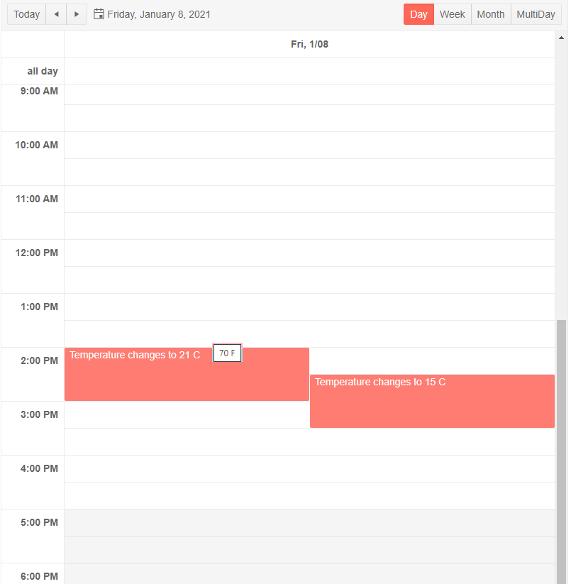
You’re not, however, restricted to plain old HTML or just the properties on the object. Given the space constraints for an item in the month view, adding duration to the text being displayed isn’t a reasonable option … but I could put the duration in a tooltip that pops up when the user hovers their mouse over an appointment. I can retrieve the duration by calling the object’s GetDuration method.
This example, then, calls the GetDuration method to retrieve the item’s time in minutes and displays it using Telerik’s ToolTip for Blazor component. This code also takes advantage of another feature of the ItemTemplate by using the ItemTemplate’s Context attribute to rename the context object in my code to something more meaningful (in this case, I’ve renamed the context object to “Appointment”):
<SchedulerMonthView>
   <ItemTemplate Context=”Appointment”>
   @{
          <TelerikTooltip TargetSelector="span[title]">
          </TelerikTooltip>
          Appointment ap = context as Appointment;
          if (ap != null)
          {
             <span title="@ev.GetDuration() minutes”>
                @ap.Start.ToString("h:mt") @ap.TItle
             </span>
          }
   }
   </ItemTemplate>
</SchedulerMonthView>
There is one problem with this solution, however: My TelerikToolTip’s TargetSelector is going to apply to any <span> element with a title attribute. There’s potential for a lot of other defenseless <span> elements in the same page getting my tooltip attached to them.
A smarter solution would give each appointment’s <span> element a unique id and then use that in my TargetSelector. Something like this ensures that each appointment’s tooltip only applies to its appointment (fortunately for me, each of my TempChange objects has a unique id property):
         …
          <TelerikTooltip TargetSelector="@(“#temp” + ev.id)" >
          </TelerikTooltip>
          ….
          <span id=”@(“#temp” + ev.id)” title="@ev.GetDuration() minutes”>
Dynamic Styling
In addition to creating a UI, you want to direct the user’s focus to what matters. In a calendar that means signaling to the user the different kinds of appointments or events the scheduler is displaying so the user to spot the items they’re interested in. To support that, the scheduler’s ItemRender event makes it easy for you to set the CSS class for the element enclosing each item’s UI.
You’ll first need to have some CSS rules that you can use to style your item’s UI. I added these two rules just before my code section, as an example:
<style>
    .longmeeting {
        background-color: lightpink;
    }

    .shortmeeting {
        background-color: lightblue;
    }
</style>
The next step in this process is to wire up the ItemTemplate’s ItemRender event to some method in your code. This code starts that process by associating a method called AppointmentRender with the ItemRender event in the TelerikScheduler element:
<TelerikScheduler Data="@Events" OnItemRender="@AppointmentRender">
You finish that process by adding a method with a matching name to your component’s code section. That method has to accept a parameter of type SchedulerItemRenderEventArgs (the parameter is conventionally named “e”). Inside that method, you can use the e parameter’s Item property to access the current appointment object being processed by the scheduler. For my Appointment object, that code might look like this:
@code
{
   void AppointmentRender(SchedulerItemRenderEventArgs e)
       {
           Appointment ev = e.Item as Appointment;
           …code to set item styling…
    }
The final step is to set the Class property on the e parameter passed to your method to one of your CSS class rules. This example looks at the duration of the appointment and uses an appropriate CSS rule to make it easy for the user to spot long and short meetings:
void AppointmentRender(SchedulerItemRenderEventArgs e)
{
   Appointment ev = e.Item as Appointment;
   if (ev.GetDuration() > 30)
   {
      e.Class = "longmeeting";
   }
   else
   {
      e.Class = "shortmeeting";
   }
}
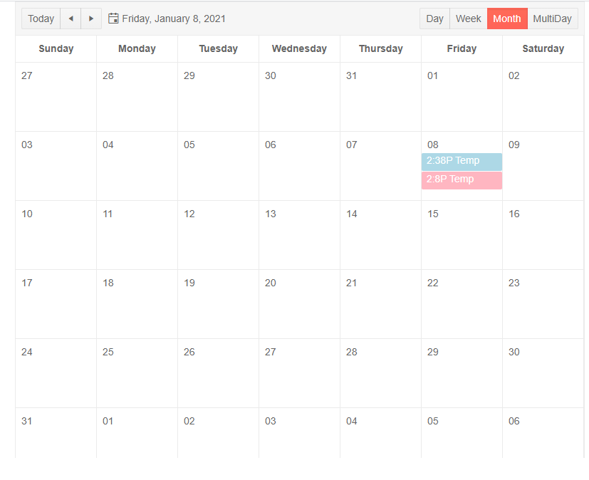
Of course, for my temperature change information, duration isn’t as important as intensity. So, here’s a Month view that lets the user know both when the temperature has changed and which ones are showing hot or cold temperatures:

This technique works even if, as I did in my sample ItemTemplate at the start of the article, you don’t wrap your item template in an enclosing element.
An effective UI is driven by the user’s needs. The ItemTemplate (and the ItemRender event) will give you all the tools you need to give the user the information (and the signals) that they need.
Try it for Yourself
If you'd like to try the scheduler tool out yourself, there is a free trial available. Learn more in the Telerik UI for Blazor demos or click the button below to try it now.

Peter Vogel
Peter Vogel is both the author of the Coding Azure series and the instructor for Coding Azure in the Classroom. Peter’s company provides full-stack development from UX design through object modeling to database design. Peter holds multiple certifications in Azure administration, architecture, development and security and is a Microsoft Certified Trainer.
