
Telerik Scheduler for Blazor (Part 2): Managing the Blazor Scheduler’s Views

Summarize with AI:
The Scheduler in Telerik UI for Blazor makes it easy to display time-based information thanks to its predefined views. Here’s how to use them well.
Last time, we went over a brief intro to the Telerik Scheduler for Blazor and how to set up a project. We even touched on the importance of the views you’re able to provide your users.
In this article, we’ll learn more about these views, because using the component well means understanding the two modes that users adopt when interacting with a calendar so that you can configure the scheduler’s UI appropriately.
Let’s get into it.
Understanding the UI Modes
The simplest way to manage the Scheduler UI is to start with the TelerikScheduler element and then add one or more SchedulerViews, nested inside the SchedulerViews element. This example uses all four of the views that are provided with the Scheduler (by default, the scheduler initially displays the current date unless the Date attribute on the TelerikScheduler is set to some other date):
<TelerikScheduler Data="@Events" >
    <SchedulerViews>
         <SchedulerMonthView />
         <SchedulerDayView />
         <SchedulerWeekView  />
         <SchedulerMultiDayView />
    </SchedulerViews>
</TelerikScheduler>
Each of the views adds a tab to the Scheduler’s header that allows the user to select the view that makes sense to them for the task at hand.
It might seem obvious that, unless you know that users only work in one particular view mode, the best UI design is to provide all the views and let the user pick the one they want, depending on their personal preference and the mode they’re working in.
There’s one downside to providing “all the views,” though: Each of the views has parameters that are set at the view level. As a result, the more views you support, the more likely it is that your views will have different settings and, as a result, different UIs. Since users value UI consistency more than almost anything else, more views equals more maintenance effort in order to keep the views coordinated.
Managing the Views
You can lower the maintenance effort required to ensure that the range is the same for all the views by centralizing as many of the parameters passed to the various views as possible. For example, all the views (except the month view), have a StartTime attribute that specifies the time range displayed in the view. In the following example, I’ve set all of the views’ start time to 9 am by adding, in my component’s code section, a field called DayStartTime and using in all of the views with a StartTime attribute:
<TelerikScheduler Data="@Events" Date="@DayStartTime" >
    <SchedulerViews>
         <SchedulerMonthView />
         <SchedulerDayView StartTime="@DayStartTime" />
         <SchedulerWeekView StartTime="@DayStartTime" />
         <SchedulerMultiDayView StartTime="@DayStartTime" />
         <SchedulerMonthView />
    </SchedulerViews>
</TelerikScheduler>
Here’s the code for that (I also loaded some sample data into the field that I bound my scheduler’s Data attribute to):
@code {
    DateTime DayStartTime = new DateTIme(DateTime.Now.Year, DateTime.Now.Month, DateTime.Now.Day, 9, 0, 0);
    List<TempChange> Events = new List<TempChange>();

    protected override Task OnInitializedAsync()
    {
        Events = new List<TempChange>
        {
            new TempChange
            {
                Start = DateTime.Now,
                End = DateTime.Now.AddHours(1),
                Title = "Temp Change",
                Description = "It's hot!",
                Temperature = 21
            },
            new TempChange
            {
                Start = DateTime.Now AddMinutes(30),
                End = DateTime.Now.AddHourse(1),
                Title = "Temp Change",
                Description = "It's hot!",
                Temperature = 21
            }
        };
        return base.OnInitializedAsync();
    }
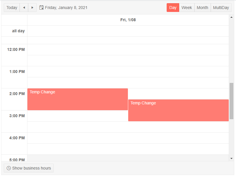
And, mostly by loading the right objects into a Collection, you get the following UI in day view, along with tabs for three more views:
Selecting the View
While it makes sense to let the user pick the UI that makes sense to them, it also makes sense to provide the user with an initial view based on your understanding of your users’ personas and typical mode. You can control which view is initially displayed by binding the TelerikScheduler’s View attribute to a field in your code of type ScheduleView and then setting that field to one of the values in the ScheduleView enum to control the view displayed.
Be aware that if you change the value of a field controlling the view in your code, you’re not guaranteed that the change will show up in the UI unless you call your component’s base StateHasChanged method (of course, if other changes to your UI have triggered a Blazor state change, you won’t need to call StateHasChanged to have the view changed). This example defines a field called sv, initialized to the day view, and then, in the OnAfterRender method, overrides that default setting based on the user’s job, calling StateHasChanged to make sure the UI updates:
<TelerikScheduler Data="@Events" Date="@DayStartTime" @bind-View="@sv">
@code {
   SchedulerView sv { get; set; }= SchedulerView.Day;
    protected override void OnAfterRender(bool firstRender)
    {
       if (firstRender && emp.IsSupervisor)
       {
          sv = SchedulerView.Week;
          StateHasChanged();
      }
Providing the right view is just the beginning to using this component effectively, however. The various views provide you with ways to declaratively configure their display (StartTime is just one example), and I’ll walk through those options in my next post.

Peter Vogel
Peter Vogel is both the author of the Coding Azure series and the instructor for Coding Azure in the Classroom. Peter’s company provides full-stack development from UX design through object modeling to database design. Peter holds multiple certifications in Azure administration, architecture, development and security and is a Microsoft Certified Trainer.