Skeleton in .NET MAUI: What It Is and How to Use It

Summarize with AI:
A skeleton allows us to indicate to users that an app or page is loading. This improves the user experience, providing feedback that the app isn’t broken.
Let’s face it: as users, we tend to be impatient when an application doesn’t respond quickly. It’s very easy to assume that the app has frozen or isn’t working when it doesn’t give us any kind of feedback.
Imagine you have an application with a menu that displays a list connected to a backend. If the backend takes time to respond and we don’t indicate to the user that data is loading, they will most likely think: “This app doesn’t work.”
As developers, it’s important to prevent this from happening. There are different ways to visually communicate that data is loading, and one of my favorites is using skeletons. These allow us to gently indicate to the user that the app is performing an action, even if the content isn’t ready yet.
In this article, we’ll learn what a Skeleton is, in which scenarios it is most useful, and how to implement the Skeleton component designed by Progress Telerik UI for .NET MAUI.
What Is a Skeleton?
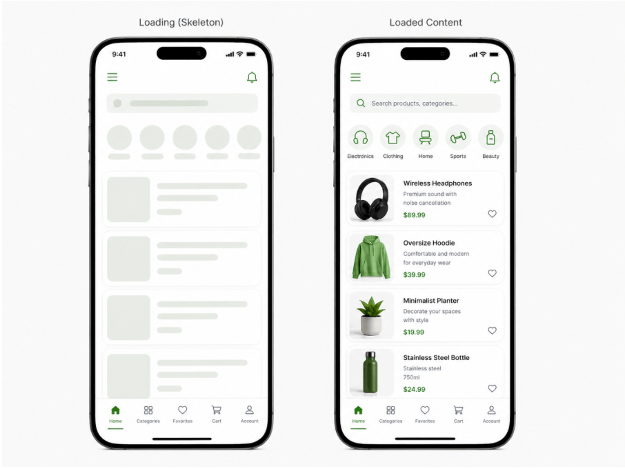
Image generated using AI for illustrative purposes
A skeleton is a visual element used to indicate that content is loading. Basically, it appears on the screen as blocks (usually gray) placed in the same positions where the actual elements will be displayed once the data is available and the effect disappears.
Its purpose is to give users context while the information is loading by showing the structure that the content will have. It also typically includes a subtle animation that communicates the app is still working, even if all that’s visible are gray blocks or rectangles.
This way, instead of showing empty spaces, a traditional loader or, even worse, nothing at all, a skeleton keeps the interface clear and lets the user know that the application is working fine.
✅ When Should You Use Skeletons?
It’s important to see skeletons not just as a visual element to “entertain” users, but as a tool that allows your app to handle loading states in a smoother and more intentional way.
Let’s look at some scenarios where skeletons are especially useful:
When Waiting for API Responses
No matter how optimized your app is, it still depends on backend response times. Skeletons help bridge that gap by showing structure while data is loading. Ideally, you should display the skeleton only while the request is in progress and replace it immediately once the data is available.
Screens with Heavy Images
When loading images that may take time, skeletons are extremely useful to indicate that content is coming, instead of leaving empty or broken-looking spaces.
❌ When Are Skeletons NOT Recommended?
When Data Is Not Actually Loading
Avoid using skeletons just for visual purposes. If there’s no real loading happening, then you don’t need them.
For Instant Loads
If the content appears immediately, adding a skeleton only adds unnecessary complexity and can even hurt the experience.
Very Simple Screens
On screens with minimal content, a skeleton might be overkill. A simple layout or even a simple loading indicator could be enough.
Meet the Telerik Skeleton 😍
Did you know that Progress Telerik provides a Skeleton component for .NET MAUI? Oh yeahh! 😍
Now that you’ve seen how powerful using one can be, let’s quickly go through how to implement it and highlight some of its most important benefits.
Before we dive in, let’s make sure your environment is ready. Just keep these two key points in mind:
- Create a Telerik account: If you don’t have a Telerik account yet, you can create one for free. You’ll get access to a trial license that allows you to explore not only the Skeleton component, but the full set of UI controls available for .NET MAUI.
- Install Telerik UI for .NET MAUI: This is a one-time setup, so you won’t need to repeat it for each component. If you haven’t installed it yet, I’ve included an article that walks you through the process step by step for both Visual Studio and Visual Studio Code.
Adding the Namespace
xmlns:telerik="http://schemas.telerik.com/2022/xaml/maui"
Registering the Component
Go to your MauiProgram.cs file and, inside the CreateMauiApp method, register the Telerik controls using the UseTelerik() extension method.
using Telerik.Maui.Controls.Compatibility;
public static class MauiProgram
{

    public static MauiApp CreateMauiApp()
    {
	    var builder = MauiApp.CreateBuilder();
	    builder
	    .UseTelerik()
	    .UseMauiApp<App>()
	    .ConfigureFonts(fonts =>
	    {
	    fonts.AddFont("OpenSans-Regular.ttf", "OpenSansRegular");
    });
    return builder.Build();

    }
}
How to Use It?
Using it is very simple. You just have to add a tag like the following:
<telerik:RadSkeleton x:Name="skeleton"/>
Skeleton Types in the Telerik UI for .NET MAUI Library
Typically, when creating a skeleton, you need to build the structure from scratch. However, the Telerik UI for .NET MAUI Skeleton component comes with predefined structures (anatomies), which helps you save both time and code. (Honestly, this is gold. A huge win!)
This control offers several built-in structures that you can use to represent different types of content:
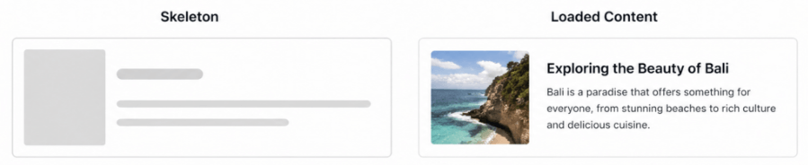
➖ Article: Displays a layout with a small image placeholder on the left and multiple text lines on the right, simulating a title and description.
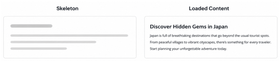
➖ Text: A simple text structure composed of multiple lines, typically used to represent titles and paragraphs.
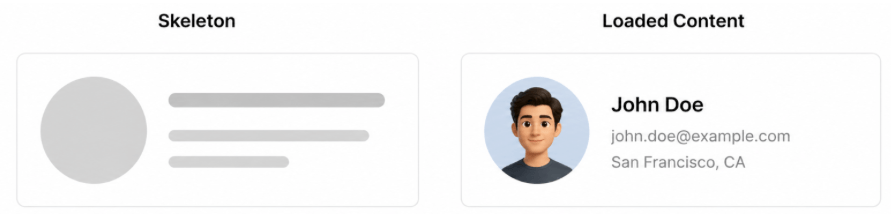
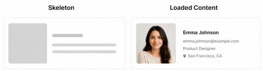
➖ PersonalCircle: Shows a circular avatar placeholder with text lines next to it, commonly used for user profiles or list items with avatars.
➖ PersonaSquare: Similar to PersonaCircle, but uses a square (with rounded corners) instead of a circular avatar.
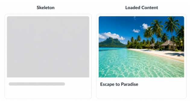
➖ Image: Represents a large media placeholder with a single text line below, ideal for image-focused layouts.
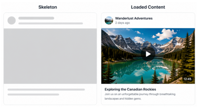
➖ Video: Simulates a video layout with a small avatar and text at the top, followed by a large media area and additional text lines below.
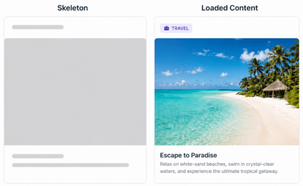
➖ Card: Displays a card-style layout with a title at the top, a large image placeholder and text lines at the bottom.
➖ ContentFeed: Mimics a feed-style layout with a header (avatar + one line), a large content block and text lines below, similar to social media posts.
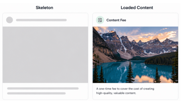
The images of the Skeleton types were generated using AI for better understanding
To use any of these types, you just need to use the SkeletonType property as shown below:
<telerik:RadSkeleton SkeletonType="Article" />
🧩 Custom Skeleton View
But … what if you want to create your own skeleton anatomy? 👀
You can do that too! 😎 Although the predefined types help you save time and effort, they don’t always fit your design. That’s why Progress Telerik allows you to create a fully custom one.
The idea is very simple: you define your own layout (just like your real UI, but without data) and assign it to the RadSkeleton using the LoadingViewTemplate property.
🛠️ Implementation
First, define your RadSkeleton and assign a custom template to it:
    <telerik:RadSkeleton LoadingViewTemplate="{StaticResource CustomSkeletonView}"
	    Grid.Row="1"
	    x:Name="skeleton">

    <!-- Your real content goes here -->

    </telerik:RadSkeleton>
Then, create the DataTemplate that will represent your skeleton:
<DataTemplate x:Key="CustomSkeletonView">
<Grid RowDefinitions="40, 100, 200"
RowSpacing="10"
Padding="10">

    <HorizontalStackLayout Spacing="10">
	    <BoxView WidthRequest="40" HeightRequest="40" CornerRadius="20"/>
	    <BoxView WidthRequest="40" HeightRequest="40" CornerRadius="20"/>
	    <BoxView WidthRequest="40" HeightRequest="40" CornerRadius="20"/>
	    <BoxView WidthRequest="40" HeightRequest="40" CornerRadius="20"/>
    </HorizontalStackLayout>
    <BoxView WidthRequest="200"
	    HeightRequest="100"
	    HorizontalOptions="Start"
	    Grid.Row="1"
	    CornerRadius="12"/>

    <Grid Grid.Row="2"
	    ColumnDefinitions="40, *"
	    ColumnSpacing="10">
	    <BoxView HeightRequest="40"
	    WidthRequest="40"
	    CornerRadius="20"
	    Grid.Column="0"/>

	    <VerticalStackLayout Spacing="10" Grid.Column="1">
	    <BoxView HeightRequest="20" WidthRequest="120" CornerRadius="6"/>
	    <BoxView HeightRequest="20" WidthRequest="180" CornerRadius="6"/>
    </VerticalStackLayout>
    </Grid>
</Grid>
</DataTemplate>
Done!!! We made it! 🎉 Did you like it?
Conclusion
I hope this article helped you understand what a skeleton is and how it can improve the user experience in your .NET MAUI applications. 😎
From understanding when to use it, to exploring the different types provided by Progress Telerik and finally implementing it in your UI, you’re now ready to apply this knowledge in your own apps. I invite you to explore more about the Telerik Skeleton for .NET MAUI in the following articles:
- https://www.telerik.com/maui-ui/skeleton
- https://www.telerik.com/maui-ui/documentation/controls/skeleton/overview
If you have any questions or would like me to dive deeper into a specific part, feel free to leave a comment, I’ll be happy to help!
See you in the next article! 🙋♀️🚀
Ready to Try Telerik UI for .NET MAUI?
Give the Skeleton component plus 70 other .NET MAUI components a try, free for 30 days.

Leomaris Reyes
Leomaris Reyes is a software engineer from the Dominican Republic specializing in mobile development. She is a 7-time Microsoft MVP and actively builds mobile applications while sharing practical knowledge through technical articles and developer-focused content.
Through her work, she explains programming concepts, developer tools and real-world development practices to help developers grow in their careers.
You can follow her on Instagram and TikTok at @leomarisreyes.dev, read her articles on AskXammy, and connect with her on LinkedIn, where she shares tutorials, insights and resources for developers.
Related Posts
Comments
All articles
Topics
Web MobileMobile
Desktop
Design
Productivity
People