.NET MAUI Skeleton Overview
Updated on Nov 8, 2025
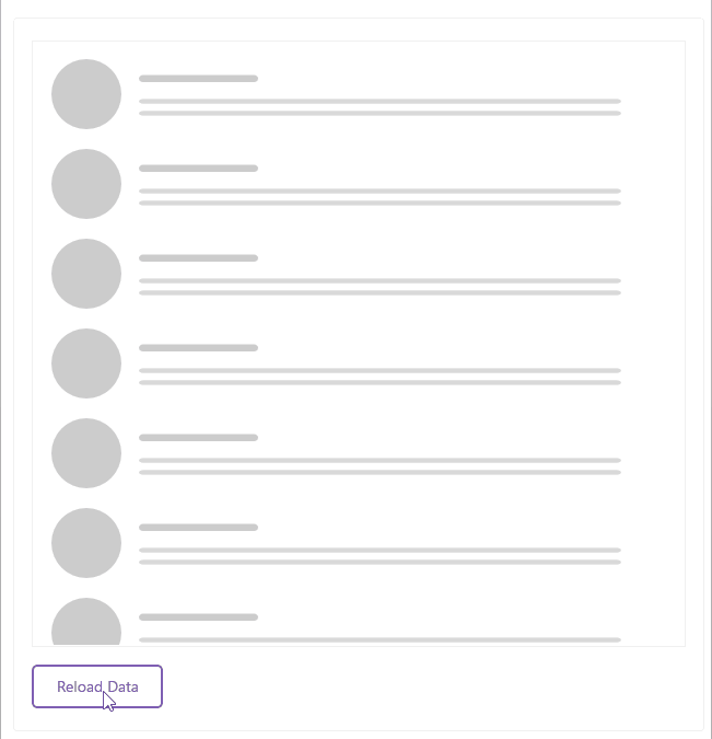
The Telerik UI for .NET MAUI Skeleton control is a UI element that serves as a placeholder while content is being loaded. It provides a visual representation of the layout and structure of the content that will eventually be displayed, helping to improve the user experience during loading times.
 Start Free Trial
The animation of the skeleton indicates that the content is in the process of loading, which can help to reduce perceived wait times and keep users engaged. In addition, you can use the built-in skeletons and to apply a custom one to match the skeleton's appearance to your application's design.
Key Features of the Telerik .NET MAUI Skeleton
- Built-in views— The Skeleton control comes with a set of built-in views that you can use to quickly create skeleton screens for common UI elements, such as text, images, and buttons.
- Width and Height— You can set minimum width and minimum height to define the size of the Skeleton control according to your layout needs.
- Repeat Count— You can set the
RepeatCountproperty to specify how many times the skeleton view should be repeated within the control. This is useful for creating lists or grids of skeleton items. - Animation— The Skeleton control includes built-in animation options that allow you to create a smooth and engaging loading experience for your users.
- Custom Views— The Skeleton control allows you to create custom skeleton views using XAML or C#, giving you full control over the appearance and layout of your skeleton screens.
- Custom Drawable—You can create a custom drawable object by implementing the
IDrawableinterface. This allows you to have full control over the appearance and behavior of the skeleton view. - Styling API—You can customize the appearance of the Skeleton using the styling API, which allows you to set properties like background color, border color, corner radius, loading view color, and more.