.NET MAUI Skeleton Configuration
The Telerik UI for .NET MAUI Skeleton control provides a variety of properties that allow you to configure its appearance and behavior to fit your application's needs.
Loading
The IsLoading (bool) property indicates whether the content of the Skeleton control is currently in a loading state. When set to true, the skeleton view is displayed, simulating the loading of content. When set to false, the actual content is shown. The default value is true.
Width and Height
The Skeleton allows you to specify the size of the loading view by using the following properties:
LoadingViewMinimumHeight(double)—Specifies the minimum height of the Skeleton loading view. The default value is64.LoadingViewMinimumWidth(double)—Specifies the minimum width of the Skeleton loading view. The default value is64.
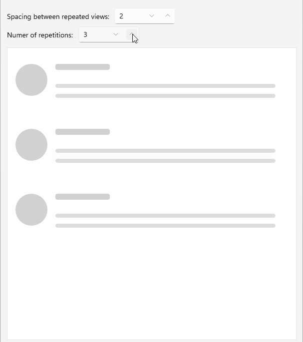
Repeat Count
The RepeatCount (int) property allows you to specify how many times the loading view should be repeated. This is useful for creating a list of skeleton items that mimic the structure of the actual content. The default value is 1, meaning the loading view is displayed only once.
In addition, you can apply spacing between the repeated skeleton views by setting the RepeatSpacing (double) property. The default value is 10.
Below is a quick example showing how to set the RepeatCount and RepeatSpacing properties:
<telerik:RadSkeleton RepeatSpacing="2"
					 RepeatCount="3"
					 x:Name="skeleton"
					 Grid.Row="1" />
This is the result:
For a runnable example with the Skeleton Repeat Count scenario, see the SDKBrowser Demo Application and go to Skeleton > Repeat Count category.