.NET MAUI Skeleton Built-in Types (Views)
The Telerik UI for .NET MAUI Skeleton control comes with a set of built-in views that you can use to quickly create skeleton screens for common UI elements. These built-in views help you to represent the structure and layout of your content while it is being loaded.
You can change the type of the skeleton loading view by setting the SkeletonType (enum of type Telerik.Maui.Controls.Skeleton.SkeletonType) property. The available built-in types are:
-
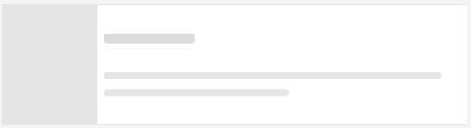
Article—Displays a skeleton layout suitable for article content, typically showing an image and text lines with varying widths. -
Text—Displays a simple text skeleton with horizontal lines representing text content. -
(Default)
PersonaCircle—Displays a persona skeleton with a circular avatar and text lines, commonly used for user profiles or contacts. -
PersonaSquare—Displays a persona skeleton with a square avatar and text lines, an alternative toPersonaCircle. -
Image—Displays a skeleton for image-based content, showing a placeholder for an image. -
Video—Displays a skeleton suitable for video content, showing a large rectangular placeholder. -
Card—Displays a card-style skeleton layout with sections for image and text content. -
ContentFeed—Displays a content feed skeleton layout, suitable for social media feeds or news lists.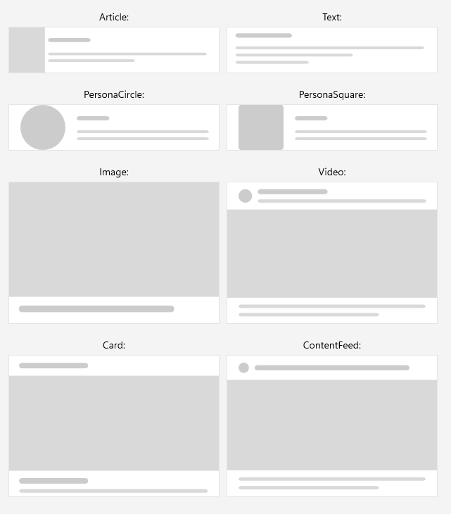
Below is a quick example showing how to set the SkeletonType property to Article:
<telerik:RadSkeleton SkeletonType="Article" />This is the result:
For a runnable example with the Skeleton Built-in Views, see the SDKBrowser Demo Application and go to Skeleton > Built-in Views category.