New to Telerik UI for .NET MAUI? Start a free 30-day trial
.NET MAUI Skeleton Styling
Updated on Jan 9, 2026
The Telerik UI for .NET MAUI Skeleton control provides extensive styling options that allow you to customize its visual appearance to match your application's design.
Styling Properties
To style the border around the Skeleton, use the following properties:
Background(Brush)—Specifies the background brush of the control.BorderBrush(Brush)—Specifies the border brush of the control.BorderColor(Color)—Specifies the border color of the control.BorderThickness(Thickness)—Specifies the border thickness of the control.CornerRadius(CornerRadius)—Specifies the corner radius of the control.Padding(Thickness)—Specifies the padding of the control.
To style the loading view, use the following properties:
LoadingViewColor(Color)—Specifies the base color of the skeleton loading view.
Here is an example of how to style the Skeleton control in XAML:
1. Define the Skeleton control in XAML:
XAML
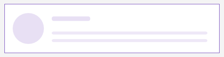
<telerik:RadSkeleton LoadingViewColor="#998660C5"
					 LoadingViewMinimumHeight="100"
					 BorderBrush="#8660C5"
					 BorderThickness="1"
					 x:Name="skeleton" />
2. Add the telerik namespace:
XAML
xmlns:telerik="http://schemas.telerik.com/2022/xaml/maui"This is the result:
For a runnable example with the Skeleton Styling scenario, see the SDKBrowser Demo Application and go to Skeleton > Styling category.