.NET MAUI Skeleton Custom View
The Telerik UI for .NET MAUI Skeleton control allows you to create custom skeleton views to match the specific design and layout of your application.
This is particularly useful when the built-in skeleton types do not fit your requirements.
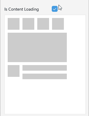
Custom Template
To create a custom skeleton view, you can define your own layout using XAML or C# and set it to the LoadingViewTemplate (DataTemplate) property of the RadSkeleton.
Here is an example of how to define a custom loading template as skeleton view:
- Define the
RadSkeletoncontrol:
<telerik:RadSkeleton LoadingViewTemplate="{StaticResource CustomSkeletonView}"
Grid.Row="1"
x:Name="skeleton">
<Grid RowDefinitions="Auto, 100, 200"
Padding="10"
RowSpacing="10">
<HorizontalStackLayout Spacing="10">
<Image>
<Image.Source>
<FontImageSource Glyph=""
FontFamily="TelerikFontExamples"
Color="#8660C5"
Size="{OnPlatform Default=16, iOS=20, MacCatalyst=20}" />
</Image.Source>
</Image>
<Image>
<Image.Source>
<FontImageSource Glyph=""
FontFamily="TelerikFontExamples"
Color="#8660C5"
Size="{OnPlatform Default=16, iOS=20, MacCatalyst=20}" />
</Image.Source>
</Image>
<Image>
<Image.Source>
<FontImageSource Glyph=""
FontFamily="TelerikFontExamples"
Color="#8660C5"
Size="{OnPlatform Default=16, iOS=20, MacCatalyst=20}" />
</Image.Source>
</Image>
<Image>
<Image.Source>
<FontImageSource Glyph=""
FontFamily="TelerikFontExamples"
Color="#8660C5"
Size="{OnPlatform Default=16, iOS=20, MacCatalyst=20}" />
</Image.Source>
</Image>
</HorizontalStackLayout>
<telerik:RadBorder WidthRequest="200"
HeightRequest="100"
BorderColor="#8660C5"
BorderThickness="1"
HorizontalOptions="Start"
Grid.Row="1">
<Label Text="Main View"
VerticalTextAlignment="Center"
HorizontalTextAlignment="Center" />
</telerik:RadBorder>
<Grid Grid.Row="2"
ColumnDefinitions="20, *"
ColumnSpacing="20">
<Image VerticalOptions="Start"
Grid.Column="0">
<Image.Source>
<FontImageSource Glyph=""
FontFamily="TelerikFontExamples"
Color="#8660C5"
Size="{OnPlatform Default=16, iOS=20, MacCatalyst=20}" />
</Image.Source>
</Image>
<VerticalStackLayout HorizontalOptions="Start"
Spacing="10"
Grid.Column="1">
<Label Text="Title" />
<Label Text="Description"
HorizontalOptions="Start"
VerticalOptions="Start" />
</VerticalStackLayout>
</Grid>
</Grid>
</telerik:RadSkeleton>- Create a custom loading template and set it to the
RadSkeleton.LoadingViewTemplateproperty:
<DataTemplate x:Key="CustomSkeletonView">
	<Grid RowDefinitions="40, 100, 200"
		  RowSpacing="10"
		  Padding="10">
		<HorizontalStackLayout Spacing="10">
			<Image WidthRequest="40" />
			<Image WidthRequest="40" />
			<Image WidthRequest="40" />
			<Image WidthRequest="40" />
		</HorizontalStackLayout>
		<Image WidthRequest="200"
			   HeightRequest="100"
			   HorizontalOptions="Start"
			   Grid.Row="1" />
		<Grid Grid.Row="2"
			  ColumnDefinitions="40, *"
			  ColumnSpacing="10">
			<Image HeightRequest="40"
				   WidthRequest="40"
				   VerticalOptions="Start"
				   Grid.Column="0" />
			<VerticalStackLayout HorizontalOptions="Start"
								 Spacing="10"
								 Grid.Column="1">
				<Label />
				<Label HorizontalOptions="Start"
					   VerticalOptions="Start" />
			</VerticalStackLayout>
		</Grid>
	</Grid>
</DataTemplate>- Add the
teleriknamespace:
xmlns:telerik="http://schemas.telerik.com/2022/xaml/maui"This is the result:
For a runnable example with the Skeleton Custom Loading Template scenario, see the SDKBrowser Demo Application and go to Skeleton > Custom View category.
Custom Drawable
You can also create a custom drawable object by implementing the IDrawable interface. This allows you to have full control over the appearance and behavior of the skeleton view.
To apply the custom drawable to the RadSkeleton, set it to the LoadingViewDrawable property.
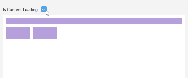
Here is an example of how to define a custom drawable object as skeleton view:
- Define the
RadSkeletoncontrol:
<Grid RowDefinitions="Auto, *"
	  RowSpacing="10">
	<HorizontalStackLayout Spacing="10">
		<Label Text="Is Content Loading"
			   VerticalOptions="Center" />
		<telerik:RadCheckBox x:Name="isSkeletonLoading"
							 IsChecked="{Binding Source={x:Reference skeleton}, Path=IsLoading}" />
	</HorizontalStackLayout>
	<telerik:RadSkeleton Grid.Row="1"
						 x:Name="skeleton"
						 LoadingViewColor="#998660C5">
		<Grid RowDefinitions="Auto, Auto"
			  Padding="10"
			  RowSpacing="10">
			<Label Text="This is a sample text that would be shown after the skeleton is no longer loading."
				   Grid.Row="0" />
			<HorizontalStackLayout Spacing="10"
								   Grid.Row="1">
				<telerik:RadButton Text="Like" />
				<telerik:RadButton Text="Dislike" />
			</HorizontalStackLayout>
		</Grid>
	</telerik:RadSkeleton>
</Grid>- Create a custom
MyCustomDrawableclass that inherits from theIDrawableinterface:
public class MyCustomDrawable : BindableObject, IDrawable
{
    public static readonly BindableProperty FillColorProperty =
        BindableProperty.Create(nameof(FillColor), typeof(Color), typeof(MyCustomDrawable));

    public Color FillColor
    {
        get => (Color)this.GetValue(FillColorProperty);
        set => this.SetValue(FillColorProperty, value);
    }

    public void Draw(ICanvas canvas, RectF dirtyRect)
    {
        if (dirtyRect.Width <= 0 || dirtyRect.Height <= 0)
            return;

        canvas.SaveState();
        canvas.Antialias = true;
        canvas.FillColor = this.FillColor;

        var padding = 10f;
        var availableWidth = dirtyRect.Width - 2 * padding;
        var availableHeight = dirtyRect.Height - 2 * padding;
        var spacing = 10f;

        // First row - long rectangle for text (takes most of the space)
        var textHeight = 20f; // Height for the text rectangle
        var firstRowY = dirtyRect.Y + padding;
        var textRect = new RectF(dirtyRect.X + padding, firstRowY, availableWidth, textHeight);
        canvas.FillRectangle(textRect);

        // Second row - two button rectangles (smaller, positioned at bottom)
        var buttonHeight = 40f; // Height for button rectangles
        var buttonWidth = 80f; // Width for each button rectangle
        var secondRowY = firstRowY + textHeight + spacing;

        // Left button (Like)
        var leftButtonRect = new RectF(dirtyRect.X + padding, secondRowY, buttonWidth, buttonHeight);
        canvas.FillRectangle(leftButtonRect);

        // Right button (Dislike) - positioned next to the left button
        var rightButtonRect = new RectF(dirtyRect.X + padding + buttonWidth + spacing, secondRowY, buttonWidth, buttonHeight);
        canvas.FillRectangle(rightButtonRect);

        canvas.RestoreState();
    }
}- Add the
teleriknamespace:
xmlns:telerik="http://schemas.telerik.com/2022/xaml/maui"This is the result: