
March 2023 Telerik & Kendo UI Update

Summarize with AI:
See what’s new in the March 2023 update with our Telerik and Kendo UI libraries.
We are constantly working to grow and improve our Progress Telerik and Kendo UI libraries and tools. Today, we have several updates to share with you!
Table of Contents
- Compatibility with .NET 8 Preview 1
- Telerik UI for Blazor
- Kendo UI for jQuery, Telerik UI for ASP.NET Core and MVC
- Telerik UI for ASP.NET Core and MVC
- Telerik UI for ASP.NET AJAX
- Kendo UI for Angular
- KendoReact
- Kendo UI for Vue
- Telerik UI for WinForms
- Telerik UI for WPF
- Telerik UI for WinUI
- Telerik Document Processing Libraries
- Telerik UI for .NET MAUI
- Telerik Reporting & Telerik Report Server
Compatibility with .NET 8 Preview 1
We are happy to announce the compatibility of the Telerik UI for Blazor and UI ASP.NET Core libraries with .NET 8 Preview 1, which was shipped by Microsoft at the end of February. This means that developers can take advantage of the latest features and performance improvements in .NET 8 while using the powerful UI components provided by Telerik.

Telerik UI for Blazor
New Blazor DropZone Component
The new DropZone component provides an intuitive and streamlined way for users to upload files within Blazor applications. The component allows users to declare an external drop zone for an existing TelerikFileSelect or FileUpload component, enabling end-users to drag and drop files to a designated space on their view port, which will then be automatically transferred to the file select/upload.
See a demo of the UI for Blazor DropZone component.
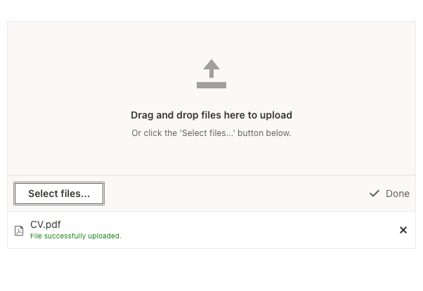
Enhancements in the FileSelect & Upload UI Components
Built-in Drag and Drop
Thanks to the new DropZone component, the FileSelect and Upload components now allow drag and drop files out of the box.
See a demo of the UI for Blazor FileSelect drag and drop support.
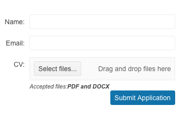
Globalization and Localization
As part of this new feature, a new label will be added to the already-existing rendering of the two components. The label will display a text similar to “Drag and drop files here to upload.”
To support localization and globalization, two new resource keys have been added: Upload_DropZoneHint and FileSelect_DropZoneHint.
Custom Content in SelectFiles Button
In this release, we have also added a templating support for the SelectFiles button in both FileSelect and Upload components. Before this enhancement, the only way to style the “Select Files…”
button was through CSS. Through this enhancement, clients can now fully customize the appearance of the button—for example, they can now render an icon.
FileSelect New Methods
Two new methods, ClearFiles and OpenSelectFilesDialog, have been added to the Blazor FileSelect component in this release. ClearFiles enables programmatically removing files
from the list, providing more control over the selection process. OpenSelectFilesDialog allows opening the browser file selection dialog with a single API call.
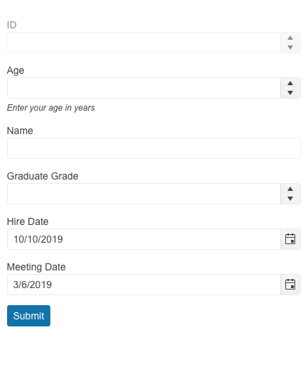
Combine AutoGenerated & Custom Fields in the Form Component
This new feature in the UI for Blazor Form component allows the usage of autogenerated form items together with manually defined ones. This allows developers to use the autogenerated fields for most of their model fields but still gives them the flexibility to customize a few of them when needed.
See a demo of autogenerated and custom fields in the UI for Blazor Form component.
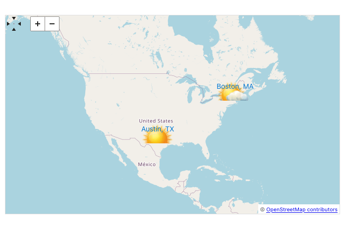
Customize the Map Component Marker Appearance
The UI for Blazor Map component now provides a templating feature, which allows easy customization of the markers that appear on the map. Developers can define custom HTML markup to style their markers as they see fit.
See how to customize the UI for Blazor Map component marker.
Accessibility Compliance for the FontIcon & SvgIcon
In this release, we enhanced the UI for Blazor FontIcon and SvgIcon components, which we shipped in R1 2023. Both components now include the needed WAI-ARIA attributes and comply with accessibility standards out of the box.
Performance Improvements in Data Grid & TreeList
We’re happy to announce a significant performance improvement for our Blazor Data Grid & TreeList components. With the current release, we have reduced the re-rendering of content cells to a minimum and only when necessary, resulting in a 40% faster component refresh time in our tests.
While template cells will still always re-render, as arbitrary markup can be placed in them, we’re confident that this improvement will make a noticeable difference in the overall performance of the UI for Blazor components.

Visible Parameter TileLayout Component Items
We have exposed a new parameter named Visible to control whether a given TileLayout item is visible or not.
See a demo of the items visibility in the UI for Blazor TileLayout component.

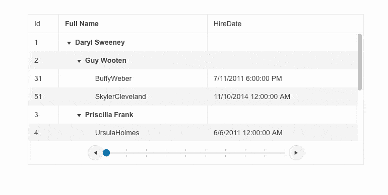
Pager Template in the Blazor Data Grid & TreeList
The new pager template feature in the UI for Blazor Data Grid and TreeList allows users to easily apply custom look and content in the paging element of the components, and completely replace the pager with their own custom markup.
See how to customize the UI for Blazor TreeList component pager.
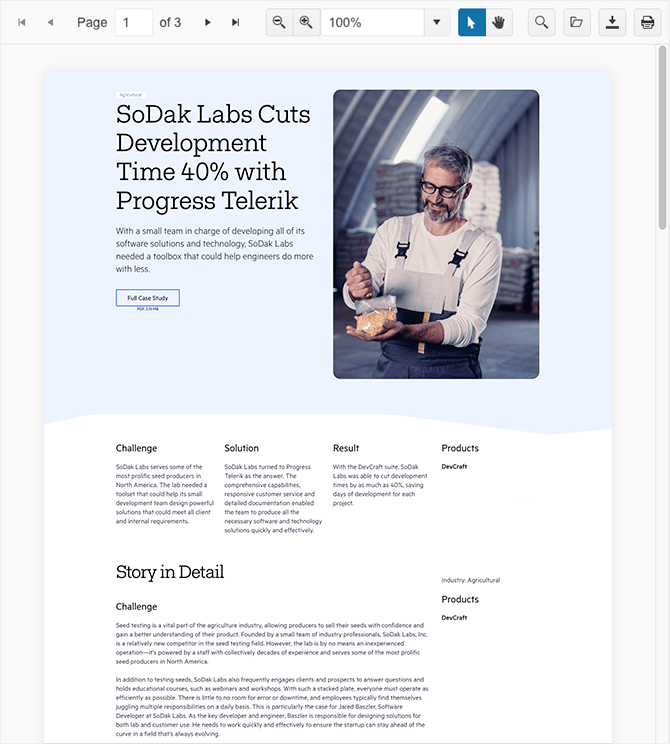
Print Method in the PDF Viewer Component
The UI for Blazor PDFViewer component now provides the ability to print the current document programmatically. With the addition of the Print() method, developers now have a simple way to enable printing functionality in their Blazor applications which utilize the PDF Viewer.
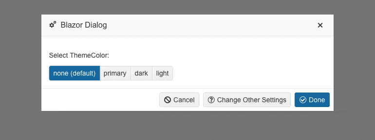
Add ThemeColor Parameter for Window & Dialog
A new parameter named ThemeColor has been added to the UI for Blazor Window and Dialog component. It allows you easy customization of the color of the titlebar of the both components and includes as possible list of values: “Primary,” “Dark,” “Light” and empty (no color).
See an example the UI for Blazor Dialog ThemeColor options.
Refresh Method for All Select-Type Components
With this release, we’ve introduced a new method called Refresh in our select-type UI components, namely the AutoComplete, ComboBox, DropDownList, MultiColumnComboBox and MultiSelect. The method allows you to easily refresh the popup of the selects and comes in handy when the popup remains open, but changes need to be applied.
View the complete release notes for Telerik UI for Blazor March 2023 update.
Kendo UI for jQuery, Telerik UI for ASP.NET Core and MVC
This month we are happy to announce that we have made possible the advanced styling of UI for jQuery, ASP.NET Core, and MVC components within ThemeBuilder Pro, and added new features such as Data Grid Sizing Options and SVG Icons to their UI tools.
Additionally, we made improvements to the Gantt component popup edit form and have ensured that their Telerik UI for ASP.NET Core and MVC are compliant with CSP regulations. Announced earlier in January 2022 we are also confirming the end of support for Less Themes in Kendo UI for jQuery, Telerik UI for ASP.NET Core, and Telerik UI for ASP.NET MVC.
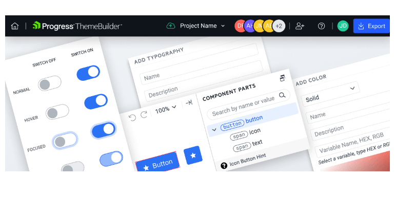
ThemeBuilder Pro with UI for jQuery, ASP.NET Core and MVC
For those who want to take customization of the Kendo UI for jQuery, Telerik UI for ASP.NET Core and MVC components to the next level, we are happy to share that with this month’s release we are introducing the full customization support of those three products within ThemeBuilder Pro!
ThemeBuilder Pro was introduced a few months back with initial support for styling components from the UI for Blazor, UI for Angular and Vue, plus KendoReact libraries. It offers robust features that will make styling UI components a breeze, including:
- Custom variables for colors, typography, metrics and more, giving you the power to create unique designs that truly stand out
- Detailed customization options, from button icon color to grid header padding, allowing you to create stunning UI components down to the smallest detail
- Custom fonts and font icons, taking your UI components to the next level and ensuring your brand identity is consistent and memorable
- Effortless collaboration and easy sharing options for seamless teamwork, enabling you and your team to create beautiful UI components together and take your projects to the next level!
End of Support for LESS Themes in UI for jQuery, ASP.NET Core and MVC
As announced last year in Jan 2022, we are confirming that with the current release Kendo UI for jQuery, Telerik UI for ASP.NET MVC and Telerik UI for ASP.NET Core are moving completely to the Sass-based Default, Bootstrap, Material and Fluent themes, and we are sunsetting the LESS-based themes for the three products.
With this month’s release, we have officially ended support for LESS themes and they will no longer be included in the distribution of Kendo UI for jQuery, Telerik UI for ASP.NET Core and UI for ASP.NET MVC libraries.
While most of you have migrated to Sass themes, we understand that some are still using LESS themes in their projects. If this is the case, you can continue to use them with your existing packages up until R1 2023 (version 2023.1.117), which is the latest stable version that supports and ships LESS themes. However, if you decide to update to any newer version, please note that starting with the current version onwards our jQuery, ASP.NET Core and ASP.NET MVC libraries will no longer include LESS theme files.
We remain committed to providing a top-notch theming experience for our customers and believe that Sass themes offer superior flexibility and performance. We strongly recommend that customers who are using LESS themes migrate to Sass themes as soon as possible. To assist with this transition, we have provided a detailed guide on why and how to migrate to Sass themes in our documentation.
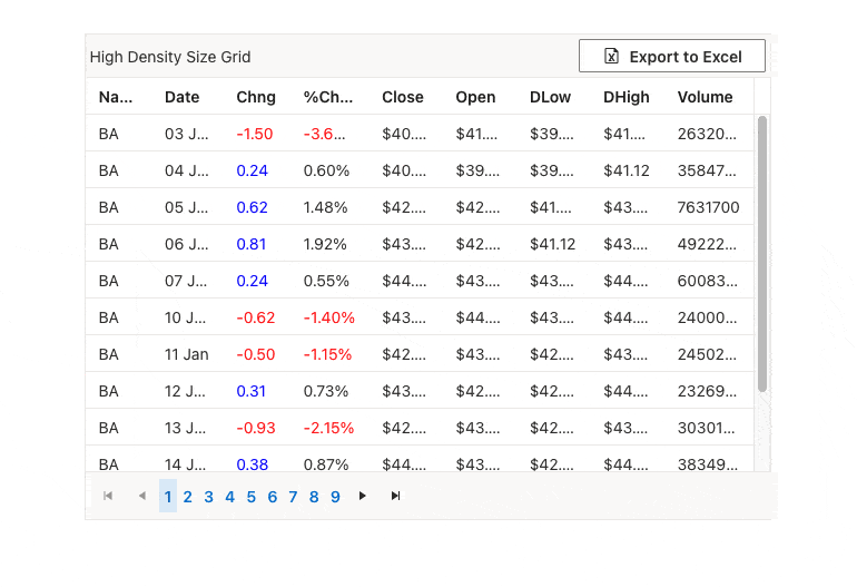
Data Grid Sizing Options UI for jQuery, ASP.NET Core and MVC
The Data Grid can now be customized to improve its visibility on smaller devices or to accommodate larger volumes of data using the new Size parameter. The Size parameter supports two values, Small and Medium, and also impacts the size of inner components such as the Toolbar, Pager and editors, making them smaller and consistent with the overall styling of the Data Grid.
A new sizing option is available for the Data Grid in UI for jQuery, ASP.NET Core and MVC. Check out the respective demos at:
- New Data Grid sizing option in Kendo UI for jQuery
- New Data Grid sizing option in Telerik UI for ASP.NET Core
- New Data Grid sizing option in Telerik UI for ASP.NET MVC
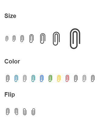
SVG Icons UI for jQuery, ASP.NET Core and MVC
Starting with the current release, the three UI libraries Kendo UI for jQuery, Telerik UI for ASP.NET Core and MVC provide a large variety of Scalable Vector Graphics (SVG) icons in addition to the existing font icons, providing developers with more choices.
SVG icons are vector images that use XML to define them, which allows them to be easily scaled and customized. They can be utilized in webpages to display vector graphics and have benefits such as clear rendering at any resolution, the ability to control individual parts with CSS and accessibility through semantic elements and attributes.
In addition to the new SVG icons package, you can now also customize the appearance of the icons used by adjusting the new IconType property, such as the type of icon (SVG or font), theme color, flip direction and size.
More details can be found at:
- SVG Icons in Telerik UI for ASP.NET Core
- SVG Icons in Telerik UI for ASP.NET MVC
- SVG Icons in Kendo UI for jQuery
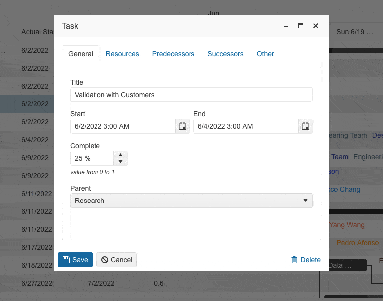
Gantt Popup Edit Form Improvements
The current release includes multiple updates designed to enhance the editing and customization capabilities of our Gantt UI component, meaning you can now fine-tune every aspect of the Gantt to your users’ preference.
One of the most significant changes is the Gantt edit popup form, which has been reorganized into tabs for easier navigation and editing of different sections.
Additionally, we’ve expanded the Gantt component’s capabilities by allowing the configuration and editing of all data fields present in the Gantt.
Another highly requested feature is the ability to edit parent tasks directly from the task’s edit form. With this update, users can easily edit any associated parent tasks without having to navigate to a separate section.
We have also streamlined the dependencies editing process by integrating it into the edit form, eliminating the need for a separate popup window. This simplifies the editing process and reduces the time and effort required to make changes.
Finally, we’ve added a new “Other” tab to the Gantt edit popup, where users can now find and edit all custom fields. This tab helps to declutter the editing form, providing a cleaner and more organized editing experience.
See an example of the improved Gantt editing experience:
- Telerik UI for ASP.NET Core Gantt component demo
- Telerik UI for ASP.NET MVC Gantt component demo
- Kendo UI for jQuery Gantt component demo
Telerik UI for ASP.NET Core and MVC
CSP Compliance Improvements
Until now, developers who needed to provide Content Security Policy (CSP) compliance for their apps with Telerik UI components used to have to defer the scripts for each component and extend the meta CSP tag to include the unsafe-eval keyword and the nonce signature for enabling the CSP mode.
With the current update of the Telerik UI for ASP.NET Core and MVC libraries, we made sure to simplify this process of eliminating the usage of inline scripts which are an obstacle to being CSP compliant. You can now defer all components once globally using the new method @Html.Kendo().DeferredScriptFile() which adds the initialization scripts into a separately generated JS file.
In addition to that, all UI components that have templating options now have new template methods that allow them to define and load templates through a JavaScript handler. This way, we ensure there is no dependency on inline scripts and simplify the process of making your web applications using Telerik UI components CSP compliant.
For existing applications you can take advantage of the DeferredScriptFile() method and new templating options, thus allowing you to remove the dependency to unsafe-eval directive in your code and reuse the templates within
multiple components in different application pages.
For a complete reference of all CSP-related improvements, read the dedicated documentation articles:
- Telerik UI for ASP.NET Core Content Security Policy
- Telerik UI for ASP.NET MVC Content Security Policy
To see all release items for Kendo UI for jQuery, Telerik UI for ASP.NET Core and MVC, please refer to the release history of the products:
- View the complete release notes for Kendo UI for jQuery March 2023 update.
- View the complete release notes for Telerik UI for ASP.NET MVC March 2023 update.
- View the complete release notes for Telerik UI for ASP.NET Core March 2023 update.
Telerik UI for ASP.NET AJAX
Fixes and Improvements
In this release, we included multiple improvements in the AutoCompleteBox, Button, Calendar, Combobox, Editor and Treeview, including support for the latest Chrome browser (iOS mobile) as well as the latest version of the W3C validator part of the XHTML Validator dialog of RadEditor.
Single Line RadAutoCompleteBox
Based on customer feedback, we shipped additional mode of the RadAutoComplete component. Now in addition to the multiline option, you can set the SingleLineEntries property and configure the AutoComplete to display all of the provided input into a single line input with horizontal scroll.
See a demo of the single line mode of the UI for ASP.NET AJAX AutoComplete component.
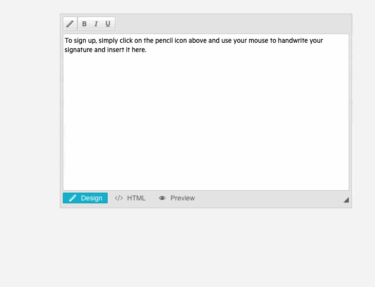
Integration Demo for RadEditor and RadSignature
Check out the Signature Dialog demo to learn how to allow handwritten signature insertion into a WYSIWYG (what you see is what you get) editor. The dialog displays a signature pad that allows the user to draw their signature. Once the user is done, they can click on the “Store on Server as PNG and Insert” button to store the signature as a PNG file and insert the image into the editor.
End of .NET 3.5 Support
Please note that R2 2023 SP1 on March 15 will be the last version to provide support and assemblies for .NET Framework 3.5.
As of R2 2023, we will continue shipping assemblies compatible with .NET 4.x.x versions of the framework.
View the complete release notes for Telerik UI for ASP.NET AJAX March 2023 update.
Kendo UI for Angular
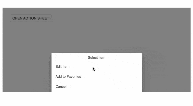
ActionSheet Component Enhancements
The Kendo UI for Angular ActionSheet component has been enriched with several new features that provide flexibility and easy customization for its use cases. The updates include:
- ActionSheetTemplate feature which allows you to completely override the component’s content, giving you more control over its appearance and functionality.
- cssClass input property, which enables you to customize the styling of the Actionsheet component to better match your application’s design.
- Animations support, which makes it more visually appealing and engaging for your users.
- Expanded input property allows you to set the initial state of the ActionSheet component to either expanded or collapsed. Additionally, the expandedChange event fires whenever the expanded state of the ActionSheet changes.
- Expand/collapse events that allow you to trigger custom actions whenever the ActionSheet component expands or collapses.
- And a new toggle method that allows you to programmatically toggle the expanded state of the ActionSheet component.
Accessibility Enhancements
We continue with the effort to raise the accessibility compliance level of Kendo UI for Angular components, and in this release, we implemented multiple WAI-ARIA, keyboard navigation and general A11y enhancements in multiple components including: DropDownTree, MultiSelect, Editor, Icons, Menu, ContextMenu, Bottom Navigation, BreadCrumb, Notification, ListBox, ScrollView, Popover, Upload, FileSelect, Gantt and Data Grid (the last two will receive further improvements in the next release).
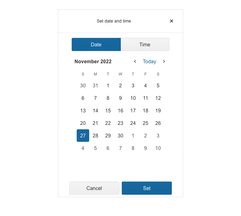
Adaptive Rendering for DatePickers
We place serious focus on the adaptive rendering of the Kendo UI for Angular library, and, in this release, we ensured mobile-friendly rendering of all Date and Time Picker components. The adaptive behavior can be provided via the new adaptiveMode parameter which was added to the DatePicker, DateTimePicker, TimePicker аnd DateRange components.
Gantt Popup Edit Form Enhancements
The UI for Angular Gantt popup editing form of the component endured some quality-of-life improvements and refreshed UX related to its command buttons, alignment and usage of icons.
See a demo of the Kendo UI for Angular Gantt popup editing form.
Charts Documentation Enhancements
The Progress Kendo UI for Angular team has been working hard to make it easier for developers to find the information they need and to enhance the overall user experience, and in this release we focused on improving the documentation and examples related to the Kendo UI for Angular Chart component.
We reorganized the content to improve the ease of use and the user journey throughout the documentation. You can now clearly see this improvement in the left-hand side navigation, which has been streamlined and made more intuitive. More examples have been added, including how to use a logarithmic axis and how to render label content in multiple lines, plus a demo showcasing the integration of Sparklines in an Angular Data Grid.
View the complete release notes for Kendo UI for Angular March 2023 update.
KendoReact
New Component: Context Menu
The new ContextMenu component is an addition to the layout package of our KendoReact UI library. It represents a vertical Menu rendered in a Popup. The ConextMenu extends the Menu properties including: “children,” “className,” “customCloseItemIds,” “dir” and also provides an “offset” property that specifies the opening coordinates and accepts “Top” and “Left” values similar to the Popup component.
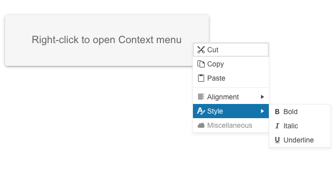
See a demo of the KendoReact ContextMenu UI component.
ComboBox AdaptiveMode
The KendoReact ComboBox now provides adaptive functionality which can be enabled through the adaptiveMode prop of the component and optimize the component’s appearance and usability on different devices and screen sizes, improving the user experience.
See a demo of the KendoReact ComboBox adaptive behavior.
Pager All Pages Configuration
The KendoReact Pager UI component can now be configured to show all items in a single page. The feature can be enabled initially, or through the PageSize DropDownList. The PageSize and PageSizeValue option of the pager now accept string “All.”
Check out the complete list of the KendoReact Pager UI component props.
KendoReact Data Grid Enhancements
Integrated ContextMenu in Data Grid
The KendoReact Data Grid enables you to display a context menu by using the newly added ContextMenu component. The GridRow now exposes an onContextMenu event that allows
you to setup a context menu with any Grid command. You can configure the context menu to show any cell operations (such as copy cell content), any row operations (such as move up or delete), or export to file features.
See a demo of the KendoReact Data Grid with integrated ContextMenu.
Data Grid Pager All Option
The new KendoReact Pager dropdown list “All” option is made available in the Grid as well. It is controlled by the respective pageable options, more specifically
the pageSizes.
Data Grid Virtualization Improvements
The virtualization feature of the KendoReact Data Grid has undergone significant stability improvements. These improvements are related to the specification of metrics about row size,
which enables us to make accurate calculations of rendered rows in the Grid and the scroll position of the content.
Now, the virtualization can work with both all data and sliced data by setting the required field rowHeight. In cases where there are details, another required field is detailRowHeight, and all data must be passed to the Grid. For grouping scenarios, it’s important to pass all data.
To showcase these enhancements, we’ve provided some examples:
ActionSheet Component Enhancements
ActionSheet Keyboard Navigation
The KendoReact ActionSheet component now provides out-of-the box keyboard navigation.
See a demo of the available keyboard shortcuts that the KendoReact ActionSheet supports.
ActionSheet Animation
The other enhancement we shipped in the ActionSheet is a smoother animation when the component appears on the screen (enabled via the new animation prop which accepts a Boolean value).
Scrollable TabStrip with RTL Support
The KendoReact TabStrip component now allows you to change the direction of the content when scrolling tabs to right-to-left using its dir property.
See a demo of the RTL support in KendoReact TabStrip component.

Accessibility Enhancements
In our continuous effort for enhancing the accessibility compliance level of the KendoReact UI library, we are happy to announce that now all components are compliant with WAI-ARIA specification and have the required aria attributes and roles with their respective values, needed for WCAG 2.1 compliance. Furthermore, all components have received their own WAI-ARIA support documentation article, a few examples are provided below:
- KendoReact Data Grid component WAI-ARIA support
- KendoReact Calendar component WAI-ARIA support
- KendoReact ComboBox component WAI-ARIA support
Updated Scaffolders
The KendoReact Chart and Data Grid scaffolders within the Visual Studio Code Productivity Tools are now enriched with multiple configuration options.
With the updated chart type option, you can now choose from a wide range of possibilities including Area, Bar, Box-Plot, Bubble, Bullet, Donut, Funnel, Heatmap, Line, Pie, Polar, Radar, RangeArea, RangeBar, Scatter and WaterFall.
The Grid scaffolder has also been enhanced to support filtering, editing, and paging customizations. Additionally, columns can now specify their own custom editor types. With the Grid scaffolder snippet, you can specify your own data source or choose an automatically generated one, ensuring that the snippet compiles seamlessly.

View the complete release notes for KendoReact March 2023 update.
Kendo UI for Vue
New Native Vue GridLayout Component
The Kendo Vue GridLayout component enables developers to easily layout components on a grid consisting of rows and columns. The rows and columns serve as coordinates for placing components on the grid, and typically a component occupies a single cell of the grid. This component is particularly helpful for developers migrating from desktop to web development, as it mimics the functionality of Windows’ GridPanel component.
See a demo of the Kendo UI for Vue GridLayout component.

New Native Vue StackLayout Component
The StackLayout component, also known as Telerik StackLayout, is designed to align multiple elements in a stack, either vertically or horizontally. This component includes different orientation, alignment, spacing, and other options, making it a versatile tool for developers seeking to streamline their web application layouts.
See a demo of the Kendo UI for Vue StackLayout component.
View the complete release notes for Kendo UI for Vue March 2023 update.
Telerik UI for WinForms
TaskBoard
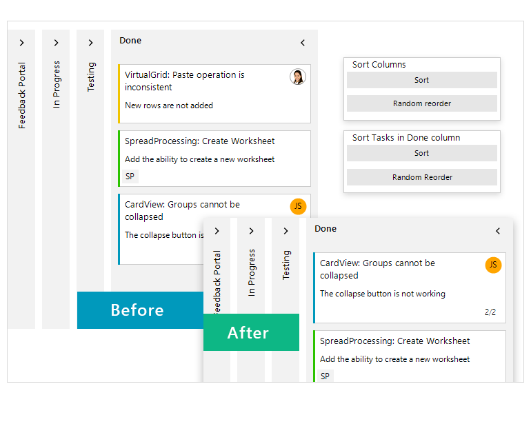
We added sorting functionality by columns and tasks. Additionally, you can choose whether to sort the tasks into a single column or multiple columns.
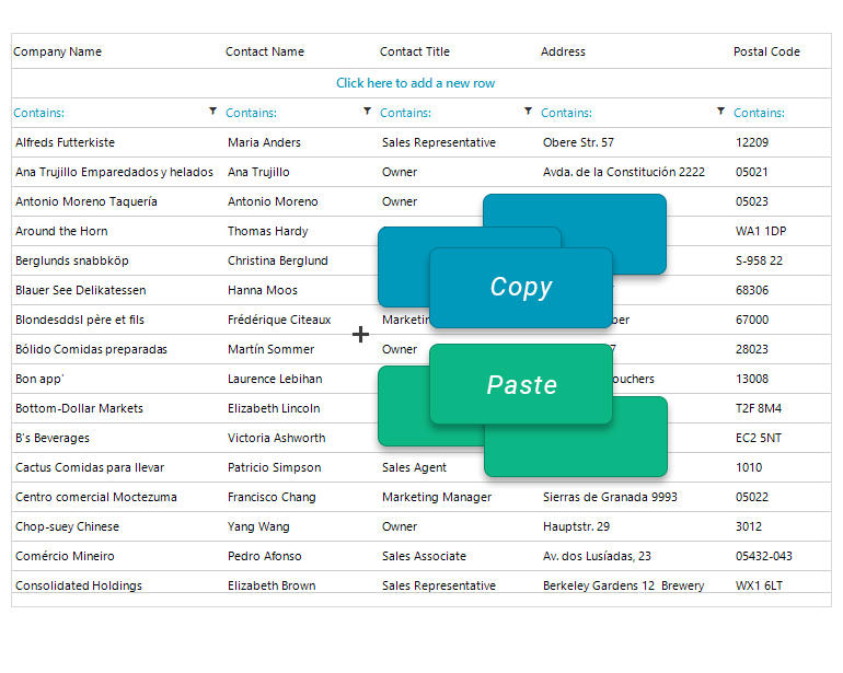
VirtualGrid
The VirtualGrid got some fixes and improvements for multiple CRUD operations and selection scenarios where the control did not behave as expected.
Demo Application
We added new Word Processing and PDF Processing demos.
Telerik UI for WPF
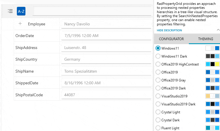
PropertyGrid
Search functionality is enhanced to allow searching for nested property fields. You can now find property field matches in collapsed property fields as well as in expanded ones.
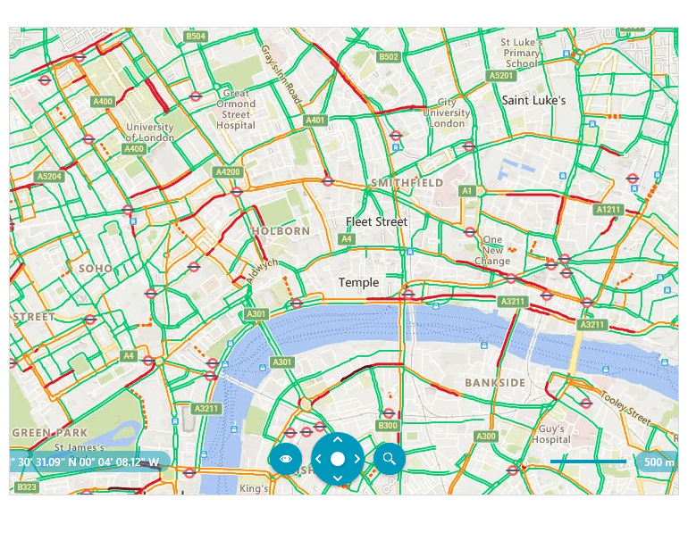
Map
We added a Bing TopLayer option in BingRestMapProvider. The control now allows you to specify the layer option that will be displayed over the received Bing Maps imagery service. The options are TrafficFlow, Foreground, Background and Basemap.
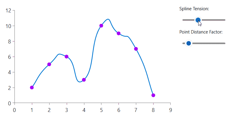
Telerik UI for WinUI
The big thing to note here is the Chart got a Spline Tension feature for Spline Series. The spline-type series provides options to control the additional points calculated for the spline of the line. You can control the tension and smoothness of the spline.
Telerik Document Processing Libraries
The PdfProcessing library now has an added image compression setting that allows you to set the desired compression for the images when exporting. The available options are: Default, None, FlateDecode.
Also in PdfProcessing, we added an option to print secured documents.
Telerik UI for .NET MAUI
DataGrid
The .NET MAUI DataGrid got an upgrade: DataTable support. You can bind your .NET MAUI DataGrid to a DataTable and have access to all the cool features. You can add, remove, select, edit item(s) and update DataGrid’s ItemsSource. You can also perform commands and operations like filtering, sorting, grouping and selection.
DataForm Improvements
DataForm also comes with some upgrades: Custom Editors, improved validation API, flexible mechanism for editors configuration, alternative attribute for ignoring properties, support for additional formatting attributes, programmatic editor generation, introduced API to validate, commit and cancel for specific properties.
Telerik Reporting & Telerik Report Server
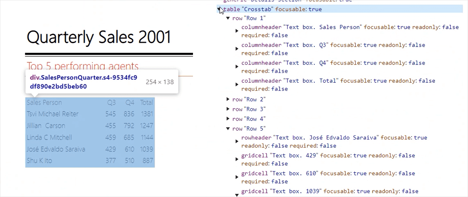
Reporting further improves its ARIA support by introducing a new dedicated property AccessibleRole on each report item, which effectively generates ARIA role attributes when the report content gets rendered in a Web Report Viewer. For this release, the items that benefit the most from this addition are the Table, Crosstab and List items.
For the accessibility content readers, the generated output is now a semantically coherent table representing data:
The Silverlight Report Viewer and its WCF Reporting Service are no longer supported and deployed with the Reporting product installation. We kept updating this control and its themes for 18 months after Silverlight officially reached its end-of-support state in October 2021. Given the decreased usage of the technology, we decided to retire the viewer and the accompanying WCF service. This will allow us to shift our implementation focus to other technologies, and ultimately give our users the best tools for embedding their reports in the latest types of application frameworks.
The list of changes and improvements goes on:
- Both HTML5-based and Native Blazor Report Viewer demo applications that get deployed with the product installer now enable the end user to change the theme of the viewer while previewing the report.
- The Shared Data Sources feature that we released in January received nice refinements.
- Report Server received numerous fixes and UI improvements, e.g., Scheduled Task/Data Alert can now be triggered on demand from the Report Server Manager, even if the task is not enabled; Web report preview triggered from the Standalone Report Designer is now fixed.
For the full list of fixes and improvements, visit the corresponding Release Notes article.
Thanks for Tuning in!
That’s it for today! We’ll have more to share before you know it. Please share your feedback with us—it truly helps us continue to improve our products for you!

Maria Ivanova
Maria Ivanova is a Manager of Product Management at Progress, for Telerik and Kendo UI components and developer tooling. She joined the company in 2019 as a Product Manager for Telerik UI web components and is passionate about developing impactful and innovative software products. Maria believes that to create great products, it's important to challenge the status quo, closely collaborate with customers, and embrace a spirit of experimentation.
Related Posts
Comments
All articles
Topics
Web MobileMobile
Desktop
Design
Productivity
People
