
Making Your Reports Interactive with the Web Report Designer

Summarize with AI:
Adding interactivity to your report means adding just two things in Telerik Web Report Designer: A filter to control your data and a Report Parameter to pass that data.
In an earlier case study using the Web Report Designer from Progress Telerik Reporting, I showed you how to combine a chart with multiple tables that both allowed you to see the charted data (on the left) and to drill down into more detailed data for any column shown in the chart (in the table below the chart).
But, to see the details for a category, you have to switch over to the search panel on the right of the report and select the category you want the detailed data for. If there are only five or six items to select from, that’s not a problem. But, as the number of entries in the chart gets larger and the list of items in the search panel gets longer, finding the right entry in the list becomes more and more awkward.
It would be considerably more efficient if you could just click on a column in the chart to have the table display the detailed data. Not only would that also just look cooler, it would eliminate the need for the search list and free up more space on the report for the data.
Well, you can have that more efficient (and cooler) report: You just need to add two things to your report.
Setting up for Interactivity: Filters and Report Parameters
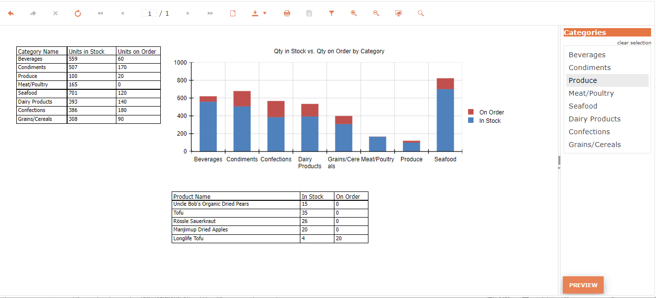
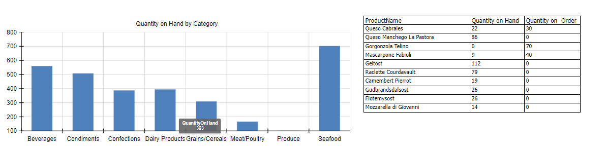
Quick review of the better report: My enhanced report has a chart showing the total Quantity on Hand for each product Category (Beverages, Produce, etc.). When I created the chart using the Column chart wizard, I set the chart’s Categories to my data source’s CategoryName field and the chart’s Values to my data source’s Quantity on Hand field.
The table is set to the same data source so, if I don’t filter it, the table will show a row for every product with each row showing the product’s name, quantity on hand and quantity on order.

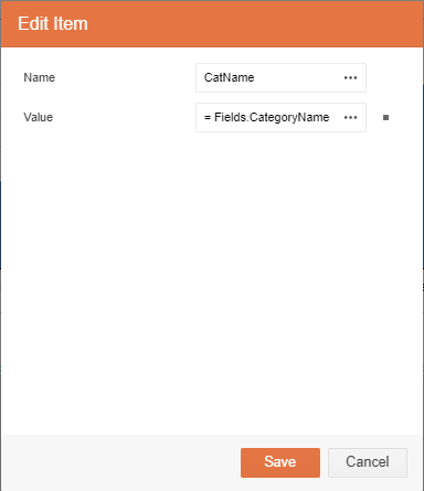
To have a table (or, for that matter, another chart) display the information for a selected column in your chart, you need to add a filter to the table. For this case study, I’m going add a filter to the table based on the same field as my chart’s Categories—the data source’s CategoryName field. In order for a click on the chart to set a filter on the table, you need a Report Parameter to pass the data. I’ll create a Report Parameter called CatName to link my chart to the filter on my table.
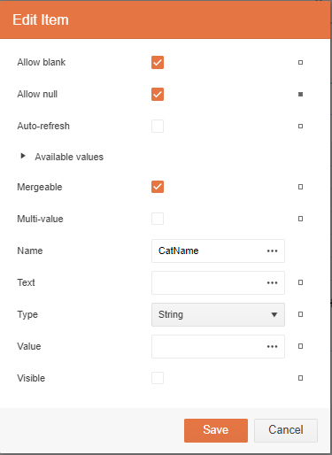
You should start by creating the Report Parameter and, to do that, you need to get the panel on the right to show your report’s settings. That’s easy: Click in the main designer window and just keep hitting the Escape key until the panel on the right shows your report name.
Then, In that panel on the right, find the Report Parameters section and click the plus sign to its right to open an Add New Item dialog.
To define your Report Parameter in the dialog:
Check the Allow Null checkbox to prevent filtering when the user hasn’t selected anything in the chart.
Set the Name textbox to call the parameter something you’ll remember (I picked “CatName”).
Set the data type to match the type of the field you’re going to filter in the table (in my case, I’m going to filter on the CategoryName field which is a String).
Now that you’ve defined a parameter that can be set from a data point in the chart, click the Save button to create it.
Now, with the Report Parameter created, you can move on to creating your filter.
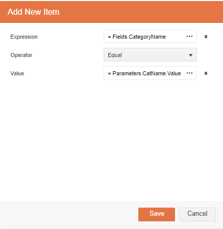
To do that, in the designer, select the table by clicking in the upper right corner of the table’s border (you can have the border appear by clicking anywhere in the table). Once you’ve selected your table, in the panel on the right, find the Filters section and click on the plus sign to its right.
In the Add New Item dialog that’s displayed, use the three horizontal dots on the right of the Expression textbox to select the field that you’ll be filtering in your table (in my case, that’s the CategoryName field). Next, use the three horizontal dots by the Value textbox to select the Value property for your Report Parameter (I selected my CatName parameter’s Value property).
Enabling Interactivity
With the filter and parameter created, you’re ready to add your interactivity: Specifically, when you click on a column in the chart, you want to redisplay your report with your Report Parameter set to a value based on the selected column. In my case, for example, when I click on a column in my chart, I want to redisplay the report with my Report Parameter’s value set to the Category field for the selected column. The filter on the table will then limit the table’s rows to products in the selected category.
Since I’m filtering on my chart’s Categories, to set the interactivity for individual columns, I need to set the Action for the Category Groups in my chart. Start by clicking on your chart to get the panel on the right to display the chart’s settings. Next, expand the Data section to display the chart’s Categories Groups area and click on the plus sign to its right to display an Add New Item dialog.
First, set up to have your report redisplayed: At the top of the dialog, expand the Activity section. From the Type dropdown list, select Navigate to Report. That will cause the Report Source area to display. In that section’s Type section, select UriReportSource to navigate to your report via its URL.
Fortunately, you don’t need to know your report’s URL: Just click on the page icon to the right of the Uri textbox to get a list of your reports. Then, double-click on the icon for your report to set the URL for your report.
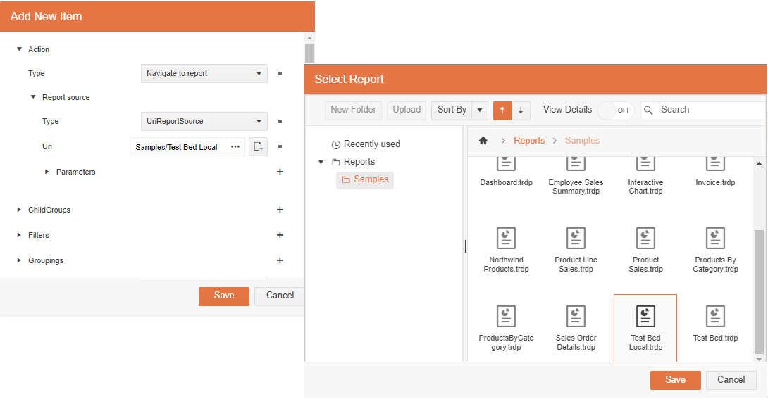
Now that you’re redisplaying your report all that’s left is to pass the value to be used by your table’s filter using your Report Parameter. Start by clicking the plus sign beside the Parameters section under the Uri textbox. That will open another Add New Item dialog.
In this dialog, in the Name dialog, enter the name of your parameter (CatName, in my case). Then, use the three dots to the right of the Value textbox to select the field whose value you want to pass to the filter used by your table (in my case, I want to pass the CategoryName field).
Save your changes and you’re ready to test your report.
Before you run your test, though, it’s a good idea to click on the hamburger menu in the upper left corner of the report designer and select the Publish option. This ensures that the version of your report that you navigate to when you redisplay your report is the same version of the report that you’re previewing.
Trying It Out
Now, to test your report, click on the Preview button in the upper right corner of your designer to display your report. Then try clicking on any of the columns in your report. Selecting a column will cause your parameter to be set, which will update the filter using that parameter. Your table will then redisplay showing only the filtered data for the item you selected in the chart.
There’s more that you can do with your chart, of course. There’s no real need for the chart in my case study to have a legend, for example. If I turn off the visibility option in the legend’s Style section, the legend will go away and get some more space for my chart. The chart’s title will have defaulted to “graph1” but you can change that in the chart’s Appearance section.
You might also want to clean up your table’s column headings because they default to your field names (just double-click on them). And, currently, before you select a column in the chart, your table displays its headers but without any data. There’s nothing wrong with that, but that initial display is sort of … well, ugly. Your table has a No Data setting that you can change to have your table just display some text before you select a column (I set mine to “Click on a column in the chart to display detail data for that category”).
But that’s all, really, just window dressing: If you’re the only person using the report you just created, you may not care much about how it looks—the interactivity was what mattered here. In fact, your interactivity is now sufficiently cool that you may be secretly waiting for someone to be looking over your shoulder as click on the chart, just so they can ask “How did you do that?”
And: Once again, thanks to Ivan Hristov whose knowledge of the Telerik Report Designers passes understanding.
Embedded Reporting?
Progress Telerik Reporting provides all the tools you need to embed the rich, interactive reports your users need in order to analyze and understand their data right into your users’ applications (including letting your users export the results into more than 15 formats, either to distribute or integrate with other analysis tools). Telerik Reporting then lets you go further and empower your users with a fully functional Web Report Designer to create the reports they want without ever leaving the applications where they’ll use their reports.
You can leverage these easy-to-use tools in both any client-side web application environment (HTML5/JS, Angular, React, Vue or Blazor) and any .NET application (web or desktop: ASP.NET Core, ASP.NET MVC, ASP.NET AJAX, WinForms and UWP).
If you still have not tried it, you can start a free trial to take a closer look. A renowned support service and an array of resources will help you along the way.

Peter Vogel
Peter Vogel is both the author of the Coding Azure series and the instructor for Coding Azure in the Classroom. Peter’s company provides full-stack development from UX design through object modeling to database design. Peter holds multiple certifications in Azure administration, architecture, development and security and is a Microsoft Certified Trainer.
Related Posts
Comments
All articles
Topics
Web MobileMobile
Desktop
Design
Productivity
People
