
Bringing it All Together in Telerik Embedded Web Report Designer: Combining Charts, Tables and Filtering

Summarize with AI:
We’ll build a case study report that does the ideal: shows high-level data while allowing drill-down views so users can fully interact with the data.
Sometimes the right report isn’t just a list of data—sometimes the right report is a chart that’s backed up with its high-level data and includes the ability to drill down from that high-level data into the necessary detail.
With that as a goal, here’s a complete case study on how to create such a report. This one, to be exact (I didn’t try to make it pretty—just useful):
For my case study, I’ve assumed an application that supports ordering inventory stock for a company. Unfortunately, the stock ordering process can’t be fully automated: Thanks to seasonal demand and other variables, deciding what counts as a product with “low enough stock that it needs a new order” requires some business knowledge … which only you have.
The Progress Telerik Web Report Designer lets you create a report, embedded in the application, that helps you get the data that you need to decide what to order.
The report in this case study begins with a chart that shows the total stock, both on-hand and on-order, by category. That chart lets a user spot the categories where the combined stock is “low.” After identifying a problem category, a single mouse click lets the user show the products in that category to decide which ones need new orders. Now, armed with that information, a user can interact with the application the report is embedded in to order the right amounts for the right products.
For this case study, I’m using the AdventureWorks database, one of Microsoft’s standard demo databases.
Structuring the Chart
First, of course, you need to start your report by opening the Web Report Designer from within your application and selecting the data source you want to work with.
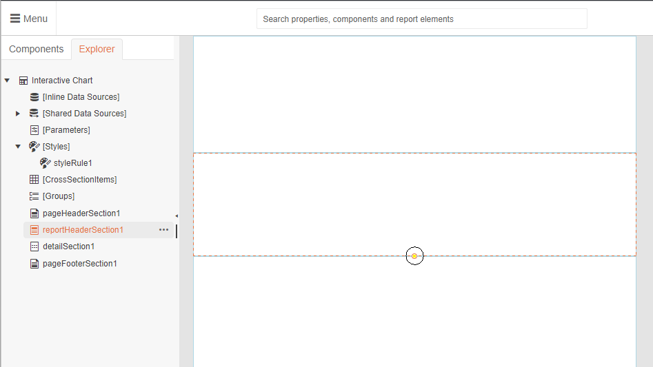
A new report initially has three sections, including a details section that repeats for every row in your data source. The case study report, however, only needs one section to display the chart and related data. The Report Header section is the perfect choice for holding a chart, so your first step is to add that section.
In the Explorer tab on the left, select the top line (it shows the name of your report). Then switch to the Components tab, scroll down to Report Sections, and click on the Report Header to add it to your report. The default size for the Report Header is too small to display my case study report, so click and drag down on the circle at the bottom of the section to make the section larger.
Two hints:
- Since you’re not going to use the Page Header and Page Footer sections, you can get rid of them: Just click on each section in the main part of the Web Report Designer and press the Delete button.
- You can’t delete the Details section but you can drag its bottom border to resize the section down to practically nothing.
Adding the Chart
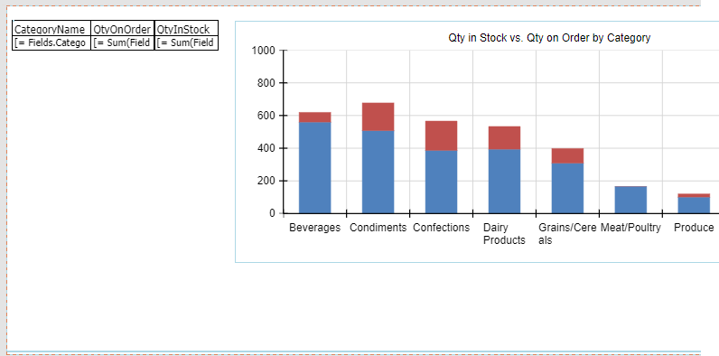
For the chart in this case study, I want a stacked column chart for each category showing both in-stock and on-order quantities. With that chart, a single glance shows both the categories with low totals (in-stock and on-order) while also breaking out how much is “in house” and how much is “on the way.”
Before adding a chart, click in your Report Header section to select it. Next, you want to find the chart component you’d like to add. The easiest way to do that might be just to use the search box at the top of the designer (especially if you’re confident that you know the name of the component you want).
Alternatively, you can switch to the Components tab on the left, scroll down to the Charts section and drag the Chart component you want into your Report Header section (I dragged a Column Chart). That will start the chart wizard in the panel on the right side of the designer.
Each chart comes with several variations, which you can select from the dropdown list at the top of the wizard (I chose Stacked Column Chart). After picking your chart type, in the Data Source dropdown list just below it, select where you’re going to pull your data from. Picking your data source will populate Data Source Fields list with the fields you can use in your chart.
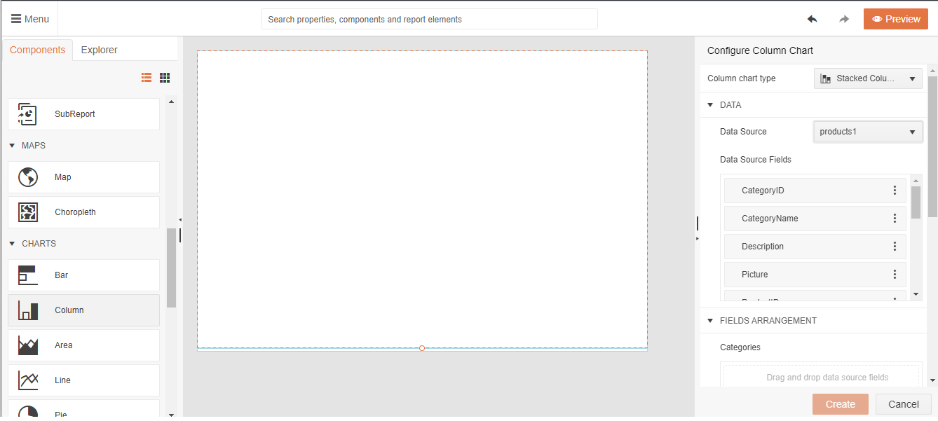
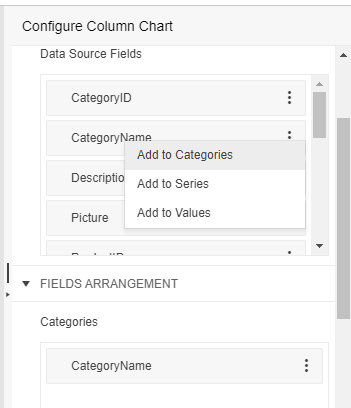
Your next step is to populate your chart with the data you want to display. If you’re going to add multiple series (as in the case study where I’m using both UnitsInStock and UnitsOnOrder), add all of the fields to the Values section of the chart. Find the field you want in the Data Source Fields section, click on the three dots on the right of the field name, and select the Add to Values option from the popup menu.
The next step is to decide how you want those values grouped by adding your “grouping” field to the Category section of the chart. Adding items to the Categories section of the chart will not only group the data but also add them to the chart’s X-axis with some separation between the groups (in the case study, I’m using the CategoryName field to group my products data). Again, find the field you want to use, click on the three buttons on its right, but this time select the Add to Categories option.
You can skip using the Series section because, as you add multiple fields to the Values section, your chart automatically creates a new series for each field.
Click the Create button at the bottom of the Wizard and you have your chart.
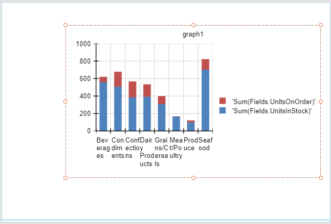
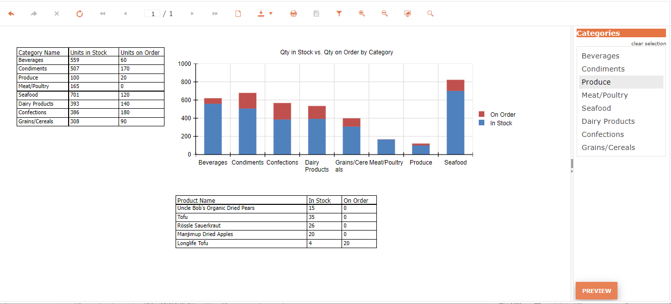
When you display your report, it’s now obvious which categories don’t have much stock either on hand or on the way (in my case study, Meat and Produce look dangerously low). The Beverages category might also be a concern: While there’s a lot of stock on hand, there’s not much on order. If there’s a lot of immediate demand for beverages expected, then you might want to increase the amount on order so that you’ve got replacement stock on the way.
Dressing the Chart
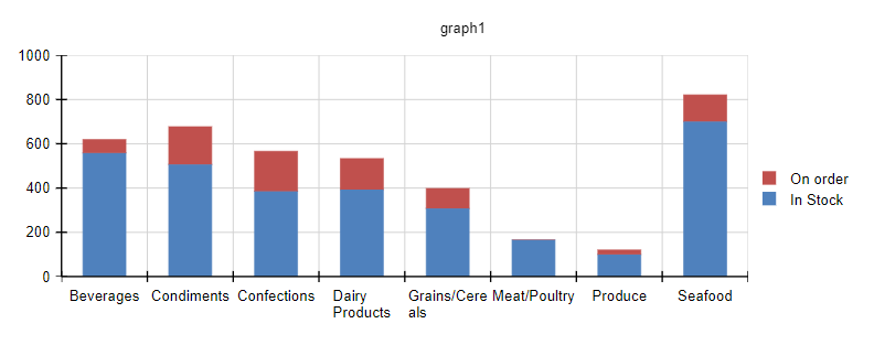
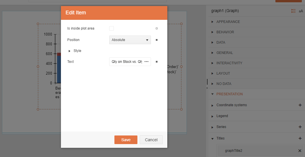
If you’re the only person using this report, you may not care particularly about how your chart looks (obviously, in the case study, I didn’t care much). On the other hand, the current version of the case study chart is taking up a lot of space on the page … but much of that space is occupied by the Legend. If I shrink the legend, I can reduce the amount of space taken up by my chart as a whole and even, perhaps, increase the size of the graphic that displays the data.
To adjust the Legend, click on your chart, and switch to the panel on the right. In that panel, expand the Presentation section and then the Series subsection. Under Series, you’ll find one tile for each series you’ve added, identified with their “internal name” (I have two tiles called barSeries3 and barSeries4 that correspond to my UnitsInStock and UnitsOnOrder fields). Clicking on a tile opens an Edit Item dialog where you can expand the LegendItem to reveal a Value property that holds your Legend’s text for the series.
The default legend text is probably longer than you want—you’ll want to replace it with something shorter (I set my LegendItem’s Values to “In stock” and “On order”). After you’ve saved your changes, you’ll find you have narrower Legend with more room for the graphic part of the chart.
Two hints:
- You can change the size of your report’s page by switching to the Explorer tab and selecting the line at the top—that causes the designer to select your whole report. You can now make your page wider by scrolling to the right in the designer and dragging on the circle in the middle of the page’s side to change your page size.
- If you do widen your page, it may not all fit into your designer window. You can zoom in/zoom out on your page with
Ctrl+andCtrl-.
One last thing: The title for this chart (“graph1”) isn’t very informative. If you’d like to change it, just search for “title” in the search box at the top of the screen. That will let you pick the Titles area for the currently selected component. If you’d prefer to navigate to the section, expand the Presentation section in the panel on the right. Expanding the Titles subsection will reveal a tile with the “internal name” for your chart. Clicking on that tile opens an Edit Item dialog. At the bottom of the dialog, you can change your report title to something better (I set mine to “Qty on Stock vs. Qty on Order by Category”).
Including Supporting Data
The next step is to add a table showing the data that supports the chart. To add a table, first click on a blank area in your Report Header section to select the header section, switch to the Components tab on the left and, from the Tables section, click on the Tables Wizard to open a helpful wizard in the panel on the right of the designer.
In the Data Source dropdown list at the top of the Wizard, select the data source you want to use. That will populate the Data Source Fields section with the fields you can use in your table. Drag each of those files into the Detail Values section right below the Data Source Fields section (I added the fields CategoryName, UnitsInStock and UnitsOnOrder).
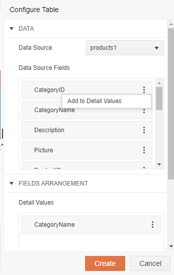
Hint: If you don’t want to drag your field, click on the three dots on the right end of each field in Data Source Fields and, from the menu that pops up, select the Add to Details Value option.
Click the Create button at the bottom of the wizard and your table is added to your report.
Two hints:
- You can change the column headers in your table by double-clicking on the header you want to rewrite (I changed mine to English phrases).
- To move your table to somewhere else on your page, first click on the table. That will display a gray border along the top and down the left side of the table. When the border appears, click in the square in the upper left corner of that border. That will display a popup menu but will also select your whole table—you can now either click in your table and drag it to a new location or use your arrow keys to reposition the table.
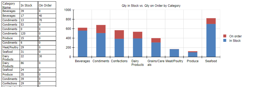
However, if you click on the Preview button to view your report, you’ll find that the data in the table isn’t summarized so it doesn’t do a good job of matching your chart. In the case study report, for example, the table shows every product while the chart is summarized by Category Name.
Fortunately, that’s easy to fix—you just need to add grouping to your table.
Grouping a Table
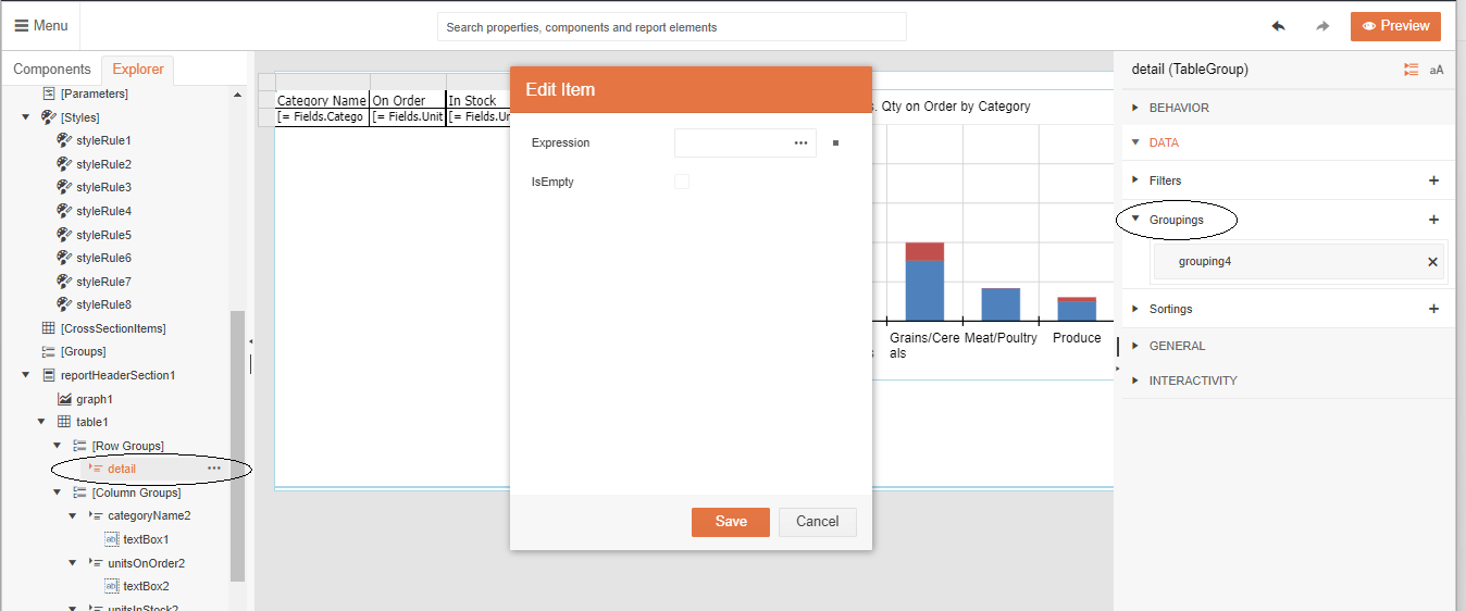
To create a group in a table, first select the table on your report. You’ll now see your table selected in the Explorer tab on the left (it’s probably called “table1”). Under the Row Groups section, click on the Details section. The panel on the right will now show the data for your table’s rows.
In the panel on the right, expand the Data section and click on the Grouping section to open an Edit Item dialog. In the Expression textbox at the top of the dialog, click on the three buttons on the textbox’s right to open an Edit Expression dialog.
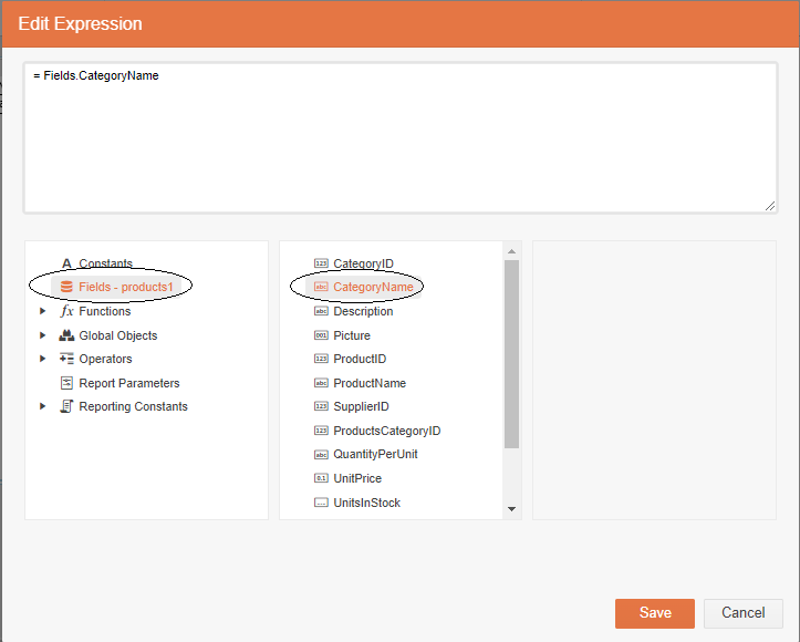
In the list in the lower left of the Edit Expression dialog, click on Fields to display a list of fields in the list box in the center of the dialog. Double-click on the field you want to use to group your table data (I selected CategoryName to be consistent with the grouping in my chart). After that, click the various Save buttons to return to your report.
Now that you’re grouping your table data, you need to specify how the other fields in your table will be summarized—do you want those fields to be totaled, to be averaged, to have the largest value extracted, the smallest value, etc.? (I wanted to total the values.)
To set the summarization, select the cell in the second row of the table with the field you want to summarize. Then, in the panel on the right, expand the Appearance section to display the cell’s Value textbox. Click on the three dots at the right end of the textbox to display an Edit Value dialog. (I started with the cell displaying my UnitsInStock field.)
In the list in the lower left of the Edit Value dialog, click on the fx Functions entry to display a list of functions in the list in the middle of the dialog. Now, double-click on the function that you want to use to summarize your field (I picked the Sum function). Then, back in the list on the left, select the Fields list to display your table’s fields. In the list of fields, double-click on the Field you want summarized (I selected UnitsInStock).
Repeat that process for each of your table’s columns (in my table’s other column, I selected the Sum function again and the UnitsOnOrder column). Now, when you press the Preview button, you’ll get a report with a table of summarized data.
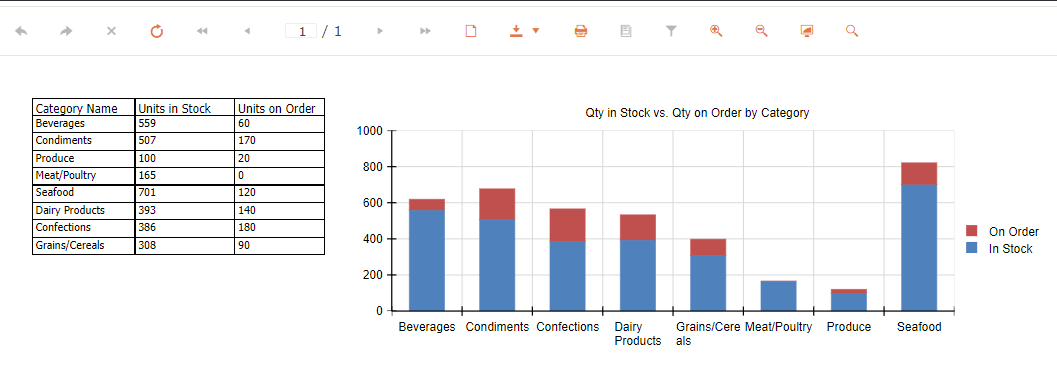
With this design, after using the chart to identify potential problem data, a user can use the table of summarized data to confirm whether an additional order is required. The table data shows, for example, that there is nothing on order for the Meat category. Unless we’re giving up on selling meats, placing an order or two in this category seems like a good idea. The table data also shows that the beverages order is only about 10% of the quantity in stock. That seems risky, so doubling the quantity on order to 120 units might be a smart move.
Displaying the Detail Data
In my case study, after a user identifies a problem category, the user will want to look at individual products to decide what to order. The report designer gives you several ways to do that. You could, for example, create a crosstab report that would let you drilldown to the detail data. Alternatively, you can add a second table that shows product data but filters the data to show only the products in a selected category (this process is almost identical to filtering data displayed in a chart).
That requires adding three things to this report:
- A table to show the detail data (in my case, every product with its units in stock and units on order)
- A Report Parameter that lets the user select the detail data they need (in my case, a parameter that lets me select a category)
- A filter that uses the parameter to limit the detail data in the table to the value in the report parameter (in my case, limiting the detail data to one category)
Adding the Table
Creating a second table to your report looks very much like adding your first table: Use the Table Wizard and create a table with the fields you want in your detail (I picked almost the same fields as before: I added ProductName instead of CategoryName but still used UnitsInStock and UnitsOnOrder). Since, this time, you want to show the detail data, you don’t have to group the data.
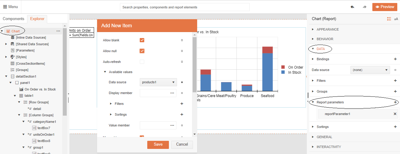
Adding the Report Parameter
To create the Report Parameter, switch to the Explorer tab on the left and select its top line. In the panel on the right, expand the Data section and find the Report Parameters item. To add your Report Parameter, click on the plus sign at its right to display an Add New Item dialog.
In this dialog, you need to set multiple items:
At the top, select Allow Null so that the parameter won’t filter any data when the report is first displayed and the user hasn’t yet selected a filter (in my case study, that will be when the user hasn’t yet selected a category).
Expand the Available values section to provide the user with a list of values to select (in my case study, I want to display a list of CategoryName values). In this section:
- Set the data source to where you’ll find the values the user can select from (in my case, that’s still the products table).
- Click on the three dots on the right the Display Member textbox and, in the Edit Display member dialog, under Fields select the field you want to show to the user to help them make the right selection (in my case, I want to display the CategoryName field).
- Repeat for the Value Member. For the Display Member you should pick a field with values the user will recognize, but, for the Value field, you should pick the field you’ll use when filtering the data (in my case, I picked CategoryName for both, but I could, for example, have used CategoryId as my Value Member).
Set the Name property to some value that you’ll recognize later when you create your filter (I used CategoryParameter).
Set the Text property to a useful heading for the list of value (I used “Categories”).
Set the Type dropdown list to the kind of data the user will be selecting (e.g., date, number, etc.—I selected String because category names are text).
At the bottom of the dialog, check the Visible property so that the list of values will be displayed to the user so the user can select a filter value while viewing the report.
Click the Save button.
Creating a Filter for a Table or a Chart
Finally, you can add a filter to your table you need to first click on the table and then, when its border appears, click in the square in its upper left corner to select the table. If you’re adding a filter to a chart, just click on the chart to select it. With the table selected, in the panel on the right, expand the Data section to display the Filters item. Click on the plus sign at its right to display an Add New Item dialog.
In this dialog, set the Expression to the field you want to filter on by clicking on the three dots at the end of the textbox. In the resulting Edit Expression dialog, select the Fields list from the box on the left and double-click on the field you want from the list in the middle (I selected CategoryName).
In the Operator dropdown list, select how you want the field to be compared to the selected value. In my case, I want the CategoryName field to match the value to be selected, so I chose Equal.
In the Value textbox, select what you want the field select to be compared to by clicking on the three dots at the right (this will open an Edit Value dialog). You want to use your parameter to filter the data so select the Report Parameters item
in the list on the lower left of the dialog which will display two items for every Report Parameter you’ve set up in the list in the center of the dialog. Find the parameter you want to use and double click on its *<parameter name>*.Value entry (I selected CategoryParm.Value).
Click the various Save buttons to return to your report and then click the Preview button to see what you’ve created. You’ll now find that you have a list on the right of side of your report (in my case, a list of CategoryName values). When the user selects one of those values and clicks the Preview button at the bottom of the page, the data in the table (or chart) will update to reflect the filtered data.
With this in place, a user interacting with the case study report can select the Produce category on the right and click the Preview button to see the selected detail. My user can, for example, select the Produce category and see that orders need to be placed for every product except LongLife Tofu.
As you can see, you can create the reports that you need and those reports can be more than a list of “dumb data”: You can create charts that show critical factors at a glance, combine that chart with summary data that provides key information, and build in the interactivity you want to get to the detail you need.
And the best part? Your report will be waiting for you when you come back to work with this application.
Special thanks to Ivan Hristov, whose knowledge (and ability to communicate it) made this post possible.
Ready to Take Advantage of Embedded Reporting?
Progress Telerik Reporting provides all the tools you need to embed the rich, interactive reports your users need in order to analyze and understand their data right into your users’ applications (including letting your users export the results into more than 15 formats, either to distribute or integrate with other analysis tools). Telerik Reporting then lets you go further and empower your users with a fully functional Web Report Designer to create the reports they want without ever leaving the applications where they’ll use their reports.
You can leverage these easy-to-use tools in both any client-side web application environment (HTML5/JS, Angular, React, Vue or Blazor) and any .NET application (web or desktop: ASP.NET Core, ASP.NET MVC, ASP.NET AJAX, WinForms and UWP).
If you still have not tried it, you can start a free trial to take a closer look. A renowned support service and an array of resources will help you along the way.

Peter Vogel
Peter Vogel is both the author of the Coding Azure series and the instructor for Coding Azure in the Classroom. Peter’s company provides full-stack development from UX design through object modeling to database design. Peter holds multiple certifications in Azure administration, architecture, development and security and is a Microsoft Certified Trainer.
Related Posts
Comments
All articles
Topics
Web MobileMobile
Desktop
Design
Productivity
People
