
A Quick Guide to the Embedded Web Report Designer

Summarize with AI:
What does Telerik Embedded Web Report Designer do? Everything you need to build the reports you need in your applications. Here’s how.
The Progress Telerik Web Report Designer lets you embed reports inside a web-based application, without leaving the application where you’ll use that report.

Starting Your Report
The application developer will provide a way for you to open the Report Designer from your application. Once you’ve opened the designer you can modify an existing report that’s associated with the application or create a new report.
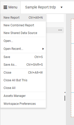
To start a new report, click on the hamburger menu in the upper left corner of the Report Designer (it’s labeled “Menu”), click the New Report menu choice, give your report a name in the Create a Report dialog and click the dialog’s Save button.
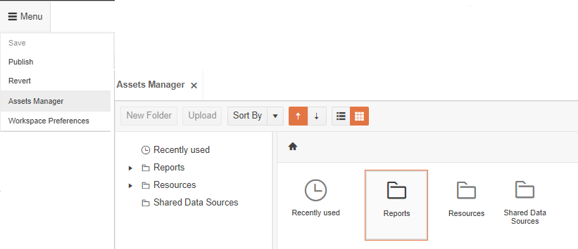
To get to all the reports associated with your application, open the hamburger menu in the upper left corner of the report designer (the one labeled “Menu”) and select Assets Manager. Assets Manager will open, displaying a treeview on the left and a set of graphics on the right—both show the folders that your resources are organized into. Now, just drill down through the Reports folder to see all the reports associated with your application.
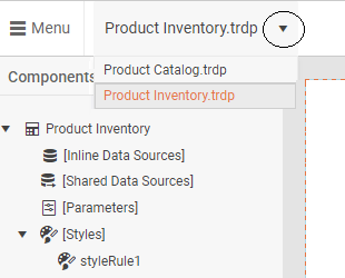
If you want to pick up and carry on with a report you worked with earlier, just click the dropdown button by the name of the currently displayed report to get a list of recent reports.
Whichever method you pick, once you’ve found the report you want to modify, just click on it to open it in the designer (if you used Asset Manager, you can close Asset Manager by clicking the X to the right of the Asset Manager label in the upper left corner).
For more on creating a report, see Creating Your Own Reports in Your Applications: Getting Started with the Telerik Web Report Designer.
Getting to Data
The developer who created your application will have set up one or more data sources for you to use in your report. To see those data sources, click on the Explorer tab in the panel on the left of the main designer window, just below the hamburger menu.
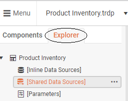
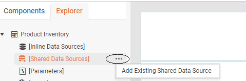
In that tab, find the Shared Data Sources Option and click on the three dots to its right to show the Add the Existing Shared Data Source menu choice. That will give you a display of the data sources available for you to use (you can also create a new data source if you need to).
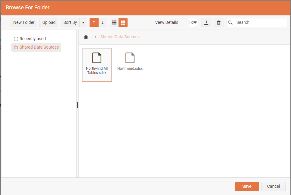
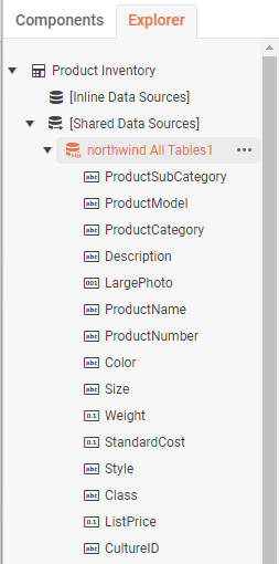
Once you’ve selected your data source, it will be added to the Shared Data Sources node in the Explorer tab.
For more on creating a report, see Getting Started with Web Report Designer.
Adding Data and Headings
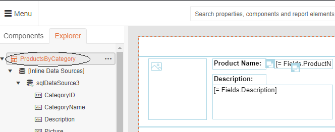
By default, your report page is divided into a header, a detail and a footer section. The detail section is the one you’ll use most because it’s repeated once for each row in your report. You can add fields from your data source to any of those sections, just by dragging a field from your data source in the designer’s Explorer tab and into one of your report’s sections.
![A graphic of the Explorer TreeView on the left with a field named ProductName under the Northwind All Tables node highlight. A curved line leads from it to the right, up to a floating box containing the text ProductName and down to the middle section of the report area where a TextBox containing =[Fields.ProductName] appears in the report.](https://d585tldpucybw.cloudfront.net/sfimages/default-source/blogs/2023/2023-05/embedded-designer-user-guide-10-drag-drop-field.png?sfvrsn=121c0faf_3)
The report designer will create an appropriate control in the report to display your field’s data, based on the data type of the field (e.g., the designer will create a TextBox to display a text field or a PictureBox to display an image field).
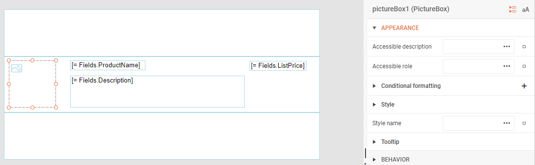
Once you’ve added a control to your report, you can use the control’s properties (displayed in a panel on the right of the designer window) to set how your data is displayed.
For more on adding data to your report (including adding calculated fields and formatting the display) see Adding Data and Text to Your Report in the Telerik Web Report Designer.
Adding Group Headers and Subtotals
You can also group the data in your report both to help you find what you want and to calculate group subtotals. When you select a field to group your data, the report will automatically sort your data by that field and add a group header and footer for the group.
To identify your grouping field, first select the name of your report at the top the of Explorer tab.
Then switch to the panel to the right of the designer and expand the Data section.
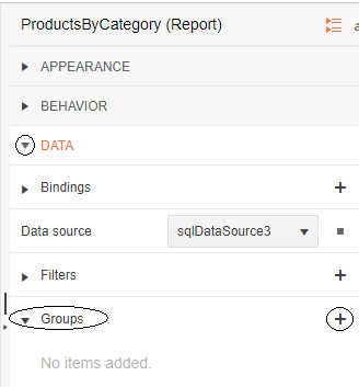
Now click on the plus sign to the right of Groups header to display an Add New Item Dialog.
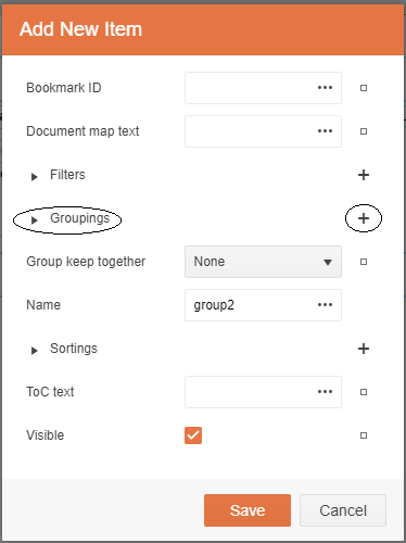
In this Add New item dialog, click on the plus sign to right of Groupings property to display another Add New Item dialog.
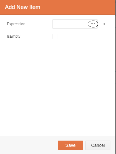
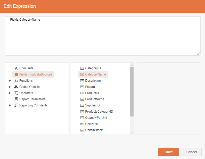
Click on the three dots to display the Edit Expression dialog and select your grouping field by double clicking on the field you want to use to group your data.
When you save your changes and return to your report, you’ll find a group header and footer added to your report.
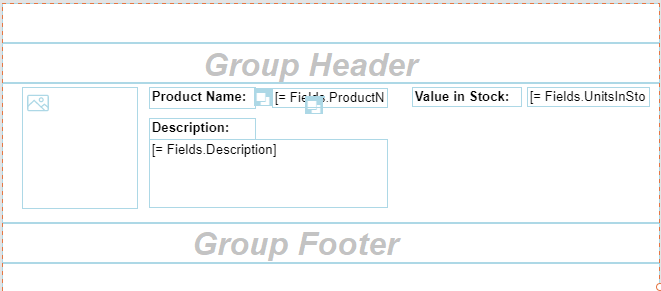
To add a label to your group header to display the group field’s value when the group changes, first drag a TextBox from the Components tab to the left of the designer window onto your group header.
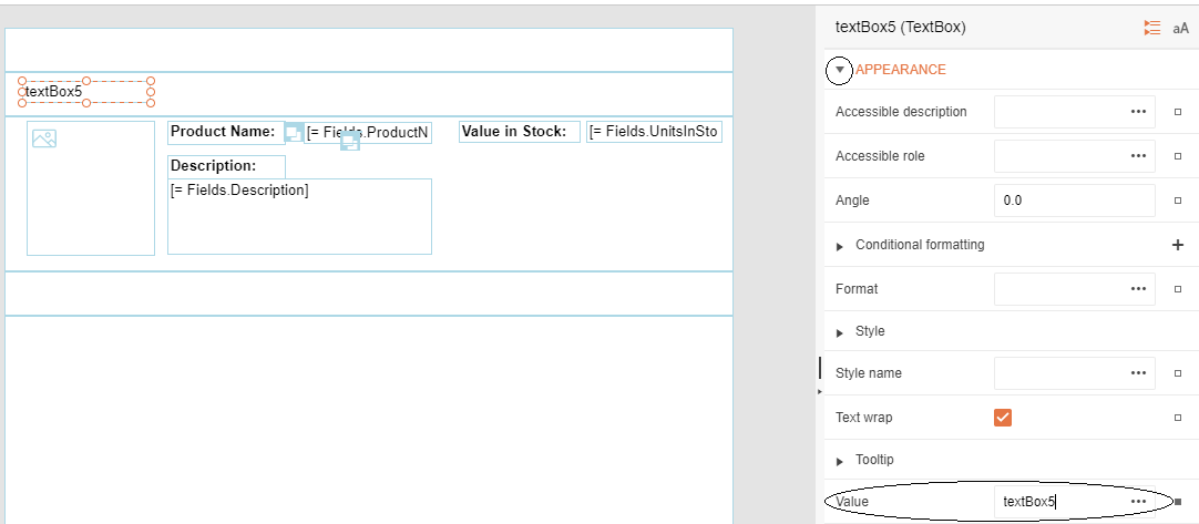
Then, in the panel on the right, expand the Appearance section and click on the three dots to the right of the Value property to get to open the Edit Value dialog. In the Fields section of that dialog, double-click on the field you want to display in your TextBox.
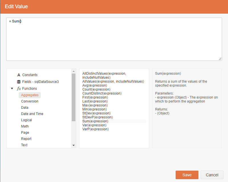
To add a subtotal to your group footer, drag a TextBox from the Components tab to the group footer. In the panel on the right, expand the Appearances section and click on the three dots beside the Value textbox. In the fx Functions section of the resulting Edit Value dialog, double-click on one of the aggregation function (e.g., Sum or Average) and then, from the Fields section, double-click on the field you want to use in your subtotal.
For more on working with grouping see Adding Group Headers and Subtotals with the Embedded Web Report Designer.
Managing Your Data
You can also control what data is included in your report by adding a filter. You can use the filter to select the data in your report when you create it or to filter data while viewing your report.
To add a filter, first select your report at the top of the Explorer tab.
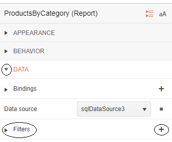
In the panel on the right, expand the Data section to show the Filters section. Click on the plus by the Filters property to display the Add New Item dialog and click on the three dots by the Display textbox.
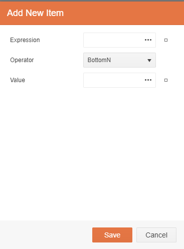
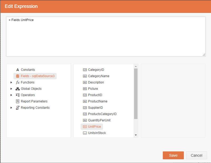
In the resulting Edit Expression dialog, click on the Fields item and then double-click on the field you want to use to filter your data. Click on the Save button to close this dialog.
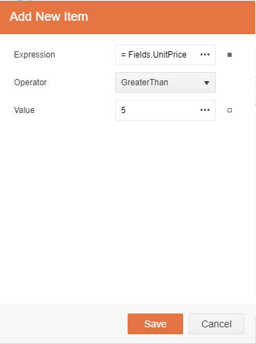
Back in the Add New Item dialog, select an operator from the Operator dropdown list and set a value in the Value textbox to finish creating your filter. The data in your report will now be filtered according to your filter’s settings.
You can also dynamically filter the data in your report while viewing the report by adding a parameter. Again, in the Explorer tab, select your report and, in the panel on the right, expand the Data section.
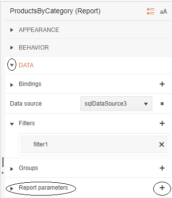
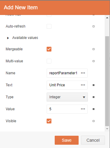
Now click the plus sign to the right of the Report Parameters property to display its Add New Item dialog. In the dialog, set the Text property to something that describes the parameter, set the Type dropdown list to the type of data you’ll be using in your filter, set the Value property to some initial value, and check the Visible checkbox to have your parameter displayed when viewing your report.
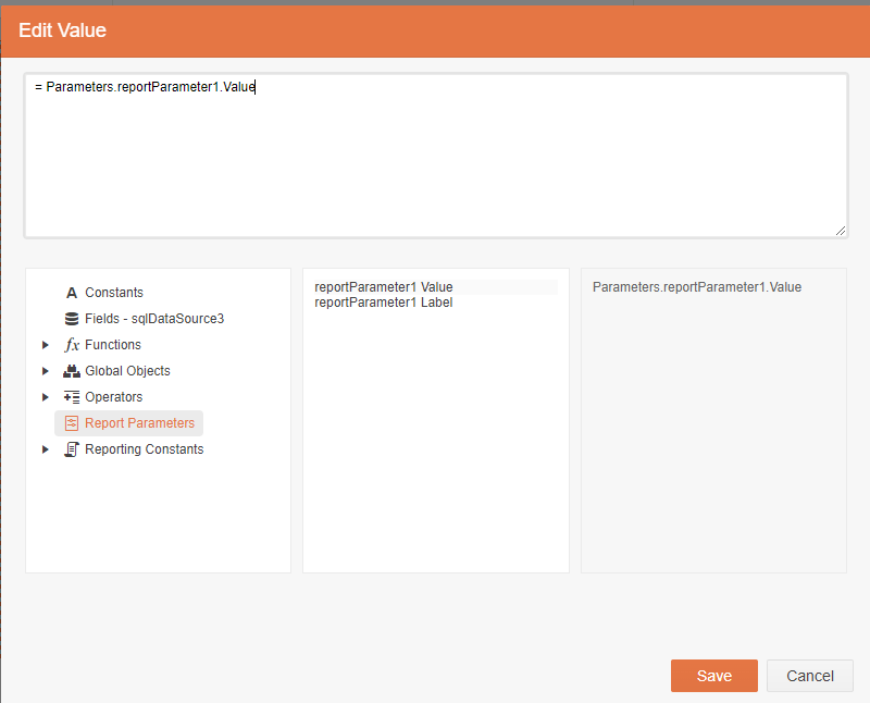
The final step is to modify a filter to use a report parameter. In the panel on the right, expand the Data section to reveal the Filters property, then expand the Filters property and double click the filter you want to modify. Click on the three dots to the right of the Value property and, in the Edit Expression dialog, click on the Report Parameters list to see the parameters you’ve created. There are two entries for every parameter—double-click on the value entry for the report parameter you want your filter to use to select that parameter.
Now, when you’re viewing your report, you’ll get a list of parameters on the right side of your report that you can use to dynamically filter the data displayed.
For more on working with filters see Filtering Your Report’s Data at Design Time and Run Time with the Embedded Web Report Designer.
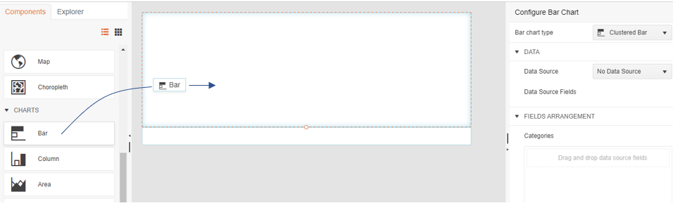
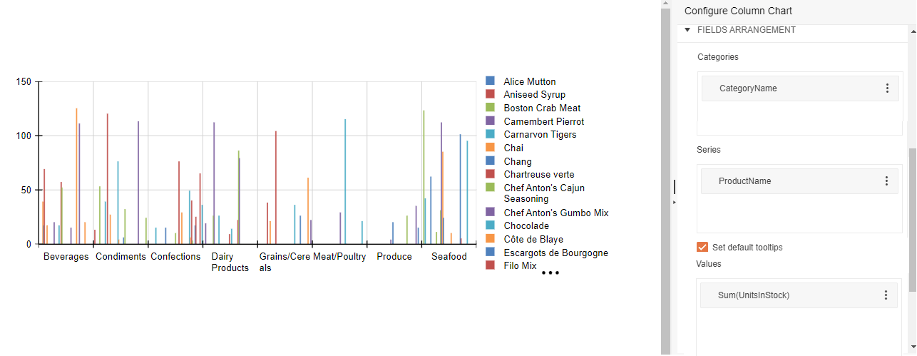
Charts
To add one or more charts to your report, switch to the Components tab on the left of your designer and drag one of the charts into the details section of your report. This will start the chart configuration wizard that will let you select the chart’s data source, both of the values to be used to generate the graph, how you want any values to be summarized, and even the categories for grouping your data.
You can add as many charts as you need to support making decisions in your application (sometimes you just need a lot of charts).
The charts you add are also integrated with the rest of the report designer’s functionality. For example, you can use the Report Designer’s filters and parameters to let you pick the data you want to display in the chart while you’re viewing your report.
For more on adding charts, see Adding Charts to Reports in the Embedded Web Report Designer.
There’s lots more that you can do with the Embedded Web Report Designer, of course, but these are the basics for creating report you need with the information you want, embedded in the application where you need it. In other words: Everything you need to get started in creating your ideal report.
Embedded Reporting?
Progress Telerik Reporting provides all the tools you need to embed the rich, interactive reports your users need in order to analyze and understand their data right into your users’ applications (including letting your users export the results into more than 15 formats, either to distribute or integrate with other analysis tools). Telerik Reporting then lets you go further and empower your users with a fully functional Web Report Designer to create the reports they want without ever leaving the applications where they’ll use their reports.
You can leverage these easy-to-use tools in both any client-side web application environment (HTML5/JS, Angular, React, Vue or Blazor) and any .NET application (web or desktop: ASP.NET Core, ASP.NET MVC, ASP.NET AJAX, WinForms and UWP).
If you still have not tried it, you can start a free trial to take a closer look. A renowned support service and an array of resources will help you along the way.

Peter Vogel
Peter Vogel is both the author of the Coding Azure series and the instructor for Coding Azure in the Classroom. Peter’s company provides full-stack development from UX design through object modeling to database design. Peter holds multiple certifications in Azure administration, architecture, development and security and is a Microsoft Certified Trainer.
Related Posts
Comments
All articles
Topics
Web MobileMobile
Desktop
Design
Productivity
People
