
Integrating Code with the Telerik UI for Blazor Form Component

Summarize with AI:
A key feature of the Blazor TelerikForm is how easy it makes adding functionality. But, if you’re willing to go a little bit further, you can also add your own custom validation.
The Progress Telerik UI for Blazor Form component makes it easy to add a form to your Blazor page, control its layout and provide basic validation by leveraging data annotations. And the TelerikForm makes it equally easy to integrate your own code into your form to either add additional functionality or to extend the form with custom validation.
Saving Data
Obviously, the first code you’ll want to integrate into your TelerikForm is what’s required to save the data the user entered (which will be in the object you’re passing to the TelerikForm’s Model attribute).
The first step is to tie a method to the form’s OnSubmit event to catch the user clicking on the form’s default submit button. After that, you need to set up a variable in your code that references your TelerikForm. This example ties the OnSubmit event to a method called DoUpdate and the TelerikForm to a field or property called form:
<TelerikForm Model="@customer"
                        OnSubmit="@DoUpdate"
                        @ref="@form" >
In the code section of your Blazor page, you need to define the field or property you tied to the form (the field or property has to be of type TelerikForm). This example sets up a field called form to match the name used in the ref attribute:
@code {
   private TelerikForm form;
After that, you need to define the method tied to the TelerikForm’s OnSubmit event. In that method, you first need check to see if any validation checks failed by calling the form’s IsValid method—you’ll use the ref field/property you just set up. That means that your method will typically have two parts: After calling the form’s IsValid method, the code will either do the update or display an error message.
The skeleton of a typical OnSubmit method will look like this:
private void DoUpdate()
{
    if (form.IsValid())
    {
        //…update data store with the object in the customer property…
    }
   else
   {
      //…display a message saying that no updates were performed
   }
}
Splitting Responsibilities
Of course, having the OnSubmit method do two things (handle both updates and failures) violates the Single Responsibility Principle: Every part of your application should do one thing well. To avoid that dual responsibility, you can, instead, use the TelerikForm’s OnValidSubmit and OnInvalidSubmit events.
The method you attach to the OnInvalidSubmit event will be called whenever any validation fails. The method tied to the OnValidSubmit will only be called if no validation fails. That separation eliminates the need to call the component’s IsValid() method and, as a result, the need to define a reference to the TelerikForm element.
Putting that all together means that a revised TelerikForm element that uses OnValidSubmit and OnInvalidSubmit just needs to tie methods to those two events like this:
<TelerikForm Model="@customer"
                        OnValidSubmit="@Update"
                        OnInvalidSubmit="@NotifyFail">
The skeletons of the resulting methods would look like this:
private void Update()
{
       //…update data store with the object in the customer property…
 }

private void NotifyFail()
{
     //…display a message saying that no updates were performed…
 }
You don’t have to use both OnValidSubmit and OnInvalidSubmit, but if you use either of them then you can’t use the OnSubmit event.
Adding Functionality
By default, the TelerikForm adds a submit button to your form. You might want to include additional buttons to support additional functionality—a delete or a clear form button, for example.
You add your own buttons by first nesting a ButtonGroup element inside your TelerikForm element. That suppresses the automatically generated Submit button, so you’ll need to add a button to trigger a submit to your form. As a result (and using a TelerikButton to trigger a submit), a minimal ButtonGroup will look like this:
<FormButtons>
    <TelerikButton ButtonType="@ButtonType.Submit"
                               ThemeColor="primary">
       Submit
   </TelerikButton>
</FormButtons>
Setting the ThemeColor lets you pick up the styling set up for your project (assuming you picked a theme when you configured your project).
You can now add more buttons, tying each of them to some new method through their OnClick attribute. The following example sets up a button that will call a method to clear the form. You’ll want to make sure that any new button’s type is set to Button so that clicking these buttons will not trigger a submit:
<FormButtons>
    <TelerikButton ButtonType="@ButtonType.Submit">
      Submit
    </TelerikButton>
    <TelerikButton ButtonType="ButtonType.Button"
                               OnClick="@ClearForm">
       Clear
     </TelerikButton>
</FormButtons>
To clear the form, all you need to do is update the object driving the form with an uninitialized version of the object. Since the case study’s Model property is using a Customer object (through the page’s customer property), a “clear form” method just has to put a new Customer object into the customer property (including initializing any objects nested inside that class, like the Address object used by the Customer class’s ShipAddress property).
In the case study, the clear form method looks like this:
private void ClearForm()
{
    customer  = new Customer
        {
            ShipAddress = new Address()
        };
}
Extending Validation
The data annotations that you add to the properties in the class that drives your form give you a good start on validating your users’ input … but it’s probably not all the validation you’ll need. One solution is to create your own data annotation validators by creating a custom validator. However, creating a custom validator only makes sense if you can see yourself using that validation logic in several different places.
If the validation makes sense only for this form and not everywhere the class is used, then a better strategy is to include the additional logic as part of the form. In that case, you may want to investigate Jeremy Skinner’s FluentValidation and Chris Sainty’s Blazored.FluentValidation which integrates fluent validation with Blazor.
You’ll need to add the NuGet packages for both components to your Blazor application to use them. Once you’ve added those NuGet Packages, you can have your TelerikForm use the FluentValidationValidator by nesting it inside the TelerikForm’s FormValidation element. The FluentValidationValidator must have a Validator attribute that points to a field or property in your code section. Something like this would work:
<TelerikForm Model="@customer"
                        OnValidSubmit="@Update"
                         OnInvalidSubmit="@NotifyFail">
    <FormValidation>
        <FluentValidationValidator Validator="@cvalid"></FluentValidationValidator>
    </FormValidation>
In your app’s code section, that field or property must be loaded with a custom fluent validator class. This code declares a field called cvalid and loads it with a custom CustomerValidator class:
@code {
    CustomerValidator cvalid = new CustomerValidator();
A custom validator class is just a class that inherits from AbstractValidator (customized to work with the class driving your form) and contains a constructor. Here’s a typical skeleton:
public class CustomerValidator : AbstractValidator<Customer>
{
    public CustomerValidator()
    {
    }
}
You can now add your custom validation code into the custom validator’s constructor by passing a lambda expression to the RuleFor method provided by the fluent validator package. Fluent validation provides a number of predefined validations, but chaining the Must method to the RuleFor method allows you to write whatever validation code you want. Further, chaining the WithMessage method to the Must method allows you to specify the error message to display when your rule finds a problem.
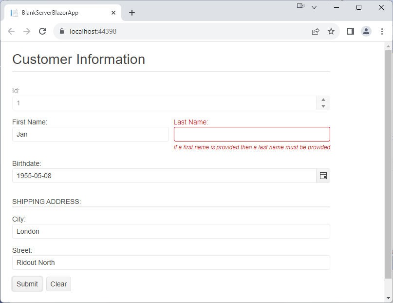
This example requires the Customer’s LastName property to have a value if the FirstName property has a value:
 public CustomerValidator()
 {
    RuleFor(c => c.LastName).NotEmpty()
                                                  .When(c => c.FirstName != "")
                                                  .WithMessage("If a first name is provided then a last name must be provided");
}
By itself, fluent validation ignores any validation done through data annotations. However, you can use the fluent validator with either the DataAnnotationsValidator or the ObjectGraphDataAnnotationsValidator to integrate data annotation-based validation. This TelerikForm combines the DataAnnotationsValidator with the FluentValidationValidator, for example:
<TelerikForm Model="@customer"
                        OnInvalidSubmit="@NotifyFail"
                        OnValidSubmit="@Update”>
    <FormValidation>
        <DataAnnotationsValidator></DataAnnotationsValidator>
        <FluentValidationValidator Validator="@cvalid"></FluentValidationValidator>
    </FormValidation>
Leveraging both validators can be a sensible strategy. You can use data annotations in the class to implement simple validation that applies wherever a class is used. You can then use fluent validation for addition validation that’s applied within a specific form. Since you can also share fluent validators among projects, you can use fluent validation to support more complex validation than is possible with data annotations across several projects.
The TelerikForm will display all the validation messages generated by any validators that you use.
Displaying Validation Messages
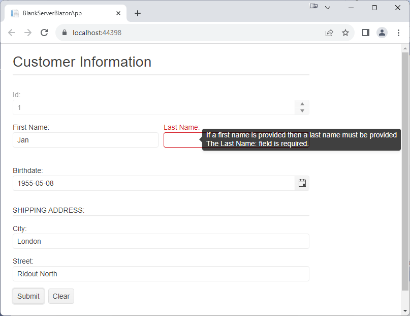
By default, the validation message appears below the input control, but you can change that. You can, for example, set use the TelerikForm’s ValidationMessageType attribute to FormValidationMessageType.Tooltip to have messages displayed in a tooltip (any input control with an error will still be displayed in red):
<TelerikForm Model="@customer"
                        OnValidSubmit="@Update"
                       OnInvalidSubmit="@NotifyFail"
                       ValidationMessageType=FormValidationMessageType.Tooltip>
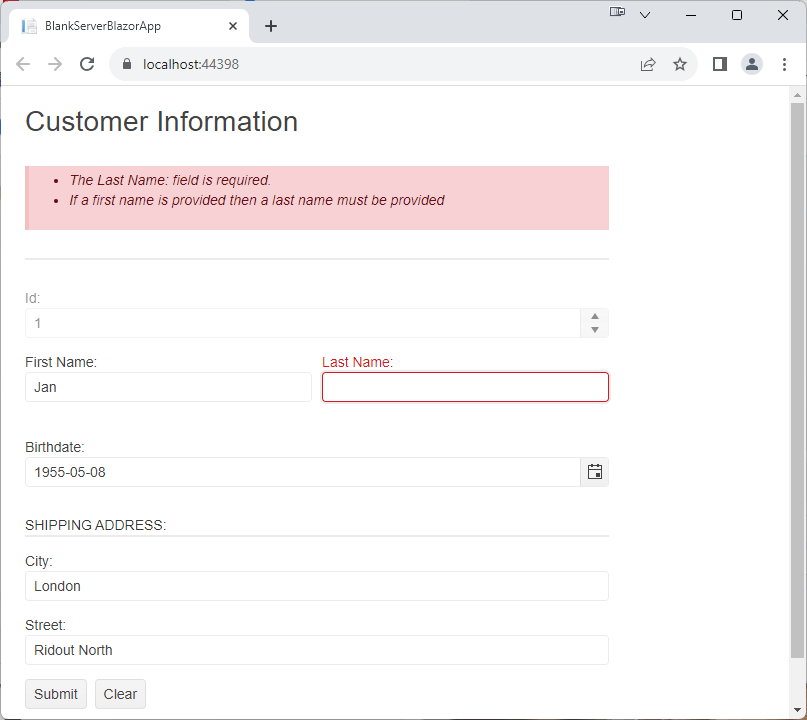
You can also set the ValidationMessageType to none to suppress messages on the control itself—any control with an error will still be highlighted in red. With this option, it would probably be a good idea to add a ValidationSummary component inside the FormValidation element to display all the errors generated in the form.
<TelerikForm Model="@customer"
             OnInvalidSubmit="@NotifyFail"
             OnValidSubmit="@Update"
             ValidationMessageType=FormValidationMessageType.None>
    <FormValidation>
        <DataAnnotationsValidator></DataAnnotationsValidator>
        <FluentValidationValidator Validator="@cvalid"></FluentValidationValidator>
        <TelerikValidationSummary></TelerikValidationSummary>
    </FormValidation>
All by itself, the TelerikForm gives you the ability to generate a data entry form quickly. Combining the TelerikForm with your own code lets you add any additional functionality you need to your form and to extend your data validation.
Try Telerik UI for Blazor
Try out the Form component, plus more than 100 other truly native, easy-to-customize Blazor components to cover any requirement. Try Telerik UI for Blazor for free with a 30-day trial and enjoy industry-leading support.

Peter Vogel
Peter Vogel is both the author of the Coding Azure series and the instructor for Coding Azure in the Classroom. Peter’s company provides full-stack development from UX design through object modeling to database design. Peter holds multiple certifications in Azure administration, architecture, development and security and is a Microsoft Certified Trainer.
Related Posts
Comments
All articles
Topics
Web MobileMobile
Desktop
Design
Productivity
People
