
Blazor Forms Without Tears Using Telerik UI for Blazor Form Component
 by Peter Vogel

Summarize with AI:
You can add a Blazor form to your page in less than a minute (and then you can start taking advantage of the customization options).
The Form component from Progress Telerik UI for Blazor lets you add a complete, fully functional form to your Blazor page with five lines of mark up and one line of code—after that, you just have to add whatever code you need to handle updating your data store. But the TelerikForm goes beyond that to give you the tools you need to create the form layout that you want (or not, if you’re happy with that initial form).
Your First Form
First things first: After creating your Blazor project, to use the TelerikForm component, confirm that you have the Telerik UI for Blazor package added to your project. Once that package is added, you can simplify your coding life by making sure that your project’s _Imports.razor file has these statements:
@using Telerik.Blazor
@using Telerik.Blazor.Components
The simplest way to ensure both of those things are in place is, in Visual Studio, to create your project by selecting the Extensions | Telerik | Telerik UI for Blazor menu choice and working through the resulting wizard to both create and configure your project.
To create your initial form, you need five lines of markup: Add the TelerikForm component to the UI portion of your Blazor page, nest a FormValidation element within the TelerikForm element and, within that element, add a DataAnnotationsValidator. The final result will look like this:
<TelerikForm>
  <FormValidation>
      <DataAnnotationsValidator />
  </FormValidation>
<TelerikForm>
But, you say: Where do I specify my input element—my input boxes and dropdown lists? This is where the TelerikForm component takes care of you: It will generate those for you. All you have to do is use the TelerikForm Model attribute to tie your form to an instance of the class you want your form to handle.
Updating the TelerikForm element to tie the Model attribute to a field or property called customer looks like this:
<TelerikForm Model="@customer">
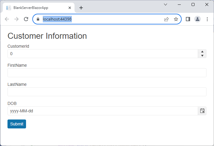
All that’s left for you to do is to load an instance of the class that you want handled by the form into that field or property. This example defines a property called customer and loads an uninitialized Customer object into it:
@code {
   public Customer customer { get; set; } = new Customer();
Now, run your application and you’ll find you have a form that generates input controls for all the properties on your class in six lines of code:
While this is a good start, you’ll probably want to do more than this (the labels in this default form probably aren’t good enough, for example). But that’s just a matter of taking advantage of two features: data annotation attributes to the properties of the class tied to the form and options within the TelerikForm component.
A side note on some additional tweaks made for this case study: The sample form is in its own .razor file named CustomerForm and customer property is flagged as a parameter, like this:
@code {
   [Parameter]
   public Customer customer { get; set; } = new Customer();
That lets you invoke the form as a component and pass a customer object to it from anywhere in your Blazor application with markup like this:
<h2>Customer Information</h2>
<CustomerForm customer="@cust"></CustomerForm>
With this structure, if you pass an initialized Customer object to the CustomerForm’s customer parameter, the form will display with the input controls filled in with the object’s data, ready to accept updates. If you pass nothing to CustomerForm (or pass an uninitialized Customer object), the user gets an empty form, suitable for adding a new customer.
Enhancing the Form
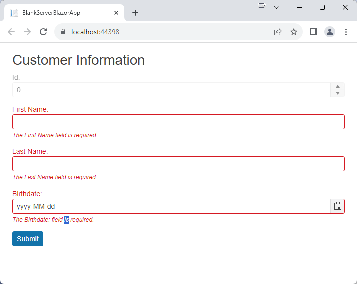
The first thing you notice when looking at the default form is that the labels are obviously just the Customer class’s property names and aren’t suitable for users.
If you work with the form, you’ll also discover that there’s no validation being applied by default—users can enter pretty much anything they want thing the limits of the property’s data type. You can address both of those issues by adding DataAnnotations to the class that’s driving your form.
Here’s a version of the Customer class used with this form but with some DataAnnotations decorating the properties:
public class Customer
 {
     [Editable(false)]
     [Display(Name = "Id:")]
     public int CustomerId { get; set; }

     [Required]
     [MaxLength(20)]
     [Display(Name = "First Name")]
     public string FirstName { get; set; }

     [Required]
     [MaxLength(25)]
     [Display(Name = "Last Name")]
     public string LastName { get; set; }

     [Required]
     [Display(Name = "Birthdate:")]
     public DateTime? DOB { get; set; }

     public Address ShipAddress { get; set; }
 }
The TelerikForm picks up all those annotations so that you not only get better labels but also the validation specified in the class’s data annotations:
If you’re not happy with what’s generated by a combination of the form’s default and your data annotations, you can enhance your input controls by using the TelerikForm’s FormItem (a FormItem element has to be nested inside a FormItems element).
This can be useful if you have a form that needs to deviate from some of the data annotations set on the object’s properties—if, for example, in this form you need to give the user the ability to enter a customer ID that the data annotations on the class have disabled (or if you just want to supply a different label than is specified in the class’s Display attribute).
By default, if you supply a FormItem for any of the class’s properties, the TelerikForm won’t autogenerate any controls for the rest of the properties. That can be useful if you want to suppress some of the properties on the form—you can just provide FormItems for the properties you do want. This example displays just the FirstName and LastName properties using the default settings set by the data annotations:
<TelerikForm Model="@customer">
    <FormValidation>
        <DataAnnotationsValidator></DataAnnotationsValidator>
    </FormValidation>
    <FormItems>
        <FormItem Field="FirstName" />
        <FormItem Field="LastName" />
    </FormItems>
</TelerikForm>
However, if what you want is to enhance just a few of default controls and keep the rest, you can use the FormAutoGenerated element inside the FormItems collection to have any properties you want to leave “as is” to continue to be automatically generated.
Here, for example, a FormItem is being used to override the disabled option for the CustomerId property (specified in the FormItem’s Field attribute) with a FormAutoGeneratedItems to ensure the rest of the controls continue to be generated:
<TelerikForm Model="@customer">
    <FormValidation>
        <DataAnnotationsValidator></DataAnnotationsValidator>
    </FormValidation>
    <FormItems>
        <FormItem Field="CustomerId"
                             Enabled=true>
        <FormAutoGeneratedItems></FormAutoGeneratedItems>
    </FormItems>
</TelerikForm>
Other options on the FormItem let you change the label text, set the resulting HTML’s Id attribute (presumably to support integrating with JavaScript code), change the type of control provided to the user, or provide a hint to the user on what to enter.
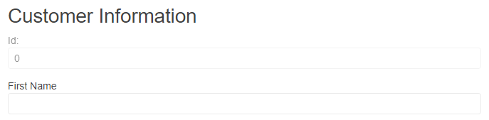
These options can be used together, of course. If, for example, you’d prefer that the disabled CustomerId property was displayed as a simple textbox, you can do that with a FormItem. This example sets the type of CustomerId to string and swaps in a textbox to simplify the CustomerId display (and this example doesn’t override the data annotation that disables the control):
<FormItem Field="CustomerId"
                     FieldType=typeof(string)
                     EditorType="FormEditorType.TextBox">
</FormItem>
And that does give a cleaner display:
If those options still don’t meet your needs, you can insert a Template element inside the FormItem and provide your own HTML implementation of the control.
Handling Nested Classes
You’ve probably noticed by now that the case study’s Customer class has a ShipAddress property that holds an Address object … and the Address class’s properties don’t appear in the sample form. By default, Blazor ignores properties on nested objects, but with FormItem you can incorporate those properties into your form.
Adding the properties for the nested class is easy: Just use a FormItem that references the properties in your nested class as children of the property on your main class.
Unfortunately, you can’t combine nested with fields with the FormAutoGeneratedItems, so you’ll need to add FormItems for all of the other items in the main class that you want on the form. That isn’t really a problem: If you’re counting on the data annotations on a property in your main object, you just need a FormItem that references the names of the properties in the main class. If you’re extending the data annotations on the properties in your main class, you’ll have already added the relevant FormItems.
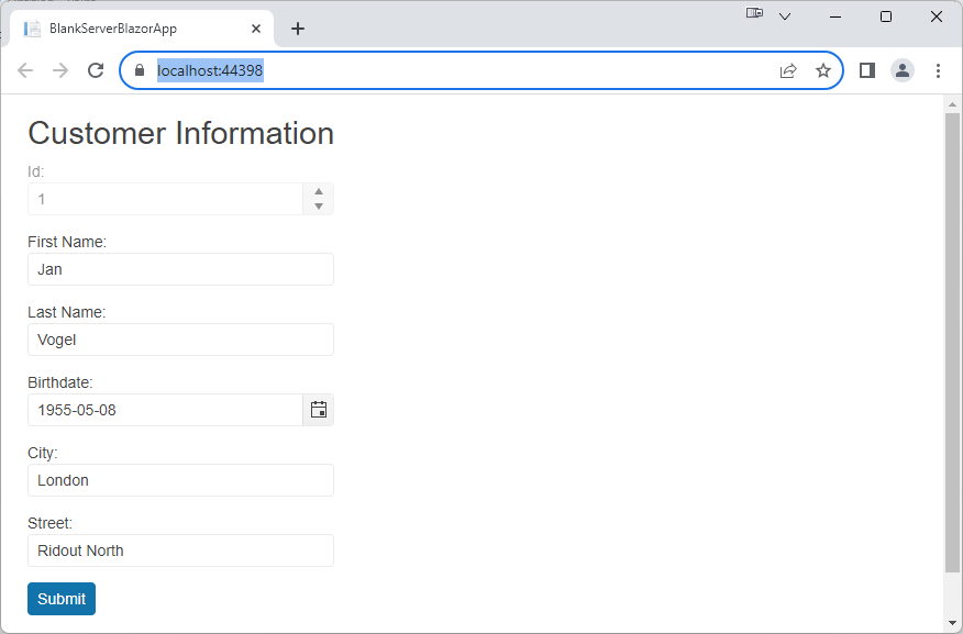
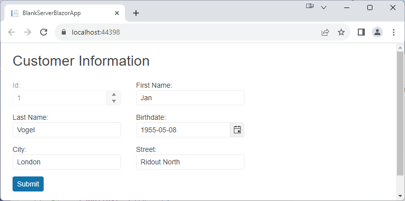
The main class has a ShipAddress property that uses the Address class. That Address class has a City and a Street property, so adding both of those properties to the form (while explicitly adding the properties from the main class) looks like this:
<FormItems>
    <FormItem Field="CustomerId" />
    <FormItem Field="FirstName" />
    <FormItem Field="LastName" />
    <FormItem Field="DOB" />

    <FormItem Field="ShipAddress.City"
                         LabelText="City:" />
    <FormItem Field="ShipAddress.Street"
                         LabelText="Street:" />
</FormItems>
However, that doesn’t include those nested properties in the form’s validation process. For that, you’ll need to do two more things.
First, you need swap out the basic DataAnnotationsValidator for some more sophisticated validator—the ObjectGraphDataAnnotationsValidator, for example (you’ll need to add the Microsoft.AspNetCore.Components.DataAnnotations.Validation NuGet package to your application to use this validator). That gives this markeup for your TelerikForm:
<TelerikForm Model="@customer">
     <FormValidation>
         <ObjectGraphDataAnnotationsValidator></ObjectGraphDataAnnotationsValidator>
     </FormValidation>
Second, you need to decorate the property holding the nested class with the ValidateComplexProperty attribute. In this case study, that means decorating the ShipAddress property in the Customer class, which ends up looking like this:
 [ValidateComplexType]
public Address ShipAddress { get; set; }
And now your nested class is fully integrated with your form.
Laying out the Form
By default, as you’ve seen, your form is laid out in a single-column format with labels above the input controls—great for smartphones with narrow screens. But you have multiple options if you want to take more control of your form’s layout.
If the user has more horizontal space (i.e., your form is displaying on anything other than a smartphone) you can set the TelerikForm’s Orientation to FormOrientation.Horizontal to have the labels placed to the left of the input item, reducing the vertical space required by the form.
<TelerikForm Model="@customer" @ref="@form" Orientation=FormOrientation.Horizontal>
You can also use the TelerikForm’s Columns attribute to move to a multi-column layout—just set the Columns attribute to the number of columns you want you want the form to use. You’ll also want to set the ColumnSpacing attribute to put some space between the columns.
That means these two additions to the TelerikForm element:
<TelerikForm Model="@customer" Columns="2" ColumnSpacing="30px">
Gives you this new layout:
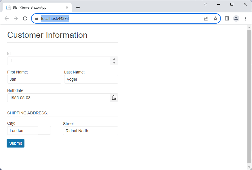
Where you have a control that you want to span multiple columns, you can have that too by setting the ColSpan attribute on the FormItem to stretch a control across multiple columns.
That can result in some odd combinations of input elements on the same line (you probably want FirstName and LastName to appear together, for example). You can determine which controls appear together by using the FormGroup element to organize your FormItems. Like the TelerikForum element, the FormGroup element has Columns and ColumnSpacing attributes to let you organize the input controls into columns. And, like the FormItem, the FormGroup also has a LabelText property to let you label your group.
Putting all that altogether means that this markup:
<FormItems>
     <FormGroup Columns="2" ColumnSpacing="10px">
       <FormItem Field="CustomerId" ColSpan="2" />
       <FormItem Field="FirstName" />
       <FormItem Field="LastName" />
    </FormGroup>

    <FormItem Field="DOB" />

     <FormGroup LabelText="Shipping Address:">
         <FormItem Field="ShipAddress.City"
                              LabelText="City:" />
         <FormItem Field="ShipAddress.Street"
                              LabelText="Street:" />
     </FormGroup>
 </FormItems>
Gives this more organized form:
And, while we won’t discuss it here, you can apply your own CSS classes to the TelerikForm, FormGroup and FormItem component to control the display of the HTML generated by those components. If you want to take advantage of the HTML 5 autocomplete attribute, you can turn that on using the Autocomplete attribute on the TelerikForm element.
Adding Code
All that’s left to you is to add the code you need use the data entered on the form and have it executed by the automatically generated submit button.
The simplest solution is to reference some method in your page from the TelerikForm’s OnSubmit attribute and, in that method, call the form’s IsValid method to see if your data annotations have flagged any errors (IsValid returns false if any errors were found). To call the form’s IsValid method, you’ll need to a reference to your TelerikForm that points to a property or field in your code.
The resulting TelerikForm element would look like this:
<TelerikForm Model="@customer"
                        @ref="@form"
                         onSubmit="@DoUpdate">
A skeleton of all the required code would look like this:
@code {
    [Parameter]
    public Customer customer { get; set; } = new Customer
        {
            ShipAddress = new Address()
       };

    private TelerikForm form;
    private void DoUpdate()
    {
        if (form.IsValid())
        {
            //…update the data store using the customer object…
        }
    }
}
With just the TelerikForm component, you can have an initial form up and running, including performing updates, in a dozen lines of code … which frees you up to explore some of the other options the component makes available to you: Managing the update button(s) at the bottom of the form, responding to some of the other events the form raises, and controlling validation. But that’s a separate discussion.
Try Telerik UI for Blazor
Try out the Form component, plus more than 100 other truly native, easy-to-customize Blazor components to cover any requirement. Try Telerik UI for Blazor for free with a 30-day trial and enjoy industry-leading support.
Peter Vogel
Peter Vogel is both the author of the Coding Azure series and the instructor for Coding Azure in the Classroom. Peter’s company provides full-stack development from UX design through object modeling to database design. Peter holds multiple certifications in Azure administration, architecture, development and security and is a Microsoft Certified Trainer.
Related Posts
Comments
All articles
Topics
Web MobileMobile
Desktop
Design
Productivity
People
