
Let Users Know What’s Going on with the Blazor Notification Component

Summarize with AI:
The more your users know about what your application is doing, the better your application will work for your users. The Telerik UI for Blazor Notification component lets you keep your users informed about what’s going on with your application.
This is fundamentally true: In user experience design, feedback matters. Feedback guides your users to do the right thing with your applications. More practically, if you don’t give users the feedback they expect, they will start whanging away at parts of your UI, trying to get some response. The resulting cascade of problems will, of course, be blamed on you and your application.
Notifications play a key role here: Notifications are your tool for keeping the user up to date with what’s going on when your user is busy interacting with some other part of your UI.
Notifications can be information about background processes (“Fetching customer data”), progress reports (“55 of 200 rows retrieved”), updates from external sources (“This project has had a new task added”), reassuring information about offscreen activities (“Your item has been added to your shopping cart”), or just telling your users about what’s going wrong (“Process failed: Customer not found”).
Basically, a notification is anything you want to bring to your user’s attention without interrupting what they’re doing in some other part of your UI.
To put it another way: Notifications turn what would otherwise be unseen by your users into part of their user experience. The Progress Telerik UI for Blazor Notification component will not only let you provide all the notifications your UI could need, it makes providing those notifications as easy as implementing a progress bar. Easier, actually.
Your First Notification
First things first: To use the Notification component, after creating your Blazor project, confirm that you have the Telerik UI for Blazor package added. Once that package is added, you can simplify your coding life by making sure that your project’s _Imports.razor file has these statements:
@using TelerikBlazorNotification.Client
@using TelerikBlazorNotification.Client.Shared
@using Telerik.Blazor
@using Telerik.Blazor.Components
The simplest way to do both of those things is to select the Extensions | Telerik | Telerik UI for Blazor menu choice in Visual Studio and work through the resulting wizard to create and configure your project.
To add the Notification component to a Razor page, place the following markup anywhere you want in your Blazor razor file’s markup area (i.e., outside of your code block) and add a reference to it so that you can take advantage of the component in your code. That’s what this example does:
<TelerikNotification @ref="@refNotification"></TelerikNotification>
In your code section, you need to define a field or property to hold that reference to your component. This example defines a property:
@code {
   private TelerikNotification refNotification { get; set; }
Finally, you’ll want to have your notification display something. This code will do the trick by creating a NotificationModel object, setting its Text property to the message you want to display, and then passing that NotificationModel object to the component’s Show method:
protected override Task OnAfterRenderAsync(bool firstRender)
{
    if (firstRender == true)
    {
        NotificationModel nm = new NotificationModel();
        nm.Text = "Hello, World";
        refNotification.Show(nm);
    }
The resulting page looks something like this:
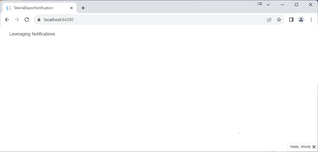
If you’re having trouble spotting the notification, look in the lower right corner of the browser window. And don’t take too long: By default, the notification automatically disappears after five seconds.
Applying Organization Standards
As you can see, the first thing you’ll want to do is take control of how your notification is displayed. The easiest way to control your notification’s appearance is to use the NotificationModel’s ThemeColor property (which does more than just control the notification’s color, by the way).
But … your organization probably has a standard set of CSS rules that you should apply to your application’s notifications. You can apply that predefined CSS to your Notification component’s element using the element’s Class attribute (and if you don’t have any standard CSS or don’t want to use it, don’t worry about it—skip this section and just use the ThemeColor property described in the next section).
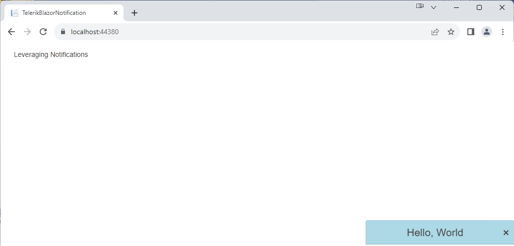
The following example adds a style element to the page to define a CSS rule named styleNotefication to control the display of the component’s notifications (this example also defines leverages some predefined Telerik-provided rules). The example then applies the rule to the notification component, using the component’s Class attribute:
<style>
.styleNotification .k-notification-container .k-notification {
            width: 300px;
            height: 50px;
            background-color: lightblue;
            font-size: 1.5em;
            text-align: center;
            align-items: center;
   }
</style>

<TelerikNotification @ref="@refNotification" Class="styleNotification"></TelerikNotification>
Those particular settings will give you a notification that looks something like this:
If you want to leverage the Telerik-provided styles, then you’ll need to include a link tag like this one in your application (if you used the Telerik extension wizard to create and configure your project, this will have been added for you and tailored to support the theme you selected):
<link rel="stylesheet" type="text/css"
        href="https://blazor.cdn.telerik.com/blazor/4.5.0/kendo-theme-default/swatches/default-ocean-blue.css" />
Getting Noticed
Now you’re ready to take control of your notifications. You can start by using attributes on the component’s element to control where notifications appear, the animation used to present a notification (you have over a dozen choices), and how long an animation takes (in milliseconds).
This example moves notifications to the top left corner of the page and switches to an animation that causes notifications to rise up over a two second period:
<TelerikNotification @ref="@refNotification"
VerticalPostion=NotificationVerticalPosition.Top
HorizontalPosition=NotificationHorizontalPosition.Left
                     AnimationType=AnimationType.PushUp
	      AnimationDuration=2000
                     Class="styleNotification">
</TelerikNotification>
Next, you’ll want to set the message to display and distinguish between different kinds of notifications. Distinguishing between kinds of notifications matters because you don’t want all your notifications to look alike: Success messages should look different from error messages which should look different from informational messages and so on.
This is where the NotificationModel’s ThemeColor property comes into play. To control your notification’s appearance, all you need to do is set the ThemeColor property to one of the 10 predefined constants in the ThemeConstants.Notification.ThemeColor enumeration. This example sets the ThemeColor to the Error constant:
NotificationModel nmError = new NotificationModel();
nmError.Text = "Something has gone wrong";
nmError.ThemeColor = ThemeConstants.Notification.ThemeColor.Error;
refNotification.Show(nmError);
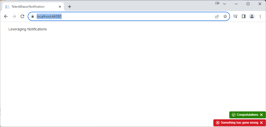
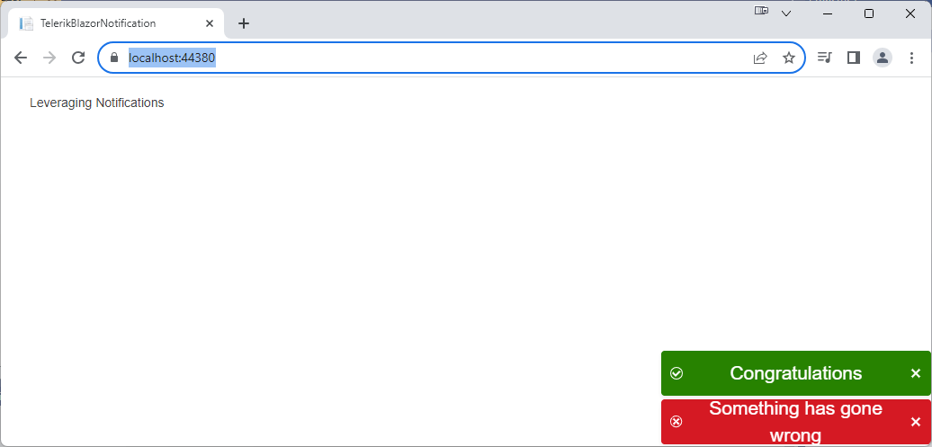
You can create multiple notifications by creating separate NotificationModel objects and passing each to the component’s Show method separately. This example displays two messages with different Text and ThemeColor settings, for example:
NotificationModel nmError = new NotificationModel();
nmError.Text = "Something has gone wrong";
nmError.ThemeColor = ThemeConstants.Notification.ThemeColor.Error;
refNotification.Show(nmError);

NotificationModel nmSuccess = new NotificationModel();
nmSuccess.Text = "Congratulations!";
nmSuccess.ThemeColor = ThemeConstants.Notification.ThemeColor.Success;
refNotification.Show(nmSuccess);
As you can see in this screenshot of the two messages, the themes make your notifications look different by applying an appropriate background color, font color and icon to the notification:
If you want, you can use the NoficationModel’s Icon property to override the icon used and use the ShowIcon property to control whether the icon is displayed at all.
The ThemeColor style, by the way, is drawn from the Telerik theme you linked your application to. That means you can count on your ThemeColor setting fitting in with overall theme you selected when you configured project, regardless of which theme (or swatch within a theme) you selected.
The theme setting is also merged with any CSS style settings you’ve used to control the overall appearance of your notifications. Where there’s a conflict between the predefined themes and your style settings, your style settings win (since the CSS settings probably reflect your organization’s standards, this is what you want).
This example uses the style element from the earlier example with the background-color setting removed so that the style element just controls the size and text in the notification.
You can exercise even more control over the format of your notification by providing your own template for the notification’s content.
Managing Multiple Notifications
Once your notification is displayed, you can update the message displayed by your notification just by changing the Text property on the message’s NotificationModel:
nm.Text = "Hello, World";
refNotification.Show(nm);
//…later…
 nm.Text = "Goodbye, World";
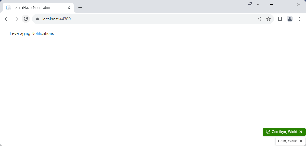
That gives you two strategies for managing multiple notifications: Updating an existing NotificationModel or creating multiple NotificationModels.
In one strategy, you have a single NotificationModel shared among all the parts of the application. This strategy would make sense, for example, with notifications associated with a long running process: Different parts of the application could change the Text and ThemeColor properties of the shared NotificationModel object to show the process’s progress.
In the other strategy, each part of the application has its own NotificationModels that is passed to the shared TelerikNotification component’s Show method. This strategy makes sense when, for example, the TelerikNotification component is used to define a “notification area” in the application’s UI that each part of the application can add notifications to.
And, of course, there are hybrid solutions that combine both strategies to create as sophisticated a solution as you need.
Dismissing Notifications
But, as notifications appear, you also need to make them disappear (otherwise, they just become screen clutter). By default, all notifications disappear automatically after five seconds. Users can also close notifications manually by clicking on the x at the right-hand end of the notification.
You can take control of both of those options. If you want to make sure a notification stays as long as you want it to, you can prevent users from being able to close a notification by setting the NotificationModel’s Closable property to false. You can also control how long a specific notification is displayed by setting the NotificationModel’s CloseAfter property to some number of milliseconds. If you set the NotificationModel’s CloseAfter property to 0, then the notification won’t ever be closed automatically.
This example ensures that the notification stays on the screen for ten seconds by setting the NotificationModel’s CloseAfter property to 10,000 milliseconds and setting the Closable property to false:
NotificationModel nmUpdates = new NotificationModel();
nmUpdates.Text = "Updates Available";
nmUpdates.ThemeColor = ThemeConstants.Notification.ThemeColor.Info;
nmUpdates.Closable = false;
nmUpdates.CloseAfter = 10000;

refNotification.Show(nmUpdates);
Even with Closable set to false and CloseAfter set to 0, you can still make notifications disappear by using the component’s Hide and HideAll methods. You can make any specific notification disappear by passing its NotificationModel to the component’s Hide method. The component’s HideAll method, on the other hand, removes all the notifications shown by the component. These two methods, for example, could be useful in dismissing notifications:
public void closeUpdatesMessage()
{
   refNotification.Hide(nmUpdates);
}

public void closeAllMessages()
{
   refNotification.HideAll();
}
Notifications make visible to your user what would otherwise be invisible to them—notifications add to the feedback that users need to figure out how to use your application in order to meet their goals (and, also, to reassure your users that they are doing the right things to achieve their goals). Really, the more your users know about your application and what it’s doing, the better your application will work for your users. Which, in the end, is all that matters.
Try Telerik UI for Blazor
Try out the Notification component, plus more than 100 other truly native, easy-to-customize Blazor components to cover any requirement. Try Telerik UI for Blazor for free with our 30-day trial and enjoy our industry-leading support.

Peter Vogel
Peter Vogel is both the author of the Coding Azure series and the instructor for Coding Azure in the Classroom. Peter’s company provides full-stack development from UX design through object modeling to database design. Peter holds multiple certifications in Azure administration, architecture, development and security and is a Microsoft Certified Trainer.
Related Posts
Comments
All articles
Topics
Web MobileMobile
Desktop
Design
Productivity
People
