How to Implement Blazor PivotGrid

Summarize with AI:
When you need to show data in your Blazor app, it’s natural to reach for a grid of some sort. But what if you need to do more than just show rows of data?
Faced with hundreds or even thousands of rows, grids provide a convenient and relatively simple way to present information as a series of rows and columns (much like an Excel spreadsheet).
But what if you need to do more than just show rows of data?
Say you’re working with sales data and you need to present high level figures, like total sales, units sold, refunds processed (as well as details of each individual sale).
Or perhaps your users need to explore data from different angles, like sales by customer or sales per month.
For this kind of “bigger picture” information, you might need to look beyond the humble grid to something with a bit more flexibility.
Introducing Telerik PivotGrid
As of R2 2023, Progress Telerik UI for Blazor now includes a handy PivotGrid component. Pivot grids are particularly useful for slicing and dicing data, and exploring your data from different angles.
Here’s an example using some auto-generated sales data:
Here I’ve bound the PivotGrid to a list of records of type SaleDetails (which is randomly generated for this demo). This shows the simplest way to get started with TelerikPivotGrid.
You can take any standard C# collection and bind your pivot grid to it, then define the three “dimensions” of a pivot chart:
- Columns
- Rows
- Measures
In our example, this translates to Years (column), Item Sold (row) and Total Value of the sales (measure).

Notice how we indicated that the measure should be the Sum of the ItemPrice. This ensures we’ll get the total value of all items sold for each year/item in our grid, but there are
other aggregations available.
For example, if we wanted to see the number of items sold we could use the Count aggregate instead.
<PivotGridMeasures>
    <PivotGridMeasure Name="@nameof(SaleDetails.ItemPrice)" Aggregate="PivotGridAggregateType.Count" />
</PivotGridMeasures>
Drill Down Further
This high-level summary is useful, but what if you want to drill down a little further?
For example, you might want to start with sales per year, but then drill down into the sales for each month within that year.
For that we can add multiple fields to the column or row.
Now users can view sales by year, then click on the year to reveal sales for each month.
Incidentally, this also shows a handy way to show different data (in different formats) in your pivot grid.
Because we’re using a local model (list of SaleDetails), we can expose data in different formats for our grid by adding additional properties to the SaleDetails model:
public class SaleDetails
{
    public int Id { get; set; }
    public DateOnly PlacedOn { get; set; }
    public string Item { get; set; }
    public double ItemPrice { get; set; }

    // Handy way to expose different data to the grid
    public string Year => $"{PlacedOn.Year}";
    public string Month => $"{PlacedOn.Month}-{PlacedOn.ToString("MMM")}";
}
In this case, the Year and Month properties are useful dimensions for our grid.
While we’re here, if you’re looking at the => and scratching your head, in this context it represents something called an expression-bodied property. These are super handy as shorthand syntax for defining
read-only properties in C#.
The alternative is to declare the property this way:
public string Month
{
    get
    {
        return $"{PlacedOn.Month}-{PlacedOn.ToString("MMM")}";
    }
}
Let Users Slice and Dice the Data Themselves
It’s useful to predetermine which data to show your users, but you may also want to give them the ability to view the data from different angles for themselves.
For that we can use another component, the TelerikPivotGridConfigurator.
First, we need to wrap the Pivot Grid in a TelerikPrivotGridContainer, then we can include an instance of the configurator:
With this, our users have a little more control over which columns, rows and measures are visible.
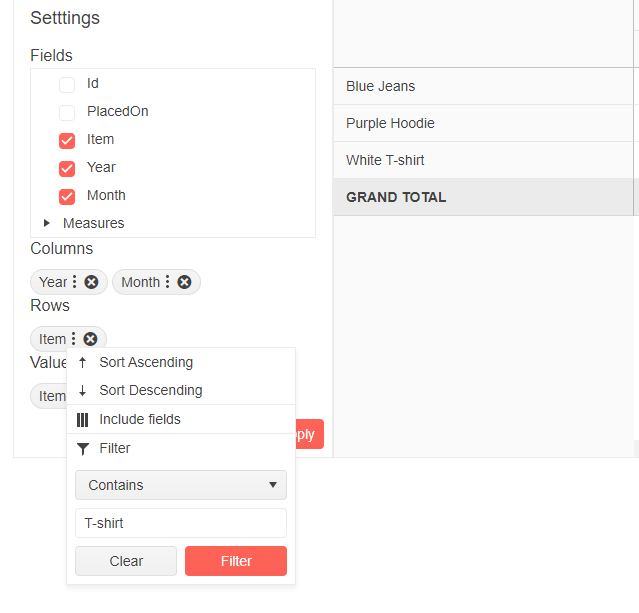
They can add and remove fields, and choose whether to use them as Columns or Rows by dragging them to the relevant section in the configurator. They can also click the vertical dots next to an item to change how that field is sorted, and filtered.
For example, say someone viewing this grid wanted to only see sales for items with T-shirt in their name. They could click the vertical dots next to the Item column, select Filter,
then enter T-shirt in the filter value box.

Equally, if they wanted to sort the data by years descending (instead of ascending) they could use the menu for Year and select Sort Descending.
Finally, if you want users to be able to show/hide the configurator, drop an instance of TelerikPivotGridConfiguratorButton on there as well.
<TelerikPivotGridContainer>

    <TelerikPivotGridConfiguratorButton />

    <TelerikPivotGridConfigurator />

    ...

</TelerikPivotGridContainer>
This will render some UI for toggling the visibility of the configurator.
Connect to OLAP Cubes
So far all our examples have used local data.
When using local data all aggregate calculations are done in-memory and the data is loaded in one go (when the grid is first rendered).
For more advanced data analysis you might want to consider another data source for your PivotGrid, namely XML For Analysis data (more specifically, OLAP cubes).
If you’re wondering what on earth an OLAP cube is, you can find out more via this handy primer from Microsoft: Just What Are Cubes Anyway? A Painless Introduction to OLAP Technology. (Or see how Kathryn explains OLAP when introducing the PivotGrid for KendoReact.)
If you’re already familiar with OLAP cubes and have some already built and ready to go, the good news is you can go ahead and point your Telerik PivotGrid at them.
Here’s an example (taken from the docs for the Pivot Grid).
@page "/OLAP"

<h3>OLAPCubeDemo</h3>

<TelerikPivotGridContainer>
    <TelerikPivotGridConfigurator />

    <TelerikPivotGridConfiguratorButton />

    <TelerikPivotGrid DataProviderType="@PivotGridDataProviderType.Xmla"
                      TItem="object">
        <PivotGridSettings>
            <PivotGridXmlaDataProviderSettings ServerUrl="https://demos.telerik.com/olap/msmdpump.dll"
                                               Catalog="Adventure Works DW 2008R2"
                                               Cube="Adventure Works" />
        </PivotGridSettings>

        <PivotGridRows>
            <PivotGridRow Name="[Product].[Category]"></PivotGridRow>
            <PivotGridRow Name="[Product].[Model Name]"></PivotGridRow>
        </PivotGridRows>

        <PivotGridColumns>
            <PivotGridColumn Name="[Date].[Calendar Quarter of Year]"></PivotGridColumn>
            <PivotGridColumn Name="[Date].[Calendar Year]"></PivotGridColumn>
        </PivotGridColumns>

        <PivotGridMeasures>
            <PivotGridMeasure Name="[Measures].[Reseller Order Count]"></PivotGridMeasure>
        </PivotGridMeasures>
    </TelerikPivotGrid>
</TelerikPivotGridContainer>
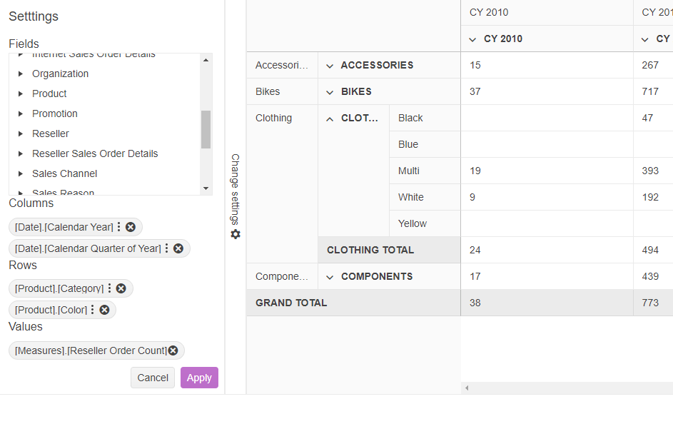
With this in place, and if you decide to also include an instance of the configurator, your users can explore data via any of the dimensions and aggregates exposed by the cube.

In this case, I’ve added the product color to the rows, so now I can drill down to view sales by color for each category if item.
In Summary
Sometimes rows and columns aren’t enough—you need to be able to dig further into your data. In these cases a pivot grid is a useful tool for uncovering valuable insights from raw data.
With the new PivotGrid from Telerik UI for Blazor, you can connect to local data or existing data (from OLAP Cubes) to present information from different angles.
Use the Configurator to give users the ability to choose those angles, to view the data that’s most relevant to them.
Try Telerik UI for Blazor
Ready to try out the PivotGrid or any of the other 100+ truly native, easy-to-customize Blazor components from Telerik UI for Blazor? Try it for free with our 30-day trial and enjoy our industry-leading support.

Jon Hilton
Jon spends his days building applications using Microsoft technologies (plus, whisper it quietly, a little bit of JavaScript) and his spare time helping developers level up their skills and knowledge via his blog, courses and books. He's especially passionate about enabling developers to build better web applications by mastering the tools available to them. Follow him on Twitter here.

