
How the Telerik UI for Blazor DatePicker Got More Powerful
 by Dimo Dimov

Summarize with AI:
Learn how to elevate your web development with the newly updated Telerik UI for Blazor DataPicker.
The main goal of input UI components is to help users enter values quickly, easily and efficiently. To achieve that goal, a component may:
- Hint about the expected value with a placeholder
- Indicate the value format with a mask
- Enable users to navigate and select from a predefined set of values
- Validate user input even before actual model validation occurs
- Auto-complete or autocorrect values
At first glance, it may seem that all these extras belong to different components, but in fact, the Progress Telerik UI for Blazor DatePicker does a great job with all of them! Moreover, all Blazor date inputs feature several recent enhancements, which greatly improved the last bullet point (auto completion and auto correction of values). Let us explore the new features together.
Date Input vs. Date Picker—To Type or Not to Type?
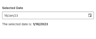
Our Blazor DateInput component is a textbox on steroids, which is optimized for DateTime value entry. In turn, the Blazor DatePicker component is a DateInput on steroids, as it integrates a popup Calendar for a better user experience and more flexibility.
The common perception is that it’s easier and preferable to select a value from a list instead of typing it. I thought that too, until I saw how fast my local cashier can type product codes at the counter. People with these skills will clearly benefit from UI components that allow quick and convenient manual data entry.
And this is exactly what Telerik UI for Blazor provides via its date and time input components:
Welcome to the New Date Typing Experience
Telerik UI for Blazor 4.0 introduced the following configurable enhancements for manual entry in our date and time input components:
- Enable automatic correction of invalid (inconsistent) parts of the DateTime value
- Enable automatic switching (focus) to the next date format segment
- Set custom keys to switch to the next date segment
- Define how the component handles two-digit years
- Show or hide the blinking caret
Automatic Correction
The Blazor Date Picker (and all our date input components) can change the value of invalid DateTime segments automatically. For example, if the value is January 31 and the user changes the month to February, the component will auto-correct the day to 28. Similarly, the component can also prohibit the user from entering an invalid value via the up/down arrow keys.
DateTime Segment Switching
By default, the Blazor DatePicker will jump over to the next value segment when the user completes the current one. However, some users may be accustomed to typing the separator manually. This applies especially to fast users with an established muscle memory from other interfaces. Or, some users may think they need to type the separator manually, although they don’t have to.
Segment Switch Keys
On a related note, some users may prefer to switch segments with custom keys, not just the common ones (such as left and right arrow). Imagine a user that types on a small numeric pad with a limited choice of keys. Moreover, the arrows and digits overlap in function, so they can’t be used at the same time.
Two-Digit Years
If I tell you that something happened in year ’22, most likely you will think about 2022. But is this always the case? For example, Bulgarian civil IDs include a two-digit year of birth. Figure out if a random person in the municipality archive was born in the early 20th or 21st century. Fortunately, the Blazor DatePicker removes this ambiguity. Depending on the component configuration, every two-digit year will strictly belong either to the current century or the previous one. Here’s how to configure it:
Visible Caret
Normally, the DatePicker will hide the caret and select the focused segment of the component value. Users who prefer the classic experience and wish to know exactly where they are typing, can see a caret too.
Try It Out!
Experiment with all the DatePicker typing settings immediately in our REPL Blazor playground, or even better, download Telerik UI for Blazor and explore all the goodies!
Sharing is Caring
Once you try the empowered DataPicker component, don’t forget to share your experience and ideas in the comments sections below or by visiting the Telerik UI for Blazor Feedback Portal. Your input makes a difference.
Dimo Dimov
Dimo Dimov is a Support Engineer at Progress, working on Telerik UI for Blazor. He is passionate about fast support service and well-structured documentation. If you succeed in taking the laptop from his hands, you can join him on a mountain hike or a marathon run.
Related Posts
Comments
All articles
Topics
Web MobileMobile
Desktop
Design
Productivity
People
