
Enhance Your Financial Charts with Telerik UI for Blazor

Summarize with AI:
With support for various chart types, interactive features, customization options and event handling, Telerik UI for Blazor makes financial charts a snap.
When it comes to developing interactive and visually appealing financial charts in your Blazor applications, Progress Telerik UI for Blazor is a powerful tool that can make your life a lot easier. This comprehensive library provides a range of features and components, including the Chart and Stock Chart components that can take your financial data visualization to the next level.
In this blog post, we’ll explore how Telerik UI for Blazor can help you enhance your financial charts, and we’ll also provide some code snippets to get you started.
Introduction to Telerik UI for Blazor
Telerik UI for Blazor is a UI component library designed to simplify the process of creating web applications with Blazor, Microsoft’s web framework for building interactive web applications using C#. It provides a wide range of components for various purposes, including charts, grids, inputs and more. In this blog post, we’ll focus on the charting capabilities of Telerik UI for Blazor.
Getting Started with Telerik Charts
To get started with Telerik charts in Blazor, you can use the <TelerikChart> and <TelerikStockChart> tags. Both of these tags allow you to easily add chart components to any Razor page. They offer compatibility with various types of financial data, making them ideal for creating interactive financial charts.
Basic Chart Series Types
Both <TelerikChart> and <TelerikStockChart> support a variety of series types, including:
The <TelerikChart> goes even further by offering additional series types, such as:
This wide range of supported chart types ensures that you can choose the most suitable one for visualizing your financial data.
Interactive Features
One of the standout features of Telerik UI for Blazor charts is their interactivity. Both chart types allow you to implement features like panning and zooming, providing users with the ability to focus on specific segments of the data. This functionality can be especially valuable when dealing with large datasets or when users need to zoom in on specific timeframes in financial charts.
Navigator Component in TelerikStockChart
For more advanced financial charting, the Telerik Stock Chart introduces the Navigator component. The Navigator component complements the main chart by providing a smaller overview of the entire dataset. Users can use it to easily navigate and select specific areas of interest in the main chart. This feature is particularly useful for analyzing historical financial data.
Customization Options
Telerik UI for Blazor charts offer extensive customization options. You can customize labels on both axes, change the appearance of the chart elements, and apply various themes to match the overall look and feel of your application. Additionally, you can use tooltips to provide users with additional information when they hover over data points on the chart.
Chart DrillDown for Deeper Insights
In addition to the versatile features already mentioned, Telerik UI for Blazor Chart offers a valuable DrillDown option that allows you to provide users with deeper insights into their financial data. With DrillDown, you can enable users to interactively explore detailed information by clicking on specific chart elements. This is particularly beneficial when dealing with complex financial data sets where users may want to dive into specific data points or categories for a closer examination.
Event Handling
To make your financial charts more interactive and responsive, Telerik UI for Blazor charts come equipped with built-in events. You can easily respond to user actions, such as clicking on a data point, by handling these events in your Blazor code. This allows you to create dynamic and user-friendly financial charting experiences.
Code Snippets for Getting Started
Let’s dive into some code snippets to demonstrate how to get started with Telerik UI for Blazor charts. You can explore our getting started documentation articles for detailed information on how to set up our components in your client-side, server-side and hybrid (with .NET MAUI) applications.
Adding Telerik UI for Blazor to Your Project
First, you need to add Telerik UI for Blazor to your Blazor project. You can do this using NuGet Package Manager:
dotnet add package Telerik.UI.for.Blazor
Using TelerikChart in a Blazor Component
To use <TelerikChart> in your Blazor component, you’ll need to add the necessary namespace and include the chart component in your Razor page:
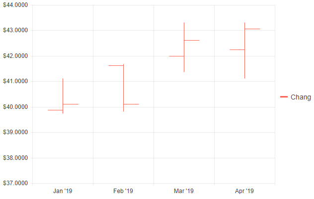
@* The code snippet below illustrate the Open-High-Low-Close, also known as OHLC, series type. *@

@page "/financial-chart"
@using Telerik.Blazor.Components

<TelerikChart Height="400px" Width="640px">
    <ChartSeriesItems>
        <ChartSeries Type="@ChartSeriesType.OHLC"
                     Name="Chang"
                     Data="@ChartProduct1Data"
                     CategoryField="@(nameof(StockDataPoint.Date))"
                     OpenField="@nameof(StockDataPoint.Open)"
                     CloseField="@nameof(StockDataPoint.Close)"
                     HighField="@nameof(StockDataPoint.High)"
                     LowField="@nameof(StockDataPoint.Low)">
        </ChartSeries>
    </ChartSeriesItems>

    <ChartCategoryAxes>
        <ChartCategoryAxis Type="@ChartCategoryAxisType.Date" BaseUnit="@ChartCategoryAxisBaseUnit.Months">
        </ChartCategoryAxis>
    </ChartCategoryAxes>

    <ChartValueAxes>
        <ChartValueAxis>
            <ChartValueAxisLabels Format="{0:C4}"></ChartValueAxisLabels>
        </ChartValueAxis>
    </ChartValueAxes>
</TelerikChart>

@code {
    List<StockDataPoint> ChartProduct1Data { get; set; }

    protected override async Task OnInitializedAsync()
    {
        await GenerateChartData();
    }

    async Task GenerateChartData()
    {
        ChartProduct1Data = new List<StockDataPoint>()
        {
            new StockDataPoint(new DateTime(2019, 1, 1), 39.88m, 40.12m, 41.12m, 39.75m, 3584700),
            new StockDataPoint(new DateTime(2019, 2, 1), 41.62m, 40.12m, 41.69m, 39.81m, 2632000),
            new StockDataPoint(new DateTime(2019, 3, 1), 42m, 42.62m, 43.31m, 41.38m, 7631700),
            new StockDataPoint(new DateTime(2019, 4, 1), 42.25m, 43.06m, 43.31m, 41.12m, 4922200),
        };

        await Task.FromResult(ChartProduct1Data);
    }

    public class StockDataPoint
    {
        public StockDataPoint() { }

        public StockDataPoint(DateTime date, decimal open, decimal close, decimal high, decimal low, int volume)
        {
            Date = date;
            Open = open;
            Close = close;
            High = high;
            Low = low;
            Volume = volume;
        }
        public DateTime Date { get; set; }
        public decimal Open { get; set; }
        public decimal Close { get; set; }
        public decimal High { get; set; }
        public decimal Low { get; set; }
        public int Volume { get; set; }
    }
}
Now we have created our first financial chart using the TelerikChart component:
Configuring the Chart
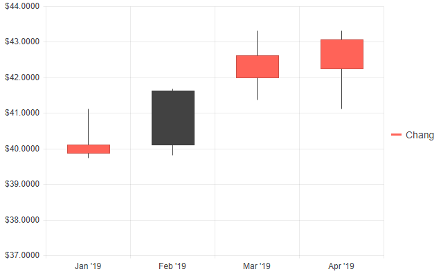
You can configure the chart by specifying the series type, data and other options. For example, to create a basic candlestick chart:
@* The Candlestick chart series type *@

<TelerikChart Height="480px" Width="640px">
    <ChartSeriesItems>
        <ChartSeries Type="@ChartSeriesType.Candlestick"
                     Name="Chang"
                     Data="@ChartProduct1Data"
                     CategoryField="@(nameof(StockDataPoint.Date))"
                     OpenField="@nameof(StockDataPoint.Open)"
                     CloseField="@nameof(StockDataPoint.Close)"
                     HighField="@nameof(StockDataPoint.High)"
                     LowField="@nameof(StockDataPoint.Low)">
        </ChartSeries>
    </ChartSeriesItems>

    <ChartCategoryAxes>
        <ChartCategoryAxis Type="@ChartCategoryAxisType.Date" BaseUnit="@ChartCategoryAxisBaseUnit.Months">
        </ChartCategoryAxis>
    </ChartCategoryAxes>

    <ChartValueAxes>
        <ChartValueAxis>
            <ChartValueAxisLabels Format="{0:C4}"></ChartValueAxisLabels>
        </ChartValueAxis>
    </ChartValueAxes>
</TelerikChart>

@code {
    List<StockDataPoint> ChartProduct1Data { get; set; }

    protected override async Task OnInitializedAsync()
    {
        await GenerateChartData();
    }

    async Task GenerateChartData()
    {
        ChartProduct1Data = new List<StockDataPoint>()
        {
            new StockDataPoint(new DateTime(2019, 1, 1), 39.88m, 40.12m, 41.12m, 39.75m, 3584700),

            // Close is lower than Open, so the Down color is used
            new StockDataPoint(new DateTime(2019, 2, 1), 41.62m, 40.12m, 41.69m, 39.81m, 2632000),

            new StockDataPoint(new DateTime(2019, 3, 1), 42m, 42.62m, 43.31m, 41.38m, 7631700),
            new StockDataPoint(new DateTime(2019, 4, 1), 42.25m, 43.06m, 43.31m, 41.12m, 4922200),
        };

        await Task.FromResult(ChartProduct1Data);
    }

    public class StockDataPoint
    {
        public StockDataPoint() { }

        public StockDataPoint(DateTime date, decimal open, decimal close, decimal high, decimal low, int volume)
        {
            Date = date;
            Open = open;
            Close = close;
            High = high;
            Low = low;
            Volume = volume;
        }
        public DateTime Date { get; set; }
        public decimal Open { get; set; }
        public decimal Close { get; set; }
        public decimal High { get; set; }
        public decimal Low { get; set; }
        public int Volume { get; set; }
    }
}
And there is our first candlestick chart. It is easy, isn’t it?
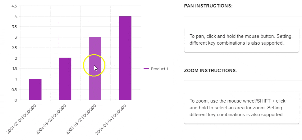
Adding Interactivity
To make the chart interactive, you can enable panning and zooming:
<TelerikChart>
    <ChartPannable Enabled="true"></ChartPannable>
    <ChartZoomable Enabled="true"></ChartZoomable>

    <ChartSeriesItems>
        <ChartSeries Type="ChartSeriesType.Column"
                     Name="Product 1"
                     Data="@Data"
                     Field="@nameof(ChartSeriesData.Product1Sales)"
                     CategoryField="@nameof(ChartSeriesData.Year)">
        </ChartSeries>

        <ChartCategoryAxes>
            <ChartCategoryAxis Min="1" Max="5">
                <ChartCategoryAxisLabels>
                    <ChartCategoryAxisLabelsRotation Angle="-45" />
                </ChartCategoryAxisLabels>
            </ChartCategoryAxis>
        </ChartCategoryAxes>
    </ChartSeriesItems>
</TelerikChart>

@code {
    List<ChartSeriesData> Data { get; set; } = new List<ChartSeriesData>();

    protected override Task OnInitializedAsync()
    {
        Data = ChartSeriesData.GenerateData();
        return base.OnInitializedAsync();
    }

    public class ChartSeriesData
    {
        public int Product1Sales { get; set; }
        public DateTime Year { get; set; }
        public string SegmentName { get; set; }

        public static List<ChartSeriesData> GenerateData()
        {
            List<ChartSeriesData> data = new List<ChartSeriesData>();

            for (int i = 1; i <= 10; i++)
            {
                var dataItem = new ChartSeriesData
                    {
                        Product1Sales = i,
                        Year = new DateTime(2000 + i, 3, i),
                        SegmentName = $"{i}"
                    };

                data.Add(dataItem);
            }

            return data;
        }
    }
}
Handling Events
You can respond to user interactions by handling events. For instance, to handle a click event on a data point:
@* Get the Category from which the user clicked. *@

<TelerikChart OnSeriesClick="@OnSeriesClickHandler">

    <ChartTooltip Visible="true">
    </ChartTooltip>

    <ChartSeriesItems>
        <ChartSeries Type="ChartSeriesType.Bar" Name="Product 1" Data="@series1Data">
        </ChartSeries>
        <ChartSeries Type="ChartSeriesType.Bar" Name="Product 2" Data="@series2Data">
        </ChartSeries>
    </ChartSeriesItems>

    <ChartCategoryAxes>
        <ChartCategoryAxis Categories="@xAxisItems"></ChartCategoryAxis>
    </ChartCategoryAxes>

    <ChartTitle Text="Quarterly revenue per product"></ChartTitle>

    <ChartLegend Position="ChartLegendPosition.Right">
    </ChartLegend>
</TelerikChart>


<div>
   Clicked from: @logger
</div>

@code {
    public List<object> series1Data = new List<object>() { 10, 2, 5, 6 };
    public List<object> series2Data = new List<object>() { 5, 8, 2, 7 };
    public string[] xAxisItems = new string[] { "Q1", "Q2", "Q3", "Q4" };

    string logger = String.Empty;

    void OnSeriesClickHandler(ChartSeriesClickEventArgs args)
    {
        var category = args.Category.ToString();
        logger = category;
    }
}
Conclusion
Telerik UI for Blazor provides a robust set of tools for enhancing your financial charts in Blazor applications. With support for various chart types, interactive features, customization options and event handling, it empowers you to create engaging and informative financial data visualizations. Whether you’re building a stock market analysis tool, a financial dashboard or any other application that requires charting capabilities, Telerik UI for Blazor has you covered.
Incorporating Telerik UI for Blazor into your project is straightforward, and the extensive documentation and community support make it even easier to harness the full potential of these powerful charting components.
So, why not give it a try and take your financial charts to the next level with Telerik UI for Blazor? Your users and stakeholders will thank you for it. Happy charting!

Svetoslav Dimitrov
Svetoslav Dimitrov serves as a Support Engineer at Progress, where his primary focus lies in assisting Telerik UI for Blazor users. In addition to delivering support services, he actively contributes to the enhancement of UI components by addressing bugs and implementing improvements. Outside of his professional commitments, Svetoslav finds joy in indulging his interests in fantasy literature, Formula 1 and all things related to the works of J.R.R. Tolkien.
Related Posts
Comments
All articles
Topics
Web MobileMobile
Desktop
Design
Productivity
People
