Creating an Account UI in .NET MAUI

Summarize with AI:
See how to bring a user interface design for an account screen to life in a .NET MAUI application.
How many times a month do you create a new account? Probably more often than you remember. And while it may seem like a simple process, that first interaction can shape a user’s perception of the entire app.
As developers, it’s important to pay attention to every detail when transforming a design into code. Our goal isn’t just to make the application work, but also to stay true to the original design and deliver a smooth, enjoyable user experience. That’s why, in this article, we’ll recreate two screens inspired by a Dribbble design, bringing them to life step by step using .NET MAUI.
So grab a cup of coffee (or hot chocolate if you have a sweet tooth ☕🍫), open Visual Studio or Visual Studio Code … and let’s start coding! 🚀
How Will the Explanation Work?
So you can understand everything 100%, I’ll explain how the process will work:
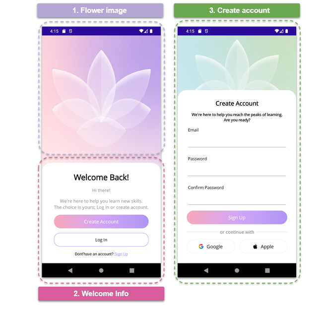
➖ Visual diagram: Before we start, you’ll see a diagram with a screenshot of the design we want to achieve. This design will be divided into blocks, each identified with a name and a color. Each one will be explained individually.
➖ Code explanation per block: In addition to the written explanation, each screen includes a set of blocks with the exact code snippets you need to implement and achieve the final result.
➖ Step-by-step visual progress: Each explanation will have its corresponding screenshot, so you can see the progress as we build the UI.
⚠️ For this design, we took inspiration from an original Dribbble UI, but made some adaptations and adjustments to align it with the goals of this article.
🔧 Environment Setup
You’ll learn how to take advantage of some of the powerful Progress Telerik UI for .NET MAUI components in this post. If you don’t have the .NET MAUI library installed yet, visit the quick start page, which explains step-by-step how to install Telerik UI for .NET MAUI, download the license key, configure the Telerik package source and install the Telerik MCP server (if needed).
Breaking Down the Design
To make this easier to follow, I’ve divided the design into clear blocks. We’ll build each part one at a time, in the order you see below.
1. Flower Image Step
Let’s start by creating the main page, which we’ll call WelcomeBackPage.xaml. This one will contain the components from both Step 1 and Step 2. For the main layout, we’ll use a Grid, divided into two rows.
<Grid RowDefinitions="500,*">

    <!-- Add blocks one and two here -->

</Grid>
This Grid is composed of the following elements:
🔹 Header image: In the first row, we’ll add the background image using the AspectFill property, allowing it to fill the available width while maintaining an attractive appearance across different screen sizes.
<Image Grid.Row="0" Source="bgroseflower.png" Aspect="AspectFill" />
🔹 Main container: In the second row, we’ll add a Border control. In this case, we’ll use the Telerik UI for .NET MAUI Border control, so make sure to include the Telerik namespace in your page:
xmlns:telerik="http://schemas.telerik.com/2022/xaml/maui"
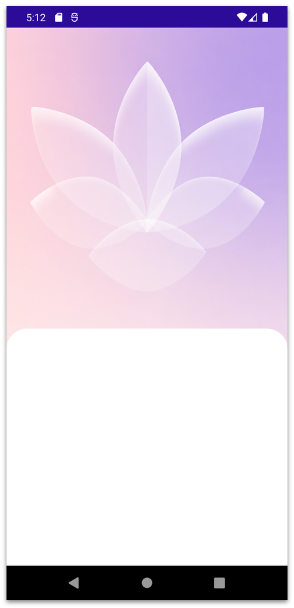
To create the overlapping effect, we only need to apply a negative top margin. This gives the impression that the white container is placed on top of the image. Finally, inside the Border, we’ll add a VerticalStackLayout, which we’ll use in the next steps to place the labels and buttons.
<telerik:RadBorder
    Grid.Row="1"
    Margin="0,-80"
    Padding="30"
    BackgroundColor="White"
    CornerRadius="30">

    <VerticalStackLayout
	    Spacing="15"
	    VerticalOptions="Fill"
	    HorizontalOptions="Center">
	    <!-- Add block two here -->
    </VerticalStackLayout>
</telerik:RadBorder>
And you’ll get a result like this:
2. Welcome Info Step
For this second step, we already have the foundation in place from the previous section when we added the VerticalStackLayout. This means that all the controls we’ll add from this point forward should be placed inside that layout.
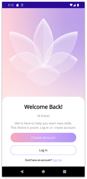
Let’s start by adding the first three Label controls:
<Label
HorizontalTextAlignment="Center"
Text="Welcome Back!"
FontAttributes="Bold"
FontSize="26"
TextColor="Black" />
<Label
HorizontalTextAlignment="Center"
Text="Hi there!"
FontSize="15"
TextColor="#8A8A8A" />
<Label
HorizontalTextAlignment="Center"
FontSize="15"
TextColor="#8A8A8A"
Text="We're here to help you learn new skills. The choice is yours; Log in or create account." />
Next, Let’s Add the Buttons
I have to admit, I absolutely love these buttons! 😍😍 The soft gradient gives them a modern and elegant look that really makes the UI stand out.
To achieve this effect, we’ll use .NET MAUI’s LinearGradientBrush along with three gradient stops. This allows us to smoothly blend multiple colors and create the beautiful gradient shown in the design.
The implementation looks like this:
<Button
    Text="Create Account"
    TextColor="White"
    FontSize="16"
    HeightRequest="45"
    CornerRadius="25">
	    <Button.Background>
		    <LinearGradientBrush
			    StartPoint="0,0.5"
			    EndPoint="1,0.5">
				    <GradientStop Color="#F8A8BC" Offset="0.0"/>
				    <GradientStop Color="#D0A6F7" Offset="0.5"/>
				    <GradientStop Color="#AF95F6" Offset="1.0"/>
		    </LinearGradientBrush>
	    </Button.Background>
</Button>
✍️ If you want to learn more about LinearGradientBrush, I recommend checking out this article.
The Login Button
<Button BorderColor="#AF95F6"
    BackgroundColor="White"
    BorderWidth="1"
    CornerRadius="20"
    Text="Log In"
    HeightRequest="45"
    TextColor="Black"/>
Finally, let’s add the label displayed for users who don’t have an account yet. Notice that this text uses two different styles within the same label. Instead of creating two Label controls, we’ll use a FormattedString, which allows us to apply multiple styles within a single Label.
<Label FontSize="13" HorizontalTextAlignment="Center">
    <Label.FormattedText>
	    <FormattedString>
		    <Span Text="Dont'have an account?"/>
		    <Span Text=" Sign Up" TextDecorations="Underline" TextColor="#AF95F6"/>
	    </FormattedString>
    </Label.FormattedText>
</Label>
And you’ll get a result like this:
3. Create Account Step
We made it to the third step, yay! 🎉
For this step, we’ll create a new page called CreateAccountPage.xaml, which will contain all the elements needed for the account creation screen.
Just like the previous page, this screen also includes a header image and a white content container with rounded top corners.
<Grid RowDefinitions="260,*">
    <Image Grid.Row="0" Source="bggreenflower.png" Aspect="AspectFill" />

    <telerik:RadBorder
	    Grid.Row="1"
	    Margin="0,-80"
	    Padding="30"
	    BackgroundColor="White"
	    CornerRadius="30">

	    <VerticalStackLayout
		    Spacing="15"
		    VerticalOptions="Fill"
		    HorizontalOptions="Center">
			    <!-- Add block three here -->
	    </VerticalStackLayout>
    </telerik:RadBorder>
</Grid>
Now, let’s add the title and description:
<Label
HorizontalTextAlignment="Center"
Text="Create Account"
FontAttributes="Bold"
FontSize="20"
TextColor="Black" />
<Label
HorizontalTextAlignment="Center"
FontSize="13"
FontAttributes="Bold"
Text="We're here to help you reach the peaks of learning. Are you ready?" />
Let’s Add the Form
For the form, we’ll use Telerik UI for .NET MAUI DataForm. This control works like magic and helps us save a lot of time when building forms! ✨
To use it in your XAML page, make sure to add the following namespace:
xmlns:telerik="clr-namespace:Telerik.Maui.Controls;assembly=Telerik.Maui.Controls"
Creating the Model
The first step is to define a model that represents the data our form will collect. Each property includes attributes that describe how it should be displayed, whether it’s required, and the type of data it accepts. The Telerik DataForm leverages these attributes to automatically generate the corresponding inputs and validation rules.
Our model should look like this:
public class SignUp : NotifyPropertyChangedBase
{
    private string email;
    private string password;
    private string confirmPassword;

    [Required]
    [Display(Name = "Email")]
    public string Email
    {
	    get => email;
	    set => UpdateValue(ref email, value);
    }

    [Required]
    [Display(Name = "Password")]
    [DataType(DataType.Password)]
    public string Password
    {
	    get => password;
	    set => UpdateValue(ref password, value);
    }

    [Required]
    [Display(Name = "Confirm Password")]
    [DataType(DataType.Password)]
	    public string ConfirmPassword
	    {
		    get => confirmPassword;
		    set => UpdateValue(ref confirmPassword, value);
	    }
}
The next step is to assign our model to the page’s BindingContext. To keep the sample simple, we’ll create a new instance of the SignUp model directly in the page constructor.
public CreateAccountPage()
{
    InitializeComponent();
    this.BindingContext = new Models.SignUp();
}
Adding It in XAML
Finally, we can add it to our XAML. Simply include the RadDataForm like the following:
<telerik:RadDataForm
    x:Name="dataForm"
    AutomationId="dataForm" />
That’s it! Your dynamic form is now ready and fully integrated into your page. 😎
Let’s Add the Button
<Button
    Text="Sign Up"
    TextColor="White"
    FontSize="16"
    HeightRequest="45"
    CornerRadius="25">
    <Button.Background>
	    <LinearGradientBrush
	    StartPoint="0,0.5"
	    EndPoint="1,0.5">
		    <GradientStop Color="#F8A8BC" Offset="0.0"/>
		    <GradientStop Color="#D0A6F7" Offset="0.5"/>
		    <GradientStop Color="#AF95F6" Offset="1.0"/>
	    </LinearGradientBrush>
    </Button.Background>
</Button>
Divider and Text
<Grid ColumnDefinitions="*,Auto,*">

    <BoxView
    Grid.Column="0"
    HeightRequest="0.2"
    Color="#AF95F6"/>

    <Label
    Grid.Column="1"
    Text=" or continue with "
    FontSize="15"
    TextColor="#6E6E6E" />

    <BoxView
    Grid.Column="2"
    HeightRequest="0.2"
    Color="#AF95F6" />

</Grid>
Social Buttons
<Grid
    ColumnDefinitions="*,*"
    ColumnSpacing="15"
    HorizontalOptions="Fill">
	    <Button
	    Grid.Column="0"
	    Text="Google"
	    ImageSource="googlecolor.png"
	    TextColor="Black"
	    FontSize="16"
	    HeightRequest="45"
	    CornerRadius="25"
	    BorderColor="LightGray"
	    BorderWidth="0.3"
	    HorizontalOptions="Fill"
	    BackgroundColor="White"/>

    <Button
	    Grid.Column="1"
	    Text="Apple"
	    ImageSource="apple.png"
	    TextColor="Black"
	    FontSize="16"
	    HeightRequest="45"
	    CornerRadius="25"
	    BorderColor="LightGray"
	    BorderWidth="0.3"
	    HorizontalOptions="Fill"
	    BackgroundColor="White"/>

</Grid>
And you’ll get a result like this:
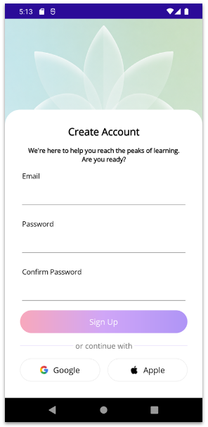
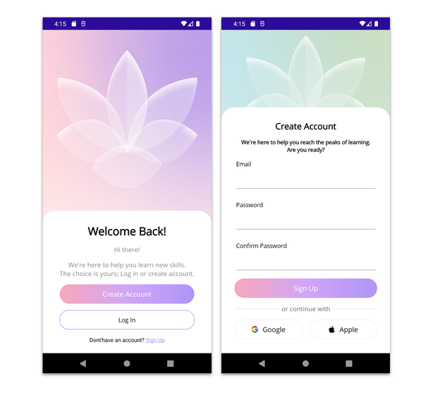
And that’s it, we’re all done! 🎉 Below, you can see the final result of both screens.
Conclusion
And that’s it! I hope this article helps you recreate beautiful UIs in .NET MAUI!
We built two account creation screens inspired by a Dribbble design. Along the way, we explored how to structure layouts with Grid, create overlapping effects, use gradients and customize the UI using Telerik UI for .NET MAUI RadBorder and DataForm.
As you can see, in just two screens we covered several tips that you can easily apply to your own applications.
I encourage you to keep exploring, experimenting and learning something new every day. 💚 See you in the next article! 🙋♀️🚀

Leomaris Reyes
Leomaris Reyes is a software engineer from the Dominican Republic specializing in mobile development. She is a 7-time Microsoft MVP and actively builds mobile applications while sharing practical knowledge through technical articles and developer-focused content.
Through her work, she explains programming concepts, developer tools and real-world development practices to help developers grow in their careers.
You can follow her on Instagram and TikTok at @leomarisreyes.dev, read her articles on AskXammy, and connect with her on LinkedIn, where she shares tutorials, insights and resources for developers.
Related Posts
Comments
All articles
Topics
Web MobileMobile
Desktop
Design
Productivity
People