Replicating a Room Sublet App UI with .NET MAUI

Summarize with AI:
Let’s build out a design of a room subletting app using the Progress Telerik UI for .NET MAUI Rating control, plus concepts like overlapping effects and FormattedText.
I dare say that a large percentage of young people, when they go to university, look for a room to rent where they can become independent and, of course, one that’s close to their campus!
And how cool would it be if, during that special moment, an app could help us find the perfect place. And if there isn’t an app that does it? Even better, let’s learn how to create one!
That’s exactly what we’re going to do in this article. We’re going to replicate a room sublet screen using .NET MAUI controls and one of my favorite Progress Telerik UI for .NET MAUI components: the MAUI Rating control. This UI was inspired from a Dribbble design. So get comfortable, and let’s start building this UI that I absolutely love!! 🤩
How Will the Explanation Work?
So you can understand everything 100%, I’ll explain how the process will work:
➖ Visual diagram: Before we start, you’ll see a diagram with a screenshot of the design we want to achieve. This design will be divided into blocks, each identified with a name and a color. Each one will be explained individually.
➖ Code explanation per block: In addition to the written explanation, each screen includes a set of blocks with the exact code snippets you need to implement and achieve the final result.
➖ Step-by-step visual progress: Each explanation will have its corresponding screenshot, so you can see the progress as we build the UI.
⚠️ For this design, we took inspiration from an original Dribbble UI, but made some adaptations and adjustments to align it with the goals of this article.
🔧 Environment Setup
You’ll learn how to take advantage of some of the powerful Telerik UI for .NET MAUI components in this post. If you don’t have the .NET MAUI library installed yet, visit the quick start page, which explains step-by-step how to install Telerik UI for .NET MAUI, download the license key, configure the Telerik package source and install the Telerik MCP server (if needed).
Breaking Down the Design
To make this easier to follow, I’ve divided the design into clear blocks. We’ll build each part one at a time, in the order you see below.
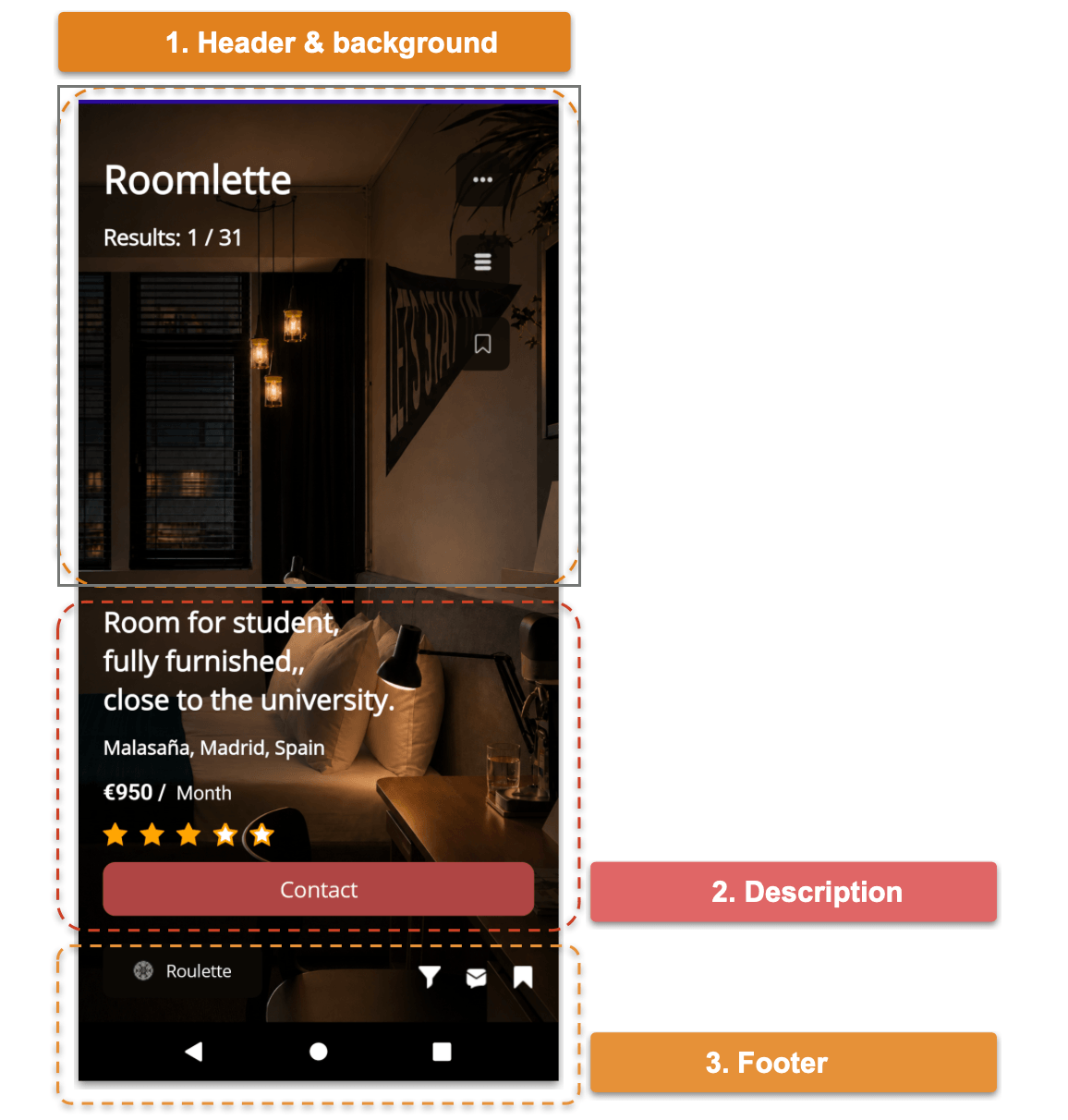
1. Header and Background
Woohoo!! 🎉🎉 Let’s start with the first block. I love this one because it contains several interesting components, but before adding them, we need to create the layout that will hold the entire page.
Grid
We’ll start with a grid composed of a single column. This will help us create the overlay effect between the background image and the main content.
Inside the grid, we’ll place two elements:
- The background image.
- Another Grid that will contain all the UI components we’ll build throughout this article. This grid will have two columns and nine rows.
In code, it should look something like this:
<Grid ColumnDefinitions="*">

    <Image Grid.Column="0" Source="room.png" Aspect="AspectFill"/>

    <Grid ColumnDefinitions="*,auto" RowDefinitions="auto,auto,*,auto,auto,auto,auto,auto,auto"
    RowSpacing="13">

	    <!-- Add all the remaining components here -- >

    </Grid>
</Grid
Name and Result Label
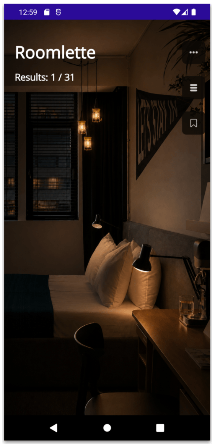
Now, inside the second grid, we’ll add two Labels to display the room name and its result, as shown below:
<Label Grid.Row="0" Grid.Column="0" Text="Roomlette" FontSize="32" FontAttributes="Bold" TextColor="White" Margin="20,40,0,0"/>

<Label Grid.Row="1" Grid.Column="0" Text="Results: 1 / 31" FontSize="18" FontAttributes="Bold" TextColor="White" Margin="20,0,0,0"/>
And then, let’s add the three action buttons on the right side of the screen, as shown below:
<Button Grid.Row="0" Grid.Column="1" BackgroundColor="#0b0905" Opacity="0.8" HeightRequest="30" WidthRequest="30" CornerRadius="8" HorizontalOptions="Center" Margin="0,40,10,0" ImageSource="ellipsis.png"/>

<Button Grid.Row="1" Grid.Column="1" BackgroundColor="#0b0905" Opacity="0.8" HeightRequest="30" WidthRequest="30" CornerRadius="8" HorizontalOptions="Center" Margin="0,10,10,0" ImageSource="stack.png"/>

<Button Grid.Row="2" Grid.Column="1" BackgroundColor="#0b0905" Opacity="0.8" HeightRequest="30" WidthRequest="30" CornerRadius="8" HorizontalOptions="Center" Margin="0,10,10,0" ImageSource="save.png" VerticalOptions="Start"/>
We’ve finished building the first block! At this point, your result should look like this:
2. Description
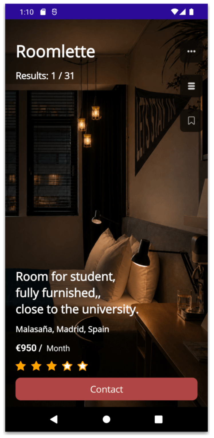
For this second block, we’ll add the elements that make up the main description of the screen. Let’s see how to build them:
Main Description and Location
<Label Grid.Row="3" Grid.Column="0" Text="Room for student, fully furnished,, close to the university." FontSize="23" FontAttributes="Bold" TextColor="White" Margin="20,40,0,0"/>
<Label Grid.Row="4" Grid.Column="0" Text="Malasaña, Madrid, Spain" FontSize="16" FontAttributes="Bold" TextColor="White" Margin="20,0,0,0"/>
Price
Take a look at this Label. Even though it’s a single label, it has different styles: one part has a different size, and another part is bold.
There are two ways to achieve this:
- Create a separate Label for each text style.
- Use FormattedText, which allows us to apply different properties within the same Label.
For this example, we’ll use the second option. Here’s how you can do it:
<Label Grid.Row="5" Grid.Column="0" Margin="20,0,0,0">
    <Label.FormattedText>
		    <FormattedString>
			    <Span Text="€950 / " FontSize="18" FontAttributes="Bold" TextColor="White"/>
			    <Span Text=" Month" FontSize="16" TextColor="White"/>
		    </FormattedString>
	    </Label.FormattedText>
</Label>
Telerik Rating Control
Oh yeah!, we’ve reached my favorite part! This screen includes a Rating control, and we’ll use the Telerik one. It’s super easy to use, and we can play with the shape of the items, the colors for the selected and unselected items and many other things. 😎
First, add the namespace:
xmlns:telerik="http://schemas.telerik.com/2022/xaml/maui"
And now, in your .xaml file, add the following code:
<telerik:RadShapeRating Grid.Row="6" Grid.Column="0" ItemFill="White" ItemStroke="#FFA500" AutomationId="radRating" Value="3" Margin="20,0,0,0"/>
I also invite you to explore more about Telerik Rating control in the official documentation, which is really helpful!
Contact Button
<Button Grid.Row="7" Grid.Column="0" Grid.ColumnSpan="2" Text="Contact" BackgroundColor="#af4544" FontSize="18" HeightRequest="25" HorizontalOptions="Fill" CornerRadius="10" Margin="20,0"/>
We’ve finished building the second block! At this point, your result should look like this:
3. Footer
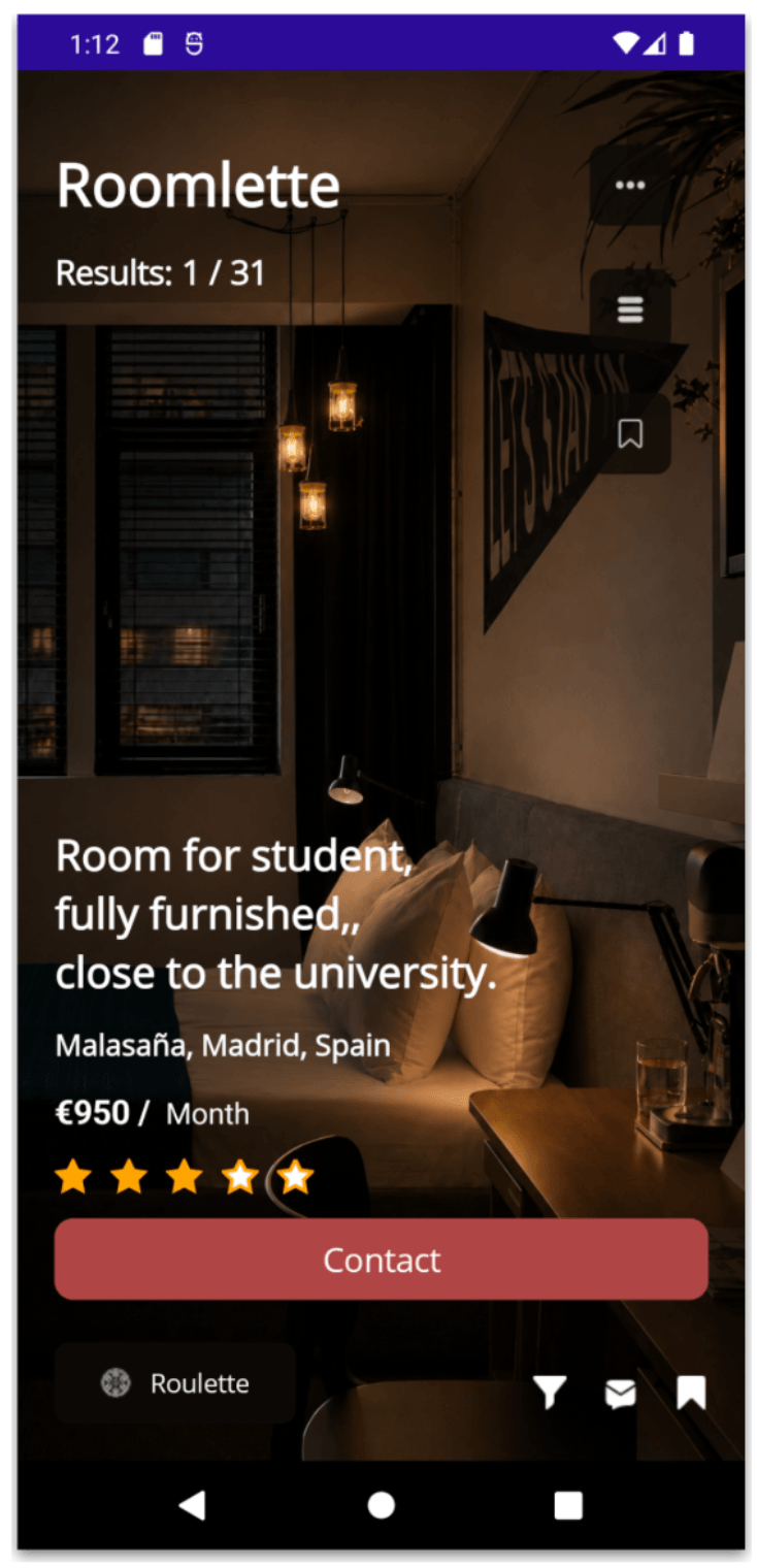
We’re almost done! This footer block basically contains a Roulette button and three icons aligned horizontally at the end: Filter, Message and Save.
How does it look in code? Like this 🤓:
<Button Grid.Row="8" Grid.Column="0" BackgroundColor="#0b0905" Padding="0" Text="Roulette" HeightRequest="18" WidthRequest="130" CornerRadius="8" Margin="20,10,20,20" ImageSource="roulette.png" HorizontalOptions="Start" />

<HorizontalStackLayout Grid.Row="8" Grid.Column="1" Spacing="20" Margin="0,0,20,0">
    <Image Source="filtericon.png" HeightRequest="18" WidthRequest="18"/>
    <Image Source="letter.png" HeightRequest="18" WidthRequest="18"/>
    <Image Source="bookmark.png" HeightRequest="18" WidthRequest="18"/>
</HorizontalStackLayout>
We’ve finished building the third block! At this point, your result should look like this:
Conclusion
And that’s all! I hope this article helps you recreate beautiful UIs in .NET MAUI! 😎
With a single screen, we explored several interesting concepts, such as using the Telerik UI for .NET MAUI Rating control, leveraging grid layouts to create overlapping effects, applying different styles within the same text using FormattedText and more!
I hope these techniques help you not only recreate this UI, but also inspire and support the interfaces you build from now on in .NET MAUI. 💚
See you in the next article! 🙋♀️🚀
If you want to explore Telerik UI for .NET MAUI, download your free trial today!

Leomaris Reyes
Leomaris Reyes is a software engineer from the Dominican Republic specializing in mobile development. She is a 7-time Microsoft MVP and actively builds mobile applications while sharing practical knowledge through technical articles and developer-focused content.
Through her work, she explains programming concepts, developer tools and real-world development practices to help developers grow in their careers.
You can follow her on Instagram and TikTok at @leomarisreyes.dev, read her articles on AskXammy, and connect with her on LinkedIn, where she shares tutorials, insights and resources for developers.
Related Posts
Comments
All articles
Topics
Web MobileMobile
Desktop
Design
Productivity
People