SmartTag
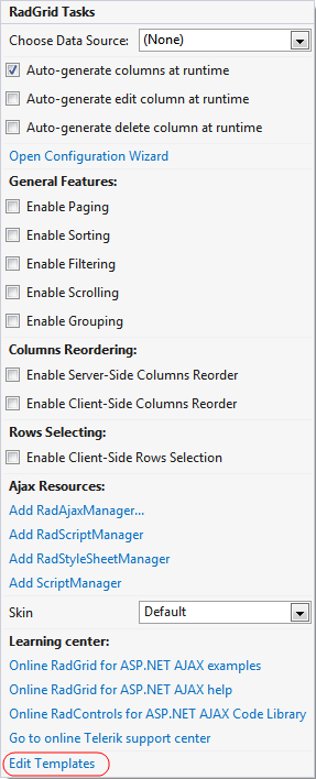
The RadGrid Smart Tag provides convenient access to frequently needed tasks. You can display the Smart Tag by right clicking on the grid in the design window, and choosing Show Smart Tag from its context menu.
The smart tag lets you perform the following:
RadGrid Tasks
-
The Choose Data Source drop-down lets you bind the grid to a declarative data source. You can select from the existing data source components on the Web page, or create and configure a new one.
-
The Configure Data Source link launches the Configure Data Source wizard for the current data source. This link does not appear in the Smart Tag unless the grid is bound to a declarative data source.
-
The Refresh Schema link refreshes the schema for the data source to which the grid is bound. This link does not appear in the Smart Tag unless the grid is bound to a declarative data source.
-
The Auto-generate columns at runtime check box sets AutoGenerateColumns property of the RadGrid control. This specifies whether the table views in the grid automatically create columns for all fields in the data source at runtime by default. This default behavior can be overridden by the AutoGenerateColumns property of any GridTableView in the grid.
-
The Auto-generate edit column at runtime check box sets the AutoGenerateEditColumn property of the RadGrid control. This specifies whether the table views in the grid automatically insert a GridEditCommandColumn column before any auto-generated data columns to allow the user to edit the data in the grid rows. This default behavior can be overridden by the AutoGenerateEditColumn property of any GridTableView in the grid.
In order to enable editing, you must configure the data source to allow updates as well as adding the edit command column.
- The Auto-generate delete column at runtime check box sets the AutoGenerateDeleteColumn property of the RadGrid control. This specifies whether the table views in the grid automatically insert a GridButtonColumn column before any auto-generated data or edit columns to allow the user to delete grid rows.
In order to enable row deletion, you must configure the data source to allow deletes as well as adding the delete column.
- The Open Editor link launches the RadGrid Editor, where you can configure the grid, including all GridTableView objects that it contains. The RadGrid Editor helps organize the many child controls and functions of the RadGrid control.
General Features
-
The Enable Paging check box sets the AllowPaging property of the RadGrid control. This specifies whether the grid supports basic paging. The AllowPaging property of the RadGrid control can be overridden by the AllowPaging property of any GridTableView in the grid.
-
The Enable Sorting check box sets the AllowSorting property of the RadGrid control. This specifies whether the grid supports basic sorting. The AllowSorting property of the grid can be overridden by the AllowSorting property of any GridTableView in the grid.
-
The Enable Filtering check box sets the AllowFilteringByColumn property of the RadGrid control. This specifies whether the grid supports basic filtering. The AllowFilteringByColumn property of the grid can be overridden by the AllowFilteringByColumn property of any GridTableView in the grid.
-
The Enable Scrolling check box sets the ClientSettings.Scrolling.AllowScroll property of the RadGrid control. This property controls whether scrolling is enabled in the grid.
-
The Enable Grouping check box sets the ShowGroupPanel and ClientSettings.AllDragToGroup properties of the RadGrid control. These controls allow users to specify grouping by columns from the data source.
Columns Reordering
-
The Enable Server-Side Columns Reorder check box sets the ClientSettings.AllowColumnsReorder and ClientSettings.ReorderColumnsOnClient properties of the grid. When Enable Server-Side Columns Reorder is checked, the AllowColumnsReorder property is set to True and the ReorderColumnsOnClient property is set to False. This allows the user to re-order the columns of the grid, where the re-ordering occurs in server-side code.
-
The Enable Client-Side Columns Reorder check box sets the ClientSettings.AllowColumnsReorder and ClientSettings.ReorderColumnsOnClient properties of the grid. When Enable Client-Side Columns Reorder is checked, both the AllowColumnsReorder property and the ReorderColumnsOnClient property are set to True. This allows the user to re-order the columns of the grid, where the re-ordering occurs in client-side code.
Rows Selecting
The Enable Client-Side Rows Selection check box sets the ClientSettings.Selecting.AllowRowSelect property of the grid. This specifies whether the user can select rows by clicking on them.
Ajax Resources
-
The Add RadAjaxManager... link adds a RadAjaxManager component to your Web page, and displays the RadAjax Property Builder where you can configure it.Adding a RadAjaxManager to your Web page lets you take advantage of the AJAX technology to improve performance by performing postbacks asynchronously.
-
The Replace ScriptManager with RadScriptManager link replaces the default ScriptManager component that is added for AJAX-enabled Web sites with RadScriptManager.
-
The Add RadStyleSheetManager link adds a RadStyleSheetManager to your Web page.
Skin
The Skin drop down lets you select a Skin to set the look-and-feel of the grid.
Learning Center
Links navigate you directly to RadGrid examples, help, or code library. You can also search the Telerik web site for a given string.
Edit Templates
The Edit Templates link lets you launch the template design surface for a particular template that the grid uses. You can select from a drop-down list of all possible templates, including templates for template columns, the no records template, pager template, command item template, edit form template, global item template, or nested view template.
