Column Types
RadGrid supports two main types of columns:
-
Data columns, which display the data you bind to the grid or contain controls that operate on the data in the grid.
-
Structure columns, which facilitate some features of the grid, such as grouping or resizing.
RadGrid does not support DataFields or UniqueNames containing spaces. Please modify the names of the fields in your data source accordingly before passing it to the grid.
Data Columns
Data columns display data or contain controls that operate on the data. They can be automatically generated, created at design time using the RadGrid Property Builder, or added dynamically at runtime to the Columns property collection.
Note that by default the header text of the auto-generated columns is the name of the data field split by capital letters. To control this behavior you can use the EnableSplitHeaderText property. Its default value is true. If you set it to false, the header text will be the same as the name of the data field.
Automatically-generated columns are added at runtime when the AutoGenerateColumns of the table view is set to true. When you use automatically-generated columns, a column is added for every field of the data source to which the table view is bound. These columns can be accessed using the AutoGeneratedColumns property collection.
Automatically-generated columns are aware of the data type of the field they display (similar to the way the ASP.NET GridView control works).
Explicitly-created columns (columns created in the Property Builder or at runtime) are added to the Columns property collection. They appear in the table view in the order in which they are declared and before any automatically-generated columns (unless you order the columns programmatically).
Automatically generated columns are created for every field in the data source. If you have explicitly created columns as well, this can result in duplicated columns.
The following excerpt shows a RadGrid declaration with explicitly-created columns. This method of declaring the columns is called column binding:
<telerik:RadGrid RenderMode="Lightweight" ID="RadGrid1" runat="server">
  ...
  <MasterTableView DataSourceID="ProductsDataSource" TableLayout="Auto">
    ...
    <Columns>
      <telerik:GridBoundColumn DataField="ProductID" DataType="System.Int32" HeaderText="Product ID"
        SortExpression="ProductID" UniqueName="ProductID">
      </telerik:GridBoundColumn>
      <telerik:GridBoundColumn DataField="ProductName" HeaderText="Product Name" SortExpression="ProductName"
        UniqueName="ProductName">
      </telerik:GridBoundColumn>
      <telerik:GridBoundColumn DataField="UnitPrice" DataType="System.Decimal" HeaderText="Unit Price"
        SortExpression="UnitPrice" UniqueName="UnitPrice">
      </telerik:GridBoundColumn>
    </Columns>
    ...
  </MasterTableView>
</telerik:RadGrid>
Column Types
There are several different column types. Different column types support different editors, different filtering options, and so on.
Every data column type has the following Boolean properties:
-
Exportable - Determines whether the column should be included into the exported file or not.
-
Display - Determines whether the column is displayed in browser mode. When Display is False, the column is rendered in the browser but all the cells are styled with "display: none", so that they are not visible to the user. Display does not affect whether the column editor is visible in an edit form, but if the table view uses an in-place editor, the column editor does not appear.
-
Visible - Determines whether the column is rendered in browser mode. When Visible is False, the column is not even rendered in the browser. Visible does not affect whether the column editor is visible in an edit form, but if the table view uses an in-place editor, the column editor does not appear.
In addition, editable column types (column types that implement the IGridEditableColumn interface)have a ReadOnly property that determines whether the column editor is visible in the edit form. When ReadOnly is True, the column editor does not appear in the edit form. ReadOnly does not affect whether the column is visible in browser mode.
None of these three properties prevents you from accessing the column cell's content server-side using the UniqueName of the column.
As of Q1 2013, a column with the Visible property set to False is no longer able to access the column cell's content. You can find additional information in this forum thread.
In order to provide more control over the editing process, every editable column also has an InsertVisiblityMode property that determines whether an editor will be displayed in the insert item. You can set the property to one of three values:
-
Default - The visibility is dependent on the ReadOnly property.
-
AlwaysVisible - The editor is always visible in the insert item.
-
AlwaysHidden - An editor is not shown in the insert item.
With explicitly-created columns, you can choose the column type you consider most appropriate. The different column types for data columns are listed in Table 1:
Table 1: Click on a column type to jump to its section for more information.
At the bottom end of the article you can find a detailed table containing the specific properties and generated controls for each column type
GridAutoCompleteColumn
When in browser mode, the column looks and behaves like GridBoundColumn. It renders text inside the cell, depending on the DataField of the column and the data source of the owner GridTableView. In insert/edit mode, it displays RadAutoCompleteBox for each edited cell in the column.
To configure the column you can use these properties, valid for most of the other columns as well:
-
EmptyDataText - Sets or gets default text when the column is empty. Default value is " "
-
AllowSorting - Gets or sets whether the column data can be sorted.
-
AllowFiltering - A Boolean property that specifies whether filtering will be enabled for the column.
-
DataField - Set the column in the grid's data source containing values to be displayed and used for the RadAutoCompleteBox initially in edit mode.
Further configuration of the RadAutoCompleteBox used in edit mode is possible using these properties exposed in both GridAutoCompleteColumn and in GridAutoCompleteColumnEditor, which is the default editor for the column:
-
InputType - Gets or sets a value indicating how the RadAutoCompleteBox items should be displayed—as tokens or as text.
-
Filter - Gets or sets a value indicating whether the RadAutoCompleteBox should apply “Contains” or “StartsWith” filter logic.
-
AllowCustomEntry - Gets or sets a value indicating whether the user will be able to add a custom text not present within the raw data to create a custom entry.
-
SelectionMode - Gets a value indicating whether the user can select multiple entries.
-
AllowTokenEditing - Gets a value indicating whether the text of the RadAutoCompleteBox Tokens can be edited when a user double-clicks it.
-
Delimiter - Gets or sets a value indicating what delimiter should be used when the control displays the selected items as text (InputType = Text).
-
DataTextField - Gets or sets the DataTextField of the RadAutoCompleteBox.
-
DataValueField - Gets or sets the DataValueField of the RadAutoCompleteBox.
You can find more information about the properties of RadAutoCompleteBox in the help topics of the control:InputType, Filter, AllowCustomEntry, SelectionMode, and AllowTokenEditing.
You can find information about binding RadAutoCompleteBox in this help article:RadAutoCompleteBox - Data Binding Overview.
GridBoundColumn
GridBoundColumn displays a table view column bound to a field in the data source of the table view that contains it. To bind this column type to a field, set its DataField property to the name of a field.
This column supports editing of its data (it implements the IGridEditableColumn interface) and provides, by default, GridTextBoxColumnEditor as a column editor to allow editing the text for each cell.
It also exposes the HtmlEncode property (its default value is False) which specifies whether the text in the corresponding cell will be encoded automatically or not when displayed in the browser. Setting the HtmlEncode property to True is recommended to avoid Cross-Site Scripting (XSS), see RadGrid Security.
You can find more information about the nature of HTML encoding here: https://msdn.microsoft.com/en-us/library/system.web.httpserverutility.htmlencode.aspx
Moreover, the built-in GridBoundColumn has an EmptyDataText property, which specifies the text that will be displayed in the column cell when it has an empty/null value retrieved from the data source.
The following declaration shows a GridBoundColumn:
<telerik:GridBoundColumn DataField="UnitPrice" DataType="System.Decimal" HeaderText="Unit Price"
  SortExpression="UnitPrice" UniqueName="UnitPrice">
</telerik:GridBoundColumn>
GridButtonColumn
GridButtonColumn displays a button for each entry in the column. This button can then perform some command.
There are two types of button columns with pre-defined commands:
-
Select - When a button in this column is pressed, the entire row is selected.
-
Delete - When a button in this column is pressed, the entire row is deleted.
In addition, you can add a generic button column and specify what command it performs by setting the CommandName (and CommandArgument) properties. For details on using commands, see Command Reference (Event Bubbling in Telerik RadGrid).
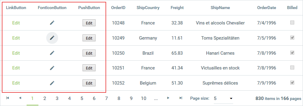
In addition to specifying the command a button performs, you can specify the type of button the column displays. The available button types are: PushButton, LinkButton and ImageButton. Image 1 shows a grid with each of these types of button columns:
Image 1: GridButtonColumn with different types of buttons
GridEditCommandColumn
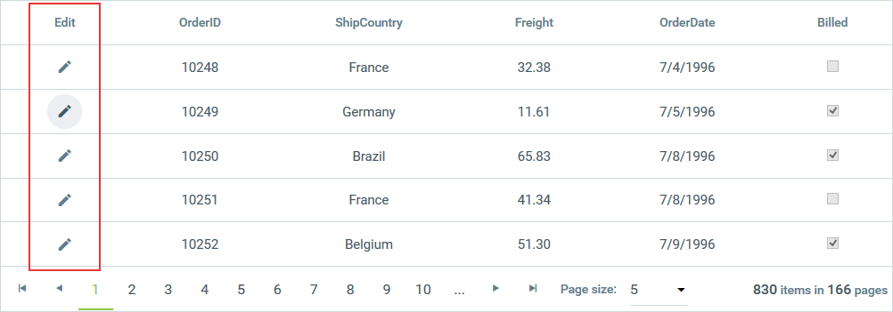
Initially, the GridEditCommandColumn displays only an Edit button as shown in Image 2.
Image 2: Edit link displayed in GridEditCommandColumn
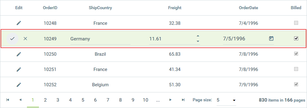
When the user presses the Edit button, if the table view is configured for in-line editing, the Update and Cancel buttons appear in place of the Edit button and the cells on the row become editable.
Image 3: RadGrid row in edit mode
The previous images showed an Edit command column that uses a link button. Like the GridButtonColumn, the GridEditCommandColumn can also use an image button or a push button.
GridHyperLinkColumn
Each cell in a GridHyperLinkColumn contains a predefined hyperlink.
To specify the text of the link, you can do one of the following:
-
Set the Text property to a static value. When you use this method, every link appears the same in the entire column.
-
Set the DataTextField property to a field that supplies the text for the link. When you use this method, you can format the text that comes from the database by setting the DataTextFormatString property.
When Filtering is enabled, the
DataTextFieldproperty will be taken into account.
To specify the target of the hyperlink, set the DataNavigateUrlFields property. You can specify multiple fields if the target of the hyperlink is determined by more than one field in the database. You can then combine the navigate URL fields by specifying a format string as the value of the DataNavigateUrlFormatString property. Additionally, you can set the ImageUrl property to override the text property of the hyperlink column and render an image.
The following example shows the declaration of a GridHyperLinkColumn:
<telerik:GridHyperLinkColumn DataTextFormatString="Search Google for '{0}'" DataNavigateUrlFields="CompanyName"
UniqueName="CompanyName" DataNavigateUrlFormatString="http://www.google.com/search?hl=en&q={0}&btnG=Google+Search"
DataTextField="CompanyName">
</telerik:GridHyperLinkColumn>GridImageColumn
Each cell in a GridImageColumn contains an image. To specify the image URL of that image, you can do one of the following:
-
Set the ImageUrl property to a static value. When you use this method, every image appears the same in the entire column.
-
Set the DataImageUrlFields property to a field in the source that can be used to supply the image path and format it by setting the DataImageUrlFormatString property. You can specify multiple fields if the image URL is determined by more than one field in the database.
-
Set the DataAlternateTextField property to specify by which field in the grid source the column will be sorted/filtered. For the filtering, you must also explicitly set the DataType property of the column to the type of the field specified through the DataAlternateTextField property (System.String in the common case). You can also apply formatting using the DataAlternateTextFormatString property.
Note that if you specify a sort expression directly through the SortExpression property of the column, it will have a higher priority and will override the sort/filter criteria of the DataAlternateTextField property.
Other commonly used properties for that column are AlternateText, ImageAlign, ImageWidth, ImageHeight, etc. The following example shows the declaration of a GridImageColumn from this online demo of the product:
<telerik:GridImageColumn DataType="System.String" DataImageUrlFields="CustomerID"
  DataImageUrlFormatString="IMG/{0}.jpg" AlternateText="Customer image" DataAlternateTextField="ContactName"
  ImageAlign="Middle" ImageHeight="110px" ImageWidth="90px" HeaderText="Image Column"
  FooterText="ImageColumn footer">
</telerik:GridImageColumn>
GridBinaryImageColumn
Each cell in a GridBinaryImageColumn contains an image streamed from a binary image source field (specified through the DataField property of the column). When used, this column will show a RadBinaryImage control in view mode and RadUpload orRadAsyncUpload in edit mode to upload an image. The type of upload is determined by the UploadControlType property. Additionally, you can persist the binary data when an item is opened for edit by setting the PersistBinaryDataOnEdit property to true. This will force the control to pass the old binary image to the data source so it could be persisted and not deleted.
The image will be sized automatically to ImageHeight and ImageWidth pixel values if the ResizeMode property of the column is different than None. Possible values for the ResizeMode property of the column are:
-
Crop (the image will be trimmed)
-
Fit (the image will be sized to fit the given dimensions)
-
None (default)
Additionally, you can set the DataAlternateTextField property to specify by which field in the grid source the column will be sorted/filtered. For the filtering, you must also explicitly set the DataType property of the column to the type of the field specified through the DataAlternateTextField property (System.String in the common case). You can also apply formatting using the DataAlternateTextFormatString property.
Note that if you directly specify a sort expression through the SortExpression property of the column, it will have higher priority and will override the sort/filter criteria of the DataAlternateTextField property.
Other commonly used properties for that column are AlternateText, ImageAlign, ImageWidth, ImageHeight, DefaultImageUrl (to set the default image when a null value is returned from the source), etc. The following example shows the declaration of a GridBinaryImageColumn from this online demo of the product.
<telerik:GridBinaryImageColumn DataField="Data" HeaderText="Image" UniqueName="Upload"
  ImageHeight="60px" ImageWidth="60px" ResizeMode="Fit">
</telerik:GridBinaryImageColumn>
GridCheckBoxColumn
GridCheckBoxColumn displays a check box to represent a Boolean value. Bind this column type to a Boolean field by setting itsDataField property. If this column type is bound to a data value that is not Boolean, the grid throws an exception.
When the grid is in browser mode, or if the column is read-only, the check box is disabled. When the column is editable, the check box is enabled.GridCheckBoxColumn implements the IGridEditableColumn interface, and by default, it provides a GridCheckBoxListColumnEditor for editing items.
The following example shows the declaration of a GridCheckBoxColumn:
<telerik:GridCheckBoxColumn UniqueName="BoolField" HeaderText="CheckBox Column" DataField="BoolField"
  AllowSorting="true">
</telerik:GridCheckBoxColumn>
See the section below for a comparison between GridCheckBoxColumn and a template column that contains a check box.
GridCheckBoxColumn also provides StringTrueValue and StringFalseValue properties to use when binding the column to a String type field, which may contain "Yes" or "No", "1" or "0", etc.
<telerik:GridCheckBoxColumn DataField="StringField" DataType="System.Boolean"
    FilterControlAltText="Filter StringField column" HeaderText="StringField"
    SortExpression="StringField" UniqueName="StringField" StringFalseValue="No"
    StringTrueValue="Yes">
</telerik:GridCheckBoxColumn>
GridClientSelectColumn
GridClientSelectColumn also displays a check box control for each cell in the column. Unlike GridCheckBoxColumn, however, this column type does not represent a Boolean data value. Instead, it acts a bit like a GridButtonColumn with its CommandName set to "Select" or "Deselect". This column type lets users select or deselect grid rows automatically by selecting or clearing each check box. To allow selection through the client select column only, the ClientSettings.Selecting.UseClientSelectColumnOnly property should be set to True (default value is False).
When using GridClientSelectColumn , you must set the grid's ClientSettings.Selecting.AllowRowSelect property to True .
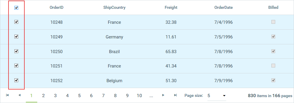
If the grid's AllowMultiRowSelection property is True, a check box is displayed in the column header as well as the rows of the grid. When the user clicks the check box in the header, the check box in every row of the current page of the grid changes to match the checked state of the check box in the header (and the row is selected or deselected, accordingly):
Image 4: RadGrid rows selected with GridClientSelectColumn
GridDragDropColumn
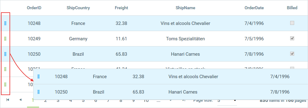
When Items Drag-and-Drop is enabled in RadGrid, defining a GridDragDropColumn in the Columns collection of the respective GridTableView will make the data items inside draggable only when grabbed by the drag handle inside the column cells.
Image 5: Dragging a row using GridDragDropColumn
GridDropDownColumn
When in browser mode, GridDropDownColumn looks and behaves like a standard GridBoundColumn. When in edit mode, however, it displays a drop-down control for each edited cell in the column. This column type is useful for lookup fields from data tables. To bind this column type:
-
Set the DataField property to the name of a field in the data source of the table view that contains the column.
-
Set the DataSourceID property to the ID of a data source control for the lookup list. If the data source contains multiple tables, set the ListDataMember property to the name of the lookup table.
-
Set the ListTextField property to the name of the field in the lookup table that provides the text of items in the drop-down control.
-
Set the ListValueField property to the name of the field in the lookup table that supplies the value for the field specified by the DataField property.
Automatic Load-On-Demand support for GridDropDownColumn
As of version 2010.Q2 of Telerik controls, GridDropDownColumn supports automatic load-on-demand for the RadComboBox editor. The column provides a set of new properties that allow you to configure how load-on-demand works:
-
AllowAutomaticLoadOnDemand - Gets or sets a value indicating whether automatic load-on-demand is enabled for the RadComboBox editor (by default false).
-
ShowMoreResultsBox - Gets or sets a value indicating whether the RadComboBox editor displays a More Results box (by default false).
-
AllowVirtualScrolling - Gets or sets a value indicating whether virtual scrolling is enabled for RadComboBox editor (by default false).
-
ItemsPerRequest - Gets or sets the number of Items the RadComboBox editor will load per Item request (by default -1, meaning all items will be requested).
For more information on configuring GridDropDownColumn, see Customize/Configure GridDropDownColumn.
GridDropDownColumn is editable (implements the IGridEditableColumn interface) and provides, by default, GridDropDownListColumnEditor as its column editor. You can use the DropDownControlType property to specify whether the column editor uses a RadComboBox or a standard DropDownList as the column editor. The default editor is RadComboBox.
<telerik:GridDropDownColumn UniqueName="DropDownListColumn" ListTextField="ContactName"
  ListValueField="ContactName" DataSourceID="SqlDataSource2" HeaderText="DropDown Column"
  DataField="ContactName" DropDownControlType="RadComboBox" AllowSorting="true">
</telerik:GridDropDownColumn>
See the GridTemplateColumn section below for a comparison between GridDropDownColumn and a template column that contains a drop-down list.
GridDateTimeColumn
When in browser mode, GridDateTimeColumn looks and behaves like a standard GridBoundColumn. When in edit mode,however, it displays a RadDateInput, RadDatePicker, RadTimePicker, orRadDateTimePicker control. This column type is for date and time values. Its DataField property must identify a field with a valid data type (DateTime).
This column type is editable (implements the IGridEditableColumn interface) and by default provides GridDateTimeColumnEditor as its column editor. You can use the PickerType property to specify the type of dataselection control the editor uses. The default editor/filter control (when filtering is enabled) is RadDatePicker.
The control for editable cells in this column type can be accessed through the editor's TextBoxControl property (when using RadDateInput editor) or the PickerControl property (for RadDatePicker, RadDateTimePicker or RadTimePicker editors).
<telerik:GridDateTimeColumn DataField="OrderDate" HeaderText="GridDateTimeColumn"
  UniqueName="OrderDate" PickerType="DatePicker" />
See the GridTemplateColumn section below for a comparison between GridDateTimeColumn and a template column that contains a RadDatePicker , RadTimePicker , RadDateTimePicker or RadDateInput control.
If you want to change properties of a
GridDateTimeColumneditor related to the calendar or time view, use theirSharedCalendarorSharedTimeViewproperties.
protected void RadGrid1_ItemDataBound(object sender, GridItemEventArgs e)
{
    if (e.Item is GridEditableItem && e.Item.IsInEditMode)
    {
        GridEditableItem item = e.Item as GridEditableItem;
        var picker = (RadTimePicker)item["Times"].Controls[0];
        picker.SharedCalendar.EnableKeyboardNavigation = true;
        picker.SharedTimeView.EnableKeyboardNavigation = true;
    }
}
GridNumericColumn
When in browser mode, GridNumericColumn looks and behaves like a standard GridBoundColumn. When in edit mode, however, it displays a RadNumericTextBox control. This column type is for numeric values. Its DataField property must identify a field with a valid data type (Number or Decimal).
This column type is editable (implements the IGridEditableColumn interface) and by default provides GridNumericColumnEditor as its column editor.
When the property DbValueFactor is set, it determines the multiplication factor applied by RadNumericTextBox in edit/insert mode. In this case, the value is represented as a percentage according to the aforementioned factor. DbValueFactor is used along with the NumericType property, which should be set to Percent. It is useful mostly when storing percent values as floating point numbers in the database. The default value of the property is 1.
<telerik:GridNumericColumn DataField="Freight" HeaderText="GridNumericColumn" UniqueName="Freight">
</telerik:GridNumericColumn>
See the GridTemplateColumn section below for a comparison between GridNumericColumn and a template column that contains a RadNumericTextBox control.
GridMaskedColumn
When in browser mode, GridMaskedColumn looks and behaves like a standard GridBoundColumn. When in edit mode, however, it displays a RadMaskedTextBox control. This column type is for values that fit a specific format. Use the Mask property to specify an edit mask that defines the valid values. The DataField property must identify a field with a valid data type (values conform to the mask).
This column type is editable (implements the IGridEditableColumn interface) and by default provides GridMaskedColumnEditor as its column editor.
<telerik:GridMaskedColumn UniqueName="PhoneNumber" HeaderText="Phone" DataField="PhoneNumber"
  Mask="(###) ###-####" />
See the GridTemplateColumn section below for a comparison between GridMaskedColumn and a template column that contains a masked text box.
GridHTMLEditorColumn
GridHTMLEditorColumn is for columns whose values are a string of HTML. It uses RadEditor to allow WYSIWYG editing of HTML values. The DataField property must identify a field with a valid data type (string of HTML).
This column type is editable (implements the IGridEditableColumn interface) and by default provides GridHTMLEditorColumnEditor as its column editor.
<telerik:GridHTMLEditorColumn UniqueName="Blurb" DataField="Blurb" HeaderText="GridHTMLEditorColumn">
</telerik:GridHTMLEditorColumn>
It also exposes the HtmlEncode property (its default value is False) which specifies whether the text in the corresponding cell will be encoded automatically or not when displayed in the browser. Setting the HtmlEncode property to True is recommended to avoid Cross-Site Scripting (XSS), see RadGrid Security.
You can find more information about the nature of HTML encoding here: https://msdn.microsoft.com/en-us/library/system.web.httpserverutility.htmlencode.aspx
See the GridTemplateColumn section below for a comparison between GridHTMLEditorColumn and a template column that contains a RadEditor control.
GridCalculatedColumn
GridCalculatedColumn displays a value that is calculated based on one or more fields and an expression that indicates how to calculate the display value. Use the DataFields property to list all the fields that are used to calculate the column value. The Expression property then specifies how the field values are to be combined, using parameters based on the order of the fields listed in the DataFields property:
	  <telerik:GridCalculatedColumn HeaderText="Total Cost" UniqueName="TotalCost" DataType="System.Double"
	    DataFields="UnitPrice, NumberOrdered" Expression="{0}*{1}" />
The following table lists the operators you can use in the expression of a calculated column (complete information about the DataColumn.Expression property and supported operators/functions can be found here).
| Operator | Meaning |
|---|---|
| + | Sums the values in the specified columns' cells |
| - | Subtracts the values in the specified columns' cells |
| * | Multiplies the values in the specified columns' cells |
| / | Divides the values in the specified columns' cells |
GridTemplateColumn
GridTemplateColumn displays each cell in the column in accordance with a specified template. This lets you provide custom controls in the column. You can view and set the templates for this column type using the Edit Templates command on the RadGrid Smart Tag.
Image 5: Set templates for GridTemplateColumn using Smart Tag

You can also create the template columns programmatically and bind the controls in the code-behind.
Please keep in mind that when adding a template column, it is also recommended that you declare an ItemTemplate. If you do not need an ItemTemplate , you can simply omit its contents and leave it empty. However, it should be declared, as some internal operations in the grid control rely on its presence.
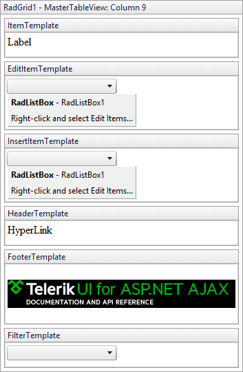
The Edit Templates command opens the template editor, where you can set the template as common HTML. The template editor displays four design surfaces:
-
ItemTemplate - The template that appears in column cells in browser mode.
-
EditItemTemplate - The template that appears in column cells in edit mode.
-
HeaderTemplate - A template for the column header.
-
FooterTemplate - A template for the column footer.
Image 6: Template editor for GridTemplateColumn
See Getting Started for a tutorial that includes creating and binding a template column.
With the Q2 2012 release, GridTemplateColumn exposes a ClientItemTemplate that allows the rendering of pure HTML into the column cell and the evaluation of Kendo-like expressions. The template is used with client-side binding and has a binding context, which has the fields of the data item object, as well as some additional properties listed below:
| Property | Description |
|---|---|
| owner | The current RadGrid instance. Can be used for calling methods of the component. |
| format(value, format) | A formatting function that can format Date and Number values. This function is based on the MS AJAX String.localeFormat(format, value) function. |
| item | The original JSON data object that the template is binding to. |
| index | The index of the currently data-binding item in the current page. |
| dataIndex | The index of the item in the set of all RadGrid data. This field has a meaning only when paging is enabled. It indicates the page-invariant index of the item. |
| isSelected | Indicates if the current grid row is selected. |
The following syntax of the binding expressions is supported:
| Format | Name | Description |
|---|---|---|
| #= ... # | Data | Evaluates the JavaScript code expression or a string property from the data item and outputs the result in the template. |
| # ... # | Code | Evaluates the JavaScript code expression inside. Does not output value. |
| #: ... # | HTML-encode | Same as the data expression, but HTML-encodes the result. |
GridCheckBoxColumn, GridDropDownColumn, GridDateTimeColumn, GridNumericColumn, GridMaskedColumn, and GridHTMLEditorColumn all behave similarly to a GridTemplateColumn with a check box, drop-down control, date selection control, RadNumericTextBox, RadMaskedTextBox, or RadEditor control in the template, respectively. However, there are some important differences when using GridTemplateColumn. These are listed in the following table:
| GridTemplateColumn | Other column types |
|---|---|
| In order to bind the controls inside the template, you must use a data binding expression on the appropriate control property. The example below shows how to do this for a CheckBox column. | Each column type can be bound directly to the grid data source by setting the DataField property. |
| In edit mode, the editor is GridTemplateColumnEditor . | The column type generates an editor of the appropriate type (see the section for the specific column type). These editors make it easier to access the data when the column is in edit mode. |
| Check boxes in an ItemTemplate can be selected and cleared, even when the column is in browser mode. | In browser mode, the check box in GridCheckBoxColumn is disabled so that it acts as a display-only control. |
| Drop-down controls in the item template must be explicitly populated. This lets you populate a lookup list statically, when the data does not come from a lookup table. | GridDropDownColumn automatically populates its drop-down list from a lookup list based on the DataSourceID , ListDataMember , ListTextField and ListValueField properties. |
<telerik:GridTemplateColumn HeaderText="Check/UnCheck" UniqueName="TemplateColumn">
  <EditItemTemplate>
      <asp:CheckBox id="editChkBox" runat="server"
      Checked='<%# Bind("Bool") %>'>
      </asp:CheckBox>
  </EditItemTemplate>
  <ItemTemplate>
      <asp:CheckBox id="defaultChkBox" runat="server"
      Checked='<%# Eval("Bool") %>'>
      </asp:CheckBox>
  </ItemTemplate>
</telerik:GridTemplateColumn>
GridAttachmentColumn
When you have attachments saved in your data source as a blob of binary data, GridAttachmentColumn provides you with an easy way to upload to and download straight from your data source. In normal mode, GridAttachmentColumn displays a button to download the attachment associated with the respective data record. In edit mode, a RadUpload or RadAsyncUpload control provides the user the ability to upload an attachment into the data source. The type of upload control used is determined by the UploadControlType property.
<telerik:GridAttachmentColumn DataSourceID="SqlDataSource2" MaxFileSize="1048576"
  EditFormHeaderTextFormat="Upload File:" HeaderText="Download" AttachmentDataField="BinaryData"
  AttachmentKeyFields="ID" FileNameTextField="FileName" DataTextField="FileName"
  AllowedFileExtensions=".jpeg,.jpg,.png,.doc,.docx,.xls,.xlsx"
  UniqueName="AttachmentColumn">
</telerik:GridAttachmentColumn>
GridAttachmentColumn works with an automatic data source control (specified through the DataSourceID property) that retrieves the attachment from the underlying data source.
Here are some of the column's properties that need to be properly set up for successful download:
-
AttachmentKeyFields - Specifies the field names from RadGrid's data source that are used to populate the attachment data source select parameters.
-
AttachmentDataField - Specifies the field from GridAttachmentColumn's data source where the attachment is stored as binary data.
-
FileName - Specifies the file name of the downloaded attachment.
-
FileNameTextField - Specifies the name of the field from RadGrid's data source, the values of which will be used as file names of the downloaded attachments.
-
FileNameTextFormatString - Specifies the format string used to format the value of the field specifies by the FileNameTextField property.
In normal mode, GridAttachmentColumn displays a download button in its cells. When configuring the download button, you can use properties already well-known from the GridButtonColumn: ButtonType, ButtonCssClass, ImageUrl (for ButtonType="ImageButton"), Text, DataTextField and DataTextFormatString.
In edit mode, a RadUpload control is provided for uploading files to the column's data source. GridAttachmentColumn provides the following properties related to the RadUpload properties:
-
AllowedFileExtensions - Specifies the allowed file extensions, e.g. AllowedFileExtensions=".jpeg,.jpg,.png,.doc,.docx,.xls,.xlsx".
-
MaxFileSize - Specifies the maximum allowed file size in bytes.
When a download button is clicked in a GridAttachmentColumn, RadGrid fires the ItemCommand event that can be used to either cancel the downloading, or to implement custom download logic. The event argument object can be cast to type GridDownloadAttachmentCommandEventArgs, providing additional properties related to the downloaded attachment.
-
AttachmentColumn - Reference to the GridAttachmentColumn instance from which the download event is fired.
-
AttachmentKeyValues - A Dictionary<string, object> collection containing the data key values for the attachment's data source, as well as additional data.
-
FileName - The file name that will be given to the downloaded attachment.
if (e.CommandName == RadGrid.DownloadAttachmentCommandName)
{
    e.Canceled = true;
    GridDownloadAttachmentCommandEventArgs args = e as GridDownloadAttachmentCommandEventArgs;
    string fileName = args.FileName;
    int attachmentId = (int)args.AttachmentKeyValues["ID"];
}
The ItemCommand event that bubbles in RadGrid can also be fired using GridItem.FireCommandEvent(string commandName, object commandArgument) on the server, or using GridTableView.fireCommand(name, argument) on the client. For the server method, the commandArgument object is the AttachmentKeyValues property in the event argument that needs to be specified, while, on the client, argument is the JSON equivalent of the same key/value collection.
protected void DownloadButton_Click(object sender, EventArgs e)
{
    int attachmentId = Int32.Parse(FileNamesComboBox.SelectedValue);
    string fileName = FileNamesComboBox.SelectedItem.Text;
    Dictionary<string, object> parameters = new Dictionary<string, object>();
    parameters["ColumnUniqueName"] = "AttachmentColumn";
    parameters["FileName"] = fileName;
    parameters["ID"] = attachmentId;
    RadGrid1.Items[0].FireCommandEvent(RadGrid.DownloadAttachmentCommandName, parameters);
}var parameters = {};
parameters.ColumnUniqueName = "AttachmentColumn";
parameters.FileName = combo.get_text();
parameters.ID = +combo.get_value();
var json = Sys.Serialization.JavaScriptSerializer.serialize(parameters);
masterTable.fireCommand("DownloadAttachment", json);The AttachmentKeyValues contains all entries for all the attachment keys, as well as two additional entries. The first contains the attachment's file name (with key "FileName"), while the second (with key "ColumnUniqueName" is the UniqueName of the GridAttachmentColumn instance. Omitting to specify the first entry will result in the attachment to be streamed as a file with a default name, while omitting to specify the UniqueName of the GridAttachmentColumn instance will cause the event to be fired from the first found GridAttachmentColumn in the parent GridTableView's columns collection. If more than one GridAttachmentColumn instance exists in the columns collection, specifying the correct column's unique name is essential.
For more information on GridAttachmentColumn, please refer to the online demo.
GridRatingColumn
The GridRatingColumn renders a RadRating control and provides different options for configuration.
-
ItemCount - Gets or sets the number of items RadRating shows. The default value is 5.
-
SelectionMode - Gets or sets the SelectionMode (Single or Continuous) property of the RadRating control.
-
Precision - Gets or sets the Precision property of the RadRating control (whether users can select an exact portion, half or whole item).
-
IsDirectionReversed - Gets or sets the IsDirectionReversed property of the RadRating control.
-
AllowRatingInViewMode - Gets or sets a value indicating whether users are allowed to rate data items in view mode. The default value is False (RadRating is rendered ReadOnly in view mode).
To retrieve or modify the value of the rating control in a given RadGrid item programmatically, you can use two options:
-
Find the RadRating control programmatically. The ID of the rating control in each column cell is Rating_[ColumnUniqueName], where [ColumnUniqueName] is the UniqueName of the GridRatingColumn instance.
-
Use the GridRatingColumnEditor instance for your rating column. This column editor type provides the read-only Value property that returns the current rating value, and the RatingControl property, returning a reference to the RadRating control in the current grid item.
As the GridRatingColumn renders a RadRating control both in view and edit mode, the GridRatingColumnEditor is always initialized. This means that you can access the editor using: GridEditableItem.EditManager.GetColumnEditor([ColumnUniqueName]) even when the item is not in edit mode, including when you want to access a modified rating value on postback with AllowRatingInViewMode = true . Simirlary, GridEditableItem.ExtractValues(Hashtable values) will also return the modified rating value both in view and edit mode.
For a live demonstration, please check out the GridRatingColumn online demo
Structure Columns
The columns that are created automatically to facilitate some functionality are called Structure Columns. These columns are added to the beginning of the rows of a table view and cannot be moved. There are three types of structure columns: GridRowIndicatorColumn, GridGroupSplitterColumn and GridExpandColumn.
GridRowIndicatorColumn
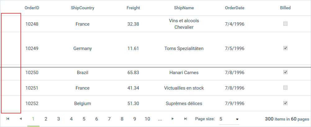
This column appears when row resizing is enabled. It provides an easy location for users to click in order to resize the respective row. This column always appears immediately before the first data column. The figure below shows how you could click to drag the row’s height to be taller or shorter.
Image 7: Using GridRowIndicatorColumn to change the height of a row in RadGrid
GridGroupSplitterColumn
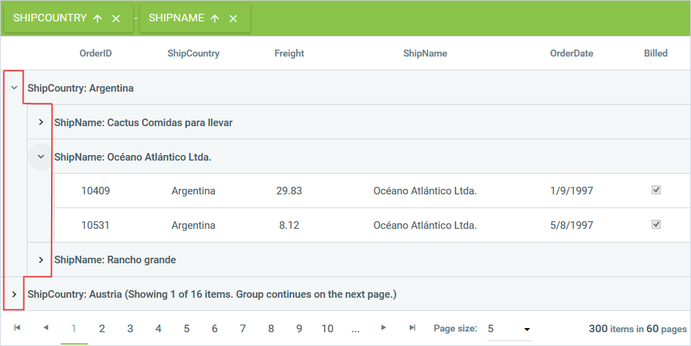
The GridGroupSplitterColumn appears when grouping is enabled. It contains controls that allow users to expand and collapse groups of rows. This column always appears first.
Image 8: GridGroupSplitterColumn example
GridExpandColumn
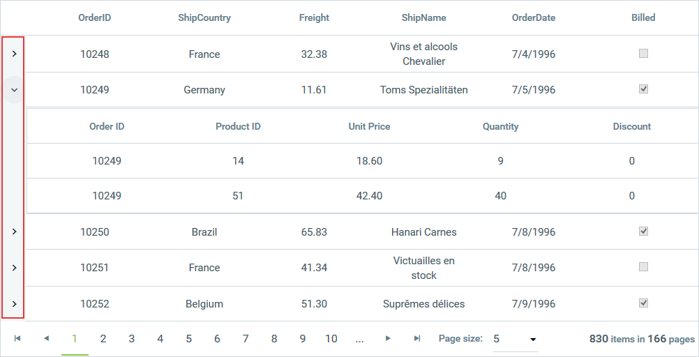
The GridExpandColumn appears when the grid has a hierarchical structure. It lets the user expand and collapse detail tables in the grid. The expand column is always placed in front of all other grid content columns unless the grouping is enabled. In those cases, GridExpandColumn is after the GridGroupSplitterColumn.
Image 9: GridExpandColumn example
Specific Properties and Generated Controls
The base class of every column provided by RadGrid is GridColumn. Depending on its specific purpose and functionality, each individual column exposes additional properties, which can prove useful when configuring its settings.
| Column Type | View Mode Control | Default Edit Control | Specific Properties |
|---|---|---|---|
| GridEditableColumn (abstract) | — | — | ColumnEditorID, ColumnEditor, ConvertEmptyStringToNull, ForceExtractValue, ReadOnly, DefaultInsertValue, InsertVisiblityMode, AllowSorting, AllowFiltering, UseNativeEditorsInMobileMode |
| GridAttachmentColumn | GridLinkButton | RadUpload | GridEditableColumn + AttachmentKeyFields, AttachmentDataField, FileNameTextField, FileNameTextFormatString, FileName, DataSourceID, AllowedFileExtensions, MaxFileSize, ButtonType, ButtonCssClass, DataTextField, DataTextFormatString, Text, ImageUrl, UploadControlType |
| GridAutoCompleteColumn | Literal | RadAutoCompleteBox | GridEditableColumn + DataField, DataSourceID, InputType, Filter, AllowCustomEntry, SelectionMode, AllowTokenEditing, Delimiter, DataTextField, DataValueField, EmptyDataText |
| GridBinaryImageColumn | RadBinaryImage | RadUpload | GridEditableColumn + AlternateText, ImageWidth, ImageHeight, ImageAlign, DataAlternateTextField, DataAlternateTextFormatString, DataField, ResizeMode, DefaultImageUrl, SavedImageName, AutoAdjustImageControlSize |
| GridBoundColumn | Plain Text | TextBox | GridEditableColumn + DataField, DataFormatString, AutoPostBackOnFilter, Aggregate, FooterAggregateFormatString, HtmlEncode, EmptyDataText, MaxLength |
| GridButtonColumn | GridLinkButton | — | Text, DataTextFormatString, DataTextField, CommandName, CommandArgument, ButtonType, ButtonCssClass, ImageUrl, ConfirmText, ConfirmTitle, ConfirmTextFields, ConfirmTextFormatString, ShowInEditForm, ConfirmDialogType, ConfirmDialogWidth, ConfirmDialogHeight |
| GridCalculatedColumn | Plain Text | — | AllowFiltering, AllowSorting, Expression, Aggregate, DataFields, DataFormatString, FooterAggregateFormatString |
| GridCheckBoxColumn | CheckBox (disabled) | CheckBox | GridEditableColumn + DataField, AutoPostBackOnFilter, ToolTip, StringTrueValue, StringFalseValue |
| GridClientDeleteColumn | GridLinkButton | — | GridButtonColumn |
| GridClientSelectColumn | CheckBox | — | GridButtonColumn |
| GridDateTimeColumn | Plain Text | RadDatePicker | GridBoundColumn + PickerType, MaxDate, MinDate, EditDataFormatString, FilterDateFormat, EnableRangeFiltering, EnableTimeIndependentFiltering |
| GridDragDropColumn | WebControl | — | DragImageUrl, DragImageToolTip |
| GridDropDownColumn | Literal | RadComboBox | GridEditableColumn + DataField, ListValueField, ListDataMember, ListTextField, ListTextFormatString, DataSourceID, EnableEmptyListItem, EmptyListItemText, EmptyListItemValue, AutoPostBackOnFilter, DropDownControlType, AllowAutomaticLoadOnDemand, ShowMoreResultsBox, AllowVirtualScrolling, ItemsPerRequest |
| GridEditCommandColumn | GridLinkButton | — | ButtonType, CancelText, EditText, FooterText, UpdateText, InsertText, EditImageUrl, UpdateImageUrl, CancelImageUrl, InsertImageUrl |
| GridExpandColumn | Button | — | CommandName, ButtonType, ExpandImageUrl, CollapseImageUrl |
| GridGroupSplitterColumn | — | — | ExpandImageUrl, CollapseImageUrl |
| GridHTMLEditorColumn | Plain Text | RadEditor | GridBoundColumn |
| GridHyperLinkColumn | HyperLink | — | DataNavigateUrlFields, DataNavigateUrlFormatString, DataTextField, DataTextFormatString, NavigateUrl, ImageUrl, Target, Text, AllowFiltering |
| GridImageColumn | Image | — | DataImageUrlFields, DataImageUrlFormatString, ImageUrl, AllowFiltering, AllowSorting, AlternateText, ImageWidth, ImageHeight, ImageAlign, DataAlternateTextField, DataAlternateTextFormatString |
| GridMaskedColumn | Plain Text | RadMaskedTextBox | GridBoundColumn + Mask, DisplayMask |
| GridNumericColumn | Plain Text | RadNumericTextBox | GridBoundColumn + NumericType, DbValueFactor, AllowRounding, KeepNotRoundedValue, DecimalDigits, MaxValue, MinValue, ShowSpinButtons, AllowOutOfRangeAutoCorrect, NumericDataType |
| GridRatingColumn | RadRating (disabled) | RadRating | GridEditableColumn + DataField, ItemCount, SelectionMode, Precision, IsDirectionReversed, AllowRatingInViewMode |
| GridRowIndicatorColumn | — | — | — |
| GridTemplateColumn | Custom | Custom | GridEditableColumn + DataField, AutoPostBackOnFilter, Aggregate, EditItemTemplate*, InsertItemTemplate*, ClientItemTemplate*, FooterTemplate*, HeaderTemplate*, ItemTemplate*, InitializeTemplatesFirst, FooterAggregateFormatString |