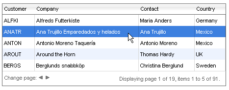
Client-side Selecting with a Click
When the ClientSettings.Selecting.AllowRowSelect property is True, users can select a single data row in the grid. Users cannot select the Header, Footer or Pager rows.
When client-side row selection is enabled, users can select rows by clicking anywhere within the row:
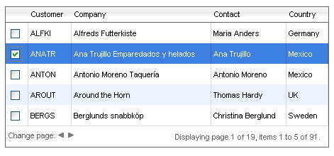
You can also add a GridClientSelectColumn to the grid to let users select and de-select rows using a checkbox:
By default the row selection is disabled ( AllowRowSelect is False ).
The selected item can be accessed by calling the get_selectedItems() method of the GridTableView client-side object (see the Client-side API Reference section for more information).
RadGrid allows users to select several rows if the AllowMultiRowSelection property is set to True. See Selecting multiple rows (client-side).
Selected row appearance
The style of the selected row is defined by the SelectedItemStyle property. You can set this property declaratively:
	  <telerik:RadGrid RenderMode="Lightweight" ID="RadGrid1" runat="server">
	    <ClientSettings>
	      <Selecting AllowRowSelect="True" />
	    </ClientSettings>
	    <SelectedItemStyle BackColor="Fuchsia" BorderColor="Purple" BorderStyle="Dashed"
	      BorderWidth="1px" />
	  </telerik:RadGrid>
You can also set the SelectedItemStyle property in the code-behind:
	    RadGrid1.SelectedItemStyle.BackColor = System.Drawing.Color.Fuchsia;
	    RadGrid1.SelectedItemStyle.BorderColor = System.Drawing.Color.Purple;
	    RadGrid1.SelectedItemStyle.BorderStyle = BorderStyle.Dashed;
RadGrid1.SelectedItemStyle.BorderWidth = new Unit("1px");For a live example demonstrating client-side selection, see Client-side row selection.