Skins
In this article, we discuss the use of skins in RadGrid. You can see examples of the built-in skins, learn how to create custom skins, and see the major properties used to customize skins.
By default, all controls in the Telerik UI for ASP.NET suite have a polished look and feel, which is consistent across the whole product line.
All resources (scripts, skins, etc.) are implemented as Embedded WebResources in ASP.NET 3.5-4.8 for a very easy and convenient deployment. The only thing you need to do is drag RadGrid from your toolbox onto your web page (no external files will be required) and RadGrid will use its default skin.
You can change the applied grid skin by setting the Skin property to the name of the skin.
Built-in Skins
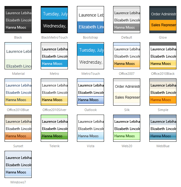
The image below shows a thumbnail view of the embedded skins provided by Telerik. They are embedded in the Telerik.Web.UI.dll assembly as web resources. To use a built-in skin, the user only needs to set the Skin property of the control. Built-in skins are also provided in "C:\Program Files\Progress\UI for ASP.NET AJAX RX YYYY\Skins".

The Material skin is available for the Lightweight RenderMode only. If you experience visual issues with it, make sure your controls are not using the default Classic mode.
Except setting the Skin property to one of the built-in skins you can use it in the following ways:
-
If a skin is not explicitly defined, the Default skin from the embedded web resources will be used.
-
You can use a predefined skin or your own skin. When following the second approach you need to set EnableEmbeddedSkins=false and define Skin property value (see the next paragraph for more details).
Creating Custom Skins for RadGrid
A developer can create custom skins for use in RadGrid. They are not embedded so the control cannot register them automatically. If you use a custom skin, you need to set the Skin and the EnableEmbeddedSkins properties of the control to false. Otherwise, the following exception will be thrown saying that there is no embedded skin matching the Skin property:
Telerik.Web.UI.RadGrid with ID='RadGrid1' was unable to find embedded skin with name 'MySkin'. Please, make sure that you spelled the skin name correctly, or if you want to use a custom skin, set EnableEmbeddedSkins=false.
For more information about how to create a custom skin with the help of the Telerik Theme Builder, see this video or the Sass Theme Builder Overview article.
The steps to apply the new custom skin are described in the Skin Registration article.
The Custom Skin demo shows what you can achieve with custom skins.
Modifying Skins
You can modify the built-in skins for RadGrid. The required steps are described in the Modifying Built-in Skins article.
The skins created in the Telerik Theme Builder can be imported via its interface and modified as many times as you wish - see Importing a Theme for the full procedure.
Properties (Applicable When Not Using an Embedded or External Skin)
You can customize the appearance of the RadGrid control by setting the style properties for the different parts of the control. Table 1 lists the various style properties.
| Style Property | Description |
|---|---|
| AlternatingItemStyle | Specifies the style for alternating items in the RadGrid control. |
| EditItemStyle | Specifies the style for the item being edited in the RadGrid control. |
| FooterStyle | Specifies the style for the footer section in the RadGrid control. |
| HeaderStyle | Specifies the style for the header section in the RadGrid control. |
| ItemStyle | Specifies the style for the items in the RadGrid control. |
| PagerStyle | Specifies the style for the page selection section of the RadGrid control. |
| SelectedItemStyle | Specifies the style for the selected item in the RadGrid control. |
| GroupHeaderItemStyle | Specifies the style for the group header in the RadGrid control. |