Why You Should Use View Components, not Partial Views, in ASP.NET Core

Summarize with AI:
Learn why you should use View Components — and not Partial Views — in your ASP.NET Core projects with this hands-on example.
Why use View Components and not Partial Views? The biggest reason is that when inserting a Partial View into a Razor page, all the ViewData associated with the calling View is automatically associated with the Partial View. This means that a Partial View may behave very differently on one Razor page than on another. With View Components, you control what gets shared to your View Components.
View Components are new to ASP.NET Core and are designed to do everything that a Partial View in previous versions of ASP.NET did and more. View Components are completely self-contained objects that consistently render html from a Razor view. They are generated from a C# class derived from the base class ViewComponent and are typically associated with a Razor file to generate markup.
Because of this, View Components nicely separate and encapsulate server-side logic necessary to render output. Just like ASP.NET MVC Controllers, View Components are easily testable, as they can be written to have no side effects, which means less bugs.
If you would like to follow along, all the source code used in this article is hosted on GitHub at:
https://github.com/pkellner/progress-telerik-blog-viewcomponent
For those more visually inclined, an eight minute video is also available that shows the steps outlined in this article.
https://www.youtube.com/watch?v=HcJJ6OVGaVE
Creating a View Component from Scratch
For this article, I'm going to use Visual Studio 2017 to create an ASP.NET Core 2.1 website. I could just as easily use the command line tools (dotnet) to create the app on either Windows or Mac, but I've chosen to use Visual Studio.
The first step is to create a new ASP.NET Core 2.1 website.
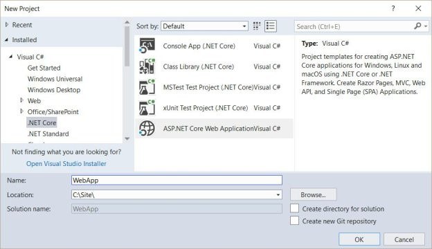
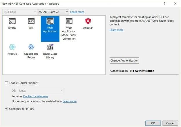
For the type of Web App, we'll choose "Web Application," which will create a nice simple site using the new ASP.NET Core Razor Pages.
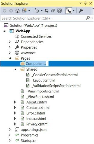
The directory structure scaffolded for us contains a directory called "Pages" and in that, we'll create a new folder in which we will create a new View Component (that's really the point of this article).
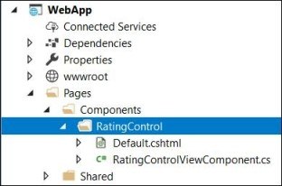
In this article, we are going to develop a very useful View Component that can be used over and over in a page for doing ratings. Because a View Component typically has both a C# file and a Razor View Page, let's create a new directory in our Components directory called RatingControl, and in that directory, create two files: RatingControlViewComponent.cs and Default.cshtml.
There are several ways you can create a view control based on attributes and naming conventions. In our case, I'm going to just explicitly create mine, which derives from the class ViewComponent, it has an empty constructor and an Invoke method with just one parameter. Unlike typical Razor pages that are invoked from a controller and take model parameters as input, View Components are invoked directly by calling the class method Invoke or InvokeAsync, with values. You can think of these values as the model.
Below is our simple View Component that simply passes a single parameter when invoked (ratingControlType), then passes that parameter as the model to a default.cshtml Razor View.
using Microsoft.AspNetCore.Mvc;

namespace WebApp.Pages.Components.RatingControl
{
  public class RatingControlViewComponent : ViewComponent
  {
    public RatingControlViewComponent() { }
    public IViewComponentResult Invoke(string ratingControlType)
    {
      return View("Default", ratingControlType);
    }
  }
}
The Razor View file, Default.cshtml is just two lines. The first line says that the model type passed in is just a string, and the second line renders that string wrapped in an h2.
@model string
<h2>@Model</h2>
Using Our View Component on a Razor Page with InvokeAsync
At this point, we have a full View Component. To have that View Component do anything for us, we can put it on a Razor page. I've created a new Razor view page called RatingDemoInvokeAsync shown here in the solution explorer.
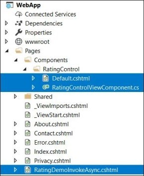
The file itself uses the Component method InvokeAsync, which references the View Component name with its first parameter, and to get parameters into that method expects an anonymous class as it's second parameter. Basically, we are just using the capabilities of Razor here. The "@" sign switches the Razor view page to C#, then what follows is just C# code. Here is the full RatingDemoInvokeAsync.cshtml.
@page
@model WebApp.Pages.RatingDemoInvokeAsyncModel
@{
  vLayout = null;
}
<!DOCTYPE html>
<html>
<head>
  <meta name="viewport" content="width=device-width" />
  <title>starsdemo1</title>
</head>
<body>
  <h1>RatingDemoInvokeAsync</h1>
  @await Component.InvokeAsync("RatingControl", new {
    ratingControlType = "1to10"
  })
</body>
</html>
The output of running this page simply shows the string "1to10" with the heading RatingDemoInvokeAsync. That is because all our View Component does is render the string passed into it.

In our next section, I'll look at a much cleaner way to invoke a View Component. That is, instead of using C# in the middle of our Razor View Page, we can use our own custom HTML element, also known as a Tag Helper.
Using Our View Component on a Razor Page with Tag Helpers
Let's first look at how using a Tag Helper to invoke our View Component changes our Razor Page. Here, I've created a new Razor Page, RatingDemoTagHelper.cshtml.
@page
@model WebApp.Pages.RatingDemoTagHelperModel
@{
  Layout = null;
}
@addTagHelper *, WebApp
<!DOCTYPE html>
<html>
<head>
  <meta name="viewport" content="width=device-width" />
  <title>RatingDemoTagHelper</title>
</head>
<body>
  <h1>RatingDemoTagHelper</h1>
  <vc:rating-control rating-control-type="1to10">
  </vc:rating-control>
</body>
</html>
All I've done is added line 6, @addTagHelper which basically says use Tag Helpers defined anywhere in my current .NET assembly. Then, I can reference the rating control as I do in the body of this HTML with the Tag Helper prefix vc for View Component. The name is just my View Component name spelled out in Kabob casing as rating-control. Instead of using an ugly anonymous class like we had to do with the invoke method in the previous section, we can just pass the string to the View Component with an HTML attribute, also in Kabob case, called rating-control-type.
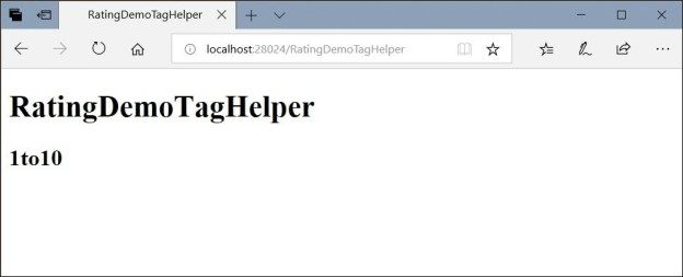
The beauty here is that we did not have to make any modifications to our View Component to make Tag Helpers work. They just work! Running the page of course gives us the same output as before, but we've changed the h1 inner HTML to RatingDemoTagHelper.
Bringing Our Rating View Component to Life
So far, we have not created a rating View Component at all. We have only created a component that renders what is passed into it. Not very useful. We have however created the groundwork, so now we can build out a real-world useful control. Rather than start from scratch, let's use this excellent MIT licensed rating control that uses jQuery and Bootstrap.
https://github.com/antennaio/jquery-bar-rating
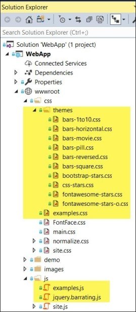
I won't bore you with the details, but I've essentially brought this project over into my ASP.NET Core Visual Studio project by copying in some CSS and JavaScript to the base of web project wwwroot as is shown here.
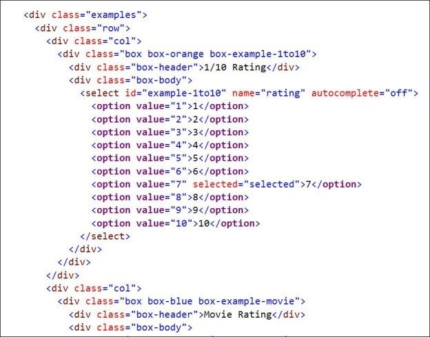
I've created a Razor view page that is just static HTML derived from the example in the jquery-bar-rating repository. That file is Pages/RatingDemoRawHtml.cshtml and has lots of code that looks like this:
Running the page shows us several ratings type supported:
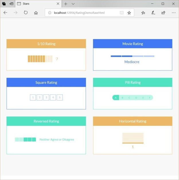
Our goal is going to be to replace the code in the select tag with a View Component that handles all the rendering of HTML options, and handles the necessary JavaScript and jQuery. That is, when finished, instead of the above raw HTML code, we will have HTML that looks like this (which is in the file pages/RatingDemoComplete.cshtml).
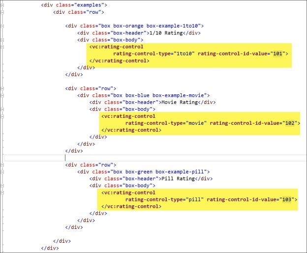
Notice that this shows three different rating types, "1to10," "movie" and "pill." I've also included a rating-control-id-value property which we've not seen before. In general, when we implement a ratings control, we'll want our control to be able to POST back to a server-side endpoint to update data when the user clicks on or changes a rating (often an Ajax call). This value essentially allows you to pass in a unique identifier to the control (usually passed in as a Razor variable). An example might be if you are looping through conference sessions and you want to know what rating control is associated with which session, the rating-control-id-value could be used to pass the session id.
When we run this page (Pages/RatingDemoComplete.cshtml), we see three rating types (in my example, I only coded for these three types though the github base project, jquery-bar-rating, supports six types):
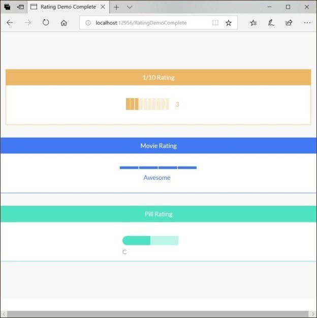
We've seen the Razor Page that renders this, but where did it all come from? Well, the obvious answer is the updated View Component. Let's look at that code and talk through what it does.
using Microsoft.AspNetCore.Mvc;
using Microsoft.AspNetCore.Mvc.Rendering;
using Microsoft.Extensions.Configuration;
using System.Collections.Generic;
using System.Linq;
using WebApp.Models;

namespace WebApp.Pages.Components.RatingControl
{
  public class RingControlModel
  {
    public List<SelectListItem> SelectedListItems { get; set; }
    public string RatingControlType { get; set; }
    public string RatingControlValue { get; set; }
    public int RatingControlIdValue { get; internal set; }
  }

  public class RatingControlViewComponent : ViewComponent
  {
    private readonly RatingControlOptions _ratingControlOptions;

    public RatingControlViewComponent(IConfiguration config)
    {
      _ratingControlOptions = new RatingControlOptions
      {
        RatingControlType = config["RatingControlType"],
        RatingControlInitialValue1to10 = config["RatingControlInitialValue1to10"],
        RatingControlInitialValuePill = config["RatingControlInitialValuePill"],
        RatingControlInitialValueMovie = config["RatingControlInitialValueMovie"]
      };
    }

    public IViewComponentResult Invoke(string ratingControlType,int ratingControlIdValue)
    {
      var ratingControlValues = new List<string>();
      var ratingControlInitialValue = "";

      if (ratingControlType == "pill")
      {
        _ratingControlOptions.RatingControlValuesPill.ForEach(a => ratingControlValues.Add(a));
        ratingControlInitialValue = _ratingControlOptions.RatingControlInitialValuePill;
      }
      else if (ratingControlType == "1to10")
      {
        _ratingControlOptions.RatingControlValues1to10.ForEach(a => ratingControlValues.Add(a));
        ratingControlInitialValue = _ratingControlOptions.RatingControlInitialValue1to10;
      }
      else if (ratingControlType == "movie")
      {
        _ratingControlOptions.RatingControlValuesMovie.ForEach(a => ratingControlValues.Add(a));
        ratingControlInitialValue = _ratingControlOptions.RatingControlInitialValueMovie;
      }

      List<SelectListItem> ratings = ratingControlValues.Select(
        myValue => new SelectListItem
        {
          Value = myValue,
          Text = myValue,
          Selected = myValue.Equals(ratingControlInitialValue)
        }).ToList();

      RingControlModel ringControlModel = new RingControlModel
      {
        SelectedListItems = ratings,
        RatingControlType = ratingControlType,
        RatingControlValue = ratingControlInitialValue,
        RatingControlIdValue = ratingControlIdValue
      };

      return View(ringControlModel);
    }
  }
}
Notice first that we've injected the program config information into the control constructor on line 23. That is, we pull in setup data from our appsettings.json file. This way we don't have to explicitly add code to our invoke method to pull this data. Below is our appsettings.json file that simply overrides the default control type as well as the initial values for all three of our rating types.
{
  "RatingControlType": "1to10", // Default Type
  "RatingControlInitialValue1to10": "6",
  "RatingControlInitialValueMovie": "Good",
  "RatingControlInitialValuePill": "C",
  "Logging": {
    "LogLevel": {
      "Default": "Warning"
    }
  },
  "AllowedHosts": "*"
}
In our Invoke method, starting on line 34, we simply create our options for our select tag based on our configuration data. I won't go through all the details here as it's not that important to understanding View Components, but feel free to review the code in GitHub on your own (the repository mentioned at the top of this article includes all the working code).
The final piece is the Pages/Components/RatingControl/Default.cshtml as shown here:
@model RingControlModel
@{
  var uniqueId = Guid.NewGuid().ToString("N");
}
<select id="@uniqueId"
        asp-for="@Model.RatingControlValue"
        asp-items="@Model.SelectedListItems"
        rating-control-id-value=@Model.RatingControlIdValue></select>
<script>
  $(document).ready(function () {
    $('#@uniqueId').barrating('show', {
      theme: 'bars-@Model.RatingControlType',
      onSelect: function(value) {
        alert('Selected rating: ' + value + ' id-value: ' + @Model.RatingControlIdValue);
      }
    });
  });
</script>
This Component View Razor Page first creates a unique ID to assign to the ratings control. It then goes on to execute the same jQuery that the base jquery-bar-rating repository used to style and add functionality to a standard html select element. You can see the jQuery on line 13 executing the method "barrating()" on the select control. That method calls styles and adds the necessary event handling for our Component View to both look good and work.
I realize I've left a lot of details out about how the jquery-bar-rating code works. The real meat of this article is about how View Components work and how to build them into your code. This bar code rating is just a good working example you can study on your own. It shows a real-life example you can model your code after rather than just a simple "hello world" example that can often be hard to expand on.
Feel free to post comments below or questions if you have them. I love the new ASP.NET Core features. View Components and Tag Helpers are just two of the new features that make our lives as web developers much easier.
You can learn more about how to use Tag Helpers in your ASP.NET projects here, and if you're looking for a set of UI components to help you build your ASP.NET Core apps, don't forget to check out Telerik UI for ASP.NET Core which supports a variety of TagHelpers. You can get started today with a free 30 day trial.

Peter Kellner
Peter Kellner is a seven course Pluralsight author, including one on ASP.NET Core Tag Helpers. He's also a consultant, mentor, trainer and entrepreneur. He's currently working with enterprises to develop technology video documentation to help onboard new engineers.
