Migrating to ASP.NET Core Tag Helpers

Summarize with AI:
This article introduces the concept of Tag Helpers in ASP.NET Core and how to use them effectively when migrating an ASP.NET project.
Note: This article was originally published on CodeProject.com.
When ASP.NET Core was released, Tag Helpers were introduced—a new feature for encapsulating HTML markup. The purpose of adding Tag Helpers to the framework was to give developers an HTML-like experience when using server-rendered bits of markup. The idea here isn't to replace HTML Helpers, but to offer another approach that follows the same conventions as HTML by using tags and attributes.
Experienced ASP.NET developers might find that Tag Helpers take some getting used to. The syntax for writing a Tag Helper is lighter and doesn't require special @ escape characters like traditional Razor. While Tag Helpers require less context switching, it can feel like a black box at first glance. To overcome the learning curve of Tag Helpers, we'll get an understanding of some of the basic concepts. Using this knowledge, we'll learn how to migrate existing HTML Helper patterns to Tag Helpers. Through this process, we'll form a solid reference for utilizing Tag Helpers in ASP.NET Core projects.
Getting Started
Before we begin working with Tag Helpers, it's important to ensure our project is configured to use Tag Helpers. At the very least, we need to be using an ASP.NET Core project. Tag Helpers aren't available in ASP.NET 4.x MVC projects.
Inside of our ASP.NET Core project, we need to ensure that Tag Helpers are enabled. This includes any third-party Tag Helper libraries we want to use. To declare Tag Helpers for our project, we'll use @addTagHelper directives in the _ViewImports.cshtml file. Within this file, all namespaces available to the view scope of the application are declared. In the following example, we have both the native ASP.NET Core Tag Helpers as well as additional UI components from the Telerik UI for ASP.NET Core package.
_ViewImports.cshtml
@* Default ASP.NET Core Tag Helpers *@
@addTagHelper *, Microsoft.AspNetCore.Mvc.TagHelpers
@* Telerik UI For ASP.NET Core Tag Helpers *@
@addTagHelper *, Kendo.Mvc
Let's do a quick test to make sure our Tag Helpers are working correctly by writing our first Tag Helper. We'll use the /Home/Index.cshtml view as a workspace to begin writing our markup. In the view, add a Tag Helper to create a simple link. To do this, we'll write <a asp-action="Index">Home</a>. If everything is configured correctly, the code highlights with a bold font.
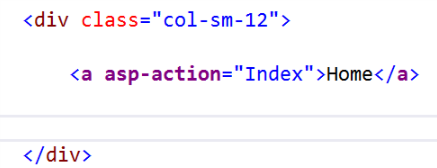
Now that we've written our first Tag Helper, let's use it to identify a few common patterns that will help when discovering new Tag Helpers and learning how to convert from the HTML Helper syntax to Tag Helpers.
We'll continue using the Anchor Tag Helper as an example. Let's look at some characteristics of the markup to identify common patterns used by Tag Helpers. By understanding these patterns, we can more easily discover Tag Helpers through IntelliSense. We'll also learn about where certain parameters have moved.
Tag Helper Attributes
If we compare the Anchor Tag Helper with the HTML Helper equivalent, we can identify key differences. In the example below, the named parameters are used on the HTML Helper to help identify where the values map to the equivalent Tag Helper. As we can see, this version uses a Tag Helper attribute in combination with an HTML <a> anchor tag to identify the action name. The link text simply follows normal HTML conventions for an anchor tag.
<a asp-action="Index">Home</a>
@Html.ActionLink(linkText: "Home", actionName: "Index")
Tag Helper attributes require less abstraction from HTML itself, providing less visual friction throughout the markup. We can see more blending of HTML and Tag Helpers when we begin to add standard HTML attributes to the element.
Standard Attributes
To add standard HTML attributes to the markup using HTML Helpers, we would use the htmlAttributes parameter and pass in an anonymous object. Since the parameter is written as an anonymous C# object, it must follow C# rules and only C# IntelliSense is applied. This means that we must escape C# keywords, and no IntelliSense is provided for CSS or HTML.
@Html.ActionLink("Home",
                 "Index",
                 new { @class="btn btn-primary", role="button" })
When we write these same standard attributes using a Tag Helper, the attributes are treated as HTML. Since the context hasn't changed to C#, we no longer need to escape keywords. We continue to get the proper IntelliSense.


<a asp-action="Index" class="btn btn-primary" role="button">
  Home
</a>
Just as standard attributes are treated as normal HTML, so is the inner content of a Tag Helper. The action name, Home, is simply written as content inside the tag.
Tags and Content
As we saw in the previous example, setting the action name within a Tag Helper is effortless. Because Tag Helpers embrace the natural flow of HTML, container UI elements are much easier to represent using Tag Helpers than with HTML Helpers. An HTML <form> is a primary example of how HTML Helpers can make things difficult. Since HTML Helpers don't have a begin/end concept, they often rely on @using statements as a proxy for being a content container.
@using (Html.BeginForm("Register",
                       "Account",
                       FormMethod.Post,
                       new { @class = "form-horizontal"}))
{
	<!-- Form Content -->
}
We can rewrite this same markup using a Form Tag Helper. The Form Tag Helper and BeginForm HTML Helper are functionally similar. They both generate the HTML <form> element and action attribute value for an MVC controller action or named route. Additionally, a hidden Request Verification Token is rendered to prevent cross-site request forgery (when used with the [ValidateAntiForgeryToken] attribute in the HTTP Post action method).
The Form Tag Helper improves readability since it requires no using statement, {} braces, or @ escape characters.
@using (Html.BeginForm("Register",
                       "Account",
                       FormMethod.Post,
                       new { @class = "form-horizontal"}))
{
	<!-- Form Content -->
}

<form asp-action="Register"
      asp-controller="Account"
      method="post"
      class="form-horizontal">
	<!-- Form Content -->
</form>
The content for a form can be any HTML, HTML Helper, or Tag Helper. The impact of migrating a form to use only standard HTML and Tag Helpers reduces the overall visual friction on the markup.

Tag Helpers flow naturally into an HTML structure as content containers. As natural content containers, Tag Helpers boast another feature that sets them apart from HTML Helpers—the child Tag Helper.
Child Tag Helpers
Child Tag Helpers allow the composition of complex UI elements by using parent-child relationships. Child Tag Helpers are specific to the parent and only available within the context of the parent element. Consider a complex UI component, such as the Telerik UI for ASP.NET Core Kendo UI grid, which has many configurable elements. Such elements include data source, columns, rows, templates, and edit modes. In addition, the data grid has properties to enable features like sorting, filtering, and paging. The grid can be created through a fluent HTML Helper, or chain-able set of APIs that render HTML.
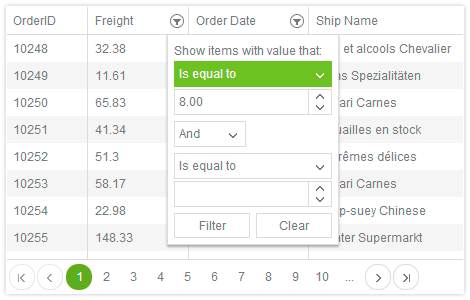
Using the grid HTML Helper, various aspects of the grid are configured through the API chain. The chain begins with setting the Name property. We then build a Columns configuration, enable features, and configure a DataSource.
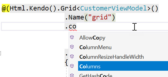
Thanks to the fluent API chain and IntelliSense, setting up the grid and all of its various parts is a streamlined process.
@(Html.Kendo().Grid<CustomerViewModel>()
  .Name("grid")
  .Columns(columns =>
  {
    columns.Bound(c => c.ContactName).Title("Contact Name")
                                     .Width(240)
                                     .Filterable(ftb => ftb.Multi(true));
    columns.Bound(c => c.ContactTitle).Title("Contact Title");
    columns.Bound(c => c.CompanyName).Title("Company Name");
    columns.Bound(c => c.Country).Title("Country").Width(150);
  })
  .Groupable()
  .Sortable()
  .Filterable()
  .Pageable(pageable => pageable
    .Refresh(true)
    .PageSizes(new int[] { 5, 10, 20 })
    .ButtonCount(5))
  .DataSource(dataSource => dataSource
    .Ajax()
    .Read(read => read.Action("Orders_Read", "Grid"))
    .PageSize(20)
  )
)
With Tag Helpers, we can have a similar experience using child Tag Helpers. Instead of starting a chain of API calls, we'll open a new <kendo-grid> tag and begin a new tag inside the grid's body.
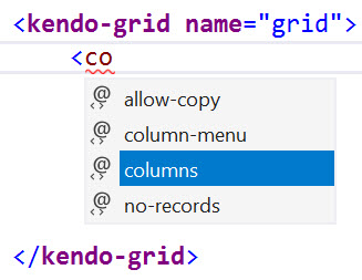
Column, feature, and DataSource configurations are all specified in the body using child tag helpers. The child tag helper pattern continues until all of the desired options have been set and the grid is fully configured.
<kendo-grid name="grid">
  <columns>
    <column field="@nameof(CustomerViewModel.ContactName)"
            title="Contact Name"
            width="240">
      <filterable multi="true"></filterable>
    </column>
    <column field="@nameof(CustomerViewModel.ContactTitle)"
            title="Contact Title" />
    <column field="@nameof(CustomerViewModel.CompanyName)"
            title="Company Name" />
    <column field="@nameof(CustomerViewModel.Country)"
            title="Country"
            width="150" />
  </columns>
  <groupable enabled="true" />
  <sortable enabled="true" />
  <filterable enabled="true" />
  <pageable button-count="5"
            refresh="true"
            page-sizes="new int[] { 5, 10, 20 }">
  </pageable>
  <datasource type="DataSourceTagHelperType.Ajax">
    <transport>
      <read url="@Url.Action("Orders_Read", "Grid")" />
    </transport>
  </datasource>
</kendo-grid>
Child Tag Helpers offer a structured way of writing complex UI elements while maintaining the HTML like document flow.
Looking closely at the code above, notice the properties are at parity with the version using HTML Helpers. There are some minor differences in the way properties are completed, for example with column field names. For simplicity, the column child Tag Helper uses a field property with a string value as opposed to the HTML Helper which uses a model expression.
The string-based field property can easily perform the equivalent task by utilizing Razor and the nameof operator.
field="@nameof(CustomerViewModel.ContactName)"
Because Tag Helpers are Razor markup, they can easily transition from HTML to C# or combine with HTML Helpers when necessary.
Combining Helpers
Remember that the purpose of Tag Helpers isn't to replace HTML Helpers, but to offer another approach to writing markup. HTML Helpers continue to work in ASP.NET Core, and they can be combined with Tag Helpers too. Mixing Tag Helpers and HTML Helpers is acceptable when a Tag Helper isn't available or when it provides a better developer experience. Using both can also provide a temporary solution while migrating to Tag Helpers or easing the learning process.
Telerik UI for ASP.NET Core's Kendo UI responsive panel Tag Helper is a content container much like the Form Tag Helper. Its main purpose is to provide a fly-out panel which displays HTML content contained within the tag's body. Since the body section is Razor markup, it can contain Tag Helpers, HTML Helpers, standard HTML, or any combination of these.

In the following example, a <kendo-responsivepanel> Tag Helper is used with a body that contains standard HTML labels and DateInput HTML Helpers.
<kendo-responsivepanel name="slidebar"
                       breakpoint="1000"
                       orientation="left">

	<label for="dateinput1">Begin Date</label>
	@(Html.Kendo().DateInput().Name("dateinput1")
                              .Format("MMMM yyyy")
                              .Value(DateTime.Now))

	<label for="dateinput2">End Date</label>
	@(Html.Kendo().DateInput().Name("dateinput2")
                              .Format("MMMM yyyy")
                              .Value(DateTime.Now))

</kendo-responsivepanel>
We could also express the body content using standard HTML labels and <kendo-dateinput> Tag Helpers. Both code examples render the same HTML output.
<kendo-responsivepanel name="slidebar"
                       breakpoint="1000"
                       orientation="left">

	<label for="dateinput1">Begin Date</label>
	<kendo-dateinput name="dateinput1"
                     format="MMMM yyyy"
                     value="DateTime.Now">
	</kendo-dateinput>

	<label for="dateinput2">End Date</label>
	<kendo-dateinput name="dateinput2"
                     format="MMMM yyyy"
                     value="DateTime.Now">
	</kendo-dateinput>

</kendo-responsivepanel>
The developer's preferred example is based on comfort level with either HTML Helpers or Tag Helpers. While Tag Helpers do provide an aesthetic, or less visual friction, there are some additional benefits too. Depending on how the Tag Helper's source code was written, there's a possibility for better performance. Tag Helpers can be authored to take advantage of asynchronous processing, or ProcessAsync, as is the case for Telerik UI for ASP.NET Core Tag Helpers. With the underlying code utilizing ProcessAsync, the <kendo-dateinput> Tag Helper can potentially render faster than its HTML Helper counterpart.
Conclusion
Through the examples, we explored the common patterns used for ASP.NET Core Tag Helpers. Tag Helpers offer an HTML-like experience by using tags and attributes for encapsulating HTML markup. Through the use of the Tag Helper's body section, child content can easily be added without the need for complex @using statements. Tag Helpers require less context switching by utilizing standard HTML attributes such as class and role and require no escape characters. They produce less visual friction within the Razor document.
Developers should find migrating from HTML Helpers to Tag Helpers relatively easy. While the syntax differs between the two concepts, convention and tooling help bridge the gap. The introduction of child Tag Helpers assist in the developer experience by providing discoverability and IntelliSense for complex UI patterns such as the Kendo UI grid. The ability to utilize standard HTML, HTML Helpers, and Tag Helpers in a single Razor file at once lessens the overall learning curve.
While migrating to Tag Helpers remains optional and at the developers discretion as to how much or how little to use them, there are possible performance gains to be had through the underlying ProcessAsync Tag Helpers use to render HTML.
To try a variety of Tag Helpers including grids, charts, graphs and navigation elements like the responsive panel, download a 30-day free trial of Telerik UI for ASP.NET Core. If you're already subscribing to the Telerik DevCraft bundle, UI for ASP.NET Core is included.

Ed Charbeneau
Ed
