What's in a Theme?

Summarize with AI:
A look at themes, what they include, some of the more common ones, and how they can help your web app development effort.
A theme is a toolkit for designing your website. If you are using a theme or thinking about using one, you should ask yourself what’s in it for you? If you haven’t asked yourself, I will tell you. Themes give you the tools to build good looking applications. With a theme you can create a unique design that has a common look and feel across all of your web properties. All you have to do is customize the color palette to match your branding. A theme can include components like buttons and forms, a grid system for creating responsive layouts, and actions to create interactive elements like a popup or animation. Different themes cater to different users, so the theme you choose will depend on your use case and design preference.
Bootstrap
My go-to theme to use is Bootstrap. I use Bootstrap because it gives me the tools to create different layouts and the JavaScript to create frequently used behavior like dialogs and alerts. This allows me to get a nice frontend up quickly and focus on building the functionality of the app. I just include the stylesheet in my main page and copy code snippets from their documentation.
The look of Bootstrap is so distinct that you can usually tell if a website is made with Bootstrap. The tell-tale signs are the rounded corners on most of the components. I like the default theme and prefer using Bootstrap when I know I don't want to change the theme. That is usually the case when I'm building an internal company site or a prototype I want to mock up. Here is an example of what the buttons, dialog, and card components look like:

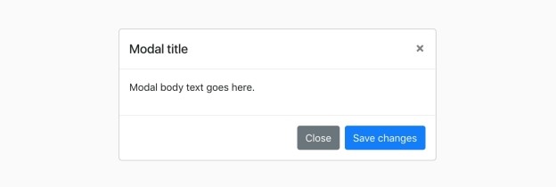
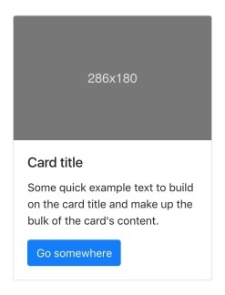
If you don’t want to use the default theme colors, you can still customize your theme by adding a Sass file to your project that overrides the Bootstrap variables.
Material
Material is a little more complex than Bootstrap. If you would like to build your own theme, Google's Material Design provides a set of UX standards to guide you. Building a theme is no easy feat. Organizing the components and creating well-named CSS classes is a headache in itself. When you are working on a large site, designing a language for your theme matters even more because it determines how well you (and your team) can maintain the code. Material Design is the language that describes how to choose the colors, layout, components, and other design elements for your app. Material Components is the library that includes basic Material blocks. There are components for the web, iOS, and Android. There is also a Material theme for Angular applications.
A Material theme is defined by flat components that are layered with drop shadows and bright, bold colors. Use of animation is also a distinguishing feature. Here is an example of what some of the web components look like:

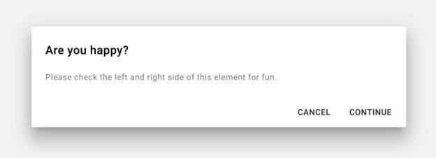
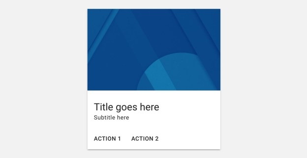
Kendo UI
Kendo UI is a third alternative that comes with a ThemeBuilder that lets you customize your theme’s colors right in the browser. The app gives you the option to use a default theme, or import your own theme to preview. You can even generate a Bootstrap theme, giving you the benefit of the Bootstrap look with non-Bootstrap components. Here is what the default Kendo UI theme looks like:

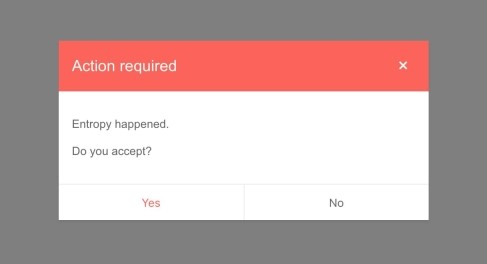
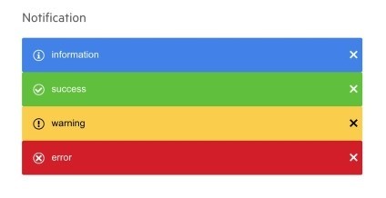
Another feature of Kendo UI is that it can be used with Angular, React and Vue. This allows you to import individual components as you need them. It is inefficient to include the entire codebase into a project if you are only using a few of the components. Also, components are integrated naturally into the framework and you do not have to write boilerplate code for defining new components.
Takeaways
You can build your own theme from scratch, but why reinvent the wheel when there are ready-made solutions available? If you feel you don't need to use a theme, think again. If you are authoring CSS, you are really just using your own theme. And if you haven't taken the time to define your brand's style guide, you run the risk of having an inconsistent look at best, or worst, a site that looks bad. The theme is more than just a stylesheet. The theme is a guideline for designing user interfaces. When you are choosing a theme to work with, ask yourself the following questions:
- Do you like the theme’s design?
- How easy is the theme to customize?
- What components are included in the theme?
- What behaviors and actions does the theme have?
- Does the theme integrate with other frameworks?
- Does the theme integrate with other platforms—web, iOS, Android?
You may have multiple projects and multiple people all working on them, but the finished products should have only one identity.

Resources

Alberta Williams
Alberta is a software developer and writer from New Orleans. Learn more about Alberta at github.com/albertaw.
