Telerik UI for Blazor 2.9.0: Upload, Tooltip, Grid State, WASM 3.2.0 Preview 2 Support and More!

Summarize with AI:
The Telerik UI for Blazor 2.9.0 release brings Upload and Tooltip components, Grid State Management, Visual Studio Code Extension, Support for WebAssembly 3.2.0 Preview 2 and more. Let's dive in.
The new 2.9.0 release of Telerik UI for Blazor is here and brings new native, production-ready components and features! The UI for Blazor library now includes new Upload and Tooltip components, multiple enhancements to the Grid including State Management, Sorting & Grouping from Code, Scheduler recurring appointments, Visual Studio Code project template wizard, WebAssembly 3.2.0 Preview 2 Compatibility and more! In this post, we’ll walk through the goodies in the 2.9.0 release and will discuss in detail all enhancements you can bring to your Blazor apps.
Telerik UI for Blazor Supports Both Server-Side and WebAssembly 3.2.0 Preview 2
As always Telerik UI for Blazor releases go hand in hand with the preview versions released by Microsoft. We are happy to announce that the latest Telerik UI for Blazor 2.9.0 release is compatible with the latest preview 2 version of Blazor WebAssembly 3.2.0.
Preview 2 of Blazor WebAssembly brings a lot of new exciting stuff – integration with ASP.NET Core static web assets, PWA template, token-based authentication, updated linker configuration, and as Microsoft has stated: “Blazor WebAssembly is on an extreme diet” meaning that the runtime and framework files are just 159kB – how cool is that!
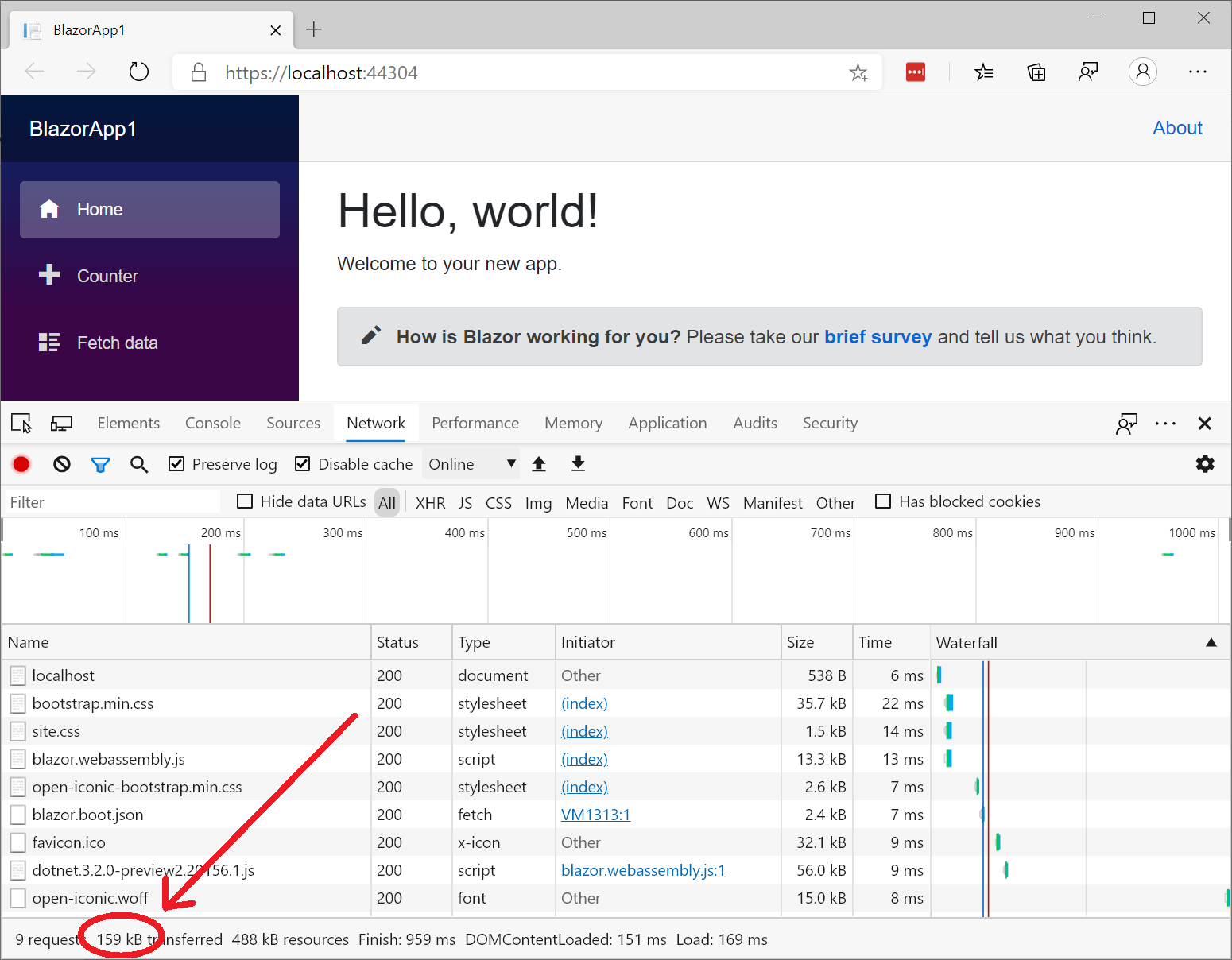
Blazor WebAssembly 3.2.0 Preview 2 - image source: https://devblogs.microsoft.com/
New Blazor Upload Component
We always listen to your feedback and in this release we implemented one of the most anticipated items in the Telerik UI for Blazor feedback portal – the File Upload Component!
Overview
You can now upload files asynchronously in your Blazor apps with ease – say hello to the <TelerikUpload> tag!
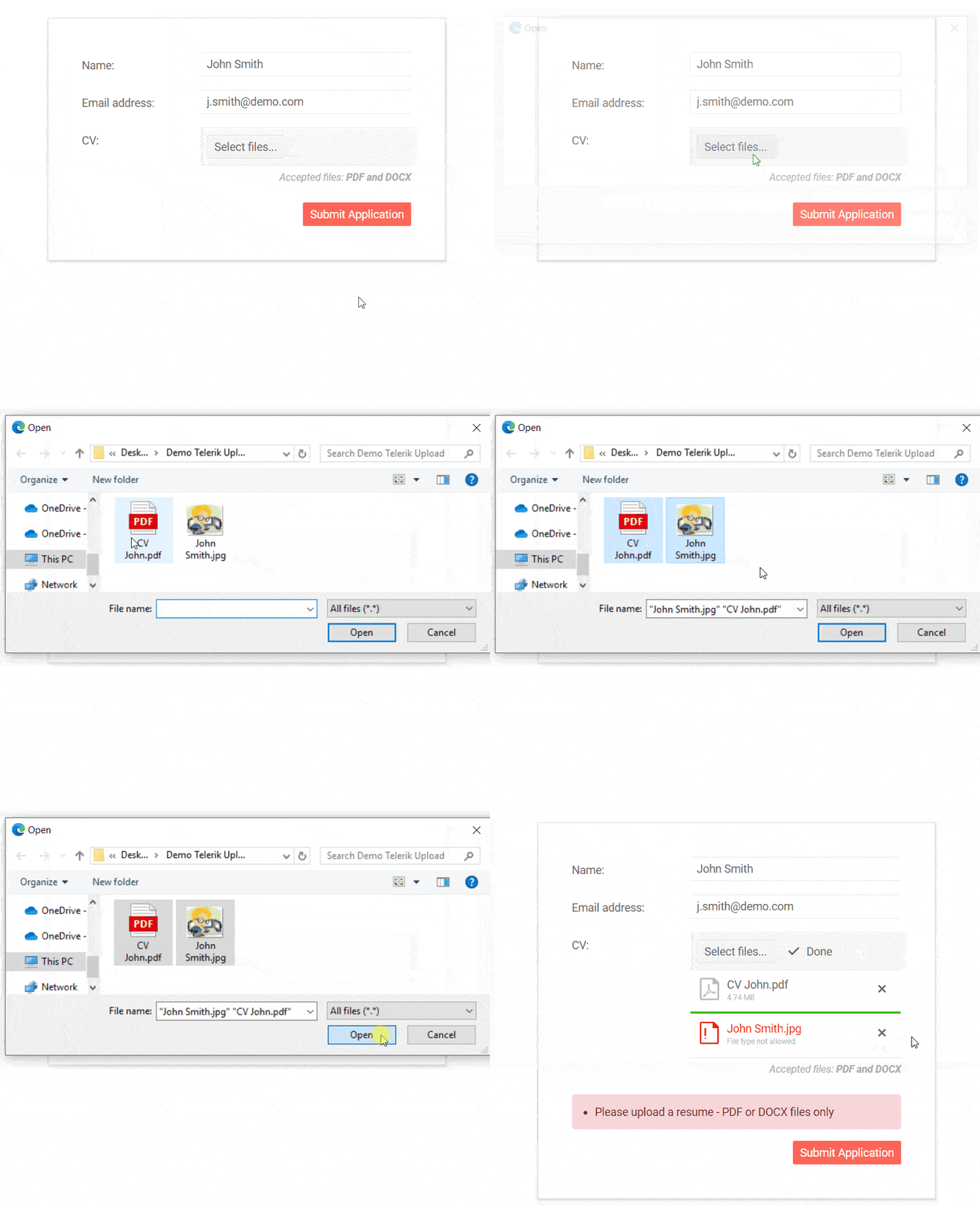
Telerik UI for Blazor Upload Component
The new Blazor Upload component has multiple configuration options and events to let you build and customize the file upload needed for your scenarios.
With just a line of code you can let your users upload single or multiple files.
<TelerikUpload SaveUrl="@SaveUrl" RemoveUrl="@RemoveUrl"/>
In the example above using the SaveUrl="@SaveUrl" you specify the URL of the handler (endpoint, controller) that will receive the uploaded files. To handle the removing of files set the RemoveUrl="@RemoveUrl"- with the URL of the endpoint for the remove request.
We have taken into consideration cases when an upload needs to happen immediately after file selection and exposed the AutoUpload property. Using it you can configure either an immediate file upload (the default), or make it so that the user must click the "Upload" button.
Validation
The Telerik UI for Blazor Upload component offers several parameters to help you validate the selected files on the client. You can set restrictions to the allowed size using MinFileSize and MaxFileSize or file format using the AllowedExtensions parameter as shown in the example code snippet below:
<TelerikUpload SaveUrl="@SaveUrl" RemoveUrl="@RemoveUrl"
               AllowedExtensions="@( new List<string>() { ".jpg", ".pdf", ".png" } )"
               MaxFileSize="2048000" MinFileSize="1024" />
Events
You have multiple events available for handling both the files and the upload process using your new Blazor Upload component. Below is a summary of the available events and their triggers:
- OnSelect - fires every time the user selects new files for upload.
- OnUpload - fires when files will be uploaded. By default, it will fire immediately after OnSelect, unless you set AutoUpload="false".
- OnRemove - fires when the users click the [x] button of an uploaded file. It sends a request to the server so you can clean up the file the user changed their mind about. It does not fire when the user removes a file that has not been uploaded yet.
- OnProgress - fires each time a file makes progress in its upload process
- OnSuccess - fires each time a request is successful - either an upload of a file, or the deletion of a file.
- OnError - fires each time a request fails - either an upload of a file, or the deletion of a file
- OnCancel - fires when the user clicks the "Cancel" button on a file that is currently uploading
- OnClear - fires when the user clicks the "Clear" button
The events arguments provide list of the files, corresponding actions (upload, deletion etc.) and access to the request objects so you can provide metadata to the server (such as authentication information).
New Blazor Tooltip Component
Another user requested item that we managed to deliver in this release is the Tooltip component.
Overview
The new Blazor Tooltip component will enable you to enrich displayed information (using text, images, HTML and even components) in a popup in response to events such as click or hover.
You can easily replace the default browser tooltip to show the title and alt attributes of a target in a fancy looking popup with just a line of code.
<TelerikTooltip TargetSelector="p a[title]">
</TelerikTooltip>
<p>
    <a title="Hello Telerik UI Tooltip'?"
      href=" https://demos.telerik.com/blazor-ui/blazor-ui/tooltip/overview">Telerik Tooltip</a>
  </p>
Templates
To spice up the visualization of data, the Tooltip component offers a template that lets you customize the content with images or – why not – other components, as shown in the example below. You can even use that to load content on demand based on the tooltip target metadata.

Position
You can easily set the Tooltip component location according to its target element using the Position parameter. Choose one of the members of the Telerik.Blazor.TooltipPosition enum and style accordingly:
- Top (default value)
- Bottom
- Right
- Left
Tooltip Show Event
You can control what user interaction is shown with the Tooltip target through the ShowOn parameter, which takes a member of the Telerik.Blazor.TooltipShowEvent enum:
- Hover (default)
- Click
@* Setting a show event is not mandatory, it defaults to Hover *@
<TelerikTooltip TargetSelector="#hoverTarget" ShowOn="@TooltipShowEvent.Hover">
</TelerikTooltip>
<div id="hoverTarget" title="Telerik Tooltip Component">
    <strong>Hover</strong> me to see the tooltip.
</div>
@code {
    TooltipShowEvent showEvent { get; set; } = TooltipShowEvent.Hover;
}
<style>
    #hoverTarget {
        position: absolute;
        top: 200px;
        left: 200px;
        width: 200px;
        background: yellow;
    }
</style>
}
Blazor Grid New Features
As the Grid component has a lot of attention from our developer community, we included in the release the delivery of two essential items from the Telerik UI for Blazor feedback portal. Managing Grid State & Grouping from Code will now give developers the needed control over sorting, filtering, grouping and expanded hierarchical indexes from code!
Blazor Grid State Management
A common scenario when working with a data grid is to be able to programmatically set different aspects of the grid from code, enable users to customize and save the way data is structured and visualized, or simply let them continue where they left off.
The new Telerik Blazor Grid State Management feature will enable you to save, load and change all Grid user-configurable elements: paging, sorting, filtering, column order, data grouping and more. Further flexibility of your application logic is provided by the events OnStateInit and OnStateChanged, and the methods SetState and GetState.
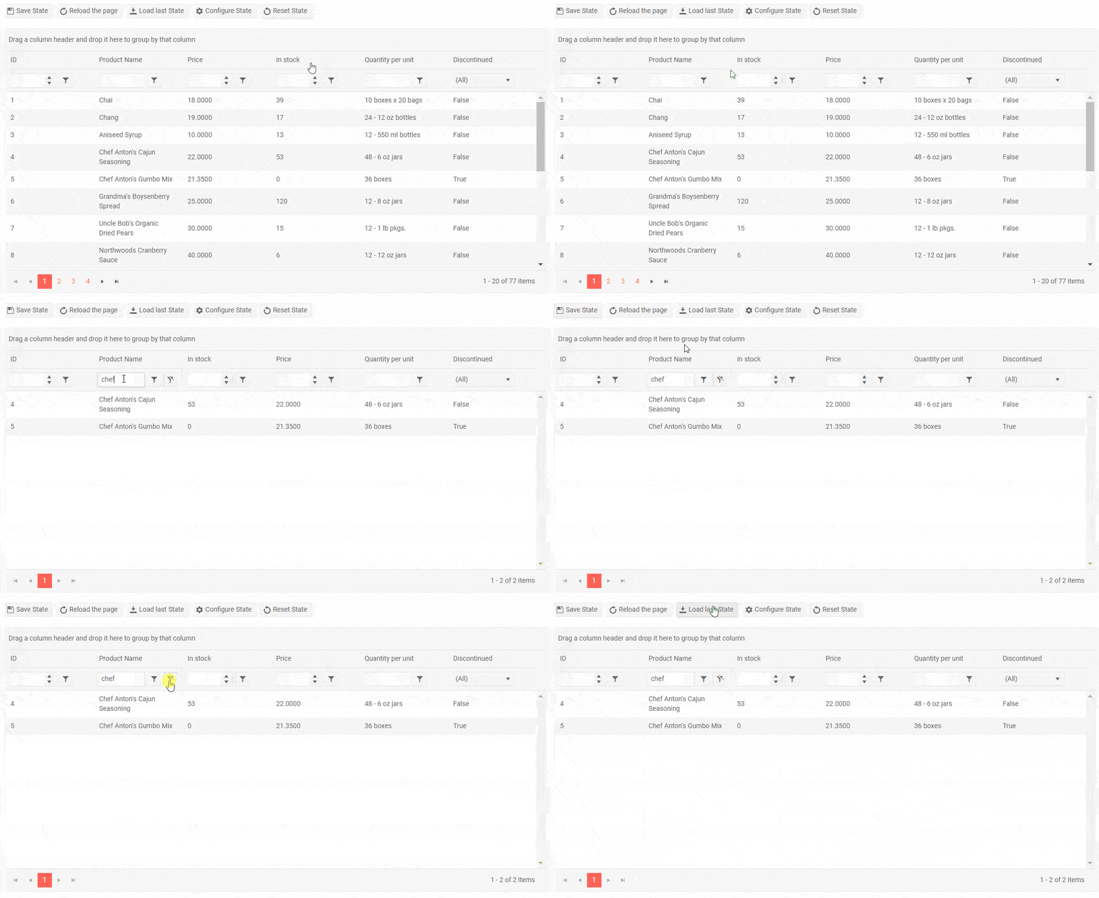 Telerik Blazor Grid State Management Example
With Grid State Management you will be able to cover common use cases such as:
- Share one state for multiple client users
- Sync the state of different grids in one page
- Allow users to continue their filtering, grouping and editing if they accidentally close their browser without any loss of the state
Check out the Grid State documentation article for further reference on Grid state management and more examples on how to handle it using different storage providers.
Blazor Grid Grouping from Code
In addition to the existing grouping option of setting the Grid's Groupable property to true, we have given flexibility to group grid data from code through grid state.
You can now specify in your app logic which fields to group by, as well as indexes of the groups that are to be expanded collapsed (by default all groups are expanded).
Blazor Grid Sorting from Code
Another cool story that is related to the Grid State feature is the ability to perform data grid sorting from code.
You can specify the member and member type to sort by, as well as the soring direction – ascending or descending.
If you want to learn more about the Telerik UI for Blazor Grid, visit our documentation, demos and overview Grid page.
Blazor Scheduler Recurring Appointments
The Scheduler has been enriched with option to set appointments as recurring events – daily, weekly, monthly or yearly. For each recurrence you can specify its interval, number recurrences and exceptions by setting the RecurrenceIdField, RecurrenceRuleField and RecurrenceExceptionsField parameters within the <TelerikScheduler> tag.
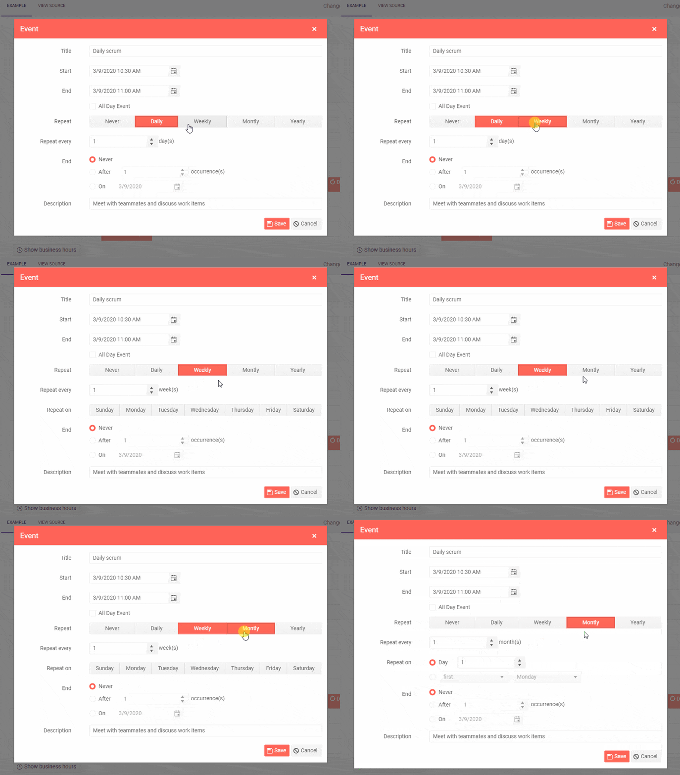 Telerik Scheduler Recurring Appointments
Visual Studio Code Extension for Blazor Projects
Good news for all Visual Studio Code fans – the Telerik UI for Blazor 2.9.0 release includes a VS Code extension to speed up your Blazor development! You can create and configure Blazor projects with just a few steps through a wizard directly in Visual Studio Code.

Telerik UI for Blazor Visual Studio Code Extension
You can download the extension from the Visual Studio Marketplace.
Download Telerik UI for Blazor 2.9.0
Head over to the Telerik UI for Blazor page and download the 2.9.0 version of Telerik UI for Blazor Native Components. Keep telling us what’s working well, what needs to change and what you’d like to see next in the dedicated Blazor feedback portal or in the comment section below!
If you're new to Telerik UI for Blazor, you can grab a free trial and start playing with the latest version right away.
Thank You!
Whether you’re just trying out Telerik UI for Blazor for the first time or have been with us on this journey over the last year, thank you from the whole Telerik UI for Blazor Team at Progress for being involved and helping us grow and make Telerik UI for Blazor bigger and better.

Maria Ivanova
Maria Ivanova is a Manager of Product Management at Progress, for Telerik and Kendo UI components and developer tooling. She joined the company in 2019 as a Product Manager for Telerik UI web components and is passionate about developing impactful and innovative software products. Maria believes that to create great products, it's important to challenge the status quo, closely collaborate with customers, and embrace a spirit of experimentation.
