Telerik UI for Blazor 1.3.0 Is Here!

Summarize with AI:
The Telerik UI for Blazor 1.3.0 release is already here! With it comes the new TreeView component, updated filtering options for the Grid, as well as improvements to other components like the DropDownList and DatePicker.
We are very excited to kick off July the right way: with a brand new release of Telerik UI for Blazor! With this most recent release, 1.3.0, we are providing a new component along with updates across existing UI widgets, all based on feedback that our users have been providing us. This is all a part of our continuous release cycle (see here in case you missed the 1.2.0 release) with quicker releases to provide you with constant updates. Blink and you might miss a release.
Without dragging the intro section along any further, let’s jump straight in to the new bits!
New Components
TreeView Arrives for Blazor!

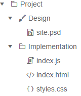
We are very happy to be able to say that the Telerik UI for Blazor TreeView has arrived! Even though this is the first release we have quite a lot of features to highlight and the component is in a great spot already.
Templates
Need to provide more in an item than we offer configuration options for? Or, just want an alternate layout for your TreeView nodes? The TreeView template feature allows you to provide custom templates within every node of the TreeView. You even have the capability to define this on a level-by-level basis, like we highlight in our TreeView template demo.
Hierarchical or Flat Data
What is a TreeView without its data? A big part of what we focused on with this initial version of the TreeView is to make sure you can properly data bind to the component. So, the Telerik Blazor TreeView can be bound to both flat and hierarchical data, giving you plenty of options for how to bind to the component. As a quick reference, here is the flat data demo and here is the hierarchical data demo just so you can compare the two approaches.
Lazy Loading
Speaking of data, out of the box we support lazy loading the various levels of the TreeView. This means that for large data sets you do not have to worry about loading all of that data at once. On initial page load only the root level will be loaded (unless you configured a node to be expanded initially). A particular node’s children will not be loaded until the node has been expanded by the user, giving you a performance-friendly experience.
Bindings
Going along with the data (since we are on a roll here) we should also mention the flexibility that we have baked in when it comes to bindings. As this demo showcases, we have some default field names that will automatically be picked up by the TreeView component if they exist on your model. This includes Id, Text, Items, ParentId, Icon, IconClass, ImageUrl, and HasChildren. If you do not want to transform your existing data to fit with these naming conventions you can simply work without TreeView bindings and define which fields within your model correspond to these properties the TreeView is expecting.
Best part about all of this? You can define these bindings on a per-level basis, so depending on where you are in the TreeView hierarchy you can define different bindings!
Feature Updates
Grid Filtering Gets a List
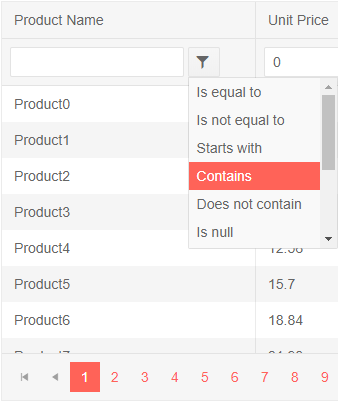
The Data Grid from Telerik UI for Blazor has supported filtering for a while now. However, filtering has been limited to more of an on or off interaction on a predefined filter type. Well, no longer! With 1.3.0 the Telerik UI for Blazor Grid now offers a built-in list that pops up when you click on the filter icon, allowing you to select what type of filtering you’d like to do on a particular column.

There’s still more to come for the Grid (and filtering) and while we have marked feature requests like this one as completed we aren’t stopping here! This is part of a continuing effort to evolve the Grid and its feature set to ensure that we can fulfill all of the requirements that your Blazor applications may have from a data table.
Making DropDowns and Popups Better
While this may not have been something apparent for everyone, working with popups in Blazor and Telerik UI for Blazor has been tricky. Specifically, the dropdowns and popups have been rendering in the place of declaration, which means that their containing / parent elements control them quite a bit. As an example, we have not been able to use our DatePickers or DropDowns in the edit templates of the Telerik Grid because the popup / dropdown will be hidden “beneath” the surrounding cells. This feedback item has a few good examples on what this has looked like so far.
Well, after a bit of research and some feedback around our approach we can finally say that we have a great solution in place for dealing with popups across all of our components. We have properly detached these popups from the component which allows them to appear freely without worrying about where they may have been added to the page (not just within the Telerik Grid). Here are some scenarios we can think of where this becomes a bigger deal:
- Using the Telerik Blazor Grid and any custom editor that involves a popup like DropDownList, ComboBox, DatePicker, etc.
- Any scenario where you need a component using a popup like a DropDown or DatePicker within an element that has
overflow:hiddenset. - Conflicts around
z-indexwithin your layout and DropDowns that need to appear above other elements within your application.
All of this is probably something that is taken for granted, especially if you’re coming from other web-based frameworks. With this improvement in place this means that we can continue to build these components without worrying about odd clipping issues here and there.
We Want to Hear from You!
That’s it for the 1.3.0 release! We’re already hard at work on 1.4.0, but in the meantime we want to hear from you and what features you’d like to see in a future release. If you have any feedback, or are missing certain components or features, head on over to our public feedback portal and let us know!

Carl Bergenhem
Carl Bergenhem was the Product Manager for Kendo UI.
