Telerik UI for Blazor 0.4.0 Just Released

Summarize with AI:
Telerik UI for Blazor has just released its 0.4.0 version, which includes more components and features for existing components! Read on to see what's new.
Telerik UI for Blazor is evolving fast with new components and features getting released hot off the presses as soon as we have them ready. With any rapid growth comes for the potential of some growing pains, which in this case comes for a breaking change with the UI for Blazor release I’m announcing today. However, with this change comes plenty of new features, components, and resources!
Keep on reading to see what’s new with Telerik UI for Blazor 0.4.0!
Breaking Changes
It’s never easy to chat about breaking changes, but I want to make a note of what the changes for 0.4.0 are as well as why we went with this direction. We do not take breaking changes lightly, even with products in early development, but we believe that this is a change that is necessary for the continued success of UI for Blazor which is why we’re going this direction.
What is Changing
First, the actual change: we are moving namespaces from Kendo.Blazor over to Telerik.Blazor. This means that any usage that you see of Kendo in your current projects will be replaced by Telerik.
As an example of our Grid taken from our docs, here’s the old way with 0.3.x:
@using Kendo.Blazor

<KendoGrid Data="@MyData">
    <KendoGridColumns>
        <KendoGridColumn Field="ID"></KendoGridColumn>
        <KendoGridColumn Field="TheName" Title="Employee Name"></KendoGridColumn>
    </KendoGridColumns>
</KendoGrid>

@functions {
    public IEnumerable<object> MyData = Enumerable.Range(1, 50).Select(x => new { ID = x, TheName = "name " + x });
}
Here’s the same declaration, but with the new namespace:
@using Telerik.Blazor

<TelerikGrid Data="@MyData">
	<TelerikGridColumns>
		<TelerikGridColumn Field="ID"></TelerikGridColumn>
		<TelerikGridColumn Field="TheName" Title="Employee Name"></TelerikGridColumn>
	</TelerikGridColumns>
</TelerikGrid>

@functions {
	public IEnumerable<object> MyData = Enumerable.Range(1, 50).Select(x => new { ID = x, TheName = "name " + x });
}
Overall the API ends up being fairly similar, but note the @using Telerik.Blazor and all of the <Telerik[X]> tags that have changed.
Why is this Change Happening?
There are a couple of reasons as to why we’re going ahead with this change, but I’ll focus on the biggest one for this blog post in order to not bore you: the usage of the Kendo UI name is confusing for people.
Specifically, a lot of the conversations we’ve had around Telerik UI for Blazor is if these components are just wrappers around the Kendo UI jQuery components. Telerik UI for Blazor is built 100% from the ground up in order to ensure deep integration with the Blazor framework itself. So to avoid this confusion and set the record straight we are moving away from the Kendo name and instead going with Telerik, a name very familiar to anyone within the .NET world (at least to you, the reader, since you are on the Telerik blog 😉).
So, in order for us to convey this more easily to new and existing users alike we’ve moved forward with this namespace change for 0.4.0.
We understand that this may be a bit of a headache for people, especially if your current Blazor project is a larger one. However, we believe that this is a necessary change and it’s overall best to do it now while the product is in its early stages and preview rather than later in the product’s life.
A note to make here is that the CSS and rendering will still be the same for the Telerik UI for Blazor components. Any changes you’ve made to the styling, or the ability to share a design across jQuery/React/Angular/Vue and Blazor projects, are still very valid.
A Quick Note on Interops
An additional thing I’d like to note is that you will be seeing a JavaScript file mentioned in some of our articles, namely telerik-blazor.js. This is in no way an indication of a trend to move over to a more JS-favored implementation of Telerik UI for Blazor, but it is something that we realized we needed to include at this point to add in some of the features and make our components what they are.
This is just a JS resource that has some interop functions to help provide keyboard navigation in the input elements, as well as the SVG and canvas rendering we utilize for our charts.
New Components & Features
Now, on to all of the fun stuff! We have a whole set of new components ready to rock and roll, along with new features for existing components, so let’s take a look at what is new in 0.4.0 Let’s first dive in to the new components.
Calendar

The name gives it away, but the Calendar component is quite simply a calendar that you can add to any page! This is completely standalone, and comes with the ability for users to navigate through the calendar to pick their date (or dates) of preference. Selection comes in both single day and multiple days, and you can prevent certain dates from being selected by setting them as disabled.
For a deeper dive in to the calendar, including the actual API and such, jump over to the Calendar component documentation.
Chart

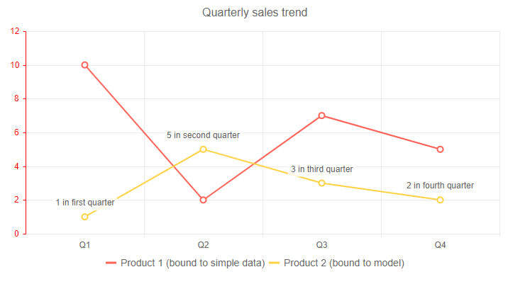
This is a big one! With 0.4.0 we are releasing our Chart library for Blazor! This is already primed to come out with a few series and chart types, namely:
- Area Chart
- Bar Chart
- Column Chart
- Donut Chart
- Line Chart
- Pie Chart
This also comes with support for a ton of features including label templates, multiple axes, stacking series, multiple series, and more! Honestly it’s a lot to get into, so check out the Telerik UI for Blazor Chart component documentation to see all of the features and how to get started with this UI component today.
DateInput

The DateInput component expands on our list of available form elements by providing an input widget that gives a pre-defined date mask. You can customize the formatting, define a placeholder, and of course mind the value to any model you have available. It also integrates natively with the Blazor validation framework, but more on that later in this post.
DropDownList

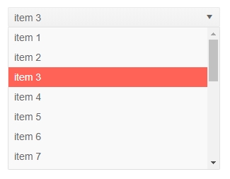
Have a long list of data that you want to have assigned to a single input? The DropDownList is your answer! Like our other DropDownList components, this gives your users a list of options to select from without the need to input custom text or searching through the list. Right out of the gate we support features like templates and integration with Blazor validation to ensure that it can fit your application requirements.
TextBox

Simple and easy. Since there’s often more to a text box than just gathering text like max/min length, patterns for valid input, and providing a label with a configuration option, we decided to create the Telerik UI for Blazor TextBox component. Of course, this also supports validation, which we’ll cover in this next section!
Native Blazor Validation Integration

With 0.4.0 Telerik UI for Blazor officially integrates with Forms and Validation within Blazor. This is supported across the board for all of the Telerik UI for Blazor input elements. Our UI components will work out of the box with these elements of Blazor when placed inside an EditForm and will respond to EditContext changes while providing default invalid styles. This doesn’t just happen on OnSubmit by the way, this validation happens in real time.
Taking some inspiration from our documentation, here are the basic steps to validate the Telerik UI for Blazor input components:
- Define a model with Data Annotation attributes
- Take the input elements that you want to represent your model in an
EditForm - Add a
DataAnnotationsValidatorinside the form - Use the
bind-Valuesyntax to provide value binding to your input elements
And that’s it!
Since this blog post is on the longer side I’ll direct you over to the validation section of our documentation where you can see more examples of this in action.
New Demo Pages
We are trying something new with Telerik UI for Blazor and releasing things early and just as they’re coming out of the oven. As a part of this we are also building out the available resources to make things fleshed out like any of the other Telerik UI products.
As a part of this I can announce that as of today we have released the official Telerik UI for Blazor demo page! Like all of our other UI libraries, this is an interactive set of demos that allows you to see the components in action, quickly look over the source code that goes in to the demo, and get helpful links to our documentation articles.
Getting the Bits
If you’ve already used Telerik UI for Blazor before then you should see 0.4.0 in the Telerik NuGet feed. After that you can just follow our documentation guidelines around adding Telerik UI for Blazor in an existing project.
If you haven’t signed up for the preview yet, all you need to do is head on over to the Telerik UI for Blazor main page and click on “Download Preview”. If you are signed in to a Telerik.com account you’ll automatically get access to Telerik UI for Blazor. If you haven’t signed up for a Telerik.com account yet you will be asked to when clicking on that button.
From there you can follow our detailed First Steps documentation article for help with getting your first Blazor project up and running, how to work with the Telerik NuGet feed, and how to add Telerik UI for Blazor components to your app!
What’s Next? We Want to Hear From You!
The first question I get after any announcement of a release is the question “what is coming next?” or “when is component/feature X coming?” While we’ll be hard at work on the next version of Telerik UI for Blazor we will continue to push out helpful pages, including an official road map page.
Until we get that out what I can say is that we will continue to release more features to the Grid component (like filtering and grouping) as well as add more form elements that you may need. Beyond this we of course have other popular components found across all of our other UI suites that we will take a peek at to see when we can deliver.
We’ve already heard from many of your already and we want to continue to hear your feedback! If there are features you are missing, or components you need, please let us know! We have the official feedback portal for this exact reason. Submit your ideas for new components and features, or vote and comment on existing ones and we will make sure we take this in to consideration for upcoming releases!

Carl Bergenhem
Carl Bergenhem was the Product Manager for Kendo UI.
