Splash Your WPF Apps with a Fresh Coat of Office 2019 Colors

Summarize with AI:
Hi, all! You've successfully landed on the shore of the R3 2020 release and we are about to delight you with one of the most important things we shipped! Inspired by the well-known Microsoft Office productivity suite and its latest version, the UI for WPF's awesome themes collection just got extended by... drum roll... the brand-new Office 2019 theme!
Microsoft Office has evolved tremendously throughout the years. And so have we! The journey of our Office themes started out with the Office Black theme. And then the Office Blue, Office Silver, Office 2013 (and all its color variations), Office 2016 (and its touch version)… I might say, we like being fancy-schmancy and to keep it all up and most importantly—empower you to bring the Office trends to your WPF apps. We just created our latest Office treasure, the Office 2019 theme. Let's explore together!
What Makes It Stand Out
At first, I thought that this was just another Office thing, not much different than the previous… But then, when I got the design for our Office 2019 theme, I said to myself—this will be a better version of our office themes, it will stand out.
To me personally, this theme is one of my ways to catch some of the last waves of this summer. I’m totally in love with its blue accent colors, they truly remind me of the all different types of cool-off helpers during the hot summer days, be it pools, seas, oceans, etc.
Built-in Variations
The Office2019 theme comes with Light, Gray and Dark built-in color variations. This is the first of our Office themes that has an actual Dark variation. It’s my personal favorite, so, yes, I’m inviting you to come and join the dark side—you’ll love it.
Color Scheme
Another thing that differs the Office 2019 from almost all other themes in our suite is the color scheme of the theme palette.

This theme palette has separate colors for foregrounds, backgrounds and borders. For example, there is an AccentBackgroundBrush and an AccentBorderBrush. The first two squares of each row in the above picture. They even use the same color, so why not create a single AccentBrush instead? Because this way, you would not be able to change only the background of all accent elements, without changing the border of the same, too. Having such separation aims for even more flexible and flawless customization.
Another thing that we thought of is offering you a recommended background color to use as a base for your WPF applications—the BaseBackgroundBrush. I know this is a hard decision for many.
Well, isn’t it high time we saw some drops of the Office2019 Sea?
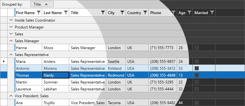
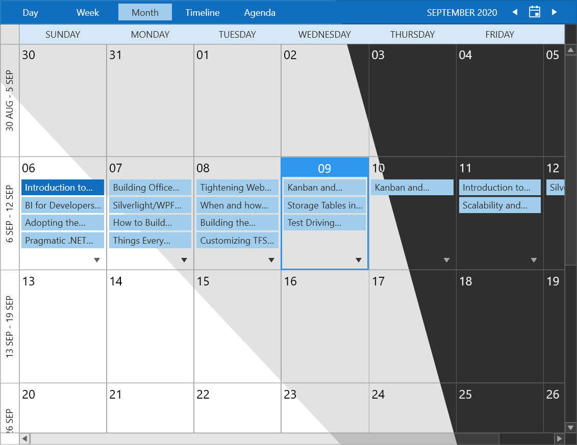
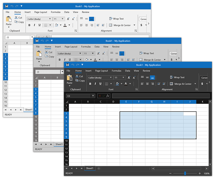
These are some of the most frequently used UI for WPF controls in all their beauty and all the Office 2019 theme’s color variations. Nice, huh?
Get Off to a Flying Office2019 Start
If this is the first time you are about to setup a WPF app with our Telerik themes, don’t you be worried—I am here to hold your hand in the process. It’ll be fast and won’t hurt at all, I promise.
There are two options to achieve the main goal—using either implicit styles (my favorite), or StyleManager. Common requirement for both options—an empty WPF application.
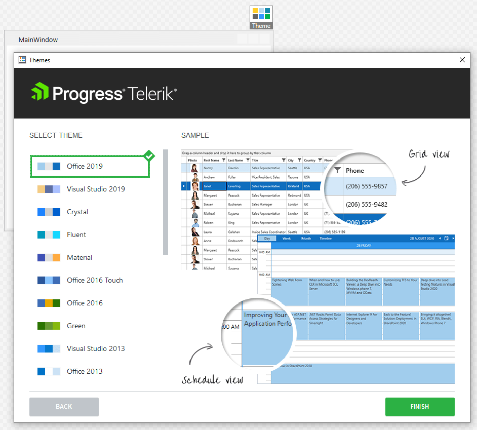
If you chose implicit styles, just click on any Telerik Control in the Design View. Then click on the Theme element and choose the "Office 2019" theme from the available choices:
StyleManager, on the other hand, allows for two options itself as well—code-behind or using the Theme attached property:
public MainWindow()
{
    StyleManager.ApplicationTheme = new Office2019Theme();
    InitializeComponent();
}
<telerik:RadButton telerik:StyleManager.Theme="Office2019"/>
I believe you’re ready to dive deeper into Office2019’s waters, so don’t wait another minute to explore its other sea treasures.
Tailor it to Your Needs
Last time I introduced another of our themes (the Visual Studio 2019 theme), I mentioned that I greatly appreciate the EEE Customization it offers—Efficient, Effortless and Exquisite. The Office 2019 theme is no exception—it also supports a ThemePalette like most of the latest UI for WPF Themes. All the colors which are present in this ThemePalette are accessible to use in your WPF applications for achieving the best results.
To help you in the process, we once created the Color Theme Generator, which allows for interactive theme palette customization with live preview. It’s good to have everything setup and only play with the colors like a real artist, isn’t it—try different shades, try different tints, blend them as much as you desire. Don’t worry—when you’re finished with your masterpiece, you only need to click a button to have the results exported for you.
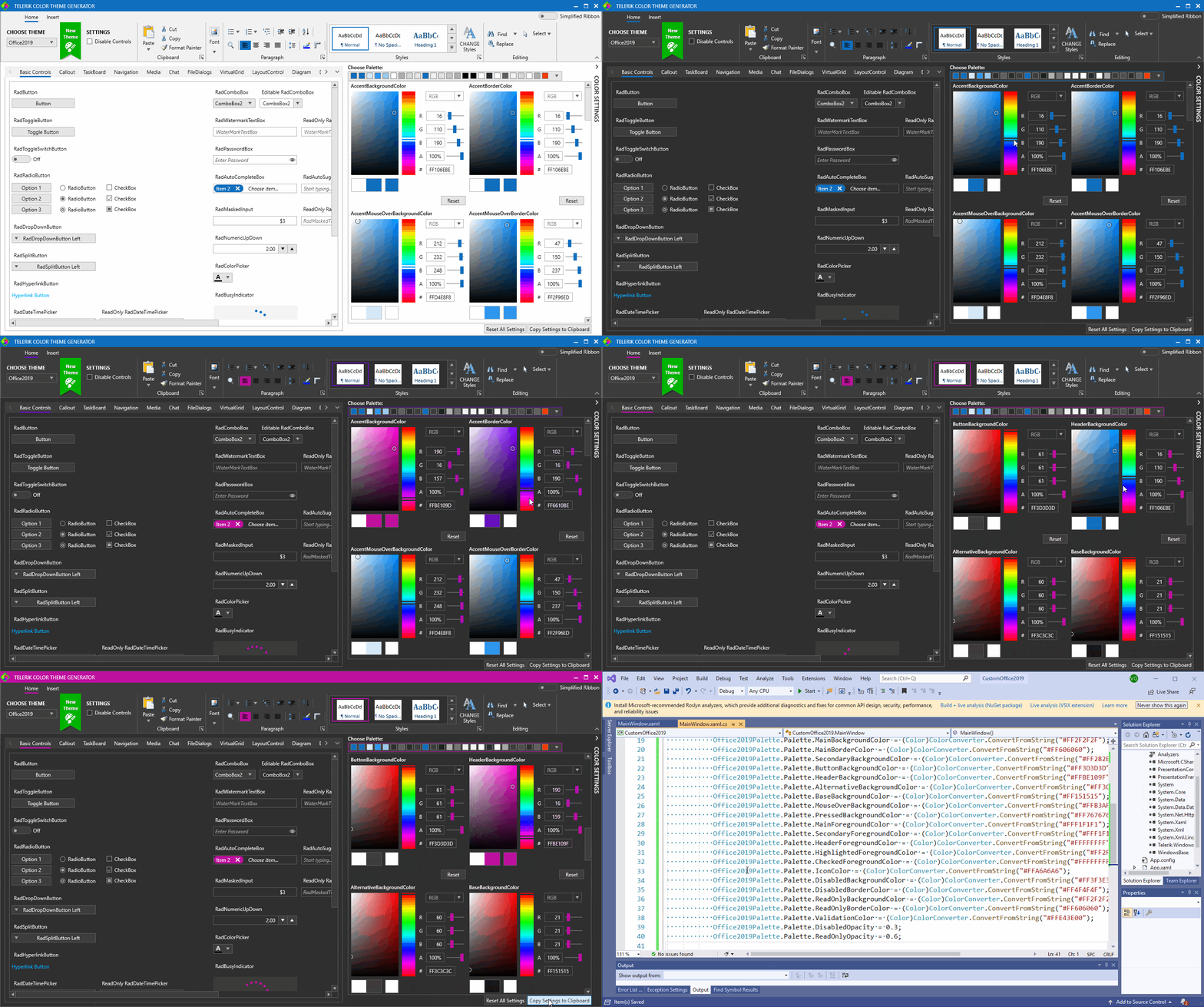
If you wish to modify the appearance of a specific basic control without altering its control template, the Theme Helper may come in handy. Aim for any of its dependency properties (be it MouseOverBrush or PressedBrush), set them directly in XAML and enjoy the results! More on this helper and the full list of the previously mentioned properties can be found in its documentation article.
Deliver Reports with Office2019 and the Telerik ReportViewer
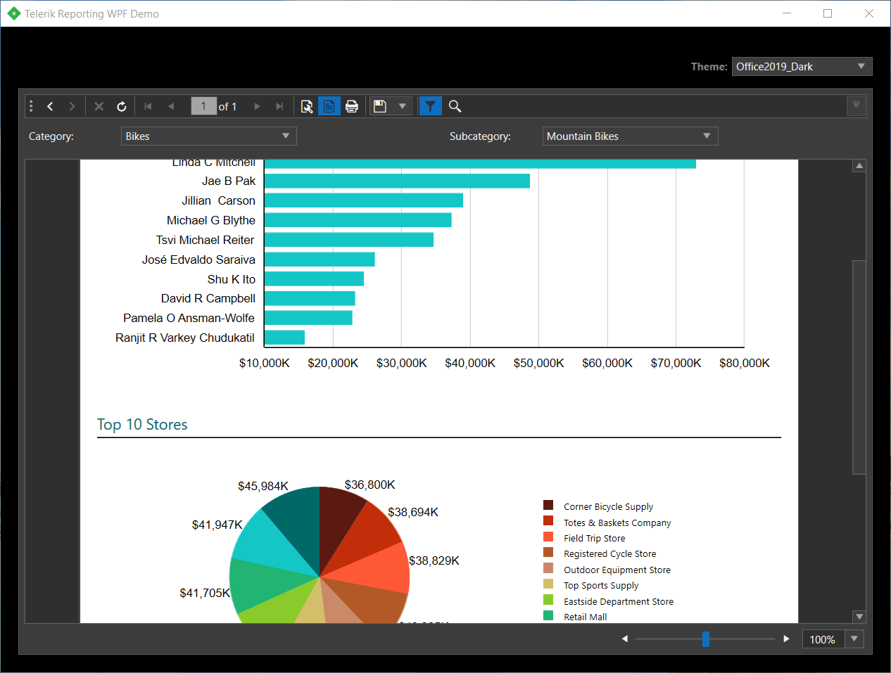
Yes, you read that correctly. For those of you that are not familiar with it, we have Telerik .NET ReportViewer Controls, responsible for delivering interactive reports directly to your desktop (or web) applications. Reports can be viewed in WPF with the Office 2019 theme in all its color variations now! Find an exquisite preview of the WPF's ReportViewer with the Office 2019 Dark theme applied below:
Try it Out and Share Your Feedback
Okay, just a few lines before you go. First—thanks for taking your time to read my blog. I hope it left you eager to:
Get the Latest Telerik UI for WPF
There is a lot more to explore, so when you try out the latest additions of the R3 2020 Release, please, take a minute or two to share your honest feedback in the comment section below or head to our Feedback portal.
Also, don’t forget to check out the Office 2019 article for further information in case I missed something.
Hate to wave goodbye, but hopefully sea you soon. 🌊

Viktoria Grozdancheva
Viktoria is a Senior Front-end Developer with 5+ years of experience designing and building modern UI for desktop and mobile platforms on Microsoft/Telerik technology stacks. Her spare time is dedicated to friends and family and discovering new pieces of the world. Find her on Twitter and LinkedIn.
