Unleash the Power of the KendoReact DatePicker Component

Summarize with AI:
The KendoReact DatePicker is a flexible React UI component that lets you customize every aspect of it with a custom renderer. In this blog post we cover how to customize the Calendar component of the DatePicker to highlight the US federal holiday schedule.
Let’s chat about dates in our React applications. Specifically, let’s chat about letting users select dates through a date picker. While there are a few choices out there, today we will be focusing on what is available in KendoReact, a set of UI components designed and built from the ground up for React. In the demo we will use in this blog, we'll explore what a React DatePicker component can do using the KendoReact DatePicker as an example.
Normally this component displays some sort of an input element, and when a user interacts with it, a calendar appears through a popup in order to help the user select a particular date. As a quick side-note, if you need to include a time selection, there exists the DateTimePicker component and for working with a range of dates, you have the DateRangePicker.
Beyond just selecting dates, a DatePicker can also be a great way to showcase available and unavailable days. It also can highlight certain dates so your users are aware that something special might be going on that day. I don’t know about you, but I constantly have to look up if a particular day is a US holiday or not, so why not create a React DatePicker that showcases the 2019 US holiday schedule? Since everyone loves emoji, why not replace the rendered dates with an applicable one (🐺 🐱 🦄)?
#1 - Understand the Flexibility of the KendoReact DatePicker
The KendoReact DatePicker is a React UI component that is extremely customizable. It allows the React developer to take full control over the look and feel of the component. It’s important to understand how this may differ from traditional configuration option customization. What is unique about this component is that it is composed of three parts and each of these parts can be completely overridden and passed custom a custom renderer, meaning a developer has full control over the component while still maintaining underlying functionality.
These parts are:
- DateInput - the actual text box and input responsible for showcasing the date that was picked, or for displaying a mask when no input has been provided.
- Popup - the part of the UI component that allows for a calendar to appear when clicking in the DateInput or on the DatePicker icon.
- Calendar - the actual calendar that is displayed within the above-mentioned popup.
This means that every single element of the KendoReact DatePicker can be tailor-made while still retaining the great underlying functionality of the component!
Today, we’ll be focusing on the Calendar portion of the DatePicker, but what we learn can also be used to work with, and customize, the DateInput and Popup pieces of the DatePicker.
#2 - Creating our Custom Calendar
Defining our Data
First, let’s think about the data that we want to use. A simple search around the web will give us a list of all federal holidays (in the US) and the days they fall upon during the 2019 calendar year. With that in mind, it makes sense to create an array of these days, with the name of the holiday, the actual date, as well as our emoji of course!
const usHolidays =  [
  { name: "New Year's Day", date: new Date("2019-01-01"), emoji: "🍾" },
  { name: "Martin Luther King Day", date: new Date("2019-01-21"), emoji: "💭" },
  { name: "President's Day", date: new Date("2019-02-18"), emoji: "👴" },
  { name: "Memorial Day", date:  new  Date("2019-05-27"), emoji: "🇺🇸" },
  { name: "Independence Day", date:  new  Date("2019-07-04"), emoji: "🎆" },
  { name: "Labor Day", date:  new  Date("2019-09-02"), emoji:  "🛠️"  },
  { name: "Columbus Day", date:  new  Date("2019-10-14"), emoji: "🌎" },
  { name: "Veterans Day", date:  new  Date("2019-11-11"), emoji: "🎖️" },
  { name: "Thanksgiving Day", date:  new  Date("2019-11-28"), emoji: "🦃" },
  { name: "Christmas Day", date: new Date("2019-12-25"), emoji: "🎅🏻" }
];
Working with the KendoReact Calendar
The KendoReact Calendar is a part of the KendoReact DateInputs npm package, which is the package that we will use to add the DatePicker to our app. For those of you worried about overall package size (since multiple components are in a single package sometimes): don’t worry, that’s where tree shaking comes in!
For these examples we are using the KendoReact Default theme, but the KendoReact Bootstrap theme and the KendoReact Material theme can also be used. In this scenario we are including a link to the compiled CSS file in the head tag of our index.html file, but following the documentation articles for any of the themes highlights how to include this as a part of our overall application bundle process if you prefer that instead.
The KendoReact Calendar documentation page provides the installation instructions for the Calendar component. Going through this we can then create our first React component that we will be building on top of for the this demo application.
import * as React from 'react';
import { Calendar } from '@progress/kendo-react-dateinputs';

export class CustomCalendar extends React.Component {
  render() {
    return (
      <Calendar />
    );
  }
}
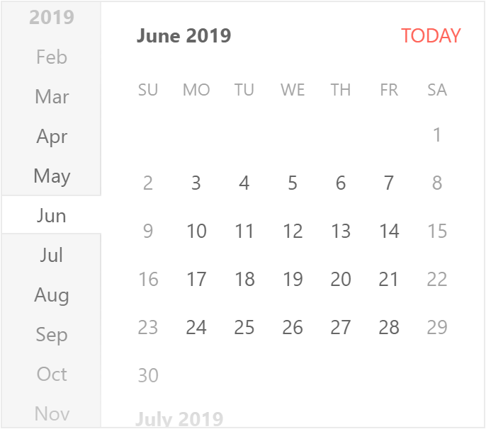
Which will render the following on the page:
Creating Custom Cells in the KendoReact Calendar
It may be helpful to understand that the HTML for the KendoReact Calendar is a table element filled with td elements that represent each cell.
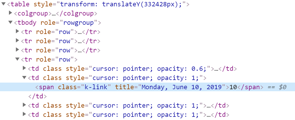
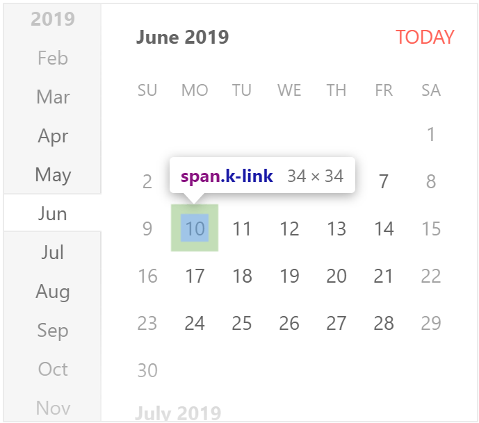
There are various ways to customize cells in the KendoReact Calendar, ranging from just adding additional information for each cell to completely taking over what is rendered in each cell. The latter is what we will be doing today. This means that in order to maintain the structure of the calendar whatever we return will need to be wrapped in a <td></td> element.
For this we should create a new React component, CustomCalendarCell and to make our life a little easier let’s start out with some boilerplate code:
export class CustomCalendarCell extends React.Component {
  handleClick = () => {
    this.props.onClick(this.props.value);
  }

  render() {
    // make weekends a bit opaque since a holiday calendar mostly focuses on what ADDITIONAL days we have off during the year (weekends are already off!)
    let style = {
        cursor: 'pointer',
        opacity: this.props.isWeekend ? .6 : 1
    };

    const className = classNames({
        'k-state-selected': this.props.isSelected,
        'k-state-focused': this.props.isFocused
    });

    return (
      <td
        onClick={this.handleClick}
        className={className}
        style={style}
      >
        <span className="k-link" title={this.props.isWeekend && this.title}>
          {this.props.children}
        </span>
      </td>
    );
  }
}
We can safely ignore style and className variables as they are only there to help with some styling options for our cells. style just makes weekend days a bit more faded (since we have those days off anyways) and className applies some KendoReact-specific CSS classes to the cells.
This piece of code may have stuck out:
handleClick = () => {
  this.props.onClick(this.props.value);
}
What we are doing here is working with the onClick() event that will be passed down from the Calendar component itself. This ensures that selecting our cell will properly highlight said cell in our Calendar and set the value of the Calendar to the selected day.
Everything else should be easy to follow. This will not change how the calendar renders normally (with the exceptions of the weekend days) so this is an excellent base to start from.
Let’s start making this calendar our own!
We already know the name and format of our data. So, let’s figure out how we can take this and check if the current date of the calendar cell is one of the holidays that we want to highlight. Something like this would work perfectly:
let emoji;

// find our holidays and assign the proper emoji - a simple for loop should do!
for (let i = 0; i < usHolidays.length; i++) {
  if (usHolidays[i].date.getUTCFullYear() == this.props.value.getUTCFullYear() &&
      usHolidays[i].date.getUTCMonth() == this.props.value.getUTCMonth() &&
      usHolidays[i].date.getUTCDate() == this.props.value.getUTCDate()) {
    emoji = usHolidays[i].emoji;
    style.backgroundColor = "rgba(255, 50, 85, 0.3)";
    this.title = usHolidays[i].name;
    break;
  };
}
What is happening here is that we create an emoji variable, which will be undefined if we are not on a holiday and will be assigned something if we have struck gold and have fallen on a holiday.
When it comes to comparing dates we’ll keep it simple and just compare the current year, month, and day for each date. The current day of our cell comes from this.props.value and is already in a date object, so we can just call getUTCFullYear(), getUTCMonth, and getUTCDate() to compare our two dates. We use the UTC variants here to avoid issues around time zones for our sample.
Once we have a match, we assign the holiday emoji to our emoji variable, update the style variable to have a background color (with 0.3 as opacity), and define the title of the day equal to the name of the holiday. On a regular day this would be written out like “Monday, June 10th, 2019” and will appear both when hovering over an item and be used for accessibility purposes.
We do have one last piece that we need to address, and that is how to use this match to update the cell content itself. This is done in the render() function when we call return. Right now we assume that we just have one type of cell, but what if we want to extend this to include a type for our emojis? Well, the easiest way would probably be to define a variable to represent our JSX outside of the return, which changes based on whether we have a normal day or one of our holidays.
let renderSpan;

if(emoji) {
  renderSpan = <span className="k-link" title={this.title}>{emoji}</span>;
}
else {
  renderSpan = <span className="k-link" title={this.props.title}>{this.props.children}</span>;
}
return (
  <td
    onClick={this.handleClick}
    className={className}
    style={style}
  >
    {renderSpan}
   </td>
);
As we see above, renderSpan becomes an important variable to ensure that we are rendering the correct content while still retaining many of the common props needed in the <td></td> element.
To take advantage of CustomCalendarCell we need to import it to our first component where we defined the calendar and define it as the cell renderer:
import * as React from 'react';
import { Calendar } from '@progress/kendo-react-dateinputs';
import { CustomCalendarCell } from './customCalendarCell.jsx';

export class CustomCalendar extends React.Component {
  render() {
    return (
      <Calendar
        cell={CustomCalendarCell}
        value={this.props.value}
        onChange={this.props.onChange}
      />
    );
  }
}
With all of this put together we can now navigate to any month with a holiday and see the fruits of our labor! Here’s January 2019 for example:
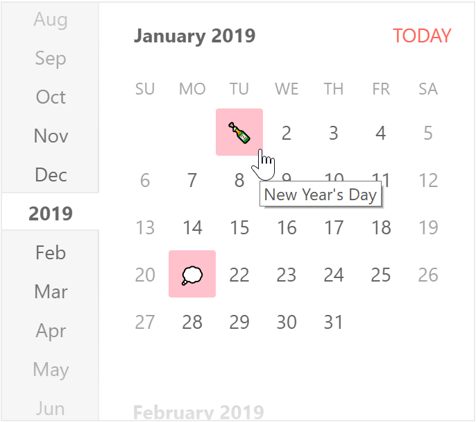
Note how hovering over the champagne bottle emoji gives us the “New Year’s Day” title!
Here is everything put together so far in a project on StackBlitz.
#3 - Adding our Custom Calendar to our React DatePicker
With the Calendar being customized the hard part is over. At this point we can take advantage of the KendoReact DatePicker customization options and simply pass in our CustomCalendar component.
Let’s update our main.jsx to import the DatePicker component and update the render() function to include the DatePicker.
import * as React from 'react';
import * as ReactDOM from 'react-dom';

import { DatePicker } from '@progress/kendo-react-dateinputs';
import { CustomCalendar } from './customCalendar.jsx';

class App extends React.Component {

  render() {
    return (
      <DatePicker
        onBlur={this.handleBlur}
        calendar={CustomCalendar}
      />
    );
  }
}
ReactDOM.render(
  <App />,
  document.querySelector('my-app')
);
It really is that simple: define the calendar prop of the DatePicker equal to our new CustomCalendar and we are already done!
A note here is that the usage of onBlur ensures that the proper propagation of the value changing will occur. So it’s just there to make the component works correctly even with our custom parts.
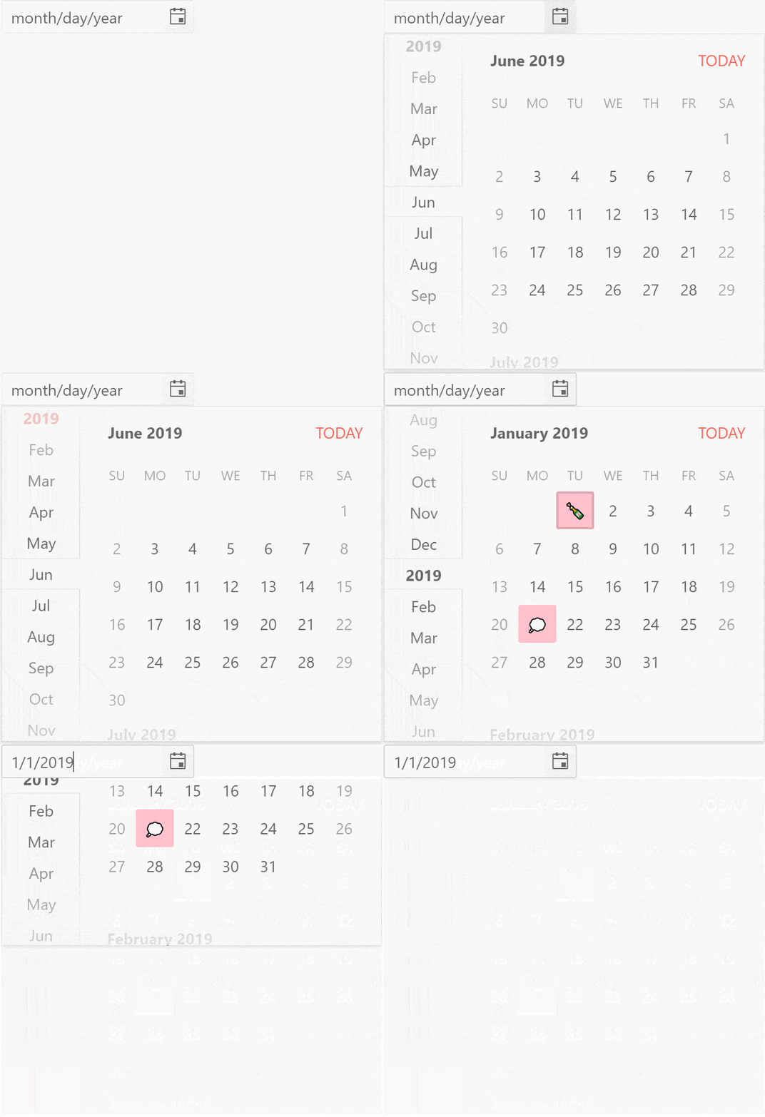
Like before, here’s the full project on StackBlitz.
#4 - Make Things Prettier with Tooltips
While the current titles that pop up is a nice feature, it doesn’t really fit with the rest of the look-and-feel of our application. This is where something like the KendoReact Tooltip comes to the rescue! We can use this to take the same titles but make them appear in a Tooltip that fits our overall theme instead.
As the KendoReact Tooltip demos showcases, normally this is done by just wrapping the element we want to tooltipify with the <Tooltip></Tooltip> tags, but because we’re dealing with a form of popup on top of a popup we need to do some slight tweaks to the way we add the component.
import * as React from 'react';
import * as ReactDOM from 'react-dom';

import { DatePicker } from '@progress/kendo-react-dateinputs';
import { Tooltip } from '@progress/kendo-react-tooltip';

import { CustomCalendar } from './customCalendar.jsx';

class App extends React.Component {
  tooltip = null;

  //we need to handle the blur event to ensure that mouseout causes tooltips to disappear
  handleBlur = (e) => {
    this.tooltip.handleMouseOut({clientX: 0, clientY: 0})
  }

  render() {
    return (
      <div
        onMouseOver={event => this.tooltip && this.tooltip.handleMouseOver(event)}
        onMouseOut={event => this.tooltip  && this.tooltip.handleMouseOut(event)}
      >
        <DatePicker
          onBlur={this.handleBlur}
          calendar={CustomCalendar}
        />
        <Tooltip ref={(tooltip) => this.tooltip = tooltip} anchorElement="target" position="top" openDelay={300} />
      </div>
    );
  }
}
ReactDOM.render(
  <App />,
  document.querySelector('my-app')
);
Without getting in to specific detail here, the extra code that we have around onMouseOver and onMouseOut is there to help in scenarios where a Tooltip may linger when interacting with the Calendar and covers scenarios where it may not disappear upon selecting the date.
With a simple inclusion of the Tooltip and a couple of lines of code we now get the following view when highlighting a date in our custom date picker component.
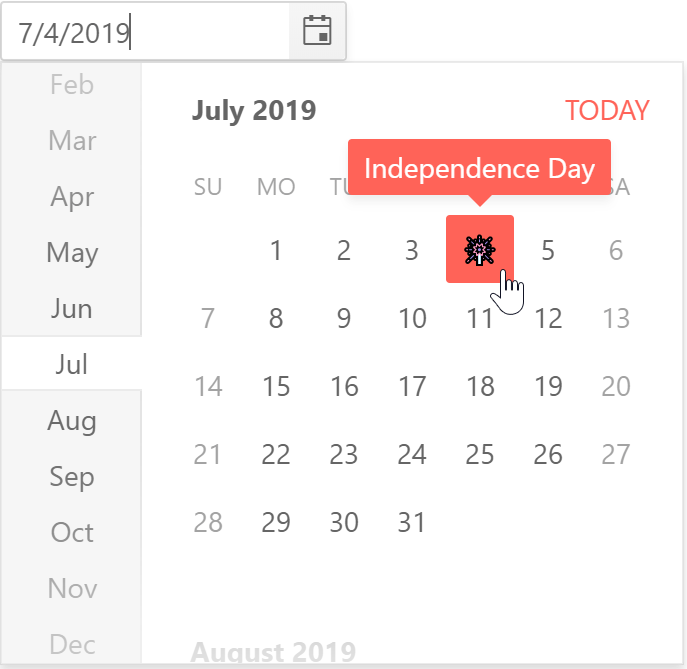
The full project in action can be found right here.
This is Just the Beginning
As we highlighted in the beginning of the article, this is just a single part of the KendoReact DatePicker component that can be customized. We also stuck to the KendoReact family of UI components instead of adding in any other custom components or other 3rd party libraries, which is certainly possible. If you found the above deep-dive useful, or if you have a customization to a DatePicker somewhere in your application, feel free to comment and share your experiences in the comment section below!

Carl Bergenhem
Carl Bergenhem was the Product Manager for Kendo UI.

