
Modern Cross-Platform ASP.NET Core Controls

Summarize with AI:
With Telerik UI for ASP.NET Core, you have everything you need to build an excellent UI. It’s one of the most complete, user-friendly component libraries on the market.
Companies deliver and develop cross-platform software and web applications to reduce costs and reach more customers. Developers can aggregate secure and reliable apps with only one code base and a single framework like Progress Telerik UI for ASP.NET Core.

Today we have five powerful platforms/environments for cross-platform software:

Windows, Apple, Android, iOS and Linux!
Telerik UI for ASP.NET Core runs on those operating systems smoothly due to its cross-platform web-based nature. With this toolkit, you can find everything you need to build an excellent UI, including an optional abstraction layer data source to perform powerful data operations.
In addition, Telerik UI for ASP.NET Core is one of the most complete and user-friendly component libraries on the market. The components are lightweight and designed for performance, offering high customization and accessibility. Plus, with built-in themes, you can be sure that your application will look amazing.
Offering software for mainstream platforms like Windows, macOS, iOS and Android via cloud computing or on premises generates a differential while exploring the vast market in a world post-pandemic. Moreover, each user can access the same data source with their device, BYOD (bring your own device) or not, reducing the knowledge learning curve with reliability.
Some of the most popular Telerik UI for ASP.NET Telerik UI for ASP.NET Core components components include the Grid, Charts, Scheduler and ListView. With these controls, you can build a robust, responsive web application that your users will love. One of the most significant advantages is the ability to add to your current application control by control as you need.
Kendo UI on the Client-Side
Telerik UI for ASP.NET Core uses the Kendo UI framework on the client-side (Telerik UI Tag Helpers and Telerik UI HTML Helpers) and server-side wrappers. It is built on top of the ASP.NET Core platform and uses the jQuery JavaScript library.
Adding a button in Kendo UI is done like this:
@(Html.Kendo().Button()
.Name("primaryTextButton")
.ThemeColor(ThemeColor.Primary)
.Content("Primary Button")
)
Working with Controls
The Telerik UI for ASP.NET Core is clean with intelligent controls for your apps, with 110+ components in the library—like PDF Viewer, Signature, TreeList, Calendar, Rating, DateInput, DropDownButton, DropDownList, DropDownTree, MultiColumnComboBox, Menu, ButtonNavigarion, AppBar, Map (GEO), Media Player, Window, Progress Bar and many more.
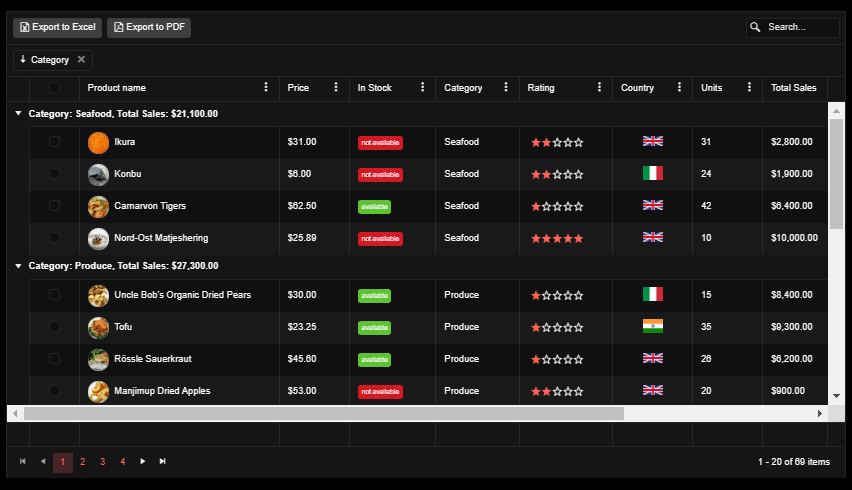
Grid Control
The Telerik UI for ASP.NET Core DataGrid control is highly performative and has export options to Excel and PDF, grouping in columns, checkbox columns, checked items, paging navigation, host images and controls inside cells.
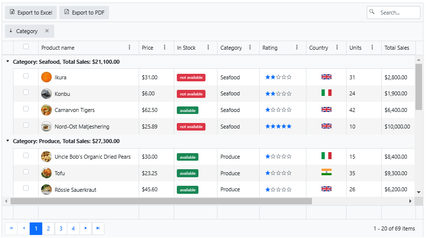
You can choose one of the four pre-built options from Telerik gallery, including Default, Bootstrap, Material and Fluent. Customize from there or create your own theming from scratch, and opt to use a default for dark mode:
Source Code
Adding an ASP.NET Core Grid control to the Index.cshtml looks like this:
With HtmlHelper
@using Kendo.Mvc

@(Html.Kendo().Grid<Kendo.Mvc.Examples.Models.DetailProductViewModel>()
    .Name("grid")
    .Columns(columns =>
    {
        columns.Select().Width(75).HtmlAttributes(new { @class = "checkbox-align" }).HeaderHtmlAttributes(new { @class = "checkbox-align" });
        columns.Bound(p => p.ProductName)
                .ClientTemplate(
                    @"<div class='product-photo'
                        style='background-image: url(" + @Url.Content("~/shared/web/foods/#:data.ProductID#.jpg") + ");'></div><div class='product-name'>#: ProductName #</div>").Width(300);
        columns.Bound(p => p.UnitPrice).Title("Price").Width(105);
        columns.Bound(p => p.Discontinued).Title("In Stock").Width(130)
                            .ClientTemplate("<span id='badge_#=ProductID#' class='badgeTemplate'></span>");
        columns.Bound(p => p.Category.CategoryName).Title("Category").EditorTemplateName("ClientCategoryEditor").ClientGroupHeaderTemplate("Category: #=data.value#, Total Sales: #=kendo.format('{0:c}', data.aggregates.TotalSales.sum)#").Width(125);
        columns.Bound(p => p.CustomerRating).Title("Rating").Width(140).Editable("returnFalse").ClientTemplate(Html.Kendo().Rating()
                .Name("rating_#=ProductID#")
                .Min(1)
                .Max(5)
                .Label(false)
                .HtmlAttributes(new { data_bind = "value: CustomerRating" })
                .Selection("continuous")
                .ToClientTemplate().Value
            );
        columns.Bound(p => p.Country.CountryNameLong).Title("Country").EditorTemplateName("Country").ClientTemplate(
            @"<div class='k-text-center'><img src='" + @Url.Content("~/shared/web/country-flags/#:data.Country.CountryNameShort#.png") + "' alt='#: data.Country.CountryNameLong#' title='#: data.Country.CountryNameLong#' width='30' /></div>").Width(120);
        columns.Bound(p => p.UnitsInStock).Title("Units").Width(105);
        columns.Bound(p => p.TotalSales).Title("Total Sales").Width(140).Format("{0:c}");
        columns.Bound(p => p.TargetSales).Editable("returnFalse").Title("Target Sales")
                      .ClientTemplate(Html.Kendo().Sparkline()
                      .Name("chart_#=ProductID#")
                      .Legend(legend => legend
                          .Visible(false)
                      )
                      .Type(SparklineType.Bar)
                      .HtmlAttributes(new { data_series= "[{data: [#=TargetSales#], labels:{visible:true, format:'{0}%', background:'none'}}]"})
                          .ChartArea(chartArea => chartArea.Margin(0).Width(180))
                          .CategoryAxis(axis => axis
                              .MajorGridLines(lines => lines.Visible(false))
                              .MajorTicks(lines => lines.Visible(false))
                          )
                          .ChartArea(c=>c.Background("transparent"))
                          .ValueAxis(axis => axis
                              .Numeric()
                              .Min(0)
                              .Max(130)
                              .Visible(false)
                              .Labels(l => l.Visible(false))
                              .MinorTicks(lines => lines.Visible(false))
                              .MajorGridLines(lines => lines.Visible(false))
                          )
                          .Tooltip(tooltip => tooltip
                              .Visible(false)
                          ).ToClientTemplate().Value
                     ).Width(220);
        columns.Command(command => command.Destroy()).Width(120);
    })
    .ToolBar(toolbar =>
    {
        toolbar.Excel();
        toolbar.Pdf();
        toolbar.Search();
    })
    .Pdf(pdf=>pdf.ProxyURL(Url.Action("Excel_Export_Save", "Grid")))
    .Excel(excel=>excel.ProxyURL(Url.Action("Excel_Export_Save", "Grid")))
    .ColumnMenu(col=>col.Filterable(false))
    .Height(700)
    .Editable(editable => editable.Mode(GridEditMode.InCell))
    .Pageable()
    .Sortable()
    .Navigatable()
    .Resizable(r=>r.Columns(true))
    .Reorderable(r => r.Columns(true))
    .Groupable(g=>g.ShowFooter(false))
    .Filterable()
    .Scrollable()
    .Events(events => events.DataBound("onDataBound"))
    .DataSource(dataSource => dataSource
        .Ajax()
        .Batch(true)
        .PageSize(20)
        .AutoSync(true)
        .ServerOperation(false)
        .Events(events => events.Error("error_handler"))
        .Model(model =>
        {
            model.Id(p => p.ProductID);
            model.Field(p => p.ProductID).Editable(false);
            model.Field(p => p.Discontinued).Editable(false);
            model.Field(p => p.TotalSales).Editable(false);
            model.Field(p => p.Category).DefaultValue(new CategoryViewModel() { CategoryID= 8, CategoryName="Seafood"});
            model.Field(p => p.Country).DefaultValue(new CountryViewModel() { CountryNameLong="Bulgaria", CountryNameShort="bg"});
        })
        .Group(group=>group.Add("Category.CategoryName", typeof(string), ListSortDirection.Descending))
        .Aggregates(agg=>agg.Add(field=>field.TotalSales).Sum())
        .Create("DetailProducts_Create", "Grid")
        .Read("DetailProducts_Read", "Grid")
        .Update("DetailProducts_Update", "Grid")
        .Destroy("DetailProducts_Destroy", "Grid")
    )
)
With TagHelper
@addTagHelper *, Kendo.Mvc

<kendo-grid name="grid" height="700" navigatable="true" on-data-bound="onDataBound">
    <datasource type="DataSourceTagHelperType.Ajax" page-size="20"
        server-operation="false"
        auto-sync="true"
        batch="true"
        on-error="error_handler">
        <schema>
            <model id="ProductID">
                <fields>
                    <field name="ProductID" editable="false" type="number"></field>
                    <field name="ProductName" type="string"></field>
                    <field name="UnitPrice" type="number"></field>
                    <field name="Discontinued" editable="false" type="boolean"></field>
                    <field name="Category" default-value='new Kendo.Mvc.Examples.Models.CategoryViewModel() { CategoryID = 8, CategoryName = "Seafood" }'></field>
                    <field name="CustomerRating" type="number"></field>
                    <field name="Country" default-value='new Kendo.Mvc.Examples.Models.CountryViewModel() { CountryNameLong= "Bulgaria", CountryNameShort="bg" }'></field>
                    <field name="UnitsInStock" type="number"></field>
                    <field name="TotalSales" type="number" editable="false"></field>
                    <field name="TargetSales" type="number" editable="false"></field>
                </fields>
            </model>
        </schema>
        <groups>
            <group field="Category.CategoryName" typeof="string" direction="desc">
                <aggregates>
                    <aggregate field="TotalSales" aggregate="sum" />
                </aggregates>
            </group>
        </groups>
        <aggregates>
            <aggregate field="TotalSales" aggregate="sum" />
        </aggregates>
        <transport>
            <read url="@Url.Action("DetailProducts_Read","Grid")"/>
            <update url="@Url.Action("DetailProducts_Update","Grid")"/>
            <create url="@Url.Action("DetailProducts_Create","Grid")"/>
            <destroy url="@Url.Action("DetailProducts_Destroy","Grid")"/>
        </transport>
    </datasource>
    <columns>
        <column width="75" selectable="true"
            header-html-attributes='new Dictionary<string,object> { ["class"] = "checkbox-align" }'
            html-attributes='new Dictionary<string,object> { ["class"] = "checkbox-align" }'/>
        <column field="ProductName" width="300" template="#=productNameTemplate(data)#"/>
        <column field="UnitPrice" title="Price" width="105" format="{0:c}"/>
        <column field="Discontinued" title="In Stock" width=" 130" template="<span id='badge_#=ProductID#' class='badgeTemplate'></span>"/>
        <column field="Category.CategoryName" title="Category" width="125" editor="categoryDropDownEditor"
            group-header-template="Category: #=data.value#, Total Sales: #=kendo.format('{0:c}', data.aggregates.TotalSales.sum)#"/>
        <column field="CustomerRating" title="Rating" width="140" editable="returnFalse"
        template="#=kendo.template($('\\#CustomerRating-template').html())(data)#" />
        <column field="Country.CountryNameLong" title="Country" width="120"
            template="<div class='k-text-center'><img src='/shared/web/country-flags/#:data.Country.CountryNameShort#.png' alt='#: data.Country.CountryNameLong#' title='#: data.Country.CountryNameLong#' width='30' /></div>"
            editor="clientCountryEditor"/>
        <column field="UnitsInStock" title="Units" width="105"/>
        <column field="TotalSales" title="Total Sales" width="140" format="{0:c}"/>
        <column field="TargetSales" title="Target Sales" editable="returnFalse" width="140"
        template="<span id='chart_#= ProductID#' class='sparkline-chart'></span>"/>
        <column width="120">
            <commands>
                <column-command text="Delete" name="destroy"></column-command>
            </commands>
        </column>
    </columns>
    <toolbar>
        <toolbar-button name="excel"></toolbar-button>
        <toolbar-button name="pdf"></toolbar-button>
        <toolbar-button name="search"></toolbar-button>
    </toolbar>
    <pdf proxy-url="@Url.Action("Excel_Export_Save","Grid")"/>
    <excel proxy-url="@Url.Action("Excel_Export_Save","Grid")"/>
    <column-menu filterable="false" enabled="true"> </column-menu>
    <editable mode="incell"/>
    <pageable enabled="true"/>
    <sortable enabled="true"/>
    <reorderable enabled="true"/>
    <groupable enabled="true"/>
    <filterable enabled="true"/>
    <scrollable enabled="true"/>
</kendo-grid>
The Charts
The Telerik UI for ASP.NET Core Chart control is a powerful data visualization component that can create charts binding efficiently to data to create various chart types. In addition, you can export to PDF, image or SVG format. The control offers the following chart types:
- Bar or Radar to compare several data sets
- Pie or Donut chart to visualize a piece of data as part of a whole
- Line or Area to monitor trends
- Bullet chart to compare quantitative against qualitative measures
- Scatter or Bubble to visualize the correlation in a set of engineering data
- Box Plot to graphically depict your statistical data
- Waterfall to represent the cumulative effect of consecutive positive or negative values
- RangeBar to visualize value ranges over time
- Funnel to represent the stages in a process
- Polar to plot engineering data in a polar coordinate system
- Sparklines to provide context to your data
Bar Chart
The ASP.NET Core Bar Chart is extremely customizable:
Pie Chart
The Telerik UI for ASP.NET Core Chart offers many features that make it easy to create pie charts. For example, you can easily bind to data to develop various chart types. In addition, the component offers a variety of customization options so that you can make pie charts that look the way you want.
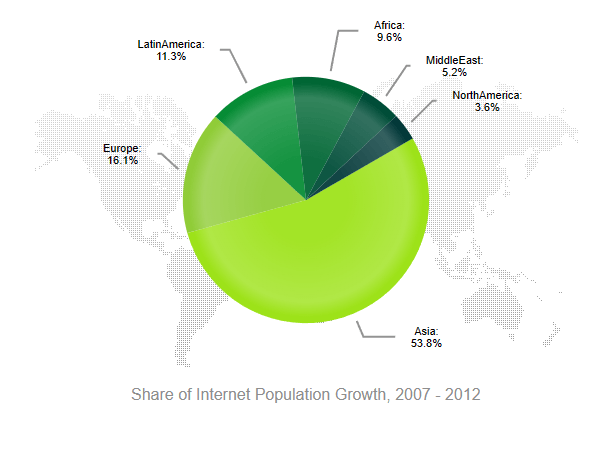
Loading a chart is easy, like this source code:
<div class="demo-section wide" >
    @(Html.Kendo().Chart()
        .Name("chart")
                .Title(title => title
                    .Text("Share of Internet Population Growth, 2007 - 2012")
                    .Position(ChartTitlePosition.Bottom))
        .Legend(legend => legend
            .Visible(false)
        )
        .ChartArea(chart => chart
            .Background("transparent")
         )
        .HtmlAttributes(new { style="background: center no-repeat url(" + @Url.Content("~/shared/styles/world-map.png")})
        .Series(series => {
            series.Pie(new dynamic[] {
                new {category="Asia",value=53.8,color="#9de219"},
                new {category="Europe",value=16.1,color="#90cc38"},
                new {category="LatinAmerica",value=11.3,color="#068c35"},
                new {category="Africa",value=9.6,color="#006634"},
                new {category="MiddleEast",value=5.2,color="#004d38"},
                new {category="NorthAmerica",value=3.6,color="#033939"}
            })
            .Labels(labels => labels
                .Template("#= category #: \n #= value#%")
                .Background("transparent")
                .Visible(true)
            )
            .StartAngle(150);
        })
        .Tooltip(tooltip => tooltip
            .Visible(true)
            .Format("{0}%")
        )
    )
</div>
Chart Events
Chart Control offers events that you can add intelligence to your chart allowing the user to interact with the data, like event click for Series, AxisLabel, PlotArea and LegendItem.
Browser Compatibility
The Telerik ASP.NET Core controls support Visual Studio with minimal requirements from the .NET SDKs 2.1, 2.2, 3.0, 3.1, 5.0, 6.0 and 7.0.
The browser support for some control requires recent versions of these browsers:

Edge, Google, Firefox, Opera and Safari!
This includes OS X Safari and iOS Safari. IE is no longer supported as of R1 2023.
Globalization
Telerik UI for ASP.NET Core supports RTL (Right To Left) and currently, these cultures:
ar-AE, ar-BH, ar-DJ, ar-DZ, ar-EG, ar-ER, ar-IL, ar-IQ, ar-JO, ar-KM, ar-KW, ar-LB, ar-LY, ar-MA, ar-MR, ar-OM, ar-PS, ar-QA, ar-SA, ar-SD, ar-SO, ar-SS, ar-SY, ar-TD, ar-TN, ar-YE, bg-BG, cs-CZ, da-DK, de-AT, de-CH, de-DE, de-LI, el-GR, en-AU, en-CA, en-GB, en-US, es-AR, es-BO, es-CL, es-CO, es-CR, es-DO, es-EC, es-ES, es-GT, es-HN, es-MX, es-NI, es-PA, es-PE, es-PR, es-PY, es-US, es-UY, es-VE, fa-IR, fi-FI, fr-BE, fr-CA, fr-CD, fr-CH, fr-CI, fr-CM, fr-FR, fr-HT, fr-LU, fr-MA, fr-MC, fr-ML, fr-SN, he-IL, hr-HR, hu-HU, hy-AM, it-CH, it-IT, ja-JP, mk-MK, nb-NO, nl-BE, nl-NL, pl-PL, pt-BR, pt-PT, ro-RO, ru-RU, sk-SK, sq-AL, sr-Latn-RS, sv-SE, tr-TR, uk-UA, vi-VN, zh-CN, zh-HK, zh-TW.
Create your own forking from GitHub if your culture needs to be listed.
To set up a server-side culture, add these lines with your culture desired name above for Spanish from Spain:
var supportedCultures = new[] { new CultureInfo("es-ES") };

app.UseRequestLocalization(new RequestLocalizationOptions
{
    DefaultRequestCulture = new RequestCulture("es-ES"),
    SupportedCultures = supportedCultures,
    SupportedUICultures = supportedCultures
});
The client-side needed a few lines of code too.
Accessibility
Progress Telerik web products comply with the best practices of WAI-ARIA (Web Accessibility Initiative - Accessible Rich Internet Applications). Most of the ASP.NET Core controls support WCAG 2.1, the standards for providing accessible web content set by the Web Content Accessibility Guidelines 2.1, and are compliant with Section 508.
Deploying
For on-premise environments, the deployment works smoothly with the Visual Studio Publish system.
For cloud computing, Telerik is ready to work with the most prominent players in the global market:

Google Cloud, Amazon AWS/S3 and Microsoft Azure!
See the reference at the end of this post to learn how to publish on Google Cloud and Amazon S3.
Conclusion
Progress Telerik UI for ASP.NET Core has three major releases each year, featuring updates, bug fixes and new controls. In addition, you can create custom themes with your visual identity customized for your product or enterprise.
Any time you can manifest your experience and suggest new features, that goes to the community for priority voting. So you can be involved in this process to help make these incredible products even better!
You can license it separately, but the most advantageous is the DevCraft Complete package, which includes several frameworks with one year update and unlimited support tickets with 24-hour response time.
References Available
- First steps: https://docs.telerik.com/aspnet-core/getting-started/first-steps
- Kendo UI intro: https://docs.telerik.com/kendo-ui/introduction
- Demonstration of Telerik UI for ASP.NET Core: https://demos.telerik.com/aspnet-core/admin-dashboard
- Chart demo: https://demos.telerik.com/aspnet-core/charts
- Edition themes: https://themebuilder.telerik.com/
- Grid demonstration: https://demos.telerik.com/aspnet-core/grid
- Globalization: https://docs.telerik.com/aspnet-core/globalization/overview
- GitHub: https://github.com/telerik/kendo-ui-core
- Grid REPL: https://netcorerepl.telerik.com/?_gl=1qn1sg5_gaMjA4NTY3OTA3LjE2NzMyODM5Nzg_ga_9JSNBCSF54*MTY3NDU5NDkzMi4yMC4xLjE2NzQ1OTQ5ODAuMTIuMC4w
- Section 508: https://docs.telerik.com/aspnet-core/accessibility/overview#section-508
- Using Telerik UI for ASP.NET Core application with Amazon S3: https://docs.telerik.com/aspnet-core/cloud-integration/amazon-web-services/s3-storage
- Creating a Google Cloud Account and project: https://docs.telerik.com/aspnet-core/cloud-integration/google-cloud/getting-started
- Feedback: https://www.telerik.com/support/feedback
Try Telerik UI for ASP.NET Core Today
Want to start taking advantage of the 110+ ready-made ASP.NET Core components, like the Grid or the Scheduler? Start a free trial today and experience for yourself that building rich interactive applications for half the time is not a fairytale.

Jefferson S. Motta
Jefferson S. Motta is a senior software developer, IT consultant and system analyst from Brazil, developing in the .NET platform since 2011. Creator of www.Advocati.NET, since 1997, a CRM for Brazilian Law Firms. He enjoys being with family and petting his cats in his free time. You can follow him on LinkedIn and GitHub.
Related Posts
Comments
All articles
Topics
Web MobileMobile
Desktop
Design
Productivity
People
