Let's Build a Sales Dashboard with React

Summarize with AI:
Last updated in July 2020.
Follow along as we mock-up, design and lay out a sales dashboard with native React components from KendoReact, complete with a responsive grid, data, charts and more.
Building web apps can be challenging, even with modern frameworks like React. Fortunately, UI libraries can make this easier. In this tutorial, we are going to use KendoReact, a library of professional UI components built for React. If you have used component libraries from Progress, you will feel right at home with KendoReact. However, if you have not, this tutorial will demonstrate how to work with our KendoReact components, how to wrap them in containers and provide data to them.
Source code for this tutorial can be found at: Github.com/Telerik/kendo-react-build-a-sales-dashboard. This repo provides step-by-step commits that follow each section of this tutorial!
Building the Sales Dashboard
What we will be making: Below is a screenshot of the final dashboard. My goal is to show you step by step how to take a wireframe mockup and turn it into working HTML using a combination of custom HTML and CSS and KendoReact components.
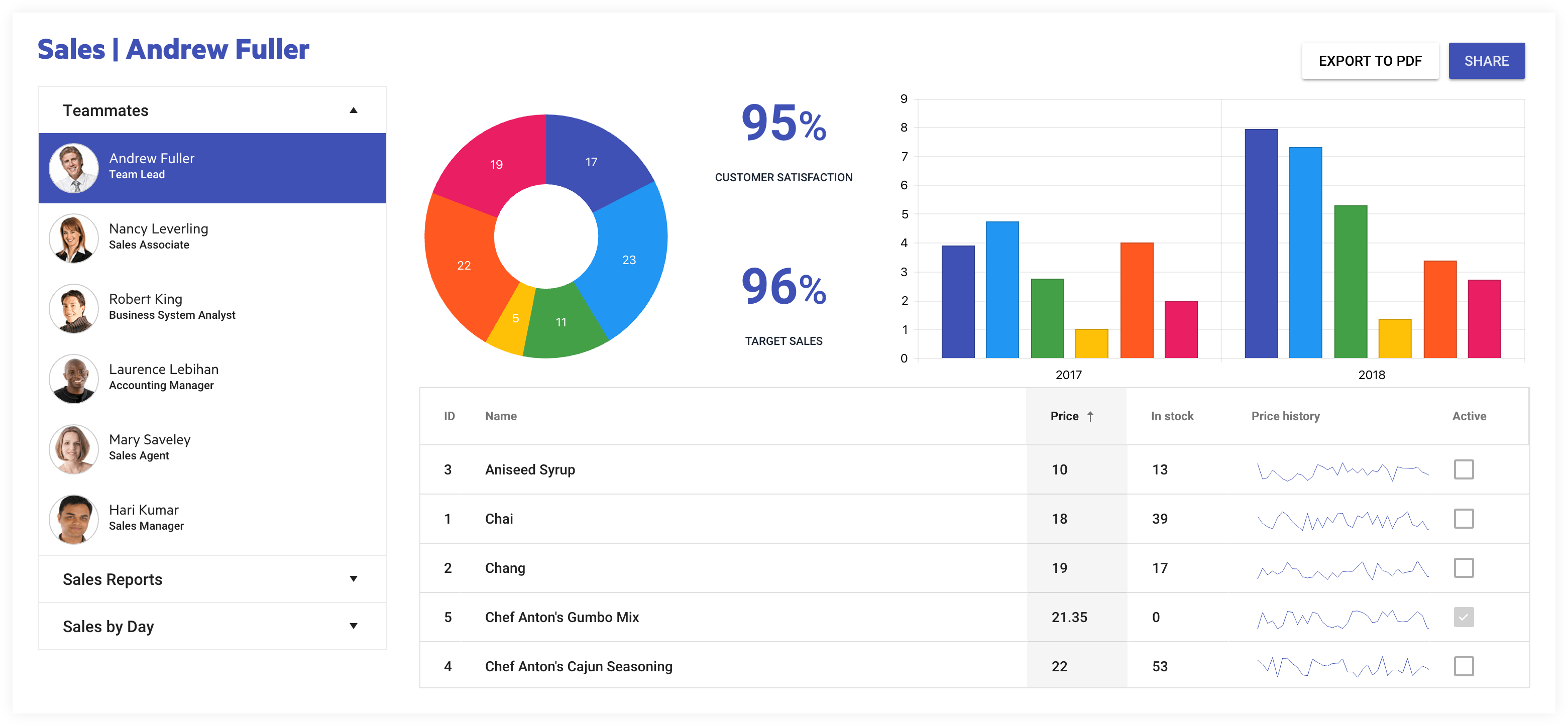
Our sales dashboard will show quarterly data for top selling products of our fictitious company. I will introduce the data needed for each component as we build them and we will utilize a responsive grid from Bootstrap to aid with responsive layout changes.
We will use Create React App to setup a React project within minutes.
A lot of line of business applications are mocked up using simple sketches. I have used a tool called Balsamiq to create a mockup for our dashboard. This tutorial will get our charts, grids, graphs and other items laid out in a dashboard fashion each component driven and controlled by JSON data.
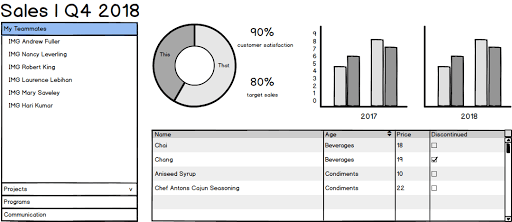
We will use a Material Design theme to give us good looking type and polished UI styles with minimal effort.
From our mock-up I have created an outline that I will use to arrange my rows and columns. This will guide me in structuring my <div> elements and creating classes I will need to achieve the specific layout I want.
Below is the typical outline I would have created given the mock-up above. We have two rows, the first containing the heading to the left and buttons to the right. Everything else will go in a new row underneath it. The second row is split up into two columns. The first (or left) column will contain our Panel Bar component. Inside the second (or right) column will be two rows, the first having three columns and the next having just one column spanning the full width of its parent container. From this description, I now have a basic idea of how to structure my HTML.
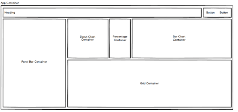
Now that we have these sketches we can create our markup using <div> elements and assigning bootstrap-grid classes indicating how many of the maximum 12 columns each <div> will take up. We will use the the Bootstrap Grid's responsive column classes to help us achieve our desired layout.
Getting Started
We need to ensure that we have Node installed, version 10 or higher, as the latest version of Create React App makes this a requirement. Having Node installed will allow us to use npm to download Yarn Package Manager. If you are new to Create React App, you can brush up on the latest with this article, Hello, Create React App!, written to get folks up to speed creating React applications using zero configuration.
Ensure Yarn is Installed:
Yarn is used as the default package manager in Create React App. Install it using:
$ npm install yarnpkg -gIf you have any issues installing Yarn on Windows, just download and run the msi installer here.
$ npx create-react-app sales-dashboard
$ cd sales-dashboard
$ yarn start
Once Create React App is started you can check what our app looks like in the browser:
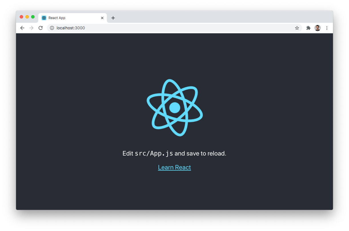
Great, the app is working. Your page will look funny for a few minutes until we add the HTML and CSS.
We need a few packages installed from npm in order to get the the basic layout for our dashboard working. KendoReact has a Material theme that we can pull in as a package for layout. We will also need to bring in a few KendoReact buttons, which will give you an idea of how easy it is to pull the bits and pieces in to get started. Since Create React App uses yarn, so will we. Let's install the few packages we need from KendoReact:
- Kendo Material Theme
- KendoReact Layout Components
- KendoReact PDF (Requires Kendo Drawing)
- KendoReact Buttons
yarn add @progress/kendo-theme-material @progress/kendo-react-layout @progress/kendo-react-pdf @progress/kendo-drawing @progress/kendo-react-buttons @progress/kendo-react-rippleThe HTML
Considering the layout we saw above, I have created a hierarchy of div elements each given a className in the traditional “12 column responsive grid” fashion, and simplified that idea in a visual aid seen below. This is just to give an idea of what we need to create. The HTML I will have you copy from the Github Gist below has some additional classes for each breakpoint xs thorugh xl.
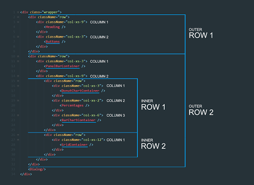
Tags like "<GridContainer />" are just placeholders for the KendoReact components we will add. Hopefully the diagram above gives you an idea of our HTML structure.
Copy the code below into your App.js page.
Copy the CSS below into your App.css.
Right now, our layout is not as we intend because we have not loaded bootstrap yet. Let's use the Bootstrap 4 Grid, which provides a CSS file that only includes styles from Bootstrap Grid and none of the other Bootstrap styles. This will ensure we are not loading additional CSS that we are not using. I use this specific package because it has a decent amount of weekly downloads and the project seems maintained, but there are many others just like it. We will add the package first:
yarn add bootstrap-4-gridNext we will add an import for the bootstrap-4-grid CSS which we will load into our node_modules/bootstrap-4-grid/css directory. This import should go at the top of the App.js file.
import 'bootstrap-4-grid/css/grid.min.css';I have a piece of CSS I would like to add just to give us an idea of the boundaries of ourBootstrap Grid. The following CSS styles will render a one pixel black line around every row and column of our Bootstrap 4 Grid. We should see a resemblance to the mockup from earlier.
.container .row div {
  outline: solid 1px black;
}
Once added to the App.css file, we will get a trace of our layout.

We can see the boundaries of each box on the page, we also see some column gutters around the percentages. If we wanted we could inspect the page using the Chrome DevTools and get a better understanding of the padding on each section of the grid.
Since we are using Bootsrap, we can change the layout at different page widths (breakpoints). With the classes that we have added, you will see a clear change in the layout when you cross the small to medium breakpoint boundary. We can open Chrome DevTools and toggle the device toolbar allowing us to resize the page. If we drag from appx 700px to 800px range, we will see a clear change in the layout when we cross 768 pixels. Try it out or just watch me do it!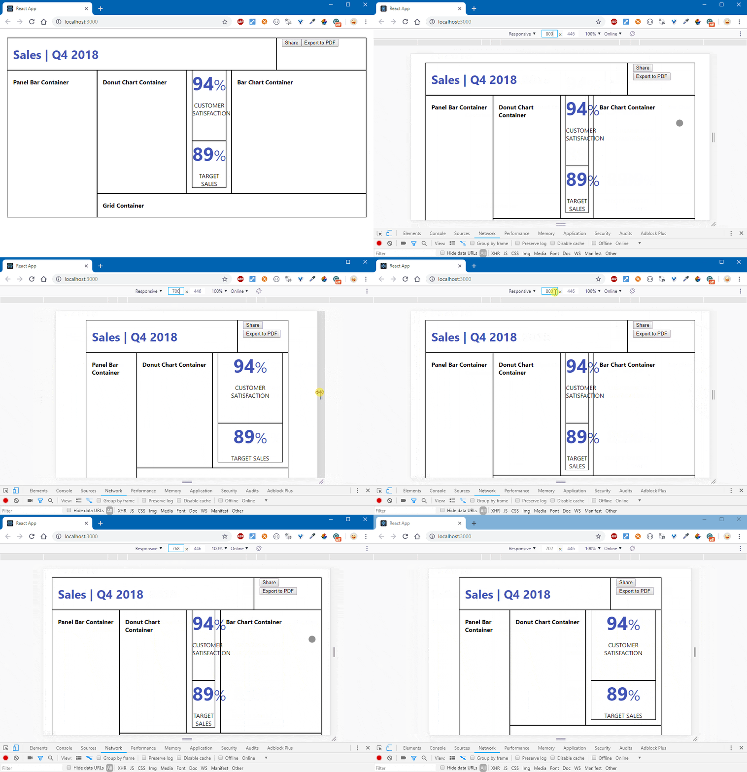
Adding Buttons
We already have a few buttons on the page, but we want to replace them with KendoReact buttons. It's a great way to get acquainted with working with KendoReact components, which take advantage of the Material theme we have installed. We already have the dependencies added. Let's go into our App.js file and add the following imports, including our stylesheet for the material theme:
import React, { Component } from 'react';
import ReactDOM from 'react-dom';
import { Button } from '@progress/kendo-react-buttons';
import { savePDF } from '@progress/kendo-react-pdf';
import '@progress/kendo-theme-material/dist/all.css';
import './App.css';
import 'bootstrap-4-grid/css/grid.min.css';
We can wire up the Export to PDF button. To do this, we simply need to find the two buttons we have in our HTML and change both <button> tags to use title casing:
<Button>Share</Button>
<Button>Export to PDF</Button>
This will render a KendoReact Button complete with its style. A KendoReact Button has a prop named primary which we can use to add a distinguishing feature to our button - it's the same as adding the class primary. We just need to pass the value true to this prop. Behind the scenes, our component takes that true value and then renders a primary class.
<Button primary={true}>Share</Button>Let's use a class that will give our buttons spacing. It's already defined in the styles we have added to the App.css file. On the div that surrounds our buttons, add buttons-right to the className. The buttons and their containing div should now look like this:
<div className="col-xs-6 col-sm-6 col-md-6 col-lg-6 col-xl-6 buttons-right">
  <Button primary={true}>Share</Button>
  <Button>Export to PDF</Button>
</div>
Now you should see your buttons taking on a Material Design style.

I noticed something missing when I clicked on our new buttons. The Material Design frameworks I have worked with in the past utilize a droplet effect on certain UI elements when pressed. Buttons definitely show this ripple effect and I am not seeing it on ours. This is because KendoReact provides this as a separate package ( KendoReact Ripple), which I think is a good idea because I may or may not want it in my project. Let's import the <Ripple> as a component and we will wrap it around whatever portion of our application we want to apply it to:
yarn add @progress/kendo-react-rippleWith that done, you can now import Ripple into the App.js page just below the savePDF import:
import { Ripple } from '@progress/kendo-react-ripple';Next, we want to add a <Ripple /> container around the <div> element of the app-container so that all Button and other components will get the ripple effect applied to them as a child of <Ripple />:
class App extends Component {
  render() {
    return (
      <Ripple>
        <div className="bootstrap-wrapper">
          { /* ... */ }
        </div>
      </Ripple>
    );
  }
}

export default App;
To test it live in our application and not trigger the actual button handler, click and drag outside the button hit state and release.
Export to PDF
A lot of times we simply want the user to be able to print everything on the page to a PDF file. In order to do this, we can use KendoReact's PDF Export to do all the heavy lifting.
Add the following code to your App Component Class in App.js:
constructor(props) {
  super(props);
  this.appContainer = React.createRef();
}

handlePDFExport = () => {
  savePDF(ReactDOM.findDOMNode(this.appContainer), { paperSize: 'auto' });
}
With that code in place, we need to bind this.appContainer to an object, which is a reference to the HTML element that contains the area we want to print to PDF.
Because we want to print the entire sales dashboard, we will place a ref attribute on an outer <div> in our JSX. I'm going to use the one with the className: app-container
<div className="app-container container" ref={(el) => this.appContainer = el}>The ref attribute allows us to assign an HTMLDivElement, representing the contents of the <div> element it is placed on, to a local property.
Next, we will want to ensure that we are calling the handlePDFExport() function from the onClick event. Let's also disable the other button for the time being.
<Button onClick={this.handlePDFExport}>Export to PDF</Button>Let's now test our button to ensure everything is working. When the button is pressed, you should get a prompt to download a PDF file. Upon opening the PDF you should see the entire contents of our page. You can imagine what would happen if we put this attribute on another <div> in our page. At that point the button would only print the contents of the <div> element. We will revisit this idea once we get the Grid working and create a button that only prints the data grid.
Share Dialog
Let's wire up the share button now. In a real production application this would talk to a service that could be used to send an email to someone in order to share the dashboard link, but we are just going to make it print to the console. The KendoReact Dialog is one of the more important and widely used components in our toolkit as a developer using KendoReact, which communicates specific info and prompts our users to take actions via a modal overlay.
In the constructor for our App.js file, let's create an object to hold state. This state object is understood by React to be a special object. Under the hood, React treats this object differently.
constructor(props) {
  super(props);
  this.appContainer = React.createRef();
  this.state = {
    showDialog: false
  }
}
Let's create a function inside the App class, underneath the handlePDFExport() function. As I mentioned React state objects are special, they have an API used specifically for interacting with it. For instance, if we want to change the state in any way, we should not access the object directly and assign new values. Instead we use the setState method for updating the state. This will schedule an update to a component's state object. When state changes, the component responds by re-rendering.
handleShare = () => {
  this.setState({
    showDialog: !this.state.showDialog
  })
}
PRO TIP: To execute a function, or verify if the state updates correctly, we can pass a function as a second argument (callback) to
setState(), the function will be executed once the state is updated. Find out more and explore the React docs for state.
handleShare = () => {
  this.setState({
    showDialog: !this.state.showDialog
  }, () => console.log(this.state))
}
We also need to update the button to use this function.
<Button primary={true} onClick={this.handleShare}>Share</Button>So this button toggles a boolean value in our state object, which is typically a good way to hide and show modals, pop ups or hidden areas of the page. But we need to create a hidden area that will reveal itself when this button is clicked. As we saw from our setState callback, each time we press the Share Button that value is flipped. This HTML block that we are going to add should be replaced by the code below:
<h4 style={{display : 'none'}}>Dialog Shown/Hidden with Logic</h4>Replace with the following code:
{this.state.showDialog &&
  <Dialog title={"Share this report"} onClose={this.handleShare}>
    <p>Please enter the email address/es of the recipient/s.</p>
    <Input placeholder="example@progress.com" />
    <DialogActionsBar>
      <Button primary={true} onClick={this.handleShare}>Share</Button>
      <Button onClick={this.handleShare}>Cancel</Button>
    </DialogActionsBar>
  </Dialog>
}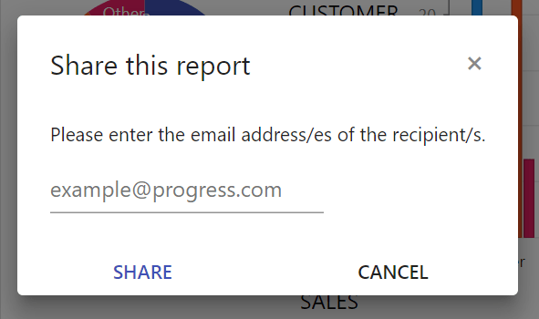
Let's unpack what we just added: we brought in a new KendoReact component called <Dialog>, which is wrapped in an expression that will hide or show the area based on the state.showDialog value being flipped. The best way to think of this is that our <Dialog> component equates to a truthy value. It's similar to saying:
{ this.state.showDialog && true }So because it's paired up with the this.state.showDialog, if both equate to true, the Dialog displays. However, if this.state.showDialog is false, the output of the <Dialog> component is not revealed. Again this is just a way to think about this statement if for any reason it looks weird to you.
The <Dialog></Dialog> component will not work without importing it from the kendo-react-dialogs package, so let's get that added and imported:
yarn add @progress/kendo-react-dialogs @progress/kendo-react-inputs @progress/kendo-react-intlAnd we'll also import those packages in our App.js. Our imports should now look like this:
import React, { Component } from 'react';
import ReactDOM from 'react-dom';

import { Dialog, DialogActionsBar } from '@progress/kendo-react-dialogs';
import { Input } from '@progress/kendo-react-inputs';
import { Button } from '@progress/kendo-react-buttons';
import { savePDF } from '@progress/kendo-react-pdf';
import { Ripple } from '@progress/kendo-react-ripple';

import '@progress/kendo-theme-material/dist/all.css';
import './App.css';
import 'bootstrap-4-grid/css/grid.min.css';
🍩 Mmm, Donut Charts
I'd like to start bringing in the Chart component. It has the least amount of data associated with it, so it's a logical next step and easy to implement.
Let's add a directory for all of our container components that will wrap our individual KendoReact components. We will call the directory components. Inside, create our first container component named: DonutChartContainer.js.
We will need KendoReact Charts for this feature. We will also install HammerJS, which is required for Chart events.
yarn add @progress/kendo-react-charts hammerjsNext, I was able to pretty much copy and paste from the KendoReact chart documentation to get what we need for DonutChartContainer.js, which you can copy from the Gist below:
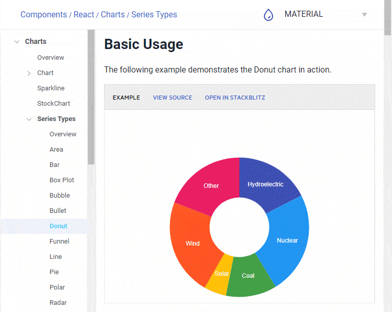
The KendoReact Charts have many different Series Types. If you go to the KendoReact Charts documentation, you will see that charts has a sub section called "Series Types". One of these series is called "Donut", and that is where I found the StackBlitz demo and I just copied the code from there.
The KendoReact charts provide a vast set of features for building rich data visualizations. To learn more about them, feel free to check out the KendoReact Charts API.
The first thing we want to create for the Chart is some dummy data. Like I said before, all of our components will need data. Let's create a directory named data as a sibling to our components directory. Inside that directory create a file named: appData.js.
Remember, the idea is to show what percentage of food (by category) has sold in Q4. That specific data is what we will use to populate the donut chart. We want to display a label (foodType) and percentage value (percentSold).
foodTypecategory of foods sold in Q4 at all storespercentSoldpercentage represented as a decimal sold in all stores in Q4
Copy the code below into the appData.js file:
export const donutChartData = [
  { 'foodType': 'Beverages', 'percentSold': 16.5 },
  { 'foodType': 'Condiments', 'percentSold': 24 },
  { 'foodType': 'Produce', 'percentSold': 13 },
  { 'foodType': 'Meat/Poultry', 'percentSold': 16.5 },
  { 'foodType': 'Seafood', 'percentSold': 20 },
  { 'foodType': 'Other', 'percentSold': 10 }
];
We need to add the import to App.js for the DonutChartContainer:
import { DonutChartContainer } from './components/DonutChartContainer';And replace the <h4>DonutChartContainer</h4> element with:
<DonutChartContainer />Now our component should be working. I want to show you how to format the label of the Donut Chart. Right now we are only displaying the category because we specified that in our component configuration. Inside the DonutChartContainer.js file, change the labelTemplate function to:
const labelTemplate = (e) => (e.category + '\n'+ e.value + '%');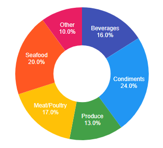
Here is our beautiful Donut, it even looks tasty! When we use the Donut Chart, we interact with a <ChartSeriesLabels> component. The content input accepts a function that returns a string. It's that simple. It fills each section (categories in our case) with rich goodness. Using just what we know about JavaScript, we can achieve some better formatting and I think we may want to use e.percentage instead of e.value. You can get details on the fields we can tap into in our ChartSeriesLabels documenation.
I have modified the template function to use percentage which is more accurate for this type of a chart. In case the data doesn't equal 100 each part will still represent its part of the whole.
const labelTemplate = (e) => (e.category + '\n' + (e.percentage*100) +'%');With that, we're now using percentage instead of value.
Raising the Bar Chart Component
We will use a KendoReact Bar Chart, which will represent a monthly breakdown of the percentages from each individual month of Q4 2018. The Donut Chart showed the average percentage over the entire quarter, but our bar chart will show each month of that quarter. Below is the data we need to add to our appData.js file. You will notice that our data corresponds to the Donut Chart as well, so the user can easily see the relationship.
export const barChartQ4Months =['October', 'November', 'December'];
export const barChartMonthlyPercentages = [
  { name: 'Beverages', data: [14, 16, 19.5] },
  { name: 'Condiments', data: [24, 23.5, 24.5] },
  { name: 'Produce', data: [12.5, 12.5, 14] },
  { name: 'Meat/Poultry', data: [16, 18, 17] },
  { name: 'Seafood', data: [21.5, 20, 17] },
  { name: 'Other', data: [7, 12, 11] },
];
With the data in place, we can add a new container component to our components directory. Create a file named BarChartContainer.js, and copy the code below into that file:
Add the import to App.js for the BarChartContainer:
import { BarChartContainer } from './components/BarChartContainer';And replace the <h4>BarChartContainer</h4> element with:
<BarChartContainer />Check to ensure that your bar charts are using the same color as the Donut Chart slices for each product. Everything should line up because our data for each chart is in the same order. If you were building an API to serve this data, that would be something you may want to be aware of.
Have you noticed how crazy simple it is to use these components? We still want to have a wrapper or container component around the KendoReact component so that we have that layer if needed.
We have an array of months, each one of those months will translate into a category on the bar chart. We also have an array of objects. Each of these objects has a name field that corresponds to our categories of food. It will also have a data field. So for each month (category on the bar chart), we iterate over the first index of every data field's array. Each iteration builds a bar whose height corresponds to the index's value. Again this happens for each month.
My tip to anyone working with this chart is to take that example and become familiar with how each tag inside the <Chart> component plays into the bigger picture. We have a Legend, ChartCategoryAxis & Items, ChartSeries & Items, ChartValueAxis & Items and of course the encompassing component, the Chart itself.
To do more hacking on charts, check out this article on Data Visualizations with Kendo UI for some really cool ideas on using different charts.
Adding the Grid Component
The Grid container is by far one of our most used and requested components. Our grid will be a list of products. To populate it, we'll copy the gist below and paste it into appData.js. This will serve as the top 10 products of Q4, which are the heart of the data we are building the dashboard around. In a more advanced situation, the Grid could be populated by clicking on a particular month and we would filter a larger set of products, but in order to just get a prototype created and a Grid on the page, we are going to use this dummy data. We will do some processing of that data, and I can show you how that is done in just a few moments when we add the Sparkline chart to our Grid as an enhancement.
We need to add a few packages before using the Grid. For info on why each dependency is needed, check out the KendoReact Grid Dependencies section in our documentation:
- Kendo Data Query package
- KendoReact Date Inputs
- KendoReact Dropdowns Overview
- KendoReact Grid
- KendoReact Inputs
- KendoReact Intl
yarn add @progress/kendo-data-query @progress/kendo-react-dateinputs @progress/kendo-react-dropdowns @progress/kendo-react-grid @progress/kendo-react-inputs @progress/kendo-react-intl @progress/kendo-react-data-toolsI listed all of the dependencies to show what is required for the grid, but a few of these we already installed during a previous component - that's because KendoReact components sometimes share the same dependencies. There is no harm in running the install again.
Next, let's add the data to our appData.js file:
Looking at the data, the most important fields are product id, name, category, price, in-stock and discontinued fields. I brought in a little more data than we needed in case you want to play around with the grid on your own and experimenting. For now we will just use those specific fields though.
The main components for a KendoReact Grid are the actual <Grid> element which contains child <Column> components, each mapping to a specific field from our data object.
I want to give you a quick visual of the code for this component, so if I only wanted to display the id, name and category from our data set, I could very easily and almost from memory build that component:
<Grid style={{height:'300px'}} data={gridData}>
  <Column field="ProductID" title="ID" />
  <Column field="ProductName" title="Name" />
  <Column field="Category.CategoryName" title="Category Name" />
</Grid>
And that would look like this rendered on the page: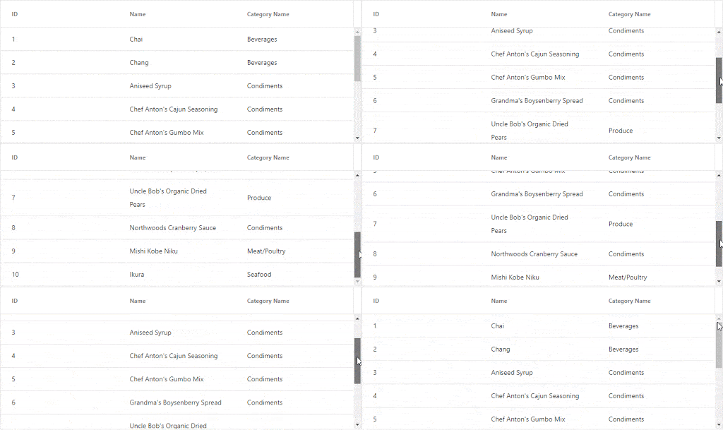
Implementing the Grid is that simple. In our project, we are going to use a few more properties and some more column sizing than you saw in the example above. Copy the entire component from the gist below and put it into a new file named GridContainer.js:
Add the import to App.js for the GridContainer:
import { GridContainer } from './components/GridContainer';And replace the <h4>GridContainer</h4> element with:
<GridContainer />Now that we have the basic grid working and using our data, we will add some code that processes the data by adding random numbers to an array so that we can create a fake sparkline chart for each product. In a real product or application we would need to use real historical data, but for the purposes of this demo, we'll fake it. Let's create the function and add it just below the imports in our GridContainer.js file:
const processData = (data) => {
  data.forEach((item) => {
    item.PriceHistory = Array.from({ length: 20 }, () => Math.floor(Math.random() * 100));
    return item;
  })
  return data;
}
The property PriceHistory is now available when the Grid is rendered. We can see this by placing a debugger; statement before the return data; line in our new function, then opening the Chrome DevTools (F12) and inspecting that data object. Now we just need a Sparkline chart that can use the new PriceHistory property.
We are going to create a Sparkline Chart component inside of this GridContainer.js file. When a component or function will only be used in conjunction with one specific component, it's okay to keep it in the same file. We will add a function and component just under the current imports of the GridContainer component, for use only in this grid:
import { Sparkline } from '@progress/kendo-react-charts';

const SparkLineChartCell = (props) => <td><Sparkline data={props.dataItem.PriceHistory}/></td>
Next, add the new column to the Grid component, just above the discontinued column:
<Column field="PriceHistory" width="130px" cell={SparkLineChartCell} title="Price history" />We also need to update the Grid component to use processData:
<Grid style={{ height: '300px' }} data={processData(gridData)}>Also, if you have not already done so 😆, we should comment out the Grid Outline code from the App.css page.
.container .row div {
  outline: solid 1px black;
}
Just in case you have any issues I have created a gist for GridContainer.js, showing what the code should look like at this point. We now have added a KendoReact component within another component, that's cool! It's a Sparkline rendering inside of a column from our Grid. I wanted to highlight this, because you can lego-style compose KendoReact components if you wish. When in doubt, just try it!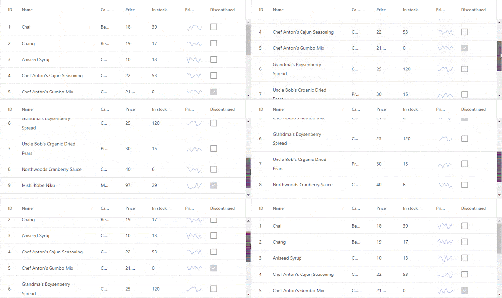
Adding PanelBar Navigation
The KendoReact PanelBar is a component in the KendoReact Layout package. We already should have this installed, so we can skip this command.
yarn add @progress/kendo-react-layoutCopy the data below into appData.js file. The data has two top level nodes containing arrays as values.
Let's bring in some additional styles for the Teammates section of the PanelBarContainer. Copy this Gist to the bottom of the App.css page:
Now we just need to copy the Gist below and paste it into our PanelBarContainer.js component:
Now add the import to App.js for the PanelBarContainer:
import { PanelBarContainer } from './components/PanelBarContainer';And replace the <h4> element for the PanelBarContainer:
<PanelBarContainer />We will also need to add some profile images for each team member. I have created a small zip file that has some images already sized correctly that you can use: profile_images.zip.
After you have downloaded those images, add them to a public/img directory in your project for any static files like logos, graphics, images, etc. The public directory is the right place for these.
Our new component should look like this: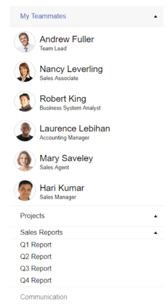
We have some semblance of a dashboard going on here. It's laid out in a manner that will look decent on medium and large sized screens (960px and up). Obviously this is nothing to ship to production, but it gets you started and working with the KendoReact components, which is the point.
A few things that we could do to expand this demo is add some interactivity, or refactor to work with Redux, and we could also build an API to serve up our data. And I'd like to implore you to explore these options and let us know what you think about our components in the comments section. Also let us know if you would like to see this demo taken further with more advanced concepts we could build.
Interested in Building a Dashboard? Watch the Recording of This Webinar On Demand:

Eric Bishard
Eric Bishard is a Developer Advocate and former member of the KendoReact team at Progress. A software engineer with experience building web based applications with a focus on components for user interfaces in Angular and React, Eric works with @Couchbase, tweets @httpJunkie and blogs at ReactStateofMind.com.

