How to Use a jQuery Autocomplete UI Component in Your Web App

Summarize with AI:
The Autocomplete component enables you to provide users with a list of options or suggestions based on what they type into a text field. This blog dives into the ins and outs of the jQuery Autocomplete component and shows you how to get started.
In the last episode of this series, we covered the `ComboBox`. This component allows you to select a single option from a list or enter a custom value. In this episode, we will learn about the jQuery `AutoComplete` component. This consists of a text field that displays a list of options based on what is typed into the field. It is also possible to make multiple selections and enter your own input. An `AutoComplete` is typically seen in search fields. When there is a large dataset to select from, like a store catalog, it is an added convenience to provide suggestions and filter the options for the user. Coming up, we will look at the how to use the jQuery `AutoComplete` component.
Basic Kendo UI AutoComplete
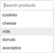
To get started, you will need to create an `input` element and configure the list of options in the component’s API using an array or a remote data service. In the following example, we will use the `dataSource` property to add an array. Our array will represent products in a grocery store. Here is the implementation:

```html<!DOCTYPE html><html> <head> <meta charset="utf-8"> <title>AutoComplete</title> <link rel="stylesheet" href="https://kendo.cdn.telerik.com/2018.2.620/styles/kendo.common-bootstrap.min.css"> <link rel="stylesheet" href="https://kendo.cdn.telerik.com/2018.2.620/styles/kendo.bootstrap.min.css"> <script src="https://code.jquery.com/jquery-1.12.3.min.js"></script> <script src="https://kendo.cdn.telerik.com/2018.2.620/js/kendo.all.min.js"></script> <style> body { font-family: helvetica;} </style> </head> <body> <input id="autocomplete"/> <script> $(document).ready(function(){ $('#autocomplete').kendoAutoComplete({ placeholder: 'Search products', dataSource: ['cookies', 'cheese', 'milk', 'donuts', 'avocados'] }); }); </script> </body></html>```By default, you will only see the options when you begin typing into the field. The suggestions shown will be filtered by items that start with the text. This can be changed by setting the `filter` property to another option like `contains` or `endswith`. If there are no options that start with the text, a default message will appear. You can customize the view when there is no data by configuring the `noDataTemplate` property. If you type something in the field but then erase it, all of the options will show. If you want to select multiple options, you add the `separator` property.
Grouping Items in the AutoComplete
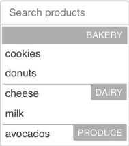
Our data does not have to be a string of items. It can also be objects with multiple fields. Say we wanted to show extra information about the products in the suggestions. We will change our data to have a field for the text and one for the category of the product. Then we will group together items by category in the dropdown. To do this, we will first add a `dataTextField` so that the component knows which field in the data to use as the displayed text. Then, our `dataSource` will be changed to an object that now has a `data` field that contains our array, and a `group` field which specifies the field name in our data to group by. This is the updated code:

```jsdataTextField: 'label',dataSource: { data: [ {label: 'cookies', category: 'bakery'}, {label: 'cheese', category: 'dairy'}, {label: 'milk', category: 'dairy'}, {label: 'donuts', category: 'bakery'}, {label: 'avocados', category: 'produce'} ], group: {field: 'category'}}```The appearance of the popup can also be customized. By default, the label for the groups will only show the name of the group. The top label for the group can be changed using the `fixedGroupTemplate`. This always shows the current group. If our list were longer, its value would change as we scrolled through other groups in the dropdown. The other groups are customized through the `groupTemplate` property. Each item in our data can also be rendered with custom HTML using the `template` property.
Summary
The jQuery `AutoComplete` component generates a list of filtered options that we can choose from based on the value of the text field. Previous components that we have reviewed share some similarities with the `AutoComplete` and each other. However, they differ in either their selection type and their editability. Below is a comparison of their features.
|
Component |
Selection Type |
Editable |
|
AutoComplete |
Multiple |
Yes |
|
ComboBox |
Single |
Yes |
|
MultiSelect |
Multiple |
No |
|
DropDownList |
Single |
No |
Each of these components allows filtering and can be customized with templates. The difference in functionality is what will determine when and where you will use each one in your app. The `AutoComplete` is ideal for searching. A `ComboBox` is suitable when selecting numbers. The `MultiSelect` can be used for tagging. And a `DropDownList` can be used as a replacement for a select menu. In the next lesson, we will review the `MaskedTextBox`. The purpose of this component is to control the kind of data a user can enter in the text field.
Try Out the Autocomplete for Yourself
Want to start taking advantage of the Kendo UI Autocomplete, or any of the other 70+ ready-made Kendo UI components, like jQuery Grid or Scheduler? You can begin a free trial of Kendo UI today and start developing your apps faster.
Angular, React and Vue Versions
Looking for a UI component to support specific frameworks? Check out the Autocomplete for Angular, the Autocomplete for React or the Autocomplete for Vue.
Resources

Alberta Williams
Alberta is a software developer and writer from New Orleans. Learn more about Alberta at github.com/albertaw.
