Getting Started with the TreeList Control in Blazor

Summarize with AI:
Display plenty of data in a clear structural hierarchy with a Blazor TreeList.
When building web applications with Blazor, you may need to display hierarchies that have table-like features such as sorting, filtering, paging or inline editing. In these cases, the Progress Telerik UI for Blazor TreeList control is an excellent option, combining both worlds in a single component.
In this article, we will explore the control, how to implement it in your Blazor apps, and some of its main features. Let’s get started!
Getting to Know the Telerik UI for Blazor TreeList Control
According to Telerik documentation, the TreeList control is a data container element, similar to a grid. In the case of the TreeList, it allows a hierarchical relationship between the items in the list, while providing a clear view like that of a grid. Some ideal use cases for this component are:
- List folders and files in a document management system
- Display a product catalog for an ecommerce platform
- Manage tasks and subtasks of a project
- Organize educational content
- Display financial account structures
Preparing a Project to Use the TreeList
To be able to use the TreeList component, you must make sure to follow the official installation guide for Telerik components for Blazor. In my case, I used the Blazor Web App template with Interactive render mode set to Server and Interactivity location set to Global.
The example we will create is a project management application, where we can view each project with its phases and individual tasks.
Creating a Data Model
To represent information about a project, we will create a class ProjectTask, which will represent projects, phases and tasks within the hierarchy. The class will look like this:
public class ProjectTask
{
    public int Id { get; set; }
    public string Name { get; set; } = string.Empty;
    public string Status { get; set; } = string.Empty;
    public string AssignedTo { get; set; } = string.Empty;
    public DateTime? DueDate { get; set; }
    public int Priority { get; set; }
    public int? ParentId { get; set; }
    public bool HasChildren { get; set; }
}
Thanks to the properties Id, ParendId and HasChildren, we will be able to create hierarchies in the projects. If ParendId is null, it means that it is a root node, while Id will be used to link child elements to their parent element.
Now, let’s create a service that simulates fetching from a database.
Creating the Data Service
Let’s create the service that will create the hierarchical relationships through the definition of the class ProjectTaskService, which looks like this:
public class ProjectTaskService
{
    public List<ProjectTask> GetTasks()
    {
        return new List<ProjectTask>
        {
            // Projects
            new ProjectTask { Id = 1, Name = "Website Redesign", Status = "In Progress",
                AssignedTo = "Team A", DueDate = new DateTime(2025, 8, 31),
                Priority = 1, ParentId = null, HasChildren = true },
            new ProjectTask { Id = 2, Name = "Mobile App", Status = "Planning",
                AssignedTo = "Team B", DueDate = new DateTime(2025, 12, 15),
                Priority = 2, ParentId = null, HasChildren = true },

            // Project Website Redesign | Phase 1
            new ProjectTask { Id = 3, Name = "Phase 1: Discovery", Status = "Done",
                AssignedTo = "Alice", DueDate = new DateTime(2025, 3, 15),
                Priority = 1, ParentId = 1, HasChildren = true },
            new ProjectTask { Id = 4, Name = "Phase 2: Design", Status = "In Progress",
                AssignedTo = "Bob", DueDate = new DateTime(2025, 6, 30),
                Priority = 2, ParentId = 1, HasChildren = true },

            // Project Website Redesign | Phase 1 | Tasks
            new ProjectTask { Id = 5, Name = "Stakeholder Interviews", Status = "Done",
                AssignedTo = "Alice", DueDate = new DateTime(2025, 2, 28),
                Priority = 1, ParentId = 3, HasChildren = false },
            new ProjectTask { Id = 6, Name = "Competitor Analysis", Status = "Done",
                AssignedTo = "Charlie", DueDate = new DateTime(2025, 3, 10),
                Priority = 2, ParentId = 3, HasChildren = false },

            // Project Website Redesign | Phase 2 | Tasks
            new ProjectTask { Id = 7, Name = "Wireframes", Status = "In Progress",
                AssignedTo = "Bob", DueDate = new DateTime(2025, 5, 15),
                Priority = 1, ParentId = 4, HasChildren = false },
            new ProjectTask { Id = 8, Name = "UI Style Guide", Status = "Pending",
                AssignedTo = "Diana", DueDate = new DateTime(2025, 6, 15),
                Priority = 2, ParentId = 4, HasChildren = false },

            // Project Mobile App | Phase 1
            new ProjectTask { Id = 9, Name = "Phase 1: Requirements", Status = "In Progress",
                AssignedTo = "Team B", DueDate = new DateTime(2025, 7, 1),
                Priority = 1, ParentId = 2, HasChildren = true },

            // Project Mobile App | Phase 1 | Tasks
            new ProjectTask { Id = 10, Name = "Requirements Document", Status = "In Progress",
                AssignedTo = "Eve", DueDate = new DateTime(2025, 6, 15),
                Priority = 1, ParentId = 9, HasChildren = false },
        };
    }
}
In the previous code, I have added some comments so you can see the hierarchy we have created, having a hierarchy like Project -> Phase -> Tasks. Now, let’s register this new service inside Program.cs as follows:
var builder = WebApplication.CreateBuilder(args);
...
builder.Services.AddScoped<ProjectTaskService>();
var app = builder.Build();
...
With the service ready, we can move on to integrating the TreeList into the application.
Integrating a TreeList into a Blazor App
It’s important to know that a TreeList supports two types of Data Binding configuration: flat data and hierarchical data. You can use hierarchical data when you have separate collections of items and their child elements. You can identify it’s being used when you see the assignment of the property Items.
On the other hand, flat data refers to when you have a single collection of items with defined parent-child relationships, in which case you must assign the properties Id and ParentId. For our example we will use the flat data approach as follows:
@page "/project-treelist"
@page "/"
@using TelerikTreeListDemo.Models
@using TelerikTreeListDemo.Services
@inject ProjectTaskService ProjectTaskService

<PageTitle>Project Task Manager</PageTitle>

<h2>Project Task Manager</h2>

<TelerikTreeList Data="@Tasks"
                 IdField="Id"
                 ParentIdField="ParentId"
                 HasChildrenField="HasChildren">
</TelerikTreeList>

@code {
    private List<ProjectTask> Tasks { get; set; } = new();

    protected override void OnInitialized()
    {
        Tasks = ProjectTaskService.GetTasks();
    }
}
In the previous code we used OnInitialized to call the service that fetches tasks, and the component TelerikTreeList using Data to bind to the hierarchical list of projects, IdField to assign the id of each element, ParentIdField to indicate which is the element that relates to the parent of the element, and finally HasChildrenField to indicate whether the element has children or not.
However, if you run the application right now you will see an empty space with no content. This happens because you must define inside the TelerikTreeList a TreeListColumns tag, which will contain a set of TreeListColumn. Each of these columns must define a Field parameter where the name of the property to bind will be assigned, as well as other properties such as Expandable, Width and Title:
...
<TelerikTreeList Data="@Tasks"
                 IdField="Id"
                 ParentIdField="ParentId"
                 HasChildrenField="HasChildren">
    <TreeListColumns>
        <TreeListColumn Field="Name" Expandable="true" Width="250px" Title="Task / Phase / Project" />
        <TreeListColumn Field="Status" Width="130px" />
        <TreeListColumn Field="AssignedTo" Width="140px" Title="Assigned To" />
        <TreeListColumn Field="DueDate" Width="130px" Title="Due Date" />
        <TreeListColumn Field="Priority" Width="100px" />
    </TreeListColumns>
</TelerikTreeList>
...
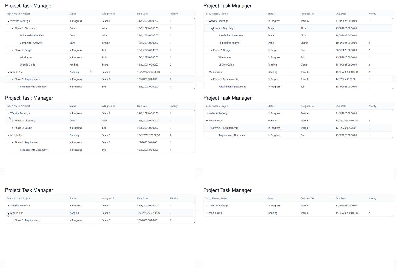
The above configuration allows rendering like the one shown below:
Now, let’s see how to configure the columns in greater detail.
Customizing the Columns
If you need a higher degree of customization for the columns in the TreeList, you can do this using a Template tag, where you’ll be able to access the model item’s context to customize the value through the use of HTML code.
In our example, we’ll customize the Status and Priority columns, replacing the TreeListColumns tag with the following:
<TreeListColumns>
    <TreeListColumn Field="Name"
                    Expandable="true"
                    Width="260px"
                    Title="Task / Phase / Project" />

    <TreeListColumn Field="Status" Width="140px">
        <Template>
            @{
                var item = context as ProjectTask;
                var color = item!.Status switch
                {
                    "Done"        => "green",
                    "In Progress" => "royalblue",
                    "Planning"    => "orange",
                    _             => "gray"
                };
            }
            <span style="color: @color; font-weight: 600;">@item.Status</span>
        </Template>
    </TreeListColumn>

    <TreeListColumn Field="AssignedTo" Width="150px" Title="Assigned To" />

    <TreeListColumn Field="DueDate"
                    Width="140px"
                    Title="Due Date"
                    DisplayFormat="{0:MMM dd, yyyy}" />

    <TreeListColumn Field="Priority" Width="110px" Title="Priority">
        <Template>
            @{
                var item = context as ProjectTask;
                var stars = new string('★', item!.Priority) + new string('☆', 3 - item.Priority);
            }
            <span style="color: gold;">@stars</span>
        </Template>
    </TreeListColumn>
</TreeListColumns>
In the code above we modified the templates to show a different coloring for the status of each task according to its state, as well as filled stars representing its priority:
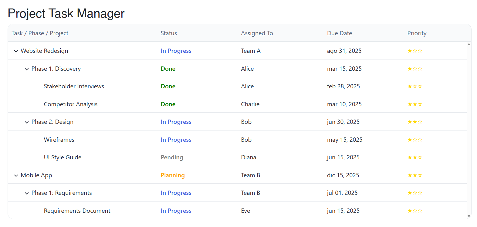
In the image you can see the customization in action, and we have also used DisplayFormat to format dates.
Enabling Pagination and Sorting in the TreeList
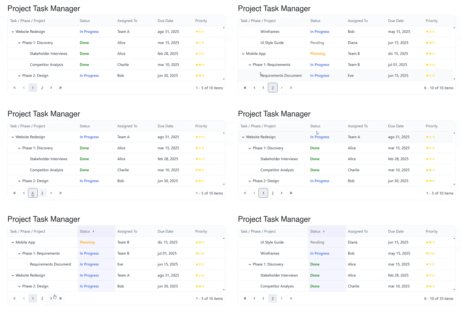
Some of the features that distinguish the TreeList component from a TreeView component are that it allows operations such as pagination and sorting. This can be very helpful when you have a large collection of data. To enable these features, simply use the Pageable and Sortable parameters:
<TelerikTreeList ...
                 Pageable="true"
                 PageSize="5"
                 Sortable="true">
In the code above, you can see that we set Pageable to true, as well as PageSize to a value 5, which will allow showing 5 results per page. Additionally, with Sortable = "true" the user will be able to click on the headers to sort the data according to their needs:
Now, let’s see how to add filtering to the component.
Adding the Filtering Feature
Another feature users will undoubtedly appreciate is being able to filter their data to quickly find items. We can achieve this using the FilterMode parameter:
<TelerikTreeList ...
                 FilterMode="@TreeListFilterMode.FilterRow">
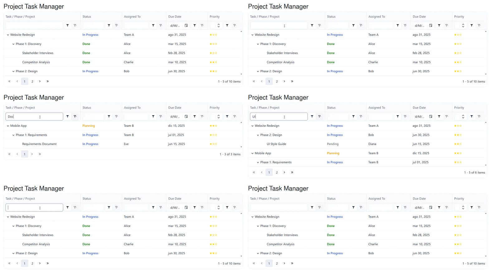
You can see that to use FilterMode we used an enumeration TreeListFilterMode, which contains two values to display filters:
TreeListFilterMode.FilterRow: Displays a row of filters below the column headers:
TreeListFilterMode.FilterMenu: Displays a pop-up menu when clicking the filter icon in the header:
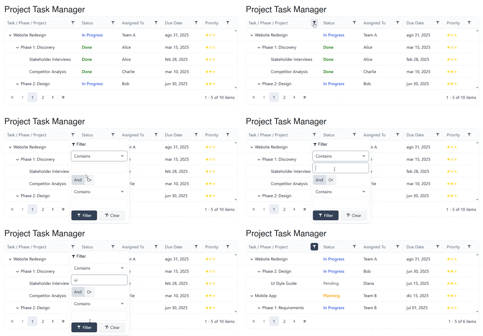
In either of the modes used, the information is easily filtered according to the search parameters.
Selecting Rows in the TreeList
If we talk about features that a grid has that we can replicate in a TreeList, we can mention row selection, either to perform a task on a single element or on multiple items. We will achieve this through SelectionMode as follows:
...
<TelerikTreeList ...
                 SelectionMode="@TreeListSelectionMode.Single"
                 @bind-SelectedItems="@SelectedItems">
...
</TelerikTreeList>

@if (SelectedTask != null)
{
    <div style="margin-top: 1rem; padding: 1rem; border: 1px solid #ccc; border-radius: 8px;">
        <h4>Task Details</h4>
        <p><strong>Name:</strong> @SelectedTask.Name</p>
        <p><strong>Status:</strong> @SelectedTask.Status</p>
        <p><strong>Assigned To:</strong> @SelectedTask.AssignedTo</p>
        <p><strong>Due Date:</strong> @SelectedTask.DueDate?.ToString("MMM dd, yyyy")</p>
    </div>
}

@code {
    private List<ProjectTask> Tasks { get; set; } = new();
    private IEnumerable<ProjectTask> SelectedItems { get; set; } = new List<ProjectTask>();
    private ProjectTask? SelectedTask => SelectedItems.FirstOrDefault() as ProjectTask;

    protected override void OnInitialized()
    {
        Tasks = ProjectTaskService.GetTasks();
    }

    private void OnSelectionChanged(IEnumerable<ProjectTask> items)
    {
        SelectedItems = items;
    }
}
In the previous code, you can see that we have assigned a selection method Single, although you could also configure it for a Multiple selection. In addition, I have added an if clause to display the selected item’s details.
You can also see that a link has been added to a new list called SelectedItems, where we will store the selected items, which in this case will be only one, obtained through the property SelectedTask. The result of the modification is as follows:
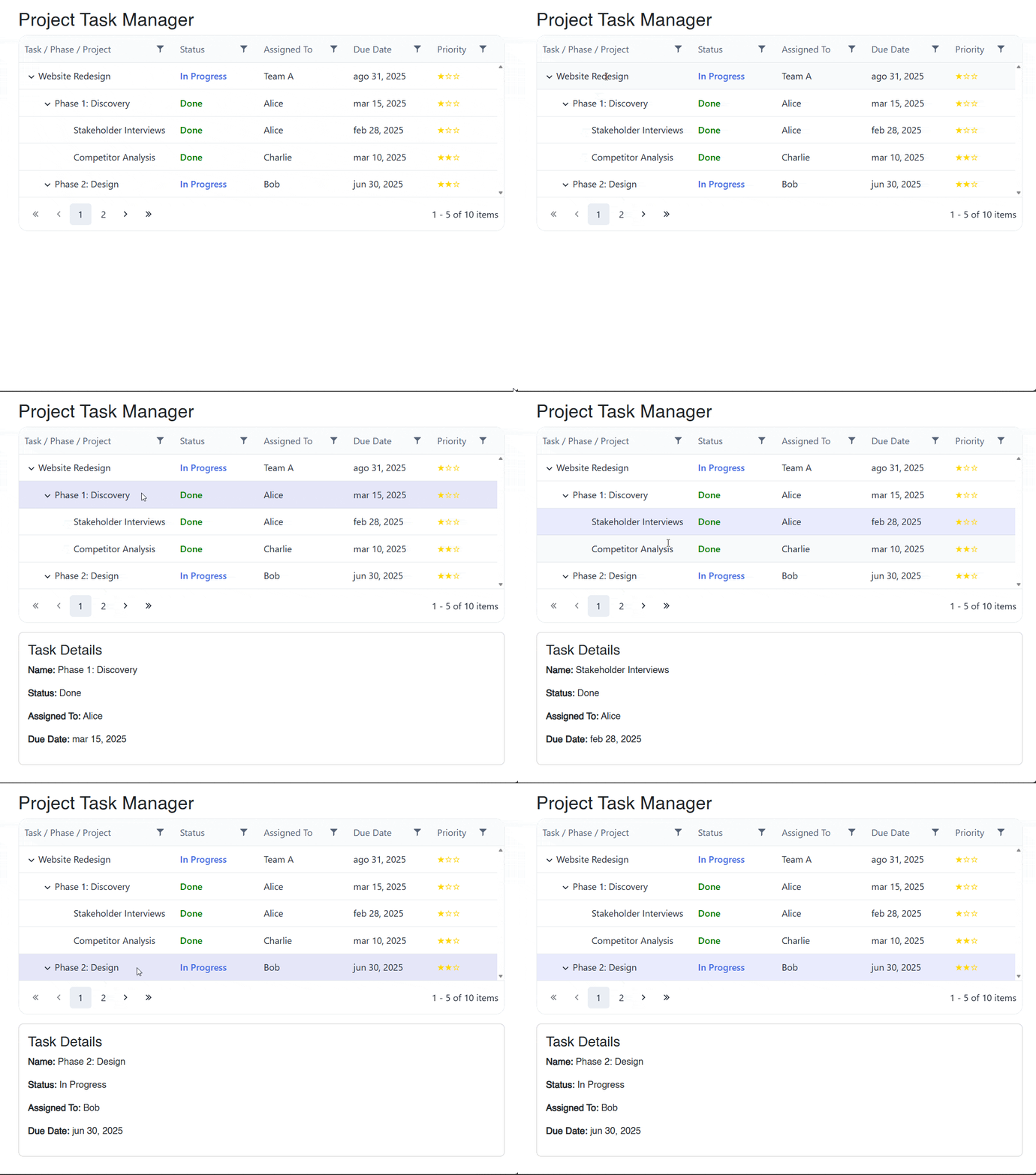
In the image above you can see that whenever an item in the hierarchy is selected, its information is displayed correctly.
Adding Inline Editing
Another very powerful feature of the TreeList control is the ability to edit data directly where it is located, that is, to perform inline edits.
To enable it, we must do so through the parameter EditMode, which will activate this feature. In addition to this, we will handle the events OnUpdate and OnDelete with their respective event handlers, to perform update and delete operations:
<TelerikTreeList ...
                 EditMode="@TreeListEditMode.Inline"
                 OnUpdate="@OnUpdateTask"
                 OnDelete="@OnDeleteTask">
    <TreeListColumns>
    ...
        <TreeListCommandColumn Width="180px" Title="Actions">
            <TreeListCommandButton Command="Edit" Icon="@SvgIcon.Pencil">Edit</TreeListCommandButton>
            <TreeListCommandButton Command="Delete" Icon="@SvgIcon.Trash">Delete</TreeListCommandButton>
            <TreeListCommandButton Command="Save" ShowInEdit="true" Icon="@SvgIcon.Save">Save</TreeListCommandButton>
            <TreeListCommandButton Command="Cancel" ShowInEdit="true" Icon="@SvgIcon.Cancel">Cancel</TreeListCommandButton>
        </TreeListCommandColumn>
    </TreeListColumns>

</TelerikTreeList>
...
@code {
    ...

    private void OnUpdateTask(TreeListCommandEventArgs args)
    {
        var updatedItem = args.Item as ProjectTask;
        if (updatedItem == null) return;

        var index = Tasks.FindIndex(t => t.Id == updatedItem.Id);
        if (index >= 0)
        {
            Tasks[index] = updatedItem;
        }
    }

    private void OnDeleteTask(TreeListCommandEventArgs args)
    {
        var itemToDelete = args.Item as ProjectTask;
        if (itemToDelete == null) return;

        RemoveItemAndChildren(itemToDelete.Id);
    }

    private void RemoveItemAndChildren(int parentId)
    {
        var children = Tasks.Where(t => t.ParentId == parentId).ToList();
        foreach (var child in children)
        {
            RemoveItemAndChildren(child.Id);
        }
        Tasks.RemoveAll(t => t.Id == parentId);
    }
}
In the previous code, you can notice that we have also added a TreeListCommandColumn section that allows defining a column with actions to edit and delete information. The implementation looks like this in action:
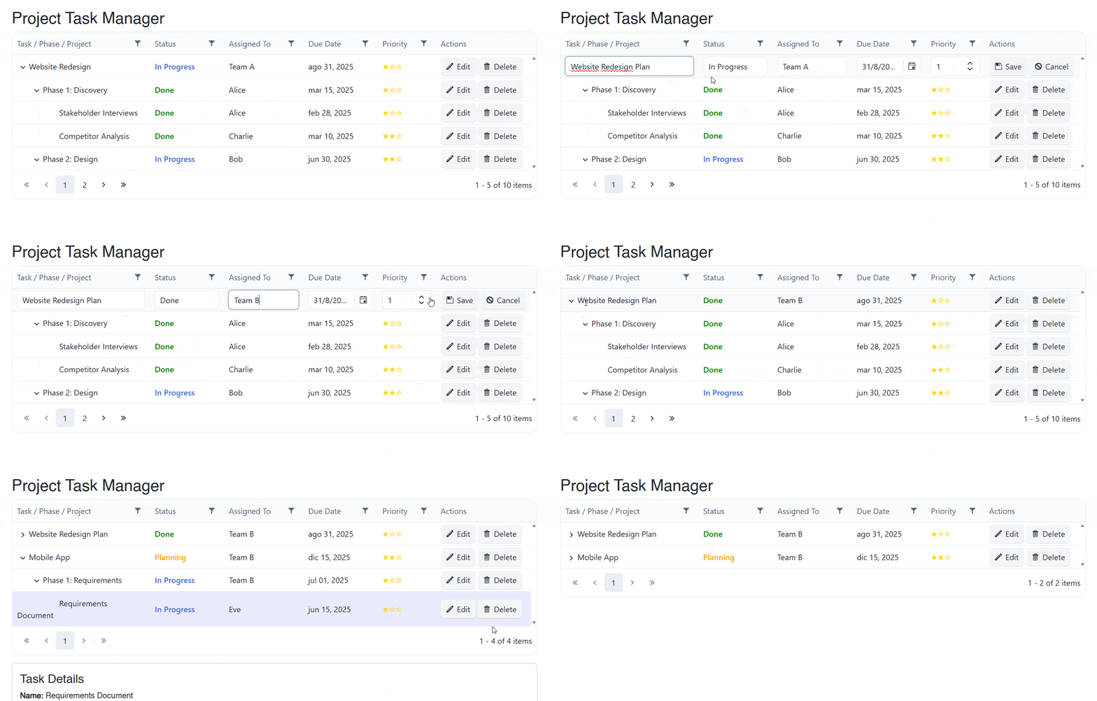
This demonstrates the power of the TreeList control when it comes to effectively editing hierarchical information.
Conclusion
Throughout this article, we have explored the Blazor TreeList component. We have covered everything from a basic setup to adding features such as paging, column customization, sorting, filtering, selection and inline editing.
The features demonstrated are only part of the set of configurable properties in the control, which will allow you to add hierarchies in grid form to your Blazor applications.
Now it’s your turn to discover use cases for this fabulous component and create better user experiences for your customers. Try Telerik UI for Blazor free for 30 days.

Héctor Pérez
Héctor Pérez is a Microsoft MVP with more than 10 years of experience in software development. He is an independent consultant, working with business and government clients to achieve their goals. Additionally, he is an author of books and an instructor at El Camino Dev and Devs School.
Related Posts
Comments
All articles
Topics
Web MobileMobile
Desktop
Design
Productivity
People