
Exploring Telerik UI for ASP.NET Core TimeDurationPicker

Summarize with AI:
See how to give your end users a place to add a time duration, and style this input with ease!
Progress Telerik brings a new control TimeDurationPicker to UI for ASP.NET Core. It allows input event durations with great visual appeal, is easy to validate, and intelligently defines custom shortcuts with predetermined intervals that make sense to facilitate inputs for the end users.
You can set it up as your need, from day to millisecond. The value returned is in milliseconds, so you can transform the “value” property as your need to store it.
In addition, ad a custom caption for any input so you deliver real-meaning data to your end user.
This code:
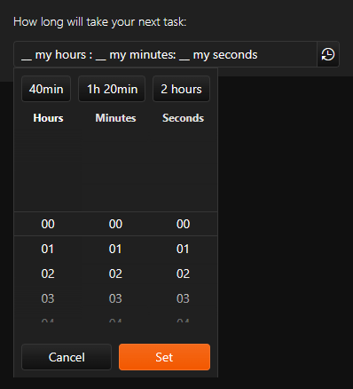
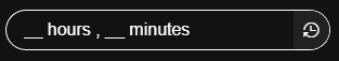
<kendo-timedurationpicker on-change="onChange" id="timedurationpicker" separator=":">
        <shortcuts>
            <shortcut text="40min" value="2400000"></shortcut>
            <shortcut text="1h 20min" value="4800000"></shortcut>
            <shortcut text="2 hours" value="7200000"></shortcut>
        </shortcuts>
        <timedurationpicker-columns>
            <timedurationpicker-column name="hours" format="## my hours "></timedurationpicker-column>
            <timedurationpicker-column name="minutes" format=" ## my minutes"></timedurationpicker-column>
            <timedurationpicker-column name="seconds" format=" ## my seconds"></timedurationpicker-column>
        </timedurationpicker-columns>
</kendo-timedurationpicker>
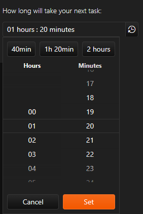
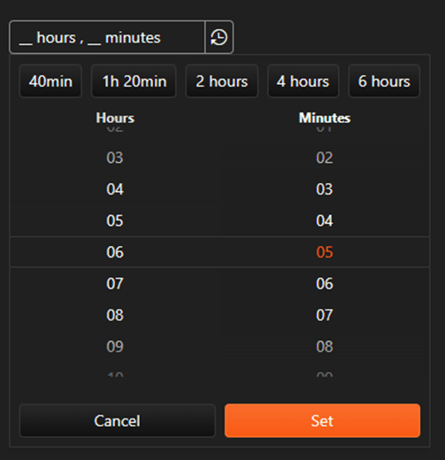
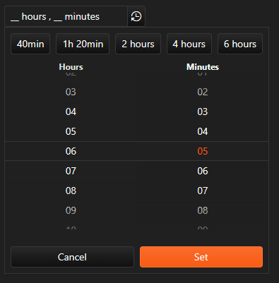
Generates this interface:

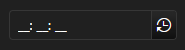
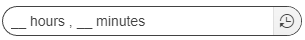
Note that the caption could be whatever you like or just empty, like:
The panel to select is shown when you click on the clock-arrow icon.
TimeDurationPicker is part of the UI for ASP.NET Core library and other Kendo UI frameworks like Kendo UI for jQuery. Explore the DevCraft bundle for multiple frameworks—it is the best option for licensing multiple Progress Telerik products.
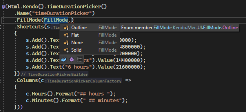
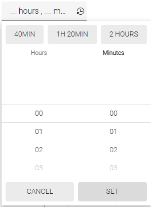
Appearance
The appearance of this component can be changed to the four states called FillMode: solid, flat, outline and none.
Below is a sample showing how to set up FillMode using “Kendo Tag.”
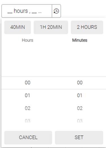
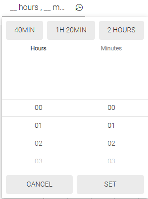
Let’s compare dark and light themes!
FillMode Outline
Dark theme
Material theme
FillMode Flat
Dark theme
Material theme
FillMode Solid
Dark theme
Material theme
Size Property
The input comes with the Size enum property that allows controlling how big or small it will look.
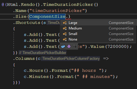
Large – call for the attention of the end user in small screens
Medium – a small emphasis

None – default control size

Small – when the space on the screen is expensive

Rounded Property
With this enum property, you can control the border of the control to adjust as your design needs.
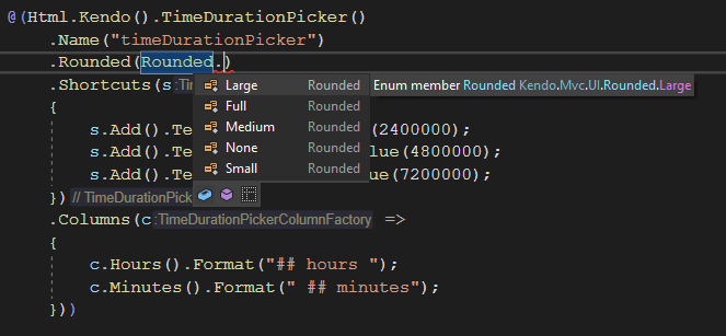
Light Theme vs. Dark Theme
Full
Large


Medium


None

Small


Coding
At the bottom of this post is a step-by-step guide demonstrating how to start a project using Progress Telerik UI for ASP. NET Core.
Now let’s take a look at this code:
Sample 1
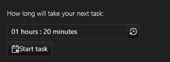
<div class="nextTask">
    <label for="timedurationpicker">How long will take your next task:</label>
    @(Html.Kendo().TimeDurationPicker()
        .Name("timeDurationPicker")
        .Shortcuts(s =>
        {
            s.Add().Text("40min").Value(2400000);
            s.Add().Text("1h 20min").Value(4800000);
            s.Add().Text("2 hours").Value(7200000);
        })
        .Columns(c =>
        {
            c.Hours().Format("## hours ");
            c.Minutes().Format(" ## minutes");
        }))
    </>
     @(Html.Kendo().Button()
        .Name("startButton")
        .Content("Start task")
        .Icon("calendar")
        .Events(ev => ev.Click("onClick")))

    @(Html.Kendo().Notification()
        .Name("notification")
        )
</div>
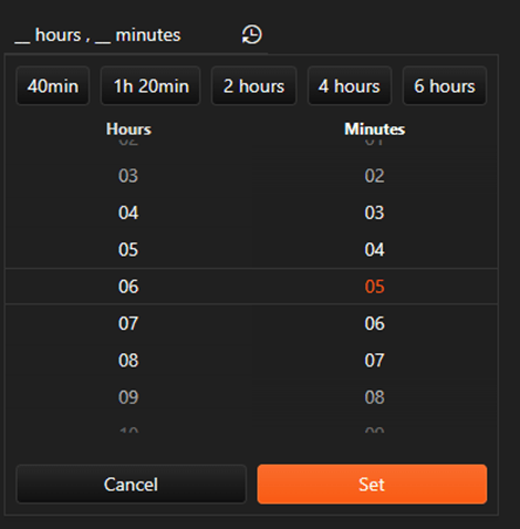
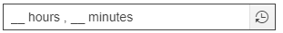
Here you can visualize the UI result.
You can similarly add the control to your interface from any “Kendo Tag” you choose, HTML or Tag.
Clarifying, when you start a new UI for ASP. NET Core project using the wizard, you will be prompted to choose the “Kendo Tag” for development.
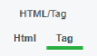
Kendo Tags are client-side components used as an alternative to traditional HTML input fields or radio buttons. They provide many features, such as auto-complete, multi-selection, drag-and-drop and templating. These tags can be used to display data in a meaningful and organized way.
Sample 2
<kendo-timedurationpicker name="timedurationpicker" separator=":">
        <shortcuts>
            <shortcut text="40min" value="2400000"></shortcut>
            <shortcut text="1h 20min" value="4800000"></shortcut>
            <shortcut text="2 hours" value="7200000"></shortcut>
        </shortcuts>
        <timedurationpicker-columns>
            <timedurationpicker-column name="hours" format="## hours "></timedurationpicker-column>
            <timedurationpicker-column name="minutes" format=" ## minutes"></timedurationpicker-column>
        </timedurationpicker-columns>
    </kendo-timedurationpicker>
Or
Sample 3
@(Html.Kendo().TimeDurationPicker()

.Name(“timeDurationPicker”)

.Shortcuts(s =>
{

s.Add().Text(“40min”).Value(2400000);

s.Add().Text(“1h 20min”).Value(4800000);
s.Add().Text(“2 hours”).Value(7200000);
})

.Columns(c =>
{

c.Hours().Format("## hours “);
c.Minutes().Format(” ## minutes");
}))
Look at Sample 1 and observe that you can use mixed “Kendo Tags.”
Kendo UI
I’m here to tell you that the TimeDurationPicker is designed on top Kendo UI, a JavaScript framework from Progress Telerik.
But what is that? Kendo UI is a powerful and intuitive framework that makes building interactive web applications fast and easy. It is designed to help developers create visually appealing and highly functional applications tailored to their specific needs. With its comprehensive library of user interface components, image and styling options, and JavaScript framework, Kendo UI offers the tools for crafting high-performance, responsive web applications.
Kendo UI offers a comprehensive integration package with popular server-side development technologies such as ASP. NET, MVC, PHP and Node.js. In addition, with its templates and support for multiple devices, you can quickly scale and adapt your applications to fit different devices and environments.
Figma

Are you or your team using Figma? That’s great. Progress Telerik has a pack for Figma!
You’ll find all four themes there!
Download DevCraft
Take advantage of Telerik UI for ASP.NET Core TimeDurationPicker, and any of the other 110+ ready-made components, like the Grid and Charts. Start a free trial today and experience for yourself that building rich interactive applications in half the time is just a click away.
As mentioned above, I recommend starting a Telerik DevCraft trial as this is the best option to explore Progress Telerik.
Check How Easy It is to Set up a New Project
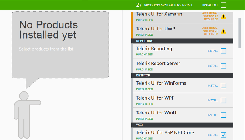
Following the download, you will select the desired package: Telerik UI for ASP. NET Core.
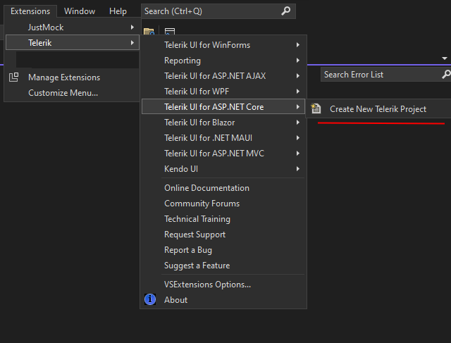
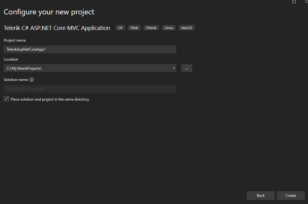
After installing the packages with the installer, open Visual Studio and access the menu Extensions -> Telerik -> Telerik UI for ASP. NET Core and select “Create New Telerik Project.”
Select the desired name and location for the project.
You can choose templates and the “Kendo Tag.”
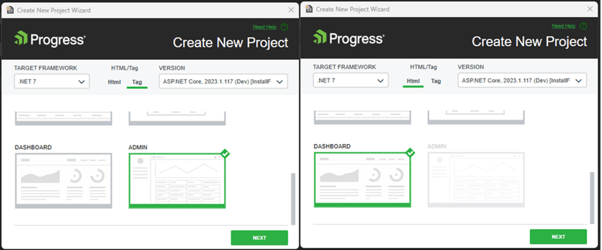
Some templates are not available in both Html and Tag.
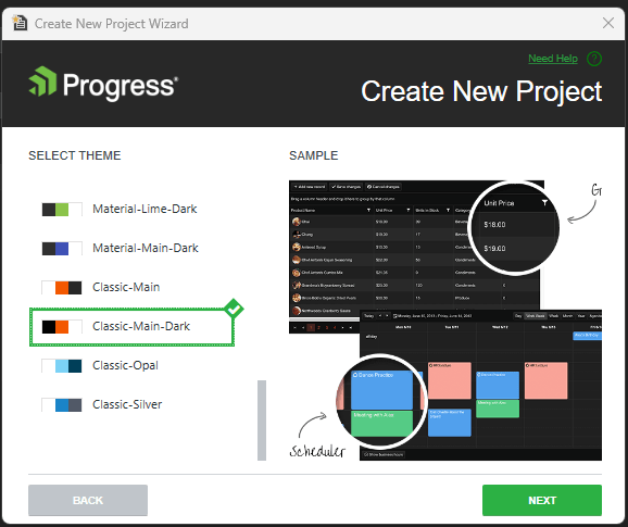
Choose your color theme. Here a dark theme was selected. Do you know that you can customize your themes?
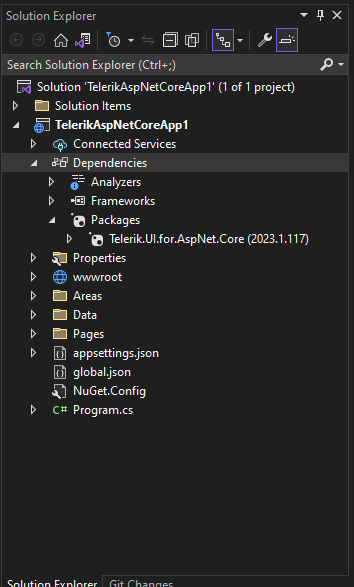
Here is the new project.
Feel free to share your experience and ideas in the comments section below or by visiting the Telerik UI for ASP. NET Core Feedback Portal. Your input makes a difference!
Save your time, save your end user time. So let’s start coding with UI for ASP.NET Core.
References to Check out

Jefferson S. Motta
Jefferson S. Motta is a senior software developer, IT consultant and system analyst from Brazil, developing in the .NET platform since 2011. Creator of www.Advocati.NET, since 1997, a CRM for Brazilian Law Firms. He enjoys being with family and petting his cats in his free time. You can follow him on LinkedIn and GitHub.
Related Posts
Comments
All articles
Topics
Web MobileMobile
Desktop
Design
Productivity
People
