
Common Tailwind CSS Patterns

With Tailwind CSS patterns, you can create and position an element.
TL;DR
Tailwind is just CSS, but Tailwind has its own patterns for creating elements. An element is just a basic block with margins, padding and alignment. You can create any element with grid, flex and positioning. You can also change these elements depending on the screen size. This should show you how to create any element and position it correctly. These are the same patterns you see in production applications.
Card
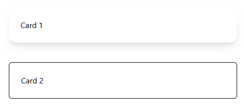
A card is a basic element with a border and rounded edges. You can create custom cards that pass titles, headers and footers, and content, but the basics of a card is an element with a border or shadow.
<div class="rounded-2xl shadow-lg p-6">Card 1</div>
A shadow has a border itself, but we could also use a regular border.
<div class="rounded-md border p-6">Card 2</div>
Notice we use padding and rounded corners, but neither are necessary.
Flex Pattern and Alignment
A flex box is probably the most useful and common item to use in Tailwind. Personally, I didn’t learn how to use it correctly in CSS until I saw the Tailwind patterns others have made easy.
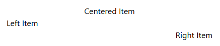
Centering, Left and Right
First, make sure the width is full. w-full. Then, use the correct justify.
<div class="flex w-full justify-center">
  <p>Centered Item</p>
</div>
<div class="flex w-full justify-start">
  <p>Left Item</p>
</div>
<div class="flex w-full justify-end">
  <p>Right Item</p>
</div>

Now, what if we are dealing with columns?
<div class="flex w-full flex-col items-center">
  <p>Centered Item</p>
</div>
<div class="flex w-full flex-col items-start">
  <p>Left Item</p>
</div>
<div class="flex w-full flex-col items-end">
  <p>Right Item</p>
</div>
We get the EXACT same results, but we use items instead. This shows us that our current context can change the way we align items.
Multiple Items
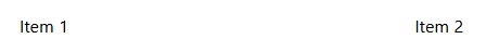
If you have multiple items, you may want one item at the start, and another item at the end.
<div class="flex w-full justify-between">
  <p>Item 1</p>
  <p>Item 2</p>
</div>
For this, we use justify-between.
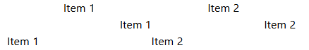
However, in a flex-col, we don’t have an items- equivalent. With multiple rows, we would need to put the entire row in a div with a regular flex, or we could set each row to start and end with self-start and self-end.
 <div class="flex w-full flex-col">
  <div class="flex justify-between">
    <p>Item 1</p>
    <p>Item 2</p>
  </div>
</div>

<div class="flex w-full flex-col">
	<p class="self-start">Item 1</p>
	<p class="self-end">Item 2</p>
</div>
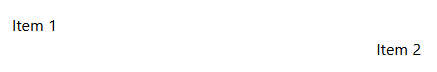
Here, the items are at the start and end, but on different rows.
Grid Pattern and Alignment
If you wanted to follow the same flex pattern for one item, but with a grid, you could.
  <div class="grid w-full justify-center">
    <p>Centered</p>
  </div>
  <div class="grid w-full justify-start">
    <p>Left</p>
  </div>
  <div class="grid w-full justify-end">
    <p>Right</p>
  </div>
However, you wouldn’t. A flex box is better as grids are best for elements that can have dynamic sizes.
Multiple Items
While there could be an entire book on grids, I just want to focus on alignment. For centering rows, use justify-center.
<div class="grid grid-rows-2 justify-center">
  <p>Item 1</p>
  <p>Item 2</p>
</div>
This has the same effect for justify-end and justify-start if we want the items to align a certain way.
But, for grid-cols, we have a different selector: place-items- in lieu of items-.
<div class="grid grid-cols-2 place-items-center">
<p>Item 1</p>
<p>Item 2</p>
</div>
<div class="grid grid-cols-2 place-items-end">
<p>Item 1</p>
<p>Item 2</p>
</div>
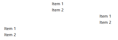
<div class="grid grid-cols-2 place-items-start">
<p>Item 1</p>
<p>Item 2</p>
</div>
Notice first two items are centered in that column, second row has items at the end and third row has items at the beginning.
Spacing
Let’s say we want to space our items by 5 (1.25rem).
Margins Collapse
If we use margins, they will only take the greatest one, not add them together.
<div>
  <p class="border">Item 1</p>
  <p class="border my-5">Item 2</p>
  <p class="border my-5">Item 3</p>
</div>
Notice we don’t have a margin on the top element, and we get the same result.
New Element
Instead of repeating oneself, we could use the space-y- selector.
<div class="space-y-5">
  <p class="border">Item 1</p>
  <p class="border">Item 2</p>
  <p class="border">Item 3</p>
</div>
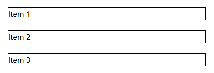
Flex
However, in most cases, the best item to use is probably gap. A lot of boilerplate code already deals with flex and grid, so gap is the natural way to create spacing.
<div class="flex flex-col gap-5">
  <p class="border">Item 1</p>
  <p class="border">Item 2</p>
  <p class="border">Item 3</p>
</div>
Extra Space
If you’re dealing with components, sometimes you don’t have direct access to the core element. In that case, it is easy to add a simple space with a self-closing div.
<div class="my-5"></div>
Bars
So you want a fixed top bar? Use fixed of course.
    <div
      class="fixed flex h-16 w-full items-center justify-between"
    >
    Bar Content...
    </div>
Top
While sticky may be correct in certain circumstances, we are going to stick with fixed, as it easier and more common. You can add top-0 to fixed, but it is not strictly necessary.
Note: You will also want to make sure the content has an equivalent or greater padding. If your bar is h-16, you want the content below to have pt-16 or greater.
Bottom
To make it a bottom bar, use bottom-0. Make sure content has correct pb-16 or equivalent.
Right
Use top-0 and right-0. You will probably want flex-col for your bar. Be sure to have pr-16 or equivalent width for the content to the left of the right bar.
Left
And finally, use top-0 and left-0 with flex-col. Add pl-16 or equivalent width.
Media Queries
Using these type of Tailwind blocks, you may want to change where they are displayed depending on the screen size.
Standard
For the smallest size and larger, don’t add anything.
Small
For 640px and larger, use sm:.
Medium
For 768px and larger, use md:.
Large
For 1024px and larger, use lg:.
Note: Tailwind also has xl: and 2xl now, but not as common.
Using
So, keep your fundamentals for all sizes, and then build on top of that.
Grid Queries
One of the best ways to modify layouts is to use grids.
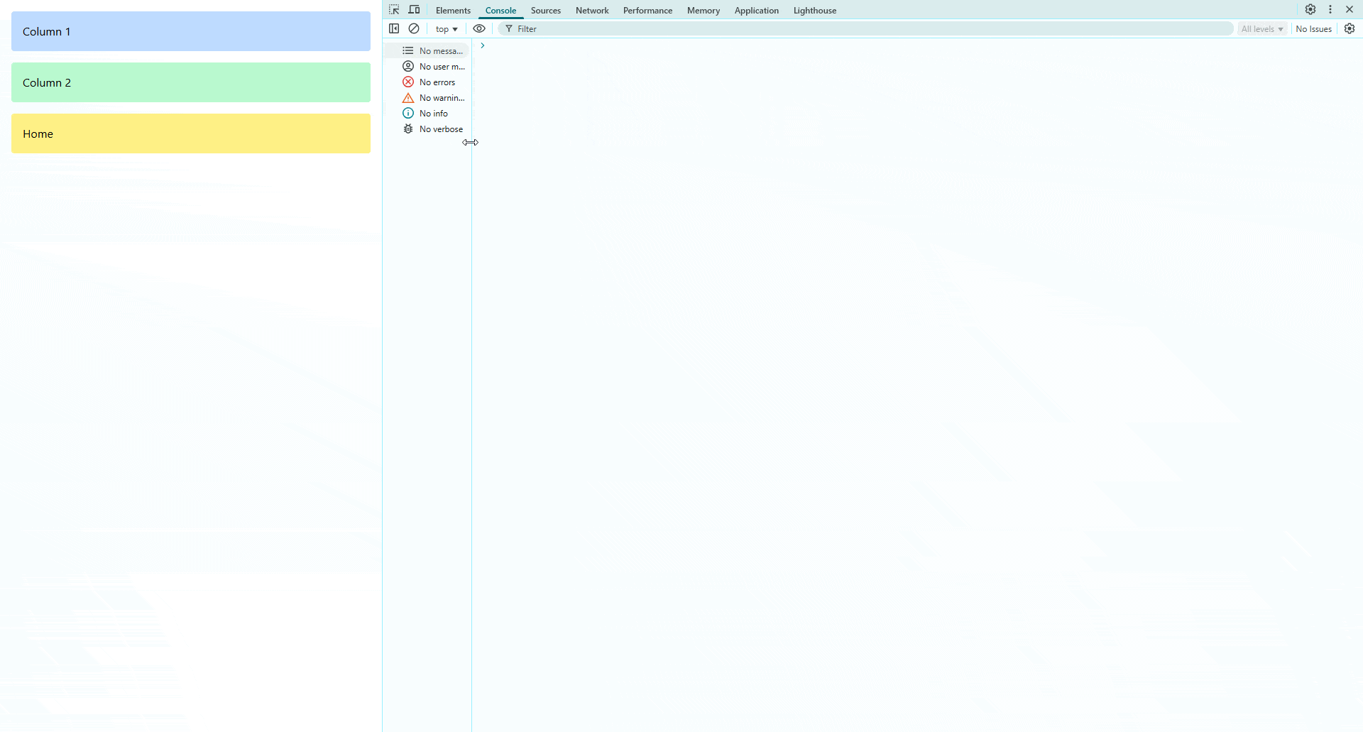
<div class="grid grid-cols-1 gap-4 p-4 md:grid-cols-2 lg:grid-cols-3">
  <div class="rounded bg-blue-200 p-4">Column 1</div>
  <div class="rounded bg-green-200 p-4">Column 2</div>
  <div class="rounded bg-yellow-200 p-4">Column 3</div>
</div>
However, what if we want to change the order of the items? We can use order-.
  <div class="grid grid-cols-1 gap-4 p-4 md:grid-cols-2 lg:grid-cols-3">
    <div class="rounded bg-blue-200 p-4 lg:order-3">Column 1</div>
    <div class="rounded bg-green-200 p-4">Column 2</div>
    <div class="rounded bg-yellow-200 p-4 md:order-first">
      Column 3
    </div>
  </div>
We can have whatever order we like, in whatever media query size.
Now, you should be able to conquer any basic element positioning!

Jonathan Gamble
Jonathan Gamble has been an avid web programmer for more than 20 years. He has been building web applications as a hobby since he was 16 years old, and he received a post-bachelor’s in Computer Science from Oregon State. His real passions are language learning and playing rock piano, but he never gets away from coding. Read more from him at https://code.build/.
Related Posts
Comments
All articles
Topics
Web MobileMobile
Desktop
Design
Productivity
People
