
A Pure SVG Circular Component

Summarize with AI:
Creating a dynamic SVG component is easier than ever in your framework of choice. After you master a few basic techniques, anything you can imagine can be realized.
TL;DR
This article teaches you how to create an SVG progress circular component that can be used in custom components like games, character counts and charts. This example uses Vue and Nuxt, but it could be easily modified to work with any JS framework. It also uses Tailwind, but standard CSS works as well.
The Core Reusable Component
We allow the user to customize the component dimensions, put an HTML object inside it and keep it reactive.
<script setup lang="ts">
const {
  size = 150,
  width = 20,
  trailColor = "gray",
  strokeColor = "black",
  progress,
} = defineProps<{
  size?: number
  width?: number
  trailColor?: string
  strokeColor?: string
  progress: number | string
}>();

const cy = size / 2
const r = cy - width / 2
const circumference = 2 * Math.PI * r

const dashOffset = computed(() => circumference * (1 - Number(progress) / 100))
</script>

<template>
  <svg xmlns="http://www.w3.org/2000/svg" :width="size" :height="size">
    <circle
      :cx="cy"
      :cy
      :r
      :stroke="trailColor"
      fill="none"
      :stroke-width="width"
    />
    <circle
      :cx="cy"
      :cy
      :r
      fill="none"
      :stroke="strokeColor"
      :transform="`rotate(-90 ${cy} ${cy})`"
      :stroke-dasharray="circumference"
      :stroke-dashoffset="dashOffset"
      :stroke-width="width"
    />
    <foreignObject :x="0" :y="0" :width="size" :height="size">
      <div class="size-full flex items-center justify-center">
        <slot />
      </div>
    </foreignObject>
  </svg>
</template>
- Size – The SVG size
- Width – The SVG stroke width
- Trail Color – The Circle Color
- Stroke Color – The progress color
- Progress – The progress number (or string) between 1 and 100
Foreign Object
The proper way to put HTML inside SVG, is to use a foreign object. To make our alignment correct, we must keep our width and height full using Tailwind or CSS, but this could be done manually outside the component.
Progress Selector
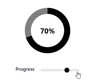
This component allows you to select the progress between 1 and 100 with a range selector.
Range Component
We need custom CSS to style the Range component, as this is not standard using Tailwind.
<script setup lang="ts">
const progress = useProgress()
</script>

<template>
  <div class="flex items-center justify-center text-center gap-5 mt-10">
    <label class="block mb-2 text-md font-medium text-gray-900" for="progress">
      Progress
    </label>
    <input
      v-model="progress"
      class="h-2 bg-gray-200 rounded-lg appearance-none cursor-pointer"
      type="range"
      name="progress"
      min="0"
      max="100"
      step="5"
    >
  </div>
</template>

<style scoped>
input[type="range"]::-webkit-slider-thumb {
  appearance: none;
  height: 1rem;
  width: 1rem;
  background-color: black;
  border-radius: 9999px;
  cursor: pointer;
}

input[type="range"]::-moz-range-thumb {
  height: 1rem;
  width: 1rem;
  background-color: black;
  border-radius: 9999px;
  cursor: pointer;
}
</style>
Shared Progress
Nuxt has a useful feature called useState, which allows you to share state between components without prop drilling. You can share the state between the components manually using providers, injectors or context, depending on your framework.
**export const useProgress = () => {
    return useState('progress', () => 90);
};**
With this code, we can use useProgress in any component, and the state is shared across the component.
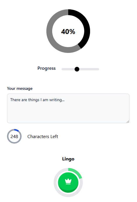
Progress Selector
We use the useProgress hook, and pass it to our <svg-circle /> component, as well as inside the slot to display the percent.
<script setup lang="ts">
const progress = useProgress()
</script>

<template>
  <div class="flex items-center justify-center text-center mt-10">
    <svg-circle :progress>
      <h1 class="text-2xl font-bold">{{ progress }}%</h1>
    </svg-circle>
  </div>
  <range-input />
</template>
We display the <range-input /> component and the progress signal inside the SVG circle. Works like a charm.
Note: We must keep the items in flex-center for proper alignment.
Word Counter
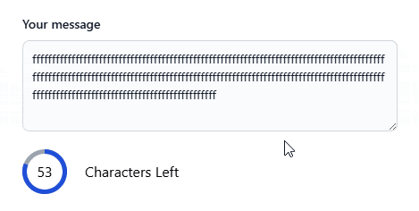
We set a character limit, compute the characters left and display the progress based on that number. With our core SVG component, this becomes extremely easy.
<script setup lang="ts">
const CHARACTER_LIMIT = 280

const content = ref("")

const progress = computed(
  () => ((content.value.length / CHARACTER_LIMIT) * 100) | 0
)

const display_characters = computed(
  () => CHARACTER_LIMIT - content.value.length
)

const color = computed(() =>
  display_characters.value < 0 ? "#dc2626" : "#1d4ed8"
)
</script>

<template>
  <div class="mx-10 mt-10">
    <label
      for="message"
      class="block mb-2 text-sm font-medium text-gray-900 dark:text-white"
      >Your message</label
    >
    <textarea
      id="message"
      v-model="content"
      rows="4"
      class="block p-2.5 w-full text-sm text-gray-900 bg-gray-50 rounded-lg border border-gray-300 focus:ring-blue-500 focus:border-blue-500"
      placeholder="Write here to see counter...."
    />
    <div class="flex items-center mt-5 gap-5">
      <svg-circle
        :progress
        :width="5"
        :size="50"
        :stroke-color="color"
        trail-color="#9ca3af"
      >
        {{ display_characters }}
      </svg-circle>
      <p>Characters Left</p>
    </div>
  </div>
</template>
We follow the same protocol of passing the progress to the <svg-circle /> component, and displaying the characters inside slot. This must be a signal as well to properly update the DOM.
Lingo Circle
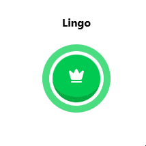
The gamified button, similar to Duolingo, is really a matter of proper styling.
<script setup lang="ts">
const progress = ref(0)

const changePercent = () => {
  const tmp = progress.value + 20
  progress.value = tmp > 100 ? 0 : tmp
}
</script>

<template>
  <div class="flex flex-col items-center justify-center my-10 gap-5">
    <h1 class="font-bold">Lingo</h1>
    <div class="mx-50">
      <svg-circle
        :progress
        trail-color="#e5e7eb"
        stroke-color="#4ade80"
        :size="100"
        :width="10"
      >
        <button
          type="button"
          class="inline-flex rounded-full items-center justify-center whitespace-nowrap text-sm font-bold ring-offset-background transition-colors focus-visible:outline-none focus-visible:ring-2 focus-visible:ring-ring focus-visible:ring-offset-2 disabled:pointer-events-none disabled:opacity-50 uppercase tracking-wide bg-green-500 text-primary-foreground hover:bg-green-500/90 border-green-600 active:border-b-0 h-[70px] w-[70px] border-b-8 fill-primary-foreground text-primary-foreground"
          @click="changePercent"
        >
          <CrownSvg />
        </button>
      </svg-circle>
    </div>
  </div>
</template>
With our <svg-circle /> customizable, this makes creating any component easy. We can calculate our progress, which must be a signal, and pass it to the circle component as usual. Instead of using a number inside of our component slot, we simply use a styled button with an onclick handle.
The rest is up to your imagination!
Even easier? Check out the Progress Kendo UI for Vue ProgressBar, one of 110+ components professionally built with accessibility baked in.

Jonathan Gamble
Jonathan Gamble has been an avid web programmer for more than 20 years. He has been building web applications as a hobby since he was 16 years old, and he received a post-bachelor’s in Computer Science from Oregon State. His real passions are language learning and playing rock piano, but he never gets away from coding. Read more from him at https://code.build/.
Related Posts
Comments
All articles
Topics
Web MobileMobile
Desktop
Design
Productivity
People
