
Theme UI Frameworks in Angular Part 1: How to Theme Your Component with Sass
 by Dany Paredes

Summarize with AI:
One of the options to theme a UI framework is Sass. Let’s explore creating colors, using mixins and any hidden costs with Sass in an Angular app.
A few months ago, we built an Angular UI library from scratch. But sometimes we don’t need to create a library from scratch—we just want to use our company brand colors. We can create components from zero or to take advantage of existing libraries and adapt them to our brand colors. Using this approach speeds up development by utilizing built-in components like buttons and powerful grids.
In my experience working with different companies, every decision has a hidden cost, whether at the beginning or later. Sometimes we don’t want to implement a UI library because we feel we can do it ourselves, but that decision has a price. In other cases, we can pick alternative solutions like implementing brand colors into an existing library like Angular Material or Progress Kendo UI for Angular.
🤔 Remember: Our choices impact more than just the code. They also affect the product, delivery timelines, workload and, ultimately, the company’s success.
So today, let’s begin a journey of exploring these various options to theme a UI framework. First, we will create a theme using Sass. We’ll look at creating colors, using mixins and any hidden costs. In the following articles, we will explore other alternatives: next Angular Material, and finally Kendo UI for Angular with Progress ThemeBuilder to see how to save time and effort while speeding up development for you, your team and your company.
Let’s get started!
Scenario
I want to take inspiration from my friend Alyssa Nicoll and her amazing project, Tour of Ponies. That project includes all colors related to ponies, and I am going to create a new project, “Ponies World,” using Angular 19. In this project, I will adapt the Ponies’ brand color identity by creating a custom Sass theme with variables, colors, mixins and a theme building a pony button component to use in an Angular app.
Let’s go!
Setting Up the Project
First, create a new Angular application using the Angular CLI with the command npx -p @angular/cli ng new ponies-world, but using the --style=scss flag, it will generate the project ready with Sass configured:
npx -p @angular/cli ng new ponies-world --style=scss
√ Do you want to enable Server-Side Rendering (SSR) and Static Site Generation (SSG/Prerendering)? No
Select the default options in the CLI. Then the project is created. Next, navigate to your project folder and open it with your favorite editor.
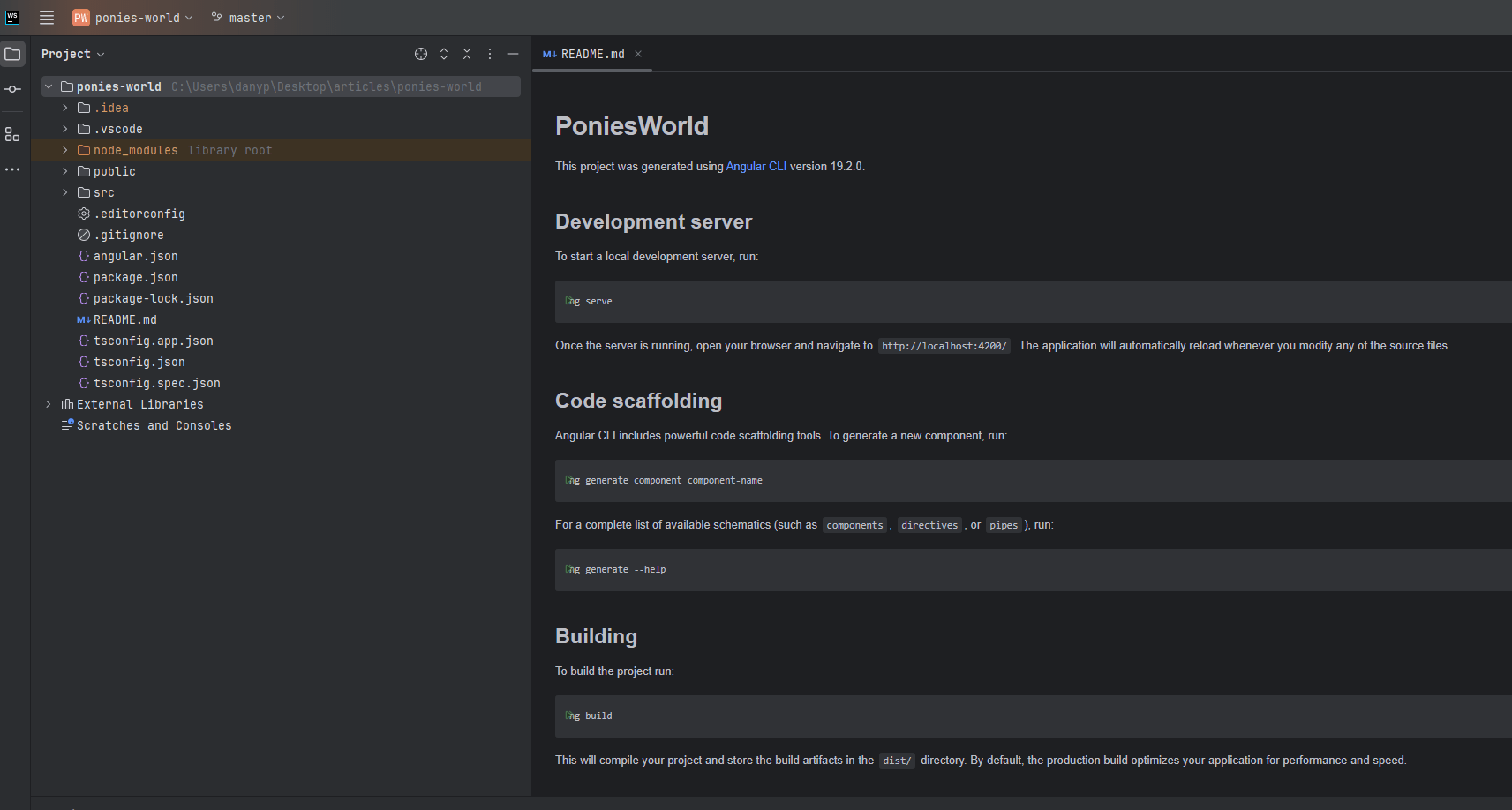
Angular by default creates for us the styles.scss. It works like our main CSS file for the entire application. But, in our case, we want to build a theme taking special care for future plans, with a clear structure that is easy to maintain, instead of putting everything in a single file. We’re going to create a set of files for variables, mixins and a theme file to provide all them to our styles.scss in Angular.
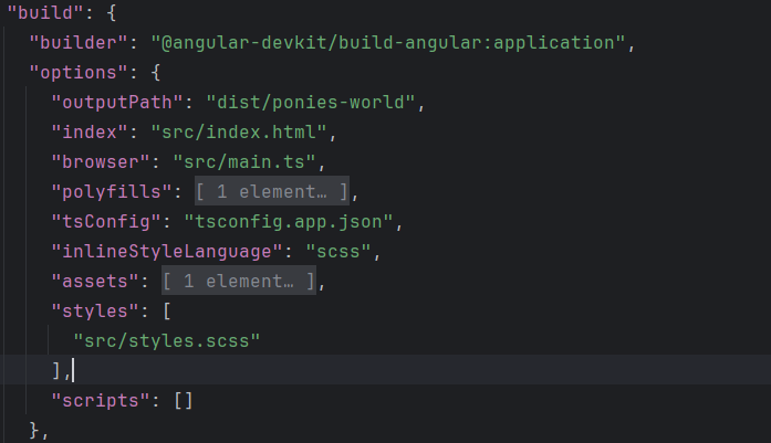
The
styles.scssis registered inangular.jsonin the build section.
OK, we are ready to start to define the color variables in Sass!
Build the Ponies with Sass
First, we are going to define the pony color variables in Sass. Variables in Sass allow us to store reusable values such as colors, fonts and spacing, making our styles more consistent and easier to maintain.
Define Color Variables
First, create an scss directory, and inside it, create a _colors.scss file to define the colors for our Pony Theme. We’ll use the $color-name convention to declare our colors. In this case, we’ll define the primary, secondary, text and background colors.
Each variable should be named with the -color suffix. For example, we added -dark for dark colors:
$primary-color: #ff69b4;
$primary-color-dark: #6c0438;
$secondary-color: #ffd700;
$text-color: #333;
$text-color-dark: #f3f1f1;
$background-color: #fff0f5;
Perfect! Now that we have our colors, it’s time to create mixins and reuse these pony colors.
Create Mixins for Components
Now it’s time to create mixins in Sass—reusable blocks of styles that we can include in multiple places. They allow us to define styles once and apply them to different elements with flexibility. We use the @mixin keyword followed by a name to define a mixin. Additionally, mixins support parameters, allowing us to create flexible styles that can be customized when applied. For example, using $primary-color by default or sending $primary-color-dark to change the button to dark mode.
First, create a _mixins.scss file. On it, we create a pony button mixin, using the primary color by default and, with (), adding two parameters: $bg-color and $text-color.
Open the _mixins.scss file and import the variables using @use keyword to import the variables, the mixin name pony-buttonusing colors.$primary-color as default value.
The final code looks like this:
@use "colors" as colors;

@mixin pony-button($bg-color: colors.$primary-color, $text-color: white) {
    background-color: $bg-color;
    color: $text-color;
    padding: 10px 15px;
    border: none;
    border-radius: 4px;
    cursor: pointer;
    font-size: 1rem;

    &:hover {
        opacity: 0.9;
    }

    &:disabled {
        background-color: #ccc;
        color: #666;
        cursor: not-allowed;
    }
}
Learn more about mixins.
Why @use Instead of @import?
I worked using @import to reuse Sass code, but Sass has deprecated @import in favor of @use. The @use rule only loads a file once, preventing duplicate imports and improving maintainability with encapsulation. It also limits accessibility of imported styles to those explicitly made available and optimizes compilation by reducing redundant imports.
Read more about @use.
Perfect! We finished our pony-button mixins. Let’s move on to creating the theme.
The Theme
Now, create a _theme.scss file and import the variables and mixins using @use. The _theme.scss file help us to centralize the import of variables and mixins, making it easier to manage styles in the application.
We only need to import this file in the global style.scss:
@use "colors";
@use "mixins";
Next, we create two classes pony-btn and pony-btn-dark. The pony-btn uses the mixins by default, and pony-btn-dark uses $primary-color-dark and $text-color-dark to change the behavior of the pony-button mixins.
The final code looks like:
@use "colors";
@use "mixins";

.pony-btn {
  @include mixins.pony-button();
}
.pony-btn-dark {
  @include mixins.pony-button(
    colors.$primary-color-dark,
    colors.$text-color-dark
  );
}
Perfect. Now is time to import our theme to the styles.scss created by Angular CLI. This makes it easy for all components to follow the same design and styles, with colors and button classes styles. Open the styles.scss file and import the theme:
@use "scss/theme";
The styles.css is configured in the angular.json file:
"styles": [
  "src/styles/styles.scss"
]
Great! Our app is ready to use our theme. It’s time to create our pony-button component.
The Pony Button
The pony-button will render a button with a title and with our CSS classes for the darkMode. First, create the component using the Angular CLI with the following command:
ng generate component components/pony-button
Open the pony-button.component.ts file. We need to declare two signal input properties, label and darkMode.
@Component({
  selector: 'app-pony-button',
  imports: [],
  templateUrl: './pony-button.component.html',
  styleUrl: './pony-button.component.scss',
})
export class PonyButtonComponent {
  label = input<string>('Accept');
  darkMode = input(false);
To allow change dynamic when the user want use the darkMode, use the powerful computed signals to react to the changes. The final code looks like:
import { Component, computed, input } from '@angular/core';

@Component({
  selector: 'app-pony-button',
  imports: [],
  templateUrl: './pony-button.component.html',
  styleUrl: './pony-button.component.scss',
})
export class PonyButtonComponent {
  label = input<string>('Accept');
  darkMode = input(false);
  themeClass = computed(() => (this.darkMode() ? 'pony-btn-dark' : 'pony-btn'));
}
Read more about signals.
Finally , edit pony-button.component.html template bind the themeClass() in the class property and the label().
<button [class]="themeClass()">
  {{ label() }}
</button>
It’s time to use the app-pony-button component with each case—the default and darkMode! 💪
Using the Pony Button
It’s time to use our nice themed button app-pony-button component. Open the app.component.ts. Because we are using standalone, import the PonyButtonComponent in the imports section.
import { Component } from '@angular/core';

import { PonyButtonComponent } from './components/pony-button/pony-button.component';

@Component({
  selector: 'app-root',
  imports: [PonyButtonComponent],
  templateUrl: './app.component.html',
  styleUrl: './app.component.scss',
})
export class AppComponent {}
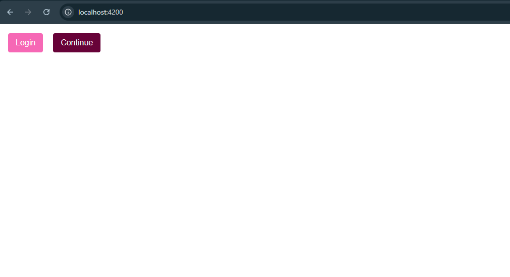
Next, add <app-pony-button/> with labeland other with darkMode to true.
<app-pony-button label="Login"/>
<app-pony-button [darkMode]="true" label="Continue"/>
Save changes and run the app with ng serve. Once it’s running, open your browser and go to: http://localhost:4200/ and tada!! We have two buttons with the pony theme!!! 🥳
ng serve
Recap
Yeah! We did it! We have successfully built the pony theme with Sass by defining variables, using mixins and structuring our files to support scalable styling.
Mmm … Hold on a second! 🤔
Do you feel like we did too much work just for a single button, with color states for disabled and hover? What about animations and other states? How much work should be required for a card or a grid?
Oops, we forgot about accessibility! 🥲
How do you think the team can handle new requirements, plus the workload of building the theme, and still deliver on time?
This is the moment when we need to pick a framework like Angular Material or Kendo UI for Angular. In the next article, we will integrate our pony theme into Angular Material, customize a component and implement dynamic theming (light/dark mode). Finally, we will explore how to save time using Kendo UI and ThemeBuilder Pro, making our theming process fast and fun!
Source Code: Ponies World
Dany Paredes
Dany Paredes is a Google Developer Expert on Angular and Progress Champion. He loves sharing content and writing articles about Angular, TypeScript and testing on his blog and on Twitter (@danywalls).
Related Posts
Comments
All articles
Topics
Web MobileMobile
Desktop
Design
Productivity
People
