
Angular Component Library Part 1: How to Build a Component Library with Angular
 by Dany Paredes

Summarize with AI:
Using a component library accelerates your development because you can skip redesigning and re-coding the same components. Here’s how to start your own shared component library in Angular.
As developers working in a company with a variety of products, we find that reusing the same components and styles between applications can be challenging. Building our own library helps us cut down on code duplication and offers a smooth, cohesive interface, which can significantly boost our team’s productivity. Moreover, it ensures consistent functionality across all applications, saving valuable time and resources—no more dealing with the same issues in different apps!
The ideal solution for this issue is to create a shared library that allows for effortless distribution of code among projects. Fortunately, Angular offers a straightforward method to develop a library for sharing components, services and utilities.
But the best way to understand how a library helps us speed up our team and deliver fast, consistent projects is to show a real scenario.
Scenario
We work for a large accounting software company that needs to release two new applications for banking and registration. Both applications require a set of buttons.
What can we do?
- Create identical buttons for both the banking and registration applications.
- Share the CSS between both applications and duplicate the button component.
- Make sure we think long term: What would happen if the company changed its brand color? This should be something we ought to be able to update in the future without too much hassle.
We can resolve this issue by creating a shared button library for both applications. Let’s proceed with this solution.
Create the Library
Before creating the library, we need to set up a workspace to serve as the location for our library and apps. To do this, we can use the Angular CLI and run the following command to set up the workspace:
ng new my-company --create-application=false
This will create a new Angular workspace without creating an initial application.
C:\Users\dany.paredes\Desktop>ng new my-company --create-application=false
CREATE my-company/angular.json (139 bytes)
CREATE my-company/package.json (993 bytes)
CREATE my-company/README.md (1063 bytes)
CREATE my-company/tsconfig.json (901 bytes)
CREATE my-company/.editorconfig (274 bytes)
CREATE my-company/.gitignore (548 bytes)
CREATE my-company/.vscode/extensions.json (130 bytes)
CREATE my-company/.vscode/launch.json (474 bytes)
CREATE my-company/.vscode/tasks.json (938 bytes)
√ Packages installed successfully.
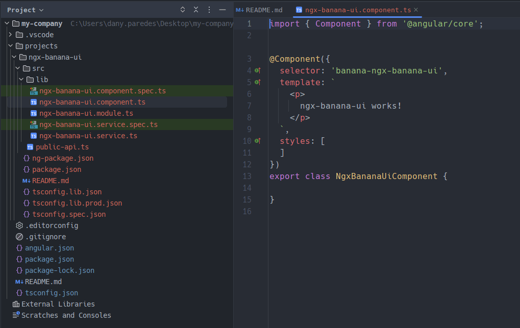
Once the setup is generated inside the my-company directory, we will generate the library. The name of your library is important, especially if you plan to publish it later in a public package registry like npm.
Avoid using names that start with “ng-” as it is a reserved keyword used by the Angular framework and its libraries. Use the prefix “ngx-” to denote that the library is suitable for use with Angular.
After picking the name ngx-banana-ui, use the command ng generate library ngx-banana-ui --prefix=banana.
The –prefix=banana: changes your component prefix from
<app-my-lib>to<banana-my-component>, by default.
cd my-company
ng g library ngx-banana-ui --prefix=banana
C:\Users\dany.paredes\Desktop\my-company>ng g library ngx-banana-ui --prefix=banana
CREATE projects/ngx-banana-ui/ng-package.json (162 bytes)
CREATE projects/ngx-banana-ui/package.json (217 bytes)
CREATE projects/ngx-banana-ui/README.md (1033 bytes)
CREATE projects/ngx-banana-ui/tsconfig.lib.json (314 bytes)
CREATE projects/ngx-banana-ui/tsconfig.lib.prod.json (240 bytes)
CREATE projects/ngx-banana-ui/tsconfig.spec.json (273 bytes)
CREATE projects/ngx-banana-ui/src/public-api.ts (183 bytes)
CREATE projects/ngx-banana-ui/src/lib/ngx-banana-ui.module.ts (269 bytes)
CREATE projects/ngx-banana-ui/src/lib/ngx-banana-ui.component.spec.ts (636 bytes)
CREATE projects/ngx-banana-ui/src/lib/ngx-banana-ui.component.ts (214 bytes)
CREATE projects/ngx-banana-ui/src/lib/ngx-banana-ui.service.spec.ts (384 bytes)
CREATE projects/ngx-banana-ui/src/lib/ngx-banana-ui.service.ts (140 bytes)
UPDATE angular.json (1149 bytes)
UPDATE package.json (1070 bytes)
UPDATE tsconfig.json (985 bytes)
Read more about projects in Angular.
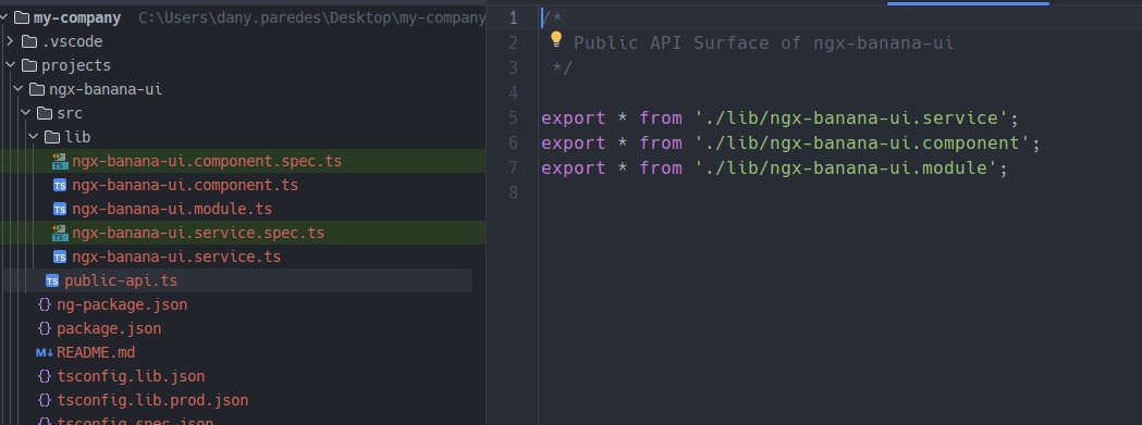
The “ng generate” command creates the “projects/my-lib” folder in your workspace, which contains a component and a service inside an NgModule with the public-api.ts to export the library API for it.
The CLI generates a public-api.ts file in your library folder. This is an essential file because anything exported from this file is made public when your library is imported into an application by using the ngx-banana-ui.module to expose services and components.
The Buttons
With the setup in place, we can generate the button component using the Angular/CLI by running ng g c components/button command.
PS C:\Users\dany.paredes\Desktop\my-company\projects\ngx-banana-ui\src\lib> ng g c components/button
CREATE projects/ngx-banana-ui/src/lib/components/button/button.component.html (21 bytes)
CREATE projects/ngx-banana-ui/src/lib/components/button/button.component.spec.ts (599 bytes)
CREATE projects/ngx-banana-ui/src/lib/components/button/button.component.ts (205 bytes)
CREATE projects/ngx-banana-ui/src/lib/components/button/button.component.css (0 bytes)
UPDATE projects/ngx-banana-ui/src/lib/ngx-banana-ui.module.ts (481 bytes)
Just like any other Angular component, we can add properties and styles. Open the button.component.css file and add the following style:
.button {
  background-color:#0a0a23;
  color: #fff;
box-sizing: border-box;
display: inline-block;
border: 0;
border-radius: 10px;
padding: 15px;
min-height: 30px;
min-width: 120px;
opacity: 0.8;


cursor: pointer;
text-align: center;
font-size: 1rem;
line-height: 1.2;
transition: opacity 0.3s ease;
}

.button:hover {
  opacity: 1;
}
Since we aim to create a customizable label button, add an input property to the component:
import {Component, Input} from '@angular/core';

@Component({
  selector: 'banana-button',
  templateUrl: './button.component.html',
  styleUrls: ['./button.component.css']
})
export class ButtonComponent {
  @Input() label = 'Accept';
}
Finally, add the HTML markup:
<button class="button">{{label}}</button>
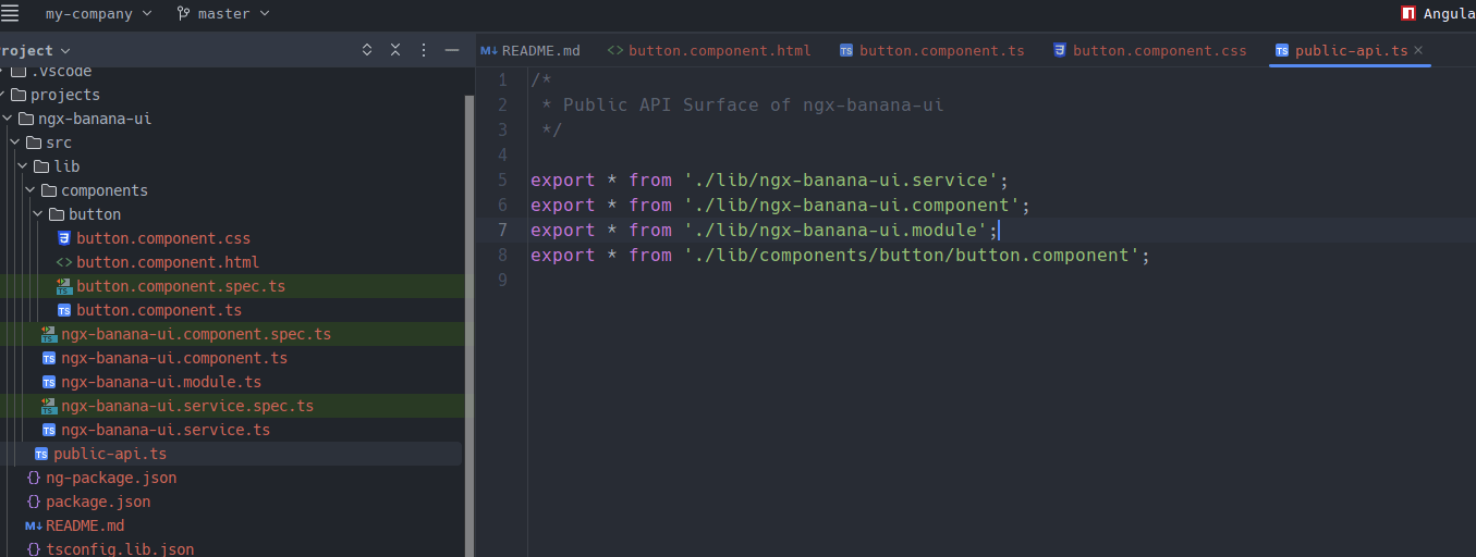
Perfect, we have already set up the button. Next, we need to export the button component into the public-api.ts.
Build the Library
We’ll first create a bundle in the dist folder to build our Angular library by running the command ng build ngx-banana-ui.
PS C:\Users\dany.paredes\Desktop\my-company\projects> ng build ngx-banana-ui
Building Angular Package

------------------------------------------------------------------------------
Building entry point 'ngx-banana-ui'
------------------------------------------------------------------------------
√ Compiling with Angular sources in Ivy partial compilation mode.
√ Generating FESM2020
√ Generating FESM2015
√ Copying assets
√ Writing package manifest
√ Built ngx-banana-ui

------------------------------------------------------------------------------
Built Angular Package
 - from: C:\Users\dany.paredes\Desktop\my-company\projects\ngx-banana-ui
 - to:   C:\Users\dany.paredes\Desktop\my-company\dist\ngx-banana-ui
------------------------------------------------------------------------------

Build at: 2023-04-23T15:36:34.716Z - Time: 2888ms
This command will create a dist folder; inside this folder, our compiled library is stored.
Publish as Local Package
As we have already built the library, we now need to build it as an npm package for the npm package manager. Once that is done, we can publish it to the local node package manager’s registry.
So we will go to our dist/ngx-banana-ui/ folder and run the command npm pack:
C:\Users\dany.paredes\Desktop\my-company\dist\ngx-banana-ui>npm pack
npm notice
npm notice package: ngx-banana-ui@1.2.3
npm notice === Tarball Contents ===
npm notice 1.0kB README.md
npm notice 2.4kB esm2020/lib/components/button/button.component.mjs
npm notice 1.7kB esm2020/lib/ngx-banana-ui.component.mjs
npm notice 2.8kB esm2020/lib/ngx-banana-ui.module.mjs
npm notice 1.5kB esm2020/lib/ngx-banana-ui.service.mjs
npm notice 512B  esm2020/ngx-banana-ui.mjs
npm notice 981B  esm2020/public-api.mjs
npm notice 4.2kB fesm2015/ngx-banana-ui.mjs
npm notice 4.0kB fesm2015/ngx-banana-ui.mjs.map
npm notice 4.2kB fesm2020/ngx-banana-ui.mjs
npm notice 4.0kB fesm2020/ngx-banana-ui.mjs.map
npm notice 123B  index.d.ts
npm notice 315B  lib/components/button/button.component.d.ts
npm notice 298B  lib/ngx-banana-ui.component.d.ts
npm notice 527B  lib/ngx-banana-ui.module.d.ts
npm notice 247B  lib/ngx-banana-ui.service.d.ts
npm notice 828B  package.json
npm notice 198B  public-api.d.ts
npm notice === Tarball Details ===
npm notice name:          ngx-banana-ui
npm notice version:       1.2.3
npm notice filename:      ngx-banana-ui-1.2.3.tgz
npm notice package size:  5.7 kB
npm notice unpacked size: 29.8 kB
npm notice shasum:        93acb4890e0523a754e17ca02bb917a0046324a7
npm notice integrity:     sha512-Le0XCo3OuXbEj[...]CmfAMUJyMO+xQ==
npm notice total files:   18
npm notice
ngx-banana-ui-1.2.3.tgz
This will create the package ngx-banana-ui-1.2.3.tgz, and local publishing will be completed! Now, we can use this library in any Angular application. Let’s quickly attempt to install the library into another Angular application.
Installing and Registering the Library
Now it’s a fun moment, consume the library, but first, create a new application using the Angular CLI.
ng new bank
Next, copy the ngx-banana-ui-1.2.3.tgz file to the root of the bank application.
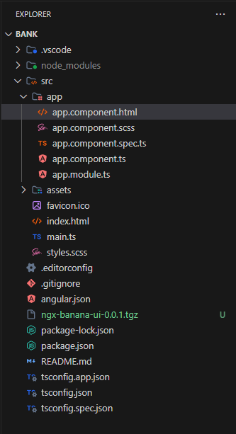
Next, install the library by running npm i ngx-banana-ui-1.2.3.tgz.
C:\Users\dany.paredes\Desktop\bank>npm i ngx-banana-ui-1.2.3.tgz

added 1 package, removed 1 package, and audited 910 packages in 2s

95 packages are looking for funding
  run `npm fund` for details

found 0 vulnerabilities
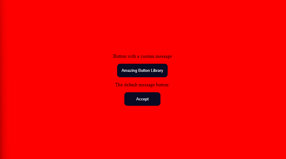
Import the NgxBananaUiModule into the AppModule in the app.module.ts file.
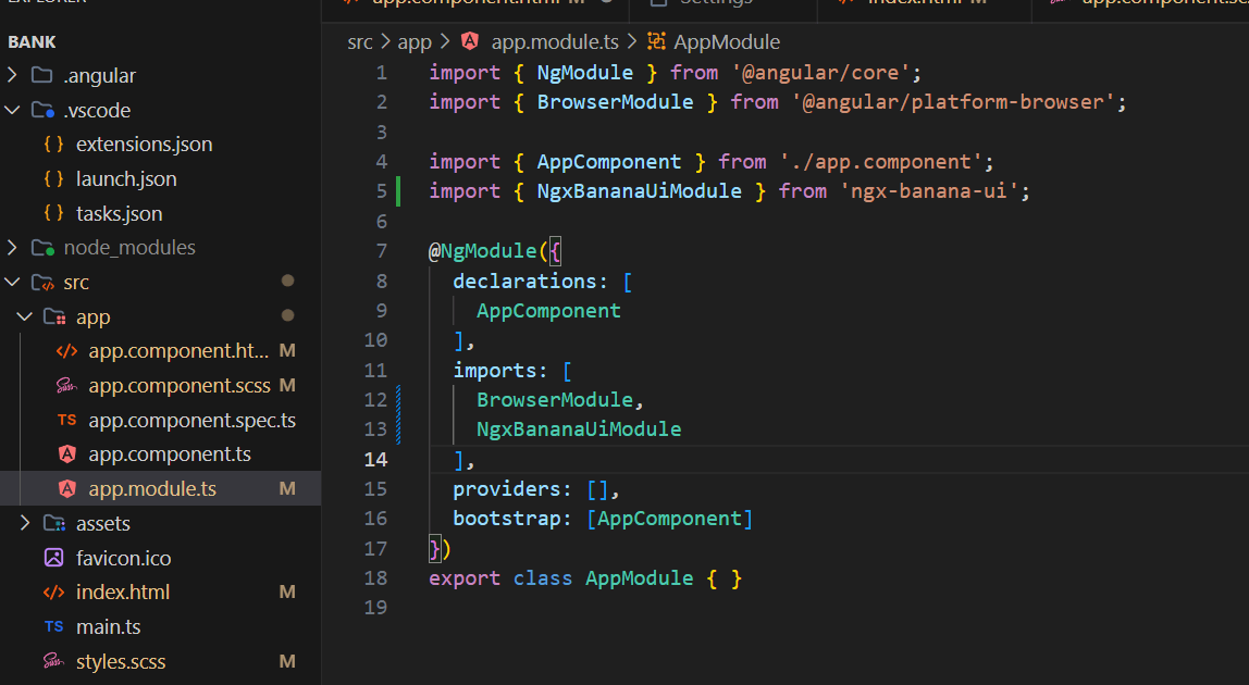
Replace the default HTML and utilize the components.
<div class="container">

  <div class="example">
    Button with a custom message<banana-button label="Amazing Button Library" />

    The default message button: <banana-button />
  </div>
</div>
Done!! Our app uses our library with amazing buttons!
What’s Next?
This example demonstrates how to create a library with a single button. However, a library is more than just a button; it must offer a range of components. Beyond simply providing components, there are several crucial aspects to consider when constructing a robust, flexible library for our organization.
To build your own library, you need to take care of other points like:
- Distribution: In our scenario, we are using a local build, but we might want to allow our company to install using an npm package from the internet.
- Theme: Allow our consumers to alter the colors of our buttons, alerts or components. We should provide a method for them to modify these colors easily.
- Organization: We must organize how to install and import the components. For example, we must use components without forcing our consumers to install numerous components if they only need one. Therefore, we should divide our components into smaller packages to install.
Yeah, it’s a nice adventure and it’s just the beginning. You can save time using a pre-built suite of Angular components.
Conclusion
We’ve learned a ton about creating a workspace, developing a library, exposing the API and integrating it into an application. It has been a truly rewarding adventure.
In the next article, we learn about how to theme and publish our library to npm.
Dany Paredes
Dany Paredes is a Google Developer Expert on Angular and Progress Champion. He loves sharing content and writing articles about Angular, TypeScript and testing on his blog and on Twitter (@danywalls).
Related Posts
Comments
All articles
Topics
Web MobileMobile
Desktop
Design
Productivity
People
