
Angular Component Library Part 2: How to Theme and Publish Your Library to npm
 by Dany Paredes

Summarize with AI:
Take your Angular component library to the next level: publish it to npm and provide theming options.
In a previous article, we demonstrated how to create an Angular library that provides a button component. We built and consumed it locally, but in the real world, a library needs to be accessible and easy to install, and provide a simple way to add themes with colors (like a professional library). Today, we are taking a step forward with our library by providing themes and publishing it to npm.
During the process of adding theme support to our library, we will learn how to achieve this using CSS variables. CSS variables allow us to style HTML elements based on their attributes in our library, export them from the library for consumption in applications and publish them to npm.
To facilitate the learning process, let’s introduce a scenario that reflects real-world challenges.
The Scenario
In the previous post, we created the library ngx-banana-ui and experimented with it in a banking application. However, our company now has a great opportunity to build a new app for selling banana-related products (let’s call it the Banana Bazaar), and they want to use our ngx-banana-ui library. This is fantastic because it saves time and accelerates the team’s progress. However, there are two new challenges:
- The team works remotely and wants to install the library easily, just like using npm.
- It would be nice to allow the customization of colors through overrides. The buttons need to change color according to the seasons, reflecting the vibrant colors of summer and the refreshing breezes of spring.
What is a Theme and How Does It Work?
A theme is a predefined set of styles and design elements that create a consistent visual appearance. It encompasses color schemes, typography, layouts, graphics and animations. Themes make websites visually appealing, user-friendly and easily customizable by updating CSS rules.
There are several ways to build a theme, but one of the most common approaches is to leverage the power of CSS variables to change colors and styles in components.
CSS Variables
CSS custom properties, or CSS variables, are a way to store reusable values in stylesheets. They allow us to declare a variable using the syntax --variable-name: value;. CSS variables help us maintain and modify CSS code
easily. To use a variable, we reference it with var(--variable-name) in CSS rules, making updates and maintenance simpler.
Let’s illustrate this with an example. First, we declare variables in the :root pseudo-class:
:root {
  --primary-color: #3498db;
  --text-color: #333;
}
Note: You can nestle these under any class that you would like, but a generic over-arching ones are best. :root is commonly used for global variables and allows for overrides with more specific selectors.
Next, we use these variables within our CSS rules:
body {
  color: var(--text-color);
}

a {
  color: var(--primary-color);
}
We can update the theme by changing the variable values in the :root selector, allowing for easy customization and maintainability of the theme.
Now that we have a basic understanding of CSS variables, let’s add theme support to the ngx-banana-library and use some CSS custom properties!
Learn more about CSS variables.
Create Theme
Clone the ngx-banana-ui library project and open it in your favorite editor. Inside the lib directory, create a new directory called theme and add a new file named theme.scss.
Next, declare the variables --banana-btn-bg-color and --banana-btn-color in the :root scope:
/* Default theme */
:root {
  --banana-btn-bg-color: rgb(55, 114, 222);
  --banana-btn-color: rgb(134, 206, 33);
}
We will update these variables using a selector that matches each seasonal theme. Create selectors with the attribute data-theme for the “summer” and “spring” themes:
banana-button[data-theme="summer"]  {
  --banana-btn-bg-color: rgb(222, 24, 114);
  --banana-btn-color: rgb(143, 218, 43);
}

banana-button[data-theme="spring"] {
  --banana-btn-bg-color: rgb(199, 206, 57);
  --banana-btn-color: rgb(179, 29, 225);
}
We want these variables to affect the background and color properties of the button class:
.button {
  box-sizing: border-box;
  display: inline-block;
  border: 0;
  border-radius: 10px;
  padding: 15px;
  min-height: 30px;
  min-width: 120px;
  opacity: 0.8;
  background-color: var(--banana-btn-bg-color);
  color: var(--banana-btn-color);
  cursor: pointer;
  text-align: center;
  font-size: 1rem;
  line-height: 1.2;
  transition: opacity 0.3s ease;
}

.button:hover {
  opacity: 1;
}
Before building and publishing, we need to update the ng-package.json to export the new theme file.
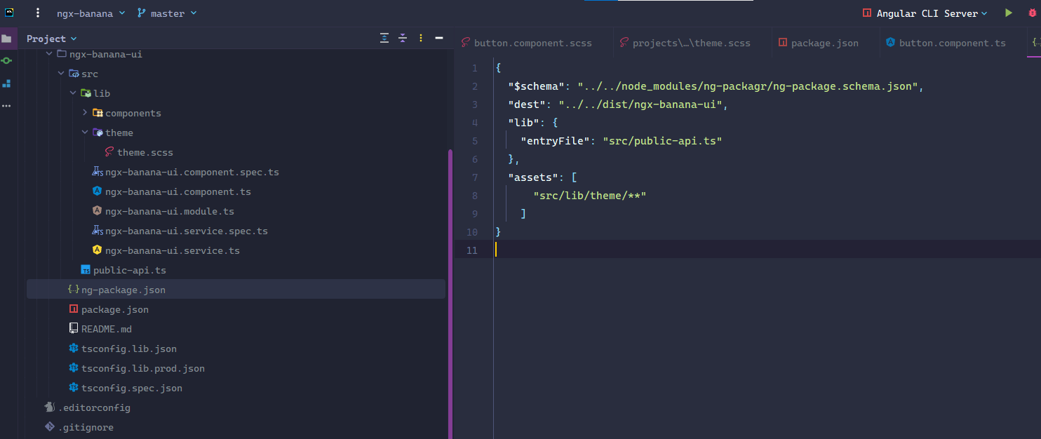
What are We Doing ?
The button component from our library uses CSS variables with predefined colors, but when the component matches with the data-theme selector, it takes the colors from there. We need one final step to start to play with our library build and publish to npm.
Learn more about CSS Selectors and Data Attributes.
Build and Publish to npm
We are now in the final phase of the theme implementation. In this part, we will build and publish our library to npm. Follow the steps below:
Navigate to the library directory and run the command npm run build ngx-banana-ui.
If desired, update the package.json file to provide additional information about the library, such as author and repository.
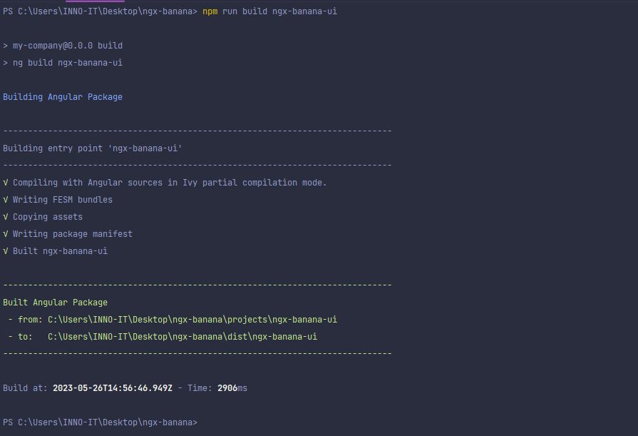
The library was built, so the next step is to publish the build from the dist directory. Change your current directory to the dist/my-library directory:
cd dist/
npm run build ngx-banana-ui
To publish the library, create a user account on npm if you don’t have one already. You can register on the npm website. After creating an account, log in using the following command:
npm login
Username: danywalls
Password:
Email: (this IS public) youremail@gmail.com
npm notice Please use the one-time password (OTP) from your authenticator application
Enter one-time password: OTPToke
Logged in as danywalls on https://registry.npmjs.org/.
Once logged in, you can publish. Go to ngx-banana-ui directory your library and run the command npm publish.
Read more about publishing package.
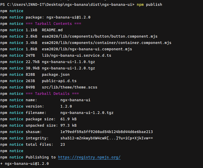
Congratulations! You now have your library ready to be used in your projects, and it is published in the npm repository.
Using the Banana Library
Now that our library is available on the npm repository, it will be easy for our remote teammates to use it in our Angular application.
First, let’s create the project using the Angular CLI:
ng new banana-store
Next, navigate to the banana-store directory and install the library:
cd banana-store
npm i ngx-banana-ui
Once the library is installed, open the project and import the library in the app.module.ts file.
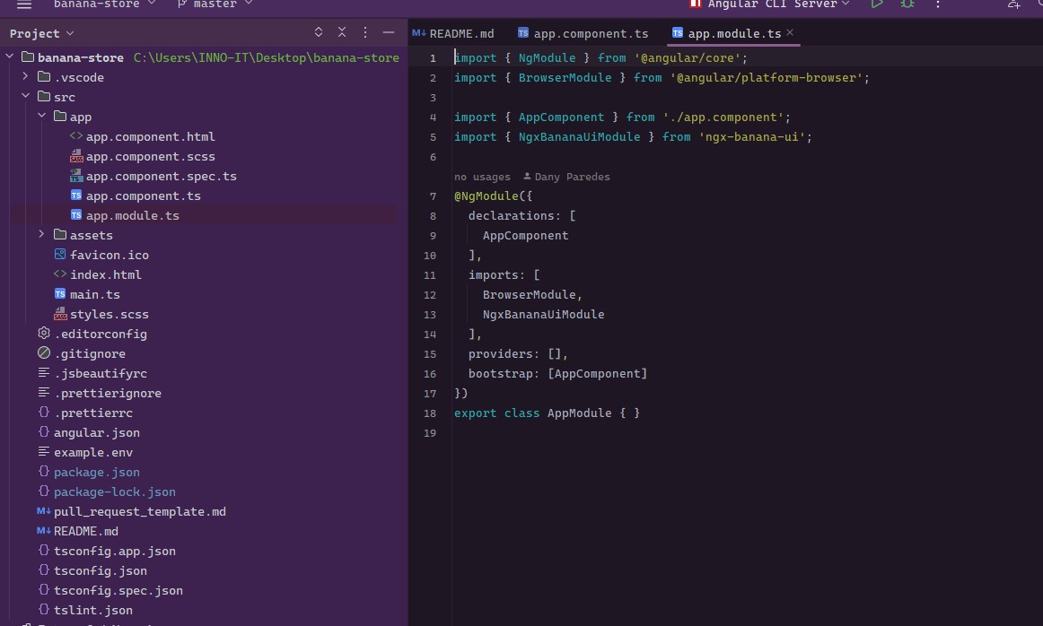
With the module imported, you can now use our button component. Remove the default HTML markup generated by Angular and add the following code to your template file app.component.html:
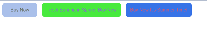
<banana-button label="Buy Now"></banana-button>
<banana-button data-theme="spring" label="Fresh Banana in Spring, Buy Now"></banana-button>
<banana-button data-theme="summer" label="Buy Now It's Summer Time!"></banana-button>
Next, import the styles in your global styles file (e.g., styles.scss):
/* You can add global styles to this file, and also import other style files */
@import '../node_modules/ngx-banana-ui/src/lib/theme/theme.scss';
Save the file, and reload your application.
Now, when you view your application, you should see the buttons rendered with the appropriate labels and themes.
Override Default Theme
If you want to use your own colors for a specific theme, such as making the “spring” theme more vibrant, you can override the variables. Let’s go ahead and do it in the styles.scss file.
Example:
/* Default theme */
:root {
  --banana-btn-bg-color: rgb(203, 39, 88);
  --banana-btn-color: rgb(20, 21, 20);
}


banana-button[data-theme="summer"]  {
  --banana-btn-bg-color: rgb(5, 80, 225);
  --banana-btn-color: rgb(218, 43, 69);
}

banana-button[data-theme="spring"] {
  --banana-btn-bg-color: rgb(59, 224, 224);
  --banana-btn-color: rgb(241, 237, 49);
}
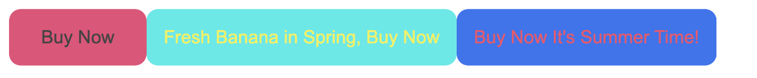
In the styles.scss file, declare the CSS variables and update the selector for each theme. These updated color values will override the default colors for the corresponding themes. Feel free to adjust the RGB values to achieve the vibrant look you desire for the “spring” theme.
Next Steps
In our journey, we have learned valuable concepts such as adding themes, publishing our library to npm, consuming it in applications and customizing it to meet our specific needs. However, as our company’s requirements grow and we need a larger set of components, the complexity increases. We find ourselves asking important questions:
- How can we efficiently customize each component to align with our unique requirements?
- What approach should we take to extend our library with additional components?
- Is there a way to publish different sets of components as separate packages?
Building and maintaining a comprehensive library of components is no small feat. It requires a significant investment of time and resources from a dedicated team to handle the development and ongoing maintenance of each individual component.
However, I have exciting news for you. There’s a way to supercharge our library and take it to the next level by harnessing the power of Kendo UI for Angular.
You can find the complete code example for this article:
Check out the next article where we’ll explore how Kendo UI can save you vast amounts of time and effort. :)
Dany Paredes
Dany Paredes is a Google Developer Expert on Angular and Progress Champion. He loves sharing content and writing articles about Angular, TypeScript and testing on his blog and on Twitter (@danywalls).
Related Posts
Comments
All articles
Topics
Web MobileMobile
Desktop
Design
Productivity
People
