Designing Custom Themes with the Progress Sass ThemeBuilder

Summarize with AI:
Quickly and easily create the perfect theme for your app and apply it across all of the cool UI libraries from Progress with Sass ThemeBuilder. Grids, charts, pickers, even buttons—all fixed at once! Let’s take a look.
Colors matter. Just ask your marketing department. Sure, you want your apps to look awesome, and part of that means that the color design you use needs to be awesome. But you also want to keep your product designers from chasing you down the street screaming, “Those are not our brand colors!” It’s just embarrassing for everyone.
Maybe more importantly, you do at least want to make your app look like your other apps so it appears that they came from a single company. And unless you are deliberately trying to trick your customers, you want buttons for major functions to have the same colors they did in your last app. It’s just not cool to have the “enter” button in one app be blue and then in your next app have the “permanently delete all my data” button be blue. Because doing that will also make your UX person’s head explode, which can be messy.
But… oh gosh… does that mean you really have to go in and manually tweak colors in CSS for each of your UI components? That doesn’t sound like much fun either. But before you start to think that maybe it’s okay if just one UX designer’s head does explode, there’s an easy answer. You just need a tool to help you tweak the design colors for your components all at once. A tool that let’s you pick from popular design themes or tweak your own. A tool that shows you right away exactly what your UI will look like with the new colors. A tool that will let you save your customer themes and edit them later.
If only there was such a tool…
Enter Progress Sass ThemeBuilder
Well, such a tool does exist or else this would be a really short blog. It’s the ThemeBuilder from Progress. And it’s not just a mere CSS theme builder—it’s a Sass theme builder for all of the Kendo UI components. Sass, if you aren’t’ familiar with it, is like “CSS with Superpowers” (their words) and is an extension to CSS that is completely compatible with CSS. Using Sass lets us use variables in our styles and makes it easy to propagate values across a whole library. And I hope you all appreciate that I stayed away from any one of the many jokes about the name “Sass”—you’re welcome!
The Sass ThemeBuilder let’s you quickly and easily create the perfect theme for your app and apply it across all of the cool Kendo UI, Telerik and other UI libraries from Progress. Grids, charts, pickers, even buttons—all fixed at once. Let’s take a look…
To get started, just go to the online utility at:
https://themebuilder.telerik.com/
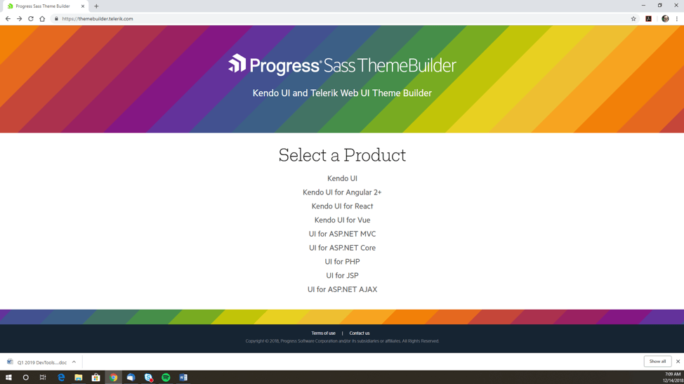
The first thing you see is a list of products libraries that you can create a theme for, ranging from Angular and React to ASP.NET and PHP. Because each library has unique characteristics, the way to set each theme is slightly different.
If you click on a product (and here I selected “Kendo UI,” which is the basic JavaScript version) you get two choices—start a new theme or import an existing customized one.
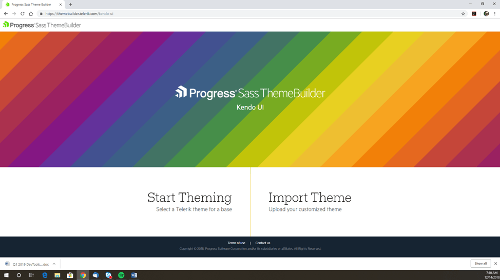
The new theme option is obvious but why would you want to import an existing customized theme? This is actually useful in a number of scenarios.
First of all, you might be working with a new standard and are in a cycle of creating a theme, seeing how it looks and maybe doing some user testing, and tweaking the theme. Rather than starting from scratch each time you can just import the theme you developed in your last iteration and tweak that. Or you might have to come back months later and make some changes to reflect new theme standards. Or you might even find some color after a while that you forgot to set. Or that someone else forgot to set, more likely, because of course *you* would never make a mistake like that.
Click on “Start Theming” and you have one more choice to make before getting started—picking the base theme to use as a starting point!
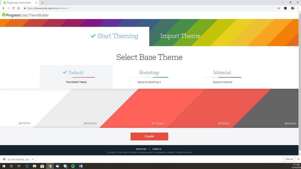
There are three options:
- Our own default theme (which is shown here and uses whites, reds and greys)
- Bootstrap (based on the Bootstrap 4 theme, which uses whites and blues—my personal favorite)
- Material (based on Google’s Material guidelines, which uses a white/red/blue/grey mix)
Now we get to the cool part!
We are now in the tool and we have several options. The first thing we see is a panel on the right-hand side of the screen that shows us a whole bunch of components: menus, buttons, pickers, grids, charts, editors, etc. Notice that you can scroll down this list and see that there are a *lot* of components instantiated here. This is so you can see exactly what the changes you make to the theme will look like across all of the components you are going to use.
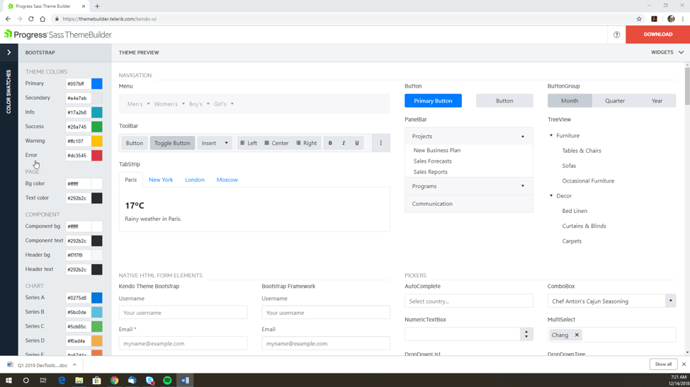
And these are all real, live components. You can select buttons, collapse grid lines, pick dates, etc. And they all have some actual data in them so when you select a drop-down list, there are several selection options. You need all of this to see what colors are going to show up where.
“But wait,” I hear you complain. “This is too much. I’m not going to use all of these components and it’s hard to find the ones I am using in the middle of this huge library. It’s just crowded.”
And you are quite right, no one is likely going to use all of those components (and if you do, please write to me, I’m sure I can find some kind of prize for you). Which is why we let you customize the list of components that are shown. On the top right, just below the red “download” button, click on “Widgets”. This shows you a list of all the components in that library—all selected by default—and all you have to do is uncheck the ones you don’t want to use.
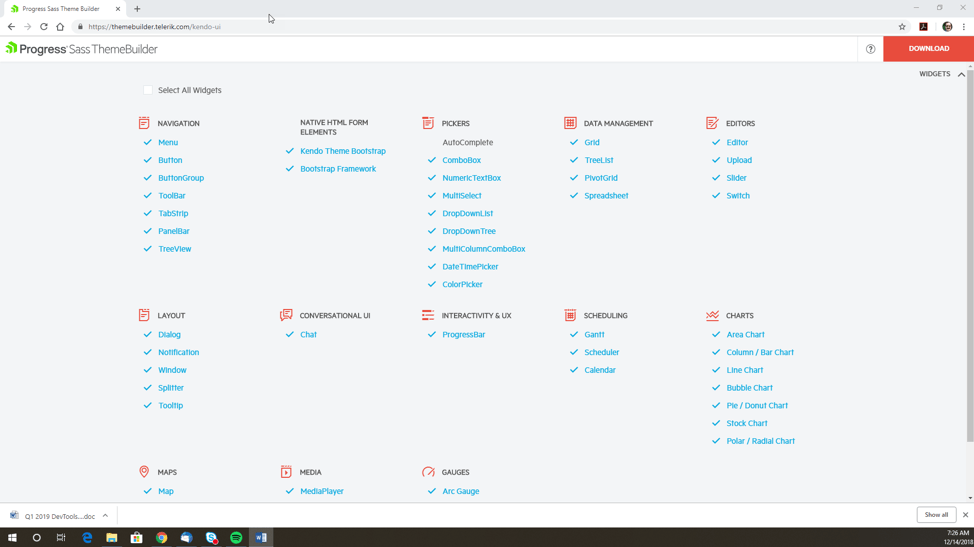
For example, let’s say I was only using the Grid, Chart, TabStrip, ButtonGroup and the DatePicker and TimePicker. If I select only those components and collapse the “widgets” screen, I now see only those five components displayed. Pretty cool, right?
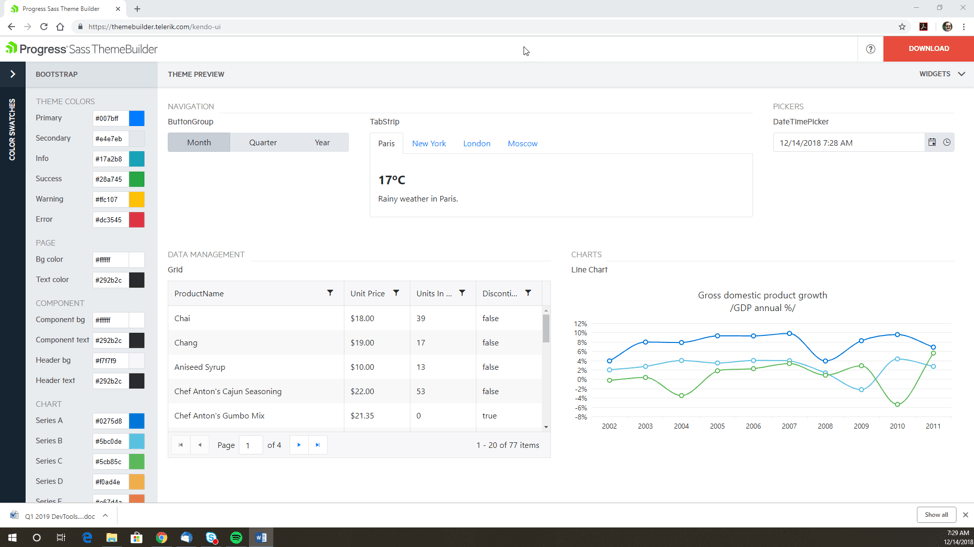
Now that we have fixed up our environment, let’s change something! First of all, before we go poking around individual colors, we do still have more options. If we click on the top left to expand the “Color Swatches” panel, we see a bunch of color swatches that we can select. This gives us even more options for using predefined color themes.
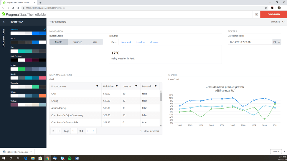
Or, if we just want to tweak individual colors, we can do that one of two ways: we can just type the color code into the text box for that item, or we can open the color picker and find some color that just looks awesome.
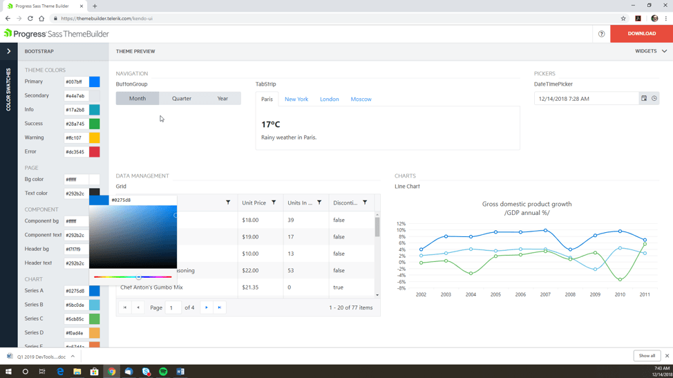
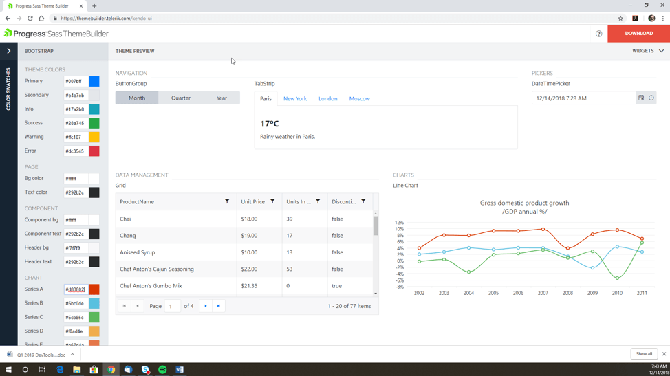
And just as an example, below I changed the first chart color from blue to red—and we can see that in the image below, where the top line on the chart is now red.
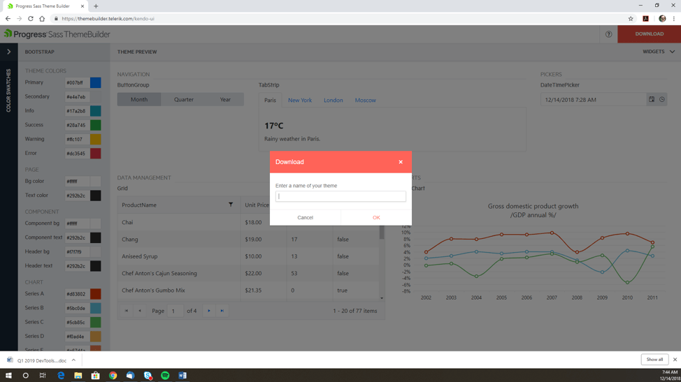
When you are done, just click on “download,” which is really hard to miss because it’s a big red button. Enter a name and a location and boom—you’re ready.
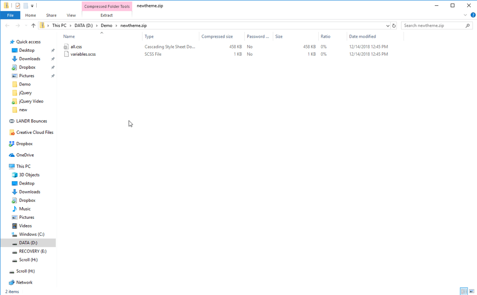
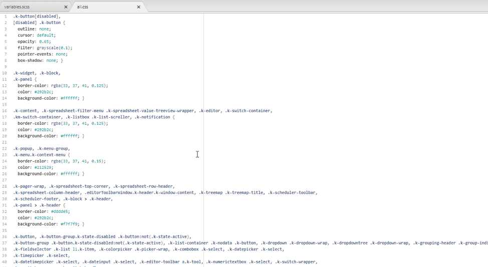
You’ll get a ZIP file that contains two files inside of it. The first is your `.css` file, and the second is a `.scss` file that contains the session settings for your theme. This is the file you use to import into ThemeBuilder later if you want to make some changes.
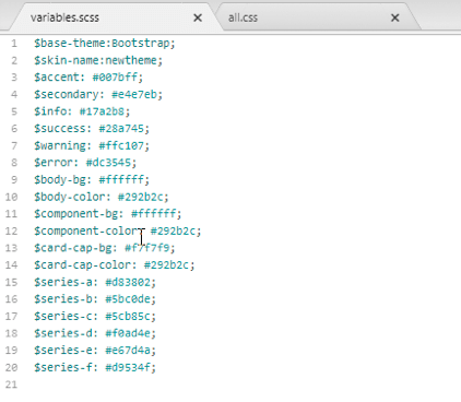
The SCSS file (below) is fairly simple but it holds the key parameters. Rather than constantly update and tweak the CSS yourself, this SCSS file gives us a chance to save and implement the changes that we want to make through simple Sass variables.
The CSS file (below) is a bit more complicated because it contains all of the CSS parameters for the Kendo UI library, not just the colors you changed.
Okay, that’s the ThemeBuilder in a nutshell. You can go check it out yourself and take a look. It’s free, you don’t need a license, you don’t need to install anything. Just go to the webpage. Now. Right now! Don’t procrastinate, just go check it out now, and get colorful!
Want to see more? Watch the video version of this overview
Want to play? Check Out ThemeBuilder
Want to try it out yourself? Sign up for a free trial of Kendo UI

John Willoughby
John loves technology and because he just doesn’t get enough during the day, he also writes apps for fun as a hobby. He has worked in various software development and product marketing roles at both hardware and software companies. John has a Bachelor's in Electrical Engineering (Computer Design) and is in the middle of his Master's in Computer Science. When not actually sitting in front of a monitor he enjoys playing guitar.

