
Creating a Landing Page in Blazor

Summarize with AI:
Learn how to create sections of a landing page in Blazor—navigation bar, hero section, customer logos section, features sections, pricing section and a form section.
In this article, we will explore some of the common sections used to create landing pages, what they are for, and how we can quickly create them thanks to the Progress Telerik UI for Blazor controls. I took inspiration from the MIT licensed template in the repository awesome-landing-pages. Let’s get started!
What Is a Landing Page?
A landing page is a webpage designed to convert visitors into leads or customers. Typically, these sites are focused on encouraging users to perform a specific action, eliminating distractions such as banners, links to other webpages or unnecessary sidebars. Another characteristic of these pages is that they often include a contact form, in addition to having a structure tailored for conversion.
How to Create Landing Pages with Blazor?
To put into practice what is described in this article, you can create a new Blazor project or add a new page-type component to an existing project. In my case, I will create a project from scratch, for which I followed these steps:
- Create a new project by selecting the Blazor Web App template, with an Interactive render mode set to Server, and an Interactivity location set to Per page/component, leaving the option to integrate the sample components selected.
- Follow the installation guide for Telerik Blazor components to integrate them into the project.
- Navigate to the file located in wwwroot |
app.cssand add the following styles at the end of the file:
.landing-container {
    display: flex;
    flex-direction: column;
    min-height: 100vh;
}

.header {
    display: flex;
    justify-content: space-between;
    align-items: center;
    padding: 10px 5%;
    position: absolute;
    top: 0;
    width: 100%;
    z-index: 20;
    background: #171B20;
    width: 100vw;
}

.top-row{
    padding-left: 0;
}

.top-row{
    background: #26b050;
}

.logo {
    width: 50px;
    height: 50px;
}

.nav-links {
    display: flex;
    gap: 20px;
    align-items: center;
}

.nav-link {
    text-decoration: none;
    color: white;
    font-size: 16px;
    transition: color 0.3s;
}

    .nav-link:hover {
        color: #6c72e8;
    }

.hero-section {
    position: relative;
    display: flex;
    flex-direction: column;
    justify-content: center;
    align-items: center;
    min-height: 100vh;
    text-align: center;
    padding: 5%;
    background: url('assets/images/background/dots.svg') center/cover no-repeat;
}

.hero-bg {
    position: absolute;
    top: 0;
    left: 0;
    width: 100%;
    height: 100%;
    background: linear-gradient(180deg, rgba(24,27,32,0.9) 30%, rgba(0,0,0,0.25) 65%);
    z-index: -1;
}

.hero-title {
    font-size: 48px;
    font-weight: bold;
    text-transform: uppercase;
    margin: 0;
    background: linear-gradient(93deg, rgba(233,92,255,1) 12%, rgba(210,125,255,1) 49%, rgba(159,121,255,1) 93%);
    -webkit-background-clip: text;
    -webkit-text-fill-color: transparent;
}

.hero-subtitle {
    font-size: 18px;
    margin-top: 20px;
    max-width: 450px;
}

.hero-buttons {
    margin-top: 20px;
    display: flex;
    gap: 20px;
    justify-content: center;
}

.dashboard-container {
    margin-top: 40px;
}

.dashboard-image {
    width: 100%;
    max-width: 950px;
    min-height: 450px;
    border-radius: 16px;
    box-shadow: 0 4px 6px rgba(0,0,0,0.2);
}

.section {
    padding: 60px 5%;
    text-align: center;
}

.pricing-cards {
    display: flex;
    flex-wrap: wrap;
    justify-content: center;
    gap: 20px;
}

.pricing-card {
    width: 380px;
    margin: 20px;
    padding: 20px;
    background-color: #1d2127;
    border-radius: 10px;
    box-shadow: 0 4px 6px rgba(0,0,0,0.2);
}

.footer {
    display: flex;
    justify-content: space-around;
    padding: 40px 5%;
    background-color: #111;
}

.footer-column {
    max-width: 250px;
}

    .footer-column h2 {
        font-size: 24px;
        margin-bottom: 20px;
    }

.footer-link {
    color: white;
    text-decoration: none;
    display: block;
    margin-bottom: 10px;
    transition: color 0.3s;
}

    .footer-link:hover {
        color: #483cf4;
    }

@keyframes scroll {
    0% {
        transform: translateX(0);
    }

    100% {
        transform: translateX(-50%);
    }
}

.item {
    background: #121418;
    color: rgba(255, 255, 255, .8);
    font: 36px/200px sans-serif;
    text-align: center;
    margin: 0;
    border: none;
    position: absolute;
    text-shadow: 1px 1px 2px rgba(0, 0, 0, .8);
    border-width: 0px;
}

.k-scrollview {
    margin: 0 auto;
    border: none;
    border-width: 0px;
}

.carousel-style {
    border: none !important;
}

    .carousel-style .k-scrollview-nav .k-link {
        background-color: #4B0082;
    }
        .carousel-style .k-scrollview-nav .k-link.k-primary {
            background-color: #3F51B5;
        }
.k-form-label,
.k-form-hint,
.k-label {
    color: #ffffff !important;
}

.k-input,
.k-textbox,
.k-dropdown,
.k-multiselect {
    color: #ffffff !important;
}

.k-validation-message {
    color: #ffffff !important;
}
- In the same stylesheet, modify the following styles:
html, body {
    font-family: 'Helvetica Neue', Helvetica, Arial, sans-serif;
    margin: 0;
    background-color: #181B20;
    color: white;
}
...

.content {
    font-family: "Poppins", sans-serif;
}
- To use the Poppins font, go to
App.razorand add the following line in theHeadsection:
<head>
    ...
    <link href="https://fonts.googleapis.com/css2?family=Poppins&display=swap" rel="stylesheet">
    <ImportMap />
    ...
</head>
With the previous steps completed, we are ready to create the landing page.
Creating a New Page-Type Component
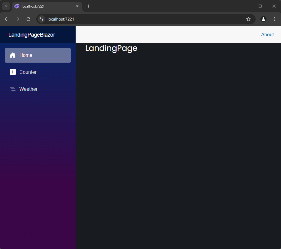
The first step we will take is to create a new Razor page-type component to add the content of the landing page. To do this, right-click on the Components folder and add a new Razor Component. You can name it whatever you like; in my case, I named it LandingPage.razor. We will modify this component by adding an @page directive to turn it into a page and assign it as the initial route of the application. Finally, we will specify the rendermode as InteractiveServer:
@page "/"
@rendermode InteractiveServer

<h3>LandingPage</h3>

@code {

}
To avoid issues with routes, you should change the @page directive of the Home.razor page to a different value, such as:
@page "/Home"
If you run the application at this point, you will see the newly created page displayed on the screen:
Previously, we mentioned that a landing page should not have distracting elements, so we need to remove the navigation menu from the current application.
Creating a Layout Without the App’s Navigation Menu
To remove the app’s navigation menu, we need to create a new layout file that defines how the application will be rendered. Currently, we have a defined layout in the Components | Layout | MainLayout.razor file, which, if you examine, includes elements such as a sidebar.
In the Layout folder, create a new Razor component named EmptyLayout.razor with the following content:
@inherits LayoutComponentBase

<TelerikRootComponent>
    <main>
        <article class="content">
            @Body
        </article>
    </main>
</TelerikRootComponent>
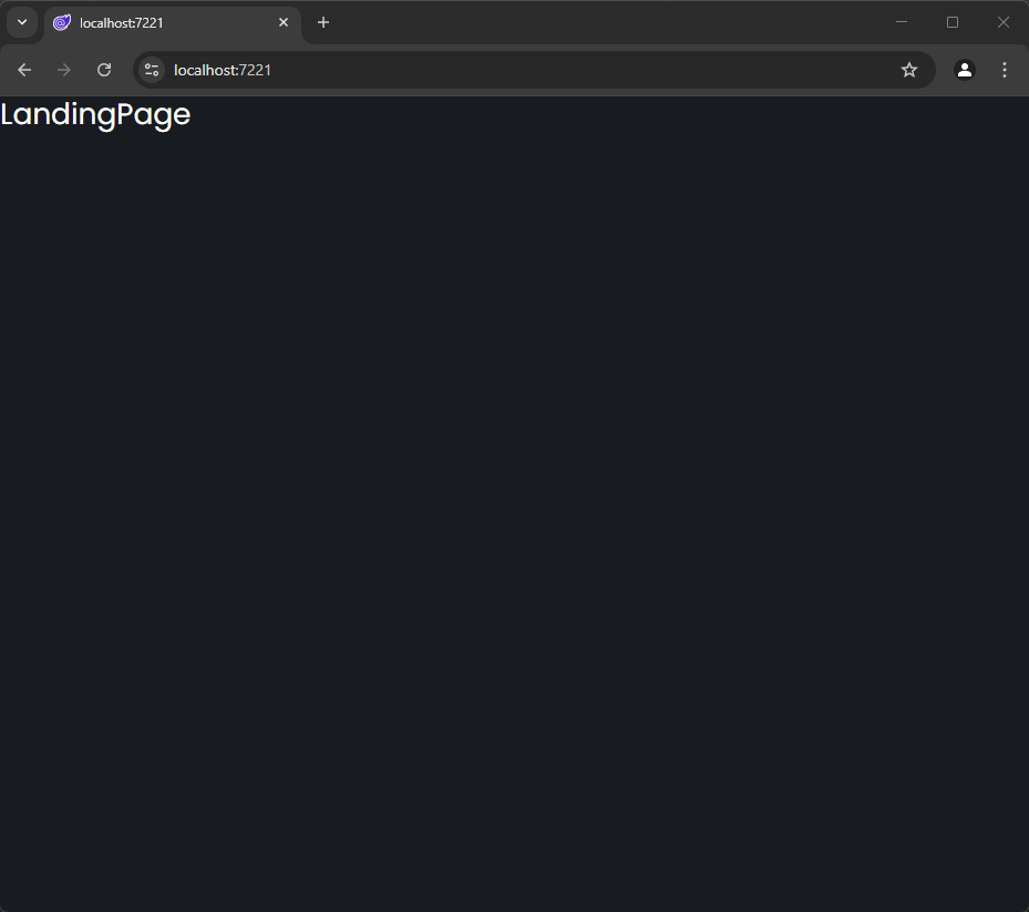
With this, we are using @Body to render the content while removing unnecessary elements like the sidebar. The next step is to go to LandingPage.razor and specify that we want to use the new layout via the @layout directive:
@using LandingPageBlazor.Components.Layout

@page "/"
@layout EmptyLayout

<h3>LandingPage</h3>

@code {

}
When you run the application, you will see that the page now occupies the full available space:
Now, let’s look at how to add elements to the landing page.
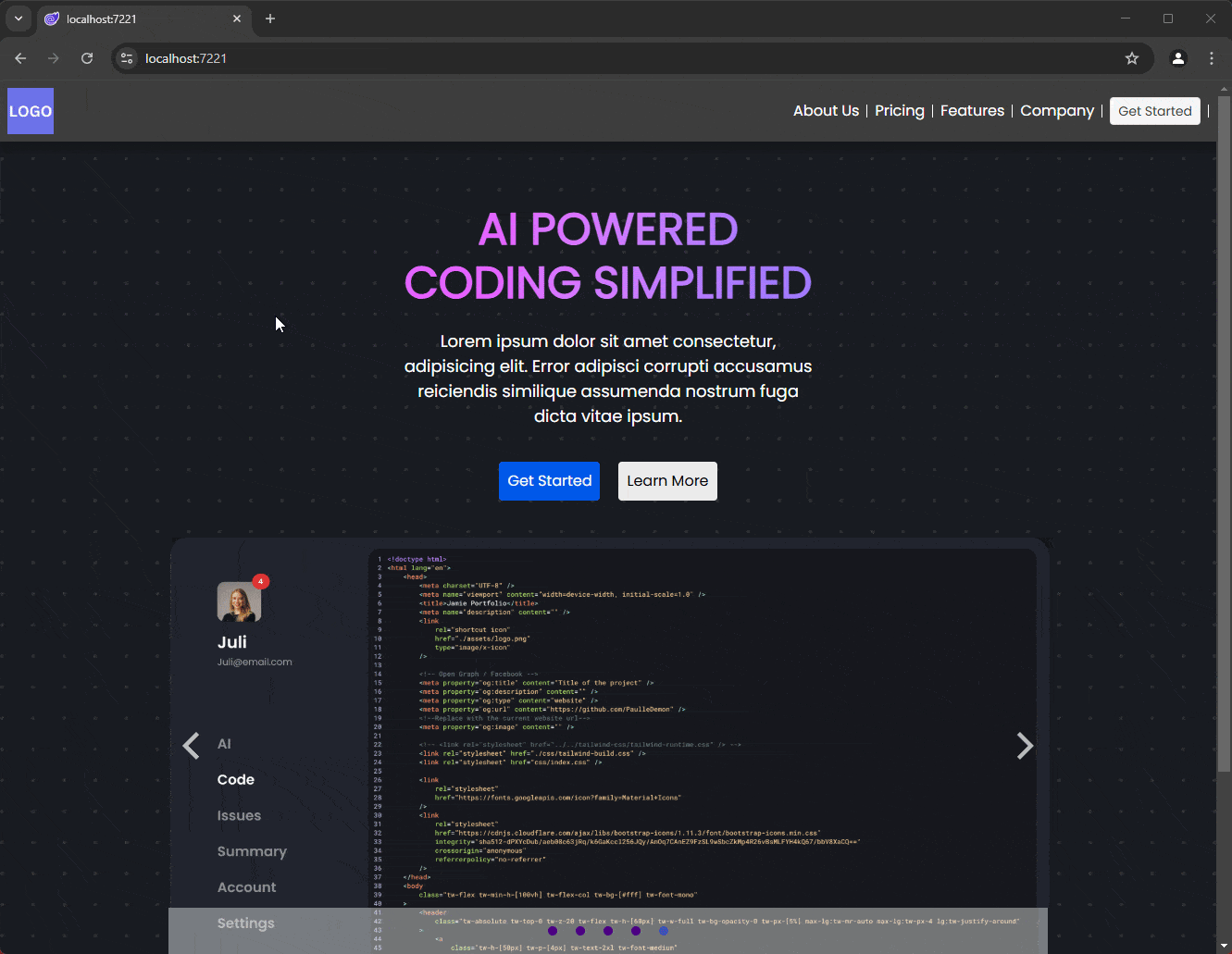
Creating the Header for the Landing Page
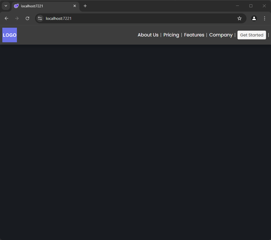
The first element we will add to our landing page is a Header that will represent a navigation menu. This is not the same application navigation menu but rather a menu that allows the user to quickly move between the sections of the page. This is useful because the user might have previously visited the landing page and want to navigate quickly to a specific section (like the payment section), so we need to make this task as easy as possible.
To create this element, we can use the TelerikAppBar control, which allows us to quickly create a top menu, including spacing between items as shown in the following example:
<TelerikAppBar ThemeColor="dark">
    <AppBarSection>
        <img src="assets/logo/logo.png" alt="Logo" class="logo" />
    </AppBarSection>
    <AppBarSpacer></AppBarSpacer>

    <AppBarSection>
        <a href="#about" class="nav-link">About Us</a>
    </AppBarSection>
    <AppBarSeparator></AppBarSeparator>

    <AppBarSection>
        <a href="#pricing" class="nav-link">Pricing</a>
    </AppBarSection>
    <AppBarSeparator></AppBarSeparator>

    <AppBarSection>
        <a href="#features" class="nav-link">Features</a>
    </AppBarSection>
    <AppBarSeparator></AppBarSeparator>

    <AppBarSection>
        <a href="#company" class="nav-link">Company</a>
    </AppBarSection>
    <AppBarSeparator></AppBarSeparator>

    <AppBarSection>
        <TelerikButton OnClick="@(() => {})">Get Started <i class="bi bi-arrow-right"></i></TelerikButton>
    </AppBarSection>
    <AppBarSeparator></AppBarSeparator>
</TelerikAppBar>
In the code above, we use the TelerikAppBar component, to which we add sections using the AppBarSection tag. This allows us to include HTML code with the desired content. You can see that in my case, I use links and even a TelerikButton to execute a C# method if needed. The AppBarSpacer and AppBarSeparator tags allow you to add space between the elements of the TelerikAppBar, resulting in a final design that looks like this:
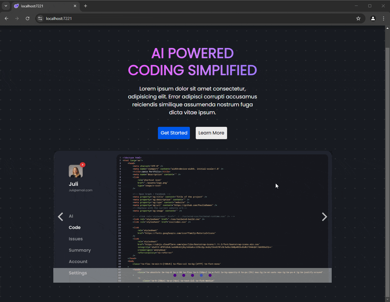
Creating the Hero Section
The first content section encountered by the user is the hero section. In this section, features of a product are typically highlighted, quick action buttons are added, etc. In our case, we are going to add a Slider displaying product images. We will do this using the TelerikCarousel control, which provides an easy and quick way to implement carousels not only of images but also of any custom content you need.
The TelerikCarousel control works by defining a data source with a set of properties that we will display in the carousel. In my case, since I only need to display images, I will add a class with the properties ID and ImagePath, in addition to creating a list with five objects of the created model:
@code {
    public IEnumerable<CarouselModel> CarouselData = Enumerable.Range(1, 5).Select(x => new CarouselModel
        {
            ID = x,
            ImagePath = "assets/images/home/dashboard.png"
        });

    public class CarouselModel
    {
        public int ID { get; set; }
        public string ImagePath { get; set; }
    }
}
The hero section looks as follows:
<!-- HERO SECTION -->
<section id="hero-section" class="hero-section">
    <div class="hero-bg"></div>
    <h1 class="hero-title">
        AI Powered<br />Coding Simplified
    </h1>
    <p class="hero-subtitle">
        Lorem ipsum dolor sit amet consectetur, adipisicing elit. Error adipisci corrupti accusamus reiciendis similique assumenda nostrum fuga dicta vitae ipsum.
    </p>
    <div class="hero-buttons">
        <TelerikButton OnClick="@(() => {})" Size="lg" ThemeColor="info">Get Started</TelerikButton>
        <TelerikButton OnClick="@(() => {})" Size="lg" Class="secondary" ThemeColor="light">Learn More</TelerikButton>
    </div>
    <div class="dashboard-container">
        <TelerikCarousel Data="@CarouselData" Width="950px" Height="450px" Class="carousel-style">
            <Template>
                <div class="item">
                    <img src="assets/images/home/dashboard.png" alt="Dashboard" class="dashboard-image" />
                </div>
            </Template>
        </TelerikCarousel>
    </div>
</section>
When running the application, you’ll see how the slider with images is displayed within the application:
Now, let’s see how to create a features section.
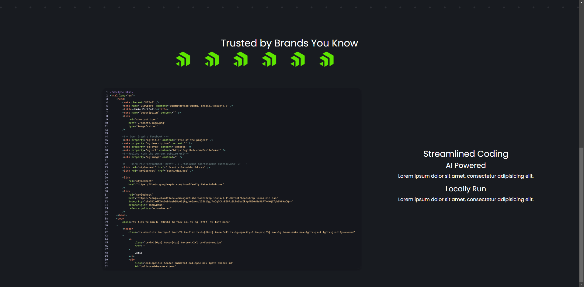
Adding a Brand Logos Section
Something that builds trust among an application’s prospects is showcasing which companies have relied on them to use their products. For this reason, we will add a dedicated section on our landing page to display logos of some companies, incorporating interactivity to make it a dynamic section.
From the Telerik UI library, we will use the Blazor Animation Container component, to quickly add fade-in and fade-out effects to elements by simply wrapping the desired HTML code section, as demonstrated in the following example:
<!-- Trusted Brands Section -->
<section class="section" id="mySection">
    <h2>Trusted by Brands You Know</h2>
    <div style="overflow: hidden; white-space: nowrap; max-width: 800px; margin: 0 auto;">
        <TelerikAnimationContainer @ref="animationContainer"
                                   AnimationType="AnimationType.ZoomIn"
                                   AnimationDuration="1000"
                                   Width="800px">

            <div style="display: inline-block; animation: scroll 10s linear infinite;">
                <img src="https://d585tldpucybw.cloudfront.net/sfimages/default-source/blogs/author-images/progress-blog-default-logo-transparent.png" alt="Progress" style="height:50px; width:50px; margin: 0 20px;" />
                <img src="https://d585tldpucybw.cloudfront.net/sfimages/default-source/blogs/author-images/progress-blog-default-logo-transparent.png" alt="Progress" style="height:50px; width:150px; margin: 0 20px;" />
                <img src="https://d585tldpucybw.cloudfront.net/sfimages/default-source/blogs/author-images/progress-blog-default-logo-transparent.png" alt="Progress" style="height:50px; width:150px; margin: 0 20px;" />
                <img src="https://d585tldpucybw.cloudfront.net/sfimages/default-source/blogs/author-images/progress-blog-default-logo-transparent.png" alt="Progress" style="height:50px; width:150px; margin: 0 20px;" />
                <img src="https://d585tldpucybw.cloudfront.net/sfimages/default-source/blogs/author-images/progress-blog-default-logo-transparent.png" alt="Progress" style="height:50px; width:150px; margin: 0 20px;" />
                <img src="https://d585tldpucybw.cloudfront.net/sfimages/default-source/blogs/author-images/progress-blog-default-logo-transparent.png" alt="Progress" style="height:50px; width:150px; margin: 0 20px;" />
            </div>

        </TelerikAnimationContainer>
    </div>
</section>
In the code above, you can see that a series of logo images (representing company logos) are nested within a div. Additionally, we have configured the TelerikAnimationContainer control with an AnimationType, an AnimationDuration, a Width and a @ref, which is used to control the animation effect. This setup is necessary as TelerikAnimationContainer can be reused for displaying other types of content as needed.
To complement the Razor code, we will add a reference to the control in the code section and specify that the animation should start upon page load:
@code {

    private TelerikAnimationContainer animationContainer;
    protected override async Task OnAfterRenderAsync(bool firstRender)
    {
        if (firstRender)
        {
             await animationContainer.ShowAsync();
        }
    }
    ...
}
However, the above code has an issue for our specific use case. The problem is that, if the user starts by viewing the navigation menu and the hero section, they might miss the logo animation since it executes immediately after the page renders. Ideally, we should see the animation only when the user scrolls to that section. This can be fixed with these steps:
- Navigate to the
App.razorfile and add a<script>tag at the end of the<body>tag with the following content:
<body>
    ...
    <script>
        window.observeElement = (elementId, dotNetHelper) => {
            const element = document.getElementById(elementId);
            if (!element) {
                console.error("Element with id: " + elementId + " was not found");
                return;
            }
            const observer = new IntersectionObserver(entries => {
                entries.forEach(entry => {
                    if (entry.isIntersecting) {
                        dotNetHelper.invokeMethodAsync('OnSectionVisible');
                        observer.unobserve(entry.target);
                    }
                });
            });
            observer.observe(element);
        };
    </script>
</body>
- In
LandingPage.razor, add the following directive:
@inject IJSRuntime JS
- Finally, within the code section of
LandingPage.razor, modify theOnAfterRenderAsyncmethod and add theOnSectionVisiblemethod:
protected override async Task OnAfterRenderAsync(bool firstRender)
{
    if (firstRender)
    {
        // await animationContainer.ShowAsync();
        await JS.InvokeVoidAsync("observeElement", "mySection", DotNetObjectReference.Create(this));

    }
}

[JSInvokable]
public async Task OnSectionVisible()
{
    await animationContainer.ShowAsync();
}
The above code enables the animation to execute only when the user scrolls to the corresponding section, as shown below:
Now, let’s see how to display feature sections.
Creating a Features Section
The next section we will create is the features section of the product. This section is useful for showcasing all the advantages of the product that set you apart from the competition. Here, you can add content such as descriptions of functionalities, technical aspects, benefits and any other information that can help your customers choose your solution.
We need a control that is flexible and allows us to divide content into multiple rows and columns to create the necessary layout. Fortunately, in the Telerik catalog, there is a Blazor GridLayout component, which allows organizing content in a grid format with rows and columns. To use it, simply define the TelerikGridLayout component, specify the rows (GridLayoutRows) and columns (GridLayoutColumns), and then place the elements in their corresponding positions. Below is an example of its usage:
<!-- Features Section -->
<section class="section" id="features" style="width: 1420px; margin: 0 auto;">
    <TelerikGridLayout ColumnSpacing="120px" VerticalAlign="GridLayoutVerticalAlign.Center">
        <GridLayoutColumns>
            <GridLayoutColumn Width="850px"></GridLayoutColumn>
            <GridLayoutColumn Width="450px"></GridLayoutColumn>
        </GridLayoutColumns>
        <GridLayoutRows>
            <GridLayoutRow Height="auto"></GridLayoutRow>
        </GridLayoutRows>
        <GridLayoutItems>
            <GridLayoutItem Column="1" Row="1">
                <img src="assets/images/home/coding.png" alt="Coding" style="width: 100%; border-radius: 10px; box-shadow: 0 4px 6px rgba(0,0,0,0.2);" />
            </GridLayoutItem>
            <GridLayoutItem Column="2" Row="1">
                <h3>Streamlined Coding</h3>
                <div>
                    <h4><i class="bi bi-check-all"></i> AI Powered</h4>
                    <p>Lorem ipsum dolor sit amet, consectetur adipisicing elit.</p>
                </div>
                <div>
                    <h4><i class="bi bi-check-all"></i> Locally Run</h4>
                    <p>Lorem ipsum dolor sit amet, consectetur adipisicing elit.</p>
                </div>
            </GridLayoutItem>
        </GridLayoutItems>
    </TelerikGridLayout>
</section>
The code above will render the content into two columns and one row:
Now, let’s see how to create a section that displays different payment options.
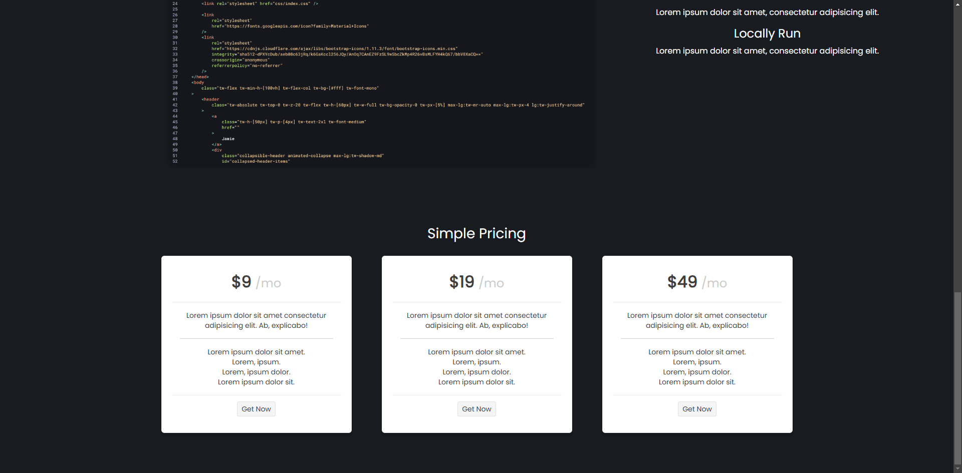
Creating Cards with Payment Plan Details
A section you will likely want to include in your landing pages is the payment options section. Remember, our goal is to convert the user by providing all the necessary information about the product, including payment details.
To achieve this, we can use the Blazor Card component, which will make it easy to define content for each card’s header (CardHeader), body (CardBody) and footer (CardFooter). As an advantage, we can combine the card’s content with HTML code or add other components, as shown in the following example:
<!-- Pricing Section -->
<section class="section" id="pricing">
    <h3>Simple Pricing</h3>
    <div class="pricing-cards">
        <TelerikCard Class="pricing-card">
            <CardHeader>
                <h3>
                    <span style="font-size: 32px; font-weight: bold;">$9</span>
                    <span style="font-size: 24px; color: #ccc;">/mo</span>
                </h3>
            </CardHeader>
            <CardBody>
                <p>
                    Lorem ipsum dolor sit amet consectetur adipisicing elit. Ab, explicabo!
                </p>
                <hr />
                <ul style="list-style: none; padding: 0;">
                    <li>Lorem ipsum dolor sit amet.</li>
                    <li>Lorem, ipsum.</li>
                    <li>Lorem, ipsum dolor.</li>
                    <li>Lorem ipsum dolor sit.</li>
                </ul>
            </CardBody>
            <CardFooter>
                <TelerikButton OnClick="@(() => {})">Get Now</TelerikButton>
            </CardFooter>
        </TelerikCard>
        <TelerikCard Class="pricing-card">
            <CardHeader>
                <h3>
                    <span style="font-size: 32px; font-weight: bold;">$19</span>
                    <span style="font-size: 24px; color: #ccc;">/mo</span>
                </h3>
            </CardHeader>
            <CardBody>
                <p>
                    Lorem ipsum dolor sit amet consectetur adipisicing elit. Ab, explicabo!
                </p>
                <hr />
                <ul style="list-style: none; padding: 0;">
                    <li>Lorem ipsum dolor sit amet.</li>
                    <li>Lorem, ipsum.</li>
                    <li>Lorem, ipsum dolor.</li>
                    <li>Lorem ipsum dolor sit.</li>
                </ul>
            </CardBody>
            <CardFooter>
                <TelerikButton OnClick="@(() => {})">Get Now</TelerikButton>
            </CardFooter>
        </TelerikCard>
        <TelerikCard Class="pricing-card">
            <CardHeader>
                <h3>
                    <span style="font-size: 32px; font-weight: bold;">$49</span>
                    <span style="font-size: 24px; color: #ccc;">/mo</span>
                </h3>
            </CardHeader>
            <CardBody>
                <p>
                    Lorem ipsum dolor sit amet consectetur adipisicing elit. Ab, explicabo!
                </p>
                <hr />
                <ul style="list-style: none; padding: 0;">
                    <li>Lorem ipsum dolor sit amet.</li>
                    <li>Lorem, ipsum.</li>
                    <li>Lorem, ipsum dolor.</li>
                    <li>Lorem ipsum dolor sit.</li>
                </ul>
            </CardBody>
            <CardFooter>
                <TelerikButton OnClick="@(() => {})">Get Now</TelerikButton>
            </CardFooter>
        </TelerikCard>
    </div>
</section>
The previous code will display three cards with subscription options, which look great:
Now let’s add a contact form to the page.
Creating a Contact Form
The last section we will add to the page is a contact form, so potential customers can reach out to us if they have additional questions. For this task, we will use a Blazor Form component, which allows us to easily create all kinds of forms. We’ll start by defining the data model that the form will bind to, with the information we need to collect, as well as define an instance of the model and a method we can use to process the submission of information:
private Contact contact = new Contact();

public class Contact
{
    [Required(ErrorMessage = "Name is required")]
    public string Name { get; set; }

    [Required(ErrorMessage = "Email is required")]
    [EmailAddress(ErrorMessage = "Enter a valid email address")]
    public string Email { get; set; }

    // Optional field
    public string Phone { get; set; }

    [Required(ErrorMessage = "Subject is required")]
    public string Subject { get; set; }

    [Required(ErrorMessage = "Message is required")]
    public string Message { get; set; }
}

private void HandleSubmit()
{
}
Next, in the Razor section of the code, we define the form using a TelerikForm, with FormItems configured according to the type of input data, along with a TelerikButton to handle the submission of information, as shown in the following example:
<section class="section" id="contact" style="display: flex; flex-direction: column; align-items: center;">
    <h3>Contact Us</h3>
    <div>
        <TelerikForm Model="@contact" Width="500px" OnSubmit="@HandleSubmit">
            <FormValidation>
                <DataAnnotationsValidator />
            </FormValidation>
            <FormItems>
                <FormItem Field="@nameof(Contact.Name)" LabelText="Name" Hint="Enter your name" />
                <FormItem Field="@nameof(Contact.Email)" LabelText="Email" Hint="Enter your email address" />
                <FormItem Field="@nameof(Contact.Phone)" LabelText="Phone" Hint="Enter your phone number (optional)" />
                <FormItem Field="@nameof(Contact.Subject)" LabelText="Subject" Hint="Enter the subject of your inquiry" />
                <FormItem Field="@nameof(Contact.Message)" LabelText="Message" Hint="Enter your inquiry or comment" EditorType="@FormEditorType.TextArea" />
            </FormItems>
            <FormButtons>
                <TelerikButton ButtonType="ButtonType.Submit">
                    Send
                </TelerikButton>
            </FormButtons>
        </TelerikForm>
    </div>
</section>
The result of the execution with the updated code looks like this:
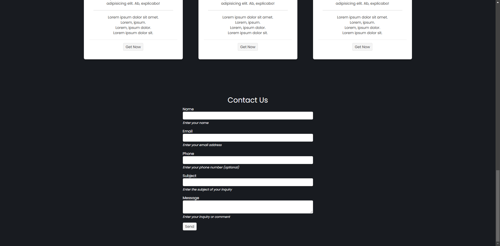
As you can see, when the application is deployed, we get a nice form that will serve to receive user questions or comments.
Conclusion
Throughout this article, we have explored how to create sections of a landing page, including the navigation bar, the hero section, the customer logos section, features sections, pricing section and a form section. We have also seen how to make use of Telerik UI for Blazor controls to quickly create the sections of the landing page. Now it’s your turn to continue exploring more ideas to create the best landing pages.

Héctor Pérez
Héctor Pérez is a Microsoft MVP with more than 10 years of experience in software development. He is an independent consultant, working with business and government clients to achieve their goals. Additionally, he is an author of books and an instructor at El Camino Dev and Devs School.
Related Posts
Comments
All articles
Topics
Web MobileMobile
Desktop
Design
Productivity
People
