
Adding a Blazor Pager to Your Data Display
 by Héctor Pérez

Summarize with AI:
Learn how to implement the TelerikPager component into a Blazor project to easily add pagination to data-bound controls such as Grid and ListView.
In this article, we will explore the Blazor Pager component from Progress Telerik UI for Blazor. This component enables pagination for data-bound controls such as Grid and ListView, allowing you to display many items and paginate them. Let’s get started!
Creating a Use Case for the Blazor Pager Control
To harness the full potential of the Blazor Pager control, we will create a simple example simulating a clothing store. Follow these steps to set up an initial example for testing:
Create a new project of type Blazor Web App, and set the Interactive render mode to Server and the Interactivity location to Global.
Follow the installation guide for Telerik controls in Blazor-based projects.
Add the stylesheet for the icon styles in the
App.razorfile according to your configuration:
<!-- If using static assets from the NuGet package -->
<link href="_content/Telerik.UI.for.Blazor/css/kendo-font-icons/font-icons.css" rel="stylesheet" />
<!-- If using static assets from a Trial NuGet package -->
<link href="_content/Telerik.UI.for.Blazor.Trial/css/kendo-font-icons/font-icons.css" rel="stylesheet" />

<!-- If using the Telerik Blazor CDN - set the correct version number in the URL -->
<link href="https://blazor.cdn.telerik.com/blazor/8.1.1/kendo-font-icons/font-icons.css" rel="stylesheet" type="text/css" />
- Go to the
app.cssfile and add the following styles at the end of the file:
/* Hero Section */
:root {
    --primary-color: #0d6efd;
    --success-color: #198754;
}

.hero-section {
    background: linear-gradient(135deg, var(--primary-color), #0b5ed7);
    color: white;
    padding: 3rem 0;
    margin-bottom: 2rem;
    border-radius: 0 0 20px 20px;
}

/* Products */
.product-card {
    transition: all 0.3s ease;
    border: none;
    box-shadow: 0 4px 6px rgba(0, 0, 0, 0.05);
    margin-bottom: 20px;
    overflow: hidden;
    border-radius: 10px;
}

    .product-card:hover {
        transform: translateY(-5px) scale(1.02);
        box-shadow: 0 10px 15px rgba(0, 0, 0, 0.1);
    }

.product-img {
    height: 200px;
    object-fit: contain;
    padding: 20px;
    background-color: #f8f9fa;
    transition: transform 0.3s ease;
}

.product-card:hover .product-img {
    transform: scale(1.05);
}

.product-price {
    color: var(--success-color);
    font-weight: bold;
    font-size: 1.2rem;
}

.category-badge {
    position: absolute;
    top: 10px;
    right: 10px;
    font-size: 12px;
    padding: 3px 8px;
    border-radius: 20px;
    background-color: var(--primary-color);
    color: white;
}

.rating-badge {
    background-color: #ffc107;
    color: #212529;
    font-size: 12px;
    padding: 3px 8px;
    border-radius: 20px;
    display: inline-flex;
    align-items: center;
}
- In the Components folder, create a subfolder called
AppComponents, and create the following Razor Components:
HeroSection.razor:
<header class="hero-section">
    <div class="container text-center">
        <h1 class="display-4 fw-bold mb-3">@Title</h1>
        <p class="lead mb-0">@Subtitle</p>
    </div>
</header>

@code {
    [Parameter]
    public string Title { get; set; }
    [Parameter]
    public string Subtitle { get; set; }
}
ProductCard.razor:
@using PagerDemo.Models
@using Telerik.Blazor.Components

<TelerikCard Width="300px" Class="product-card h-100">
    <div class="position-relative">
        <CardImage Src="@Product.image" Class="product-img"  />
        <span class="category-badge">@FormatCategory(Product.category)</span>
    </div>
    <CardBody>
        <CardTitle>@TruncateTitle(Product.title)</CardTitle>
        <p class="card-text">
            <span class="product-price">$@Product.price</span>
            <span class="rating-badge ms-2">
                <TelerikFontIcon Icon="@FontIcon.Star" /> @Product.rating?.rate
            </span>
        </p>
    </CardBody>

    <CardFooter Class="bg-white">
        <TelerikButton Class="btn btn-outline-primary w-100">
            <TelerikFontIcon Icon="@FontIcon.Cart" /> Add to Cart
        </TelerikButton>
    </CardFooter>
</TelerikCard>

@code {
    [Parameter]
    public Product Product { get; set; }

    private string FormatCategory(string category)
    {
        if (string.IsNullOrEmpty(category))
            return "";
        return string.Join(" ", category.Split(' ').Select(word => char.ToUpper(word[0]) + word.Substring(1)));
    }

    private string TruncateTitle(string title)
    {
        if (title.Length > 50)
            return title.Substring(0, 50) + "...";
        return title;
    }
}
You can see that we are using Telerik components like TelerikCard to quickly create user interfaces, as Telerik components provide ready-to-use properties and sections to fit the content to our needs.
- Create a folder named
Models, replacing the content with the following classes:
public class Product
{
    public int id { get; set; }
    public string title { get; set; }
    public double price { get; set; }
    public string description { get; set; }
    public string category { get; set; }
    public string image { get; set; }
    public Rating rating { get; set; }
}
public class Rating
{
    public double rate { get; set; }
    public int count { get; set; }
}
- Replace the contents of
Home.razorwith the following code:
@page "/"
@using PagerDemo.Components.AppComponents
@using PagerDemo.Models

<PageTitle>Home</PageTitle>

<HeroSection Title="FakeStore Products" Subtitle="Browse our collection of high-quality products from the FakeStore API" />

<main class="container my-5">
    <div class="row mb-4">
        <div class="col">
            <div class="d-flex justify-content-between align-items-center">
                <h2 class="mb-0">Our Products</h2>
                <p class="mb-0 text-muted">@resultCountText</p>
            </div>
            <hr />
        </div>
    </div>

    @if (isLoading)
    {
        <div class="d-flex justify-content-center align-items-center" style="height: 50vh;">
            <TelerikLoader Visible="@LoaderVisible"
                           Size="@ThemeConstants.Loader.Size.Large"
                           ThemeColor="@ThemeConstants.Loader.ThemeColor.Tertiary"
                           Type="@LoaderType.ConvergingSpinner" />
        </div>
    }
    else
    {
        <div class="row g-4">
            @if (filteredProducts.Count == 0)
            {
                <div class="col-12">
                    <div class="alert alert-info">
                        No products found matching your criteria.
                    </div>
                </div>
            }
            else
            {
                @foreach (var product in filteredProducts)
                {
                    <div class="col-sm-6 col-md-4 col-lg-3 fade-in">
                        <ProductCard Product="product" />
                    </div>
                }
            }
        </div>
    }
</main>

@code {
    private const string API_URL = "https://fakestoreapi.com/products";
    private List<Product> allProducts = new();
    private List<Product> filteredProducts = new();
    private List<string> categories = new();
    private string currentCategory = "all";
    private string currentSearchTerm = "";
    private bool isLoading = true;
    private string resultCountText = "Loading products...";
    bool LoaderVisible { get; set; } = true;

    [Inject] private HttpClient Http { get; set; }

    protected override async Task OnInitializedAsync()
    {
        await FetchProducts();
    }

    private async Task FetchProducts()
    {
        try
        {
            isLoading = true;
            allProducts = await Http.GetFromJsonAsync<List<Product>>(API_URL) ?? new();
            categories = allProducts.Select(p => p.category).Distinct().ToList();
            filteredProducts = new List<Product>(allProducts);
            UpdateResultCount();
        }
        catch (Exception ex)
        {
            Console.Error.WriteLine("Error fetching products: " + ex.Message);
        }
        finally
        {
            isLoading = false;
        }
    }

    private void UpdateResultCount()
    {
        int count = filteredProducts.Count;
        resultCountText = $"{count} product{(count != 1 ? "s" : "")} found";
    }
}
Finally, in Program.cs, add the following line to inject a reference to the HTTP service:
var builder = WebApplication.CreateBuilder(args);
...
builder.Services.AddHttpClient();
var app = builder.Build();
When running the preceding code, you’ll have a beautiful page that loads products from an external API:
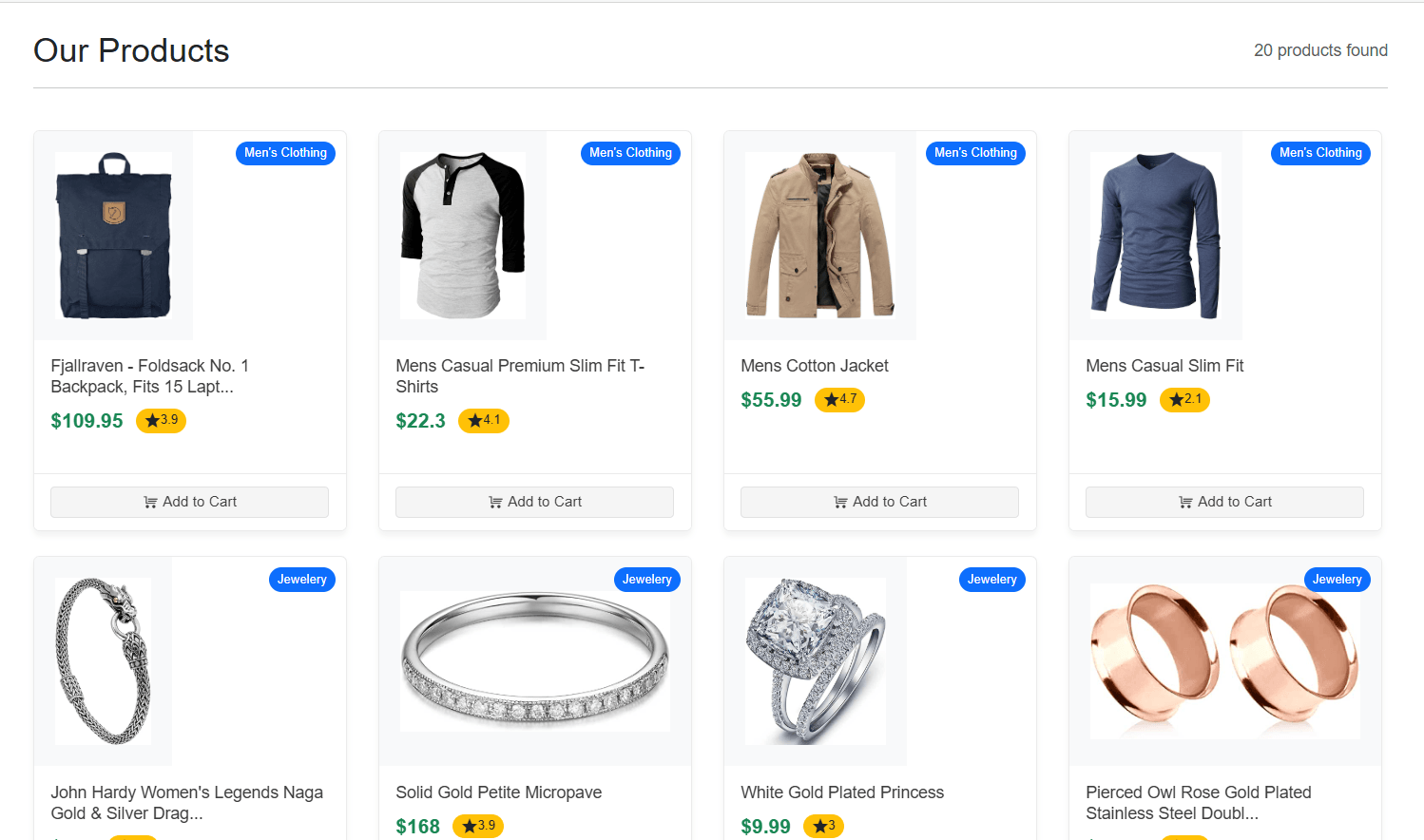
Integrating a Telerik Pager into the Product List
We have created a product page that looks quite good; however, one issue we currently face is that all products are loaded on the same page at once. Imagine if you had 100 products or, worse, 1,000 or 10,000. Navigating through such a large number of products would be a real challenge for the user.
To solve this issue, we will add the Pager component to our application, enabling pagination with the desired number of products per page. To do this, we need to modify the code section that displays the list items. In our case, the current code is as follows:
@foreach (var product in filteredProducts)
{
    <div class="col-sm-6 col-md-4 col-lg-3 fade-in">
        <ProductCard Product="product" />
    </div>
}
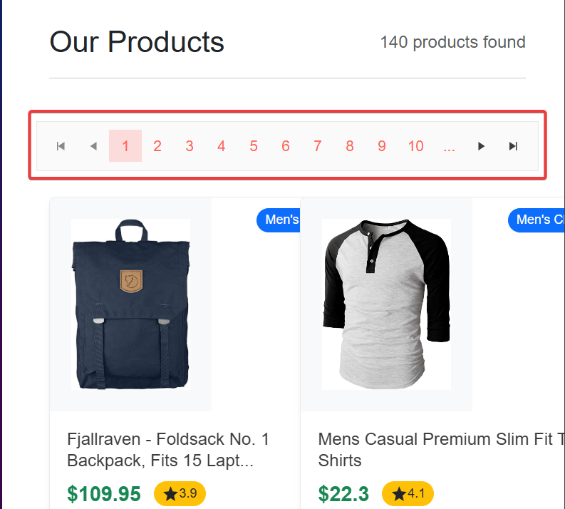
Next, we will add the Pager component, which requires at least the following three properties:
Total: Indicates the total number of items in the data source.PageSize: Specifies the number of items to be displayed per page.Page: The index of the page the user is currently on. It can either be one-way or two-way.
You can place the component wherever it fits best; in my example, I will place it above the list:
@page "/"
@using BlazorPagerDemo.Components.AppComponents
@using BlazorPagerDemo.Models

<PageTitle>Home</PageTitle>

...

<main class="container my-5">
    ...
    else
    {
       ...
            else
            {
                <TelerikPager Total="@filteredProducts.Count" PageSize="5" @bind-Page="@Page"></TelerikPager>

                var pageData = filteredProducts.Skip((Page - 1) * PageSize).Take(PageSize).ToList();

                @foreach (var product in pageData)
                {
                    <div class="col-sm-6 col-md-4 col-lg-3 fade-in">
                        <ProductCard Product="product" />
                    </div>
                }
            }
        </div>
    }
</main>

@code {

    public int PageSize { get; set; } = 3;
    public int Page { get; set; } = 1;

    ...
}
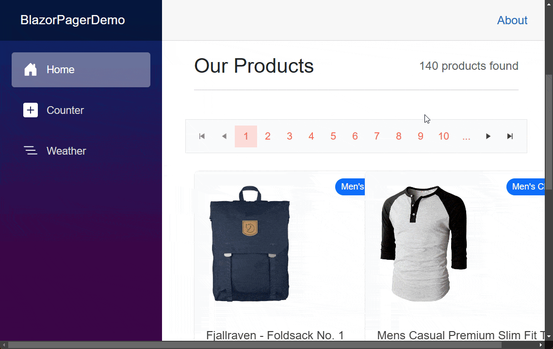
In the code above, you can also see that I have created a variable called pageData, which performs the calculation to filter the page items based on the page size and the current page values. The result is displayed below:
As you can see, with just a few modifications, we now have an aesthetically pleasing component that adds pagination to the product list.
Other Useful Parameters of the Blazor Pager Component
In addition to the essential parameters needed for the Pager component to display information correctly, we also have the following parameters that allow further customization of the Pager:
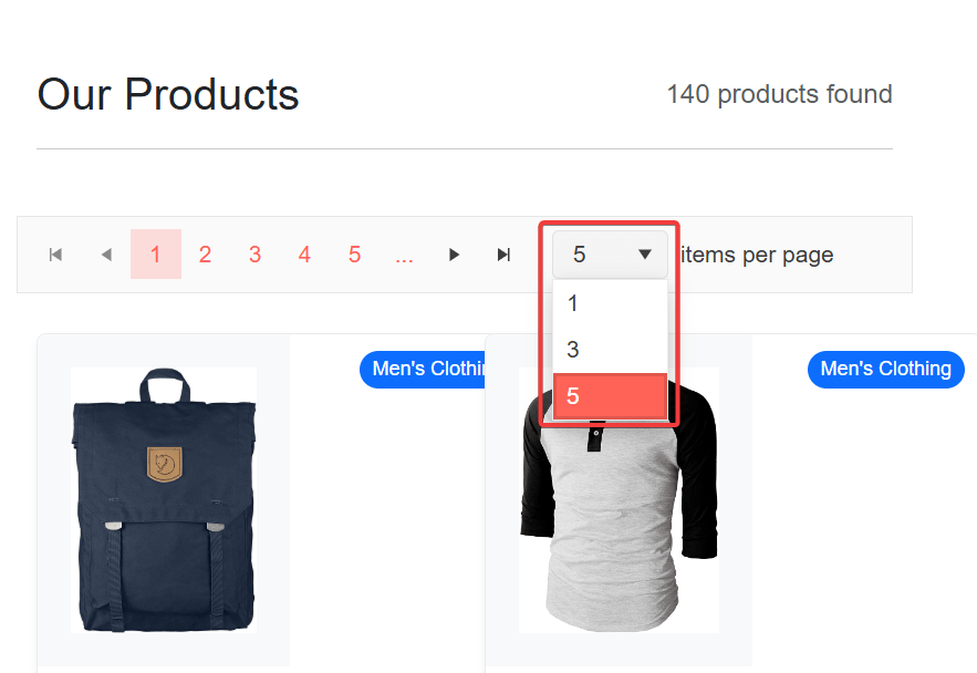
Adaptive(bool): When set totrue, the pager’s elements will adapt based on the screen size. On smaller screens, aPageSizeDropDownList will be displayed to allow the user to select a page, as shown in the following example:
ButtonCount(int): Specifies the maximum number of page buttons to be displayed in the interface. It’s important to note that this number must be lower than the calculation ofTotal/PageSize. For instance, if you set it to 5, only five buttons will be displayed for navigating between pages, as shown in the following example:
Class(string): Allows assigning a custom CSS class to the<div class="k-pager-wrap">element.PageSizes(List<int?>): Enables specifying a set of page indexes in a DropDownList for quick navigation. For example, if we want the user to access pages 1, 3 and 5 directly, we can configure the component as shown below:
<TelerikPager Total="@filteredProducts.Count"
    ...
    PageSizes="@pageSizes"/>
...
@code{
     private List<int?> pageSizes = new() { 1, 3, 5 };
}
With this, the DropDownList displayed in the Pager will only show the pages configured in the pageSizes property:
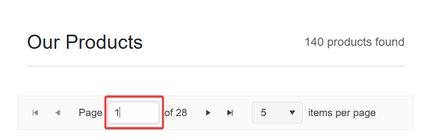
InputType(PagerInputType): Allows specifying a value from thePagerInputTypeenumeration, eitherButtonsorInput. When assigned the default valueButtons, numeric buttons are displayed for navigating to specific pages. Alternatively, if the value is set toInput, a textbox will appear instead of buttons, enabling users to enter a page index directly. The following code demonstrates the use of this property:
<TelerikPager
    InputType="PagerInputType.Input"
    .../>
The above displays the following result in the Pager control:
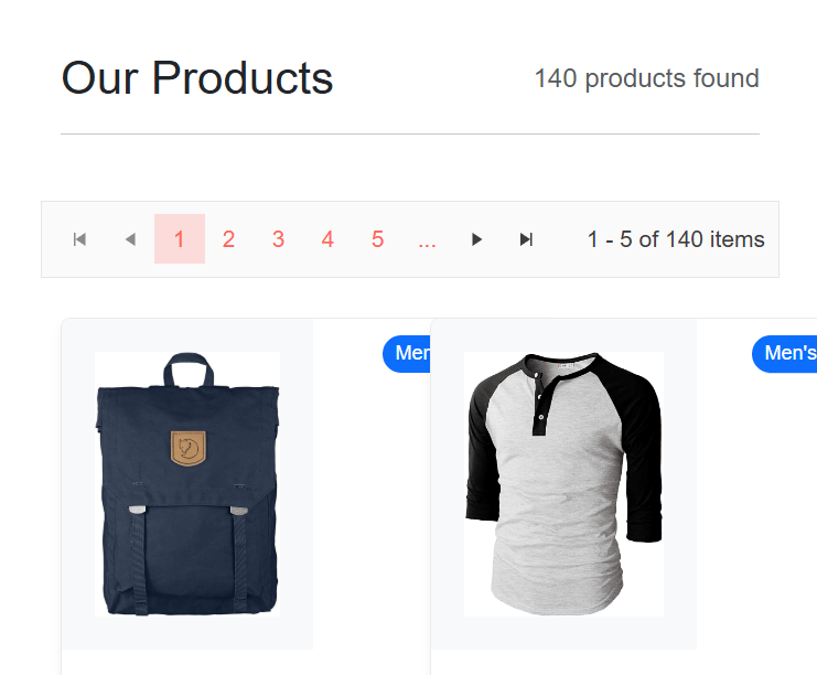
ShowInfo: With a default value of true, it allows you to specify whether the current page information and the number of rows should be displayed in the graphical interface.Size: Lets you change the Pager’s size by specifying the valuessm,mdandlg.
Events in the Pager Control
The Pager control provides the following events:
PageSizeChanged: Used to detect when the user changes the number of items displayed per page using the pager’s DropDownList, allowing the new selected size to be received as a parameter.PageChanged: This event is triggered when the user navigates to a page different from the current one. It is ideal for performing some kind of validation or dynamic data loading. In the documentation, you can find an example of dynamic loading in the Pager control, simulating a data load when changing the page. This example can be adapted to make it a service that provides data dynamically.
Conclusion
Throughout this article, you have learned how to implement the TelerikPager component into a Blazor project to easily add pagination. Additionally, you have seen which parameters and events can be configured to adapt the Pager’s behavior to your needs. Now it’s time to get to work and implement it in your own projects.
Héctor Pérez
Héctor Pérez is a Microsoft MVP with more than 10 years of experience in software development. He is an independent consultant, working with business and government clients to achieve their goals. Additionally, he is an author of books and an instructor at El Camino Dev and Devs School.
Related Posts
Comments
All articles
Topics
Web MobileMobile
Desktop
Design
Productivity
People
